As television screens are typically viewed from a distance, interfaces that use larger typography are more legible and comfortable for users. TV Design's default type scale includes contrasting and flexible type styles to support a wide range of use cases.
Highlights
- Prioritize using larger typography for a more comfortable viewing experience on TV screens.
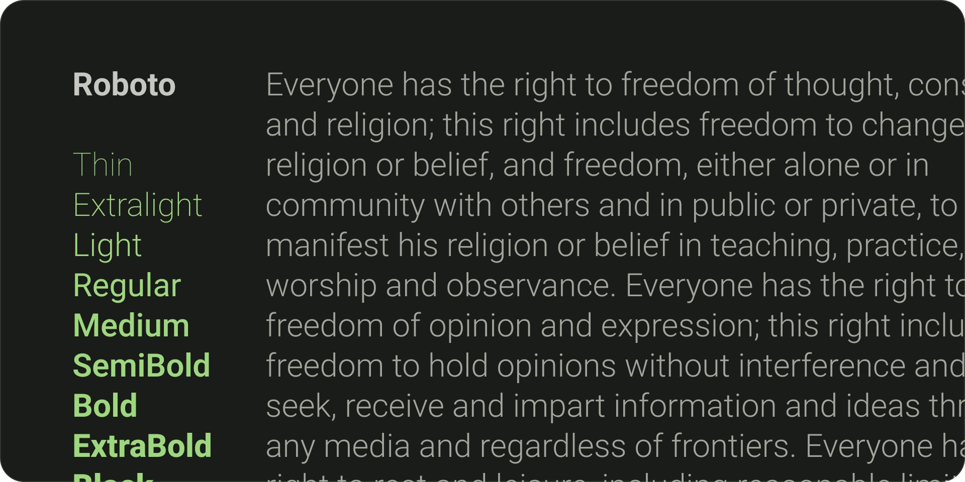
- The default Android TV typeface is Roboto.
- Choose distinct, legible fonts which best reflect your brand style.
- Ensure fonts are readable at a glance, with appropriate width and optical sizing.
- Pair complimentary fonts; for instance, use sans-serif for body text and labels.
- Maximize legibility by avoiding decorative fonts.
Fonts
Default typefaces
Android TV has its own system typeface, Roboto, which is optimized for legibility and clarity. Use Roboto for a utilitarian, non-branded UI element that's best served using the native platform experience.
Distinct typefaces
Where relevant, use a distinctive font that reflects your brand style. Here are the main things to think about when choosing a font:
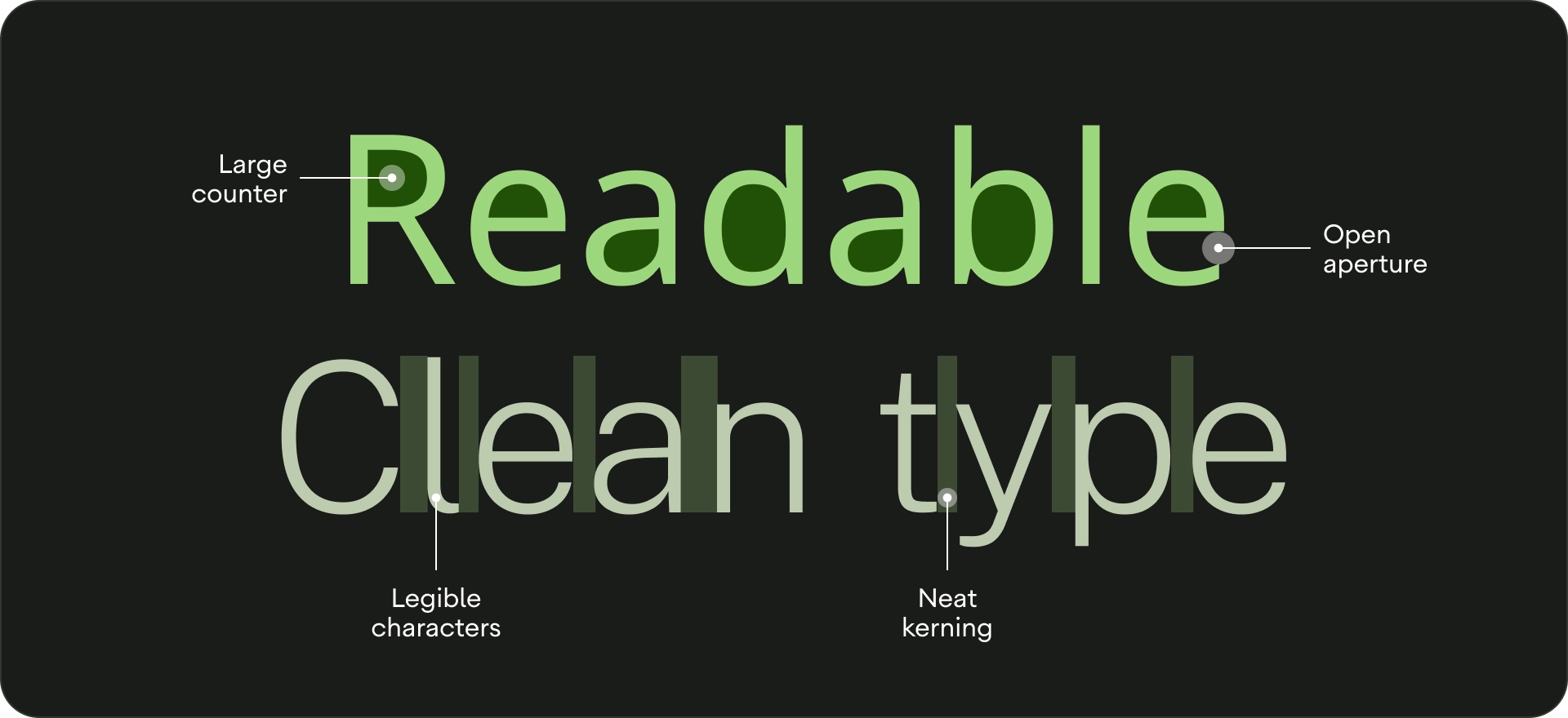
- Legibility - For better readability from a distance, use typefaces with large counters and apt optical sizing. Ensure letters are distinguishable from one other.
- Readable at a glance- Any text on TV needs to have a legible font width, as thinner lines are not instantly recognisable.
- Pair complimentary fonts - If you want to use multiple fonts, use a sans-serif typeface for body text and labels.
- If you can, avoid decorative fonts. While the font sizes on TV are bigger than other display sizes, UI text legibility is the priority. Steer clear of fonts that can't function as body text.
Type scale
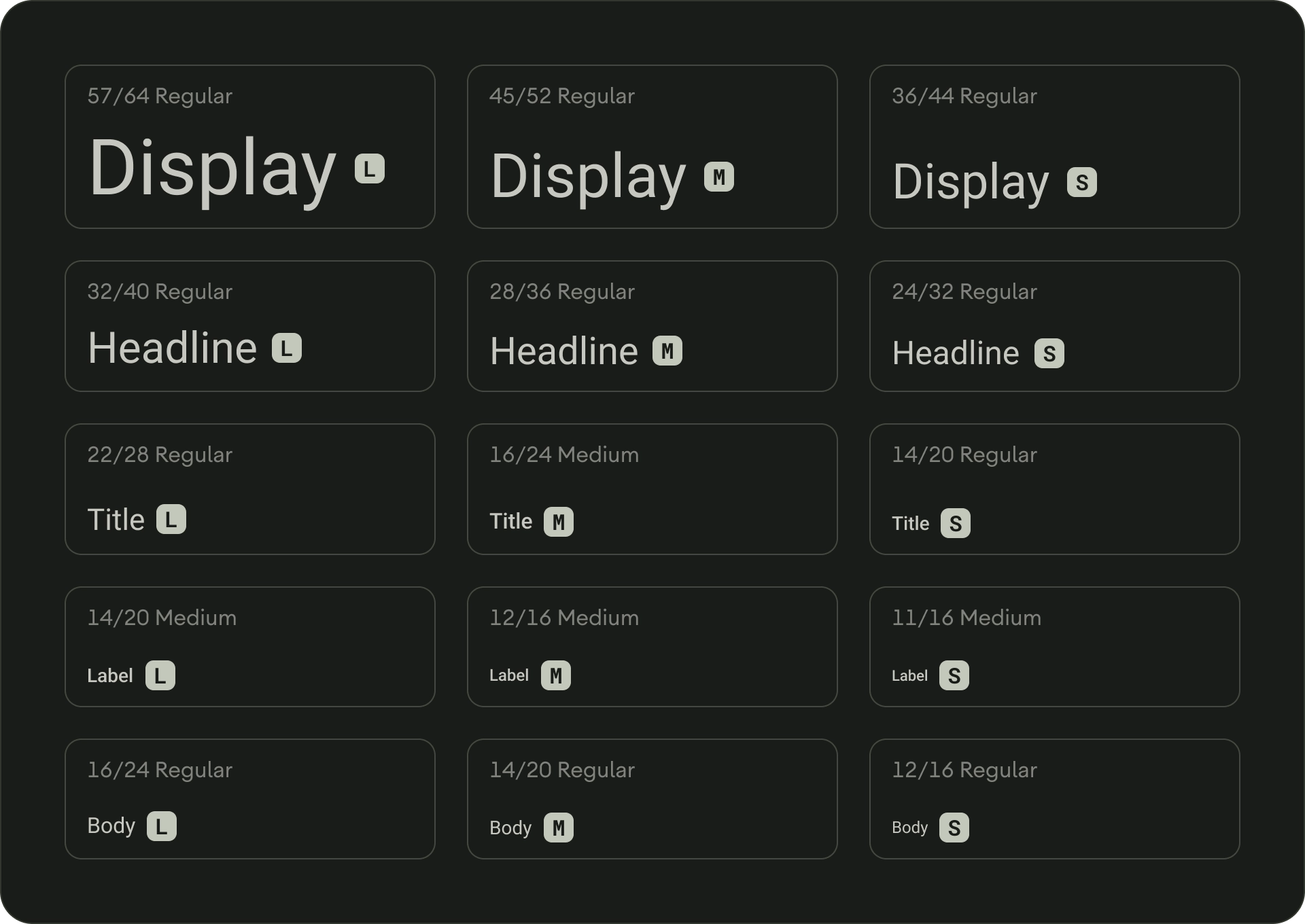
A type scale is a selection of font styles that can be used across an app. It ensures a flexible, yet consistent style that accommodates a range of purposes. The TV Design type scale is a combination of 15 styles, each with an intended application and meaning. They're assigned based on use, such as "display," or "headline," and are grouped into categories based on scale (large or small). TV Design's default type scale uses Roboto for all titles, labels, and body text to create a unified typography experience.
To learn about typography tokens and typeface customization, visit Material Design 3.
Type roles
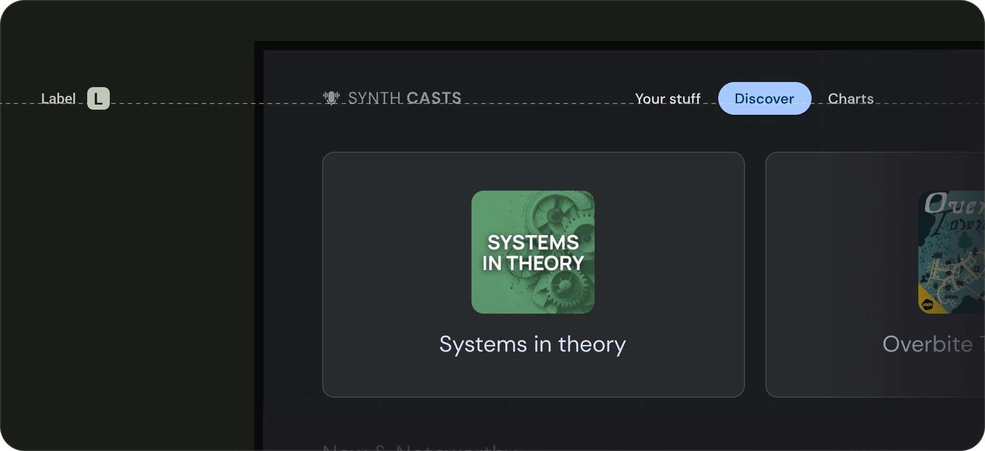
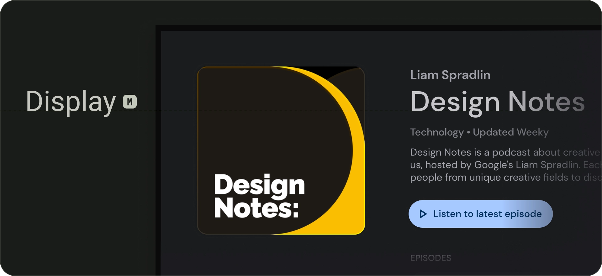
Display
There are three display styles in the default type scale: large, medium, and small. As the largest text on the screen, large display styles are reserved for short, important text passages, or numerals. They can be used for the main heading of the screen. Don't use large display styles for section or cluster headings.
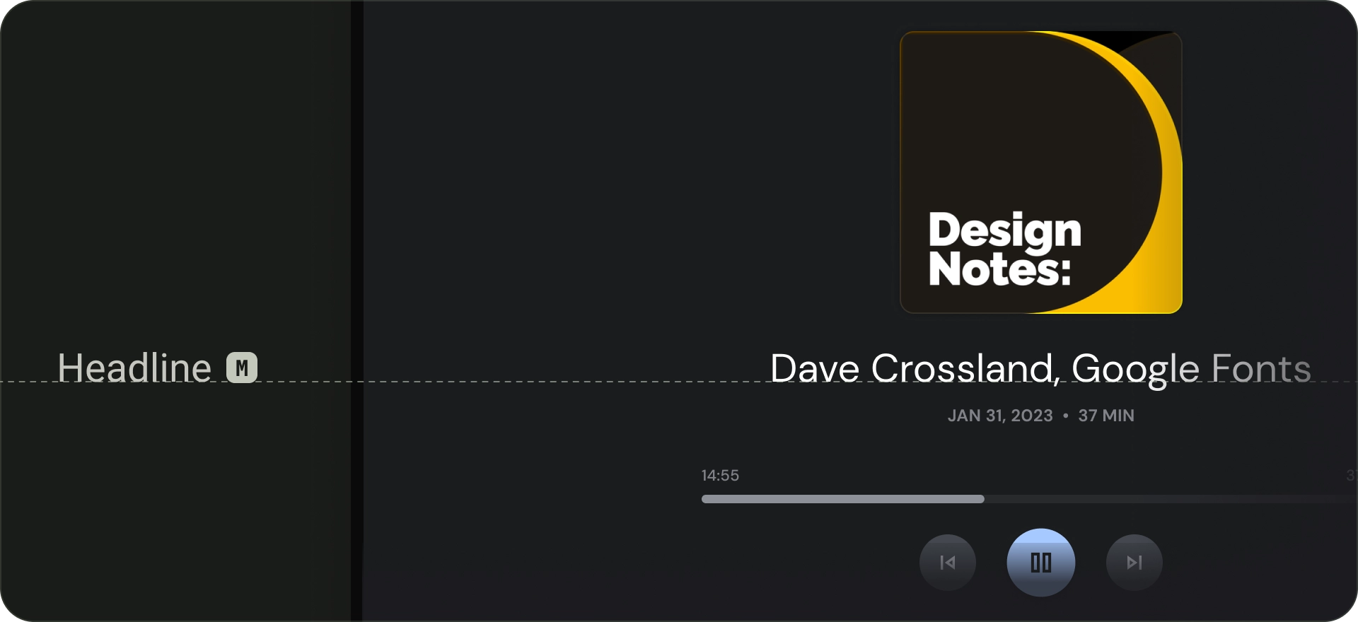
Headline
Headlines are best-suited for short, high-emphasis text. These styles can be good for marking primary passages of text or important regions of content. They are used for headings in featured carousels and immersive clusters. Headlines can also make use of expressive typefaces, provided appropriate line height and letter spacing helps maintain readability.
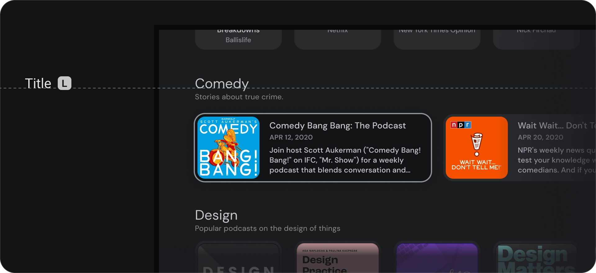
Title
Title styles are smaller than headline styles. Use titles for brief, medium-emphasis text. For example, consider using titles to divide secondary passages of text or secondary regions of content.
Use titles for UI elements like cards or lists. Title sizes are compact while providing a useful level of prominence and legibility.
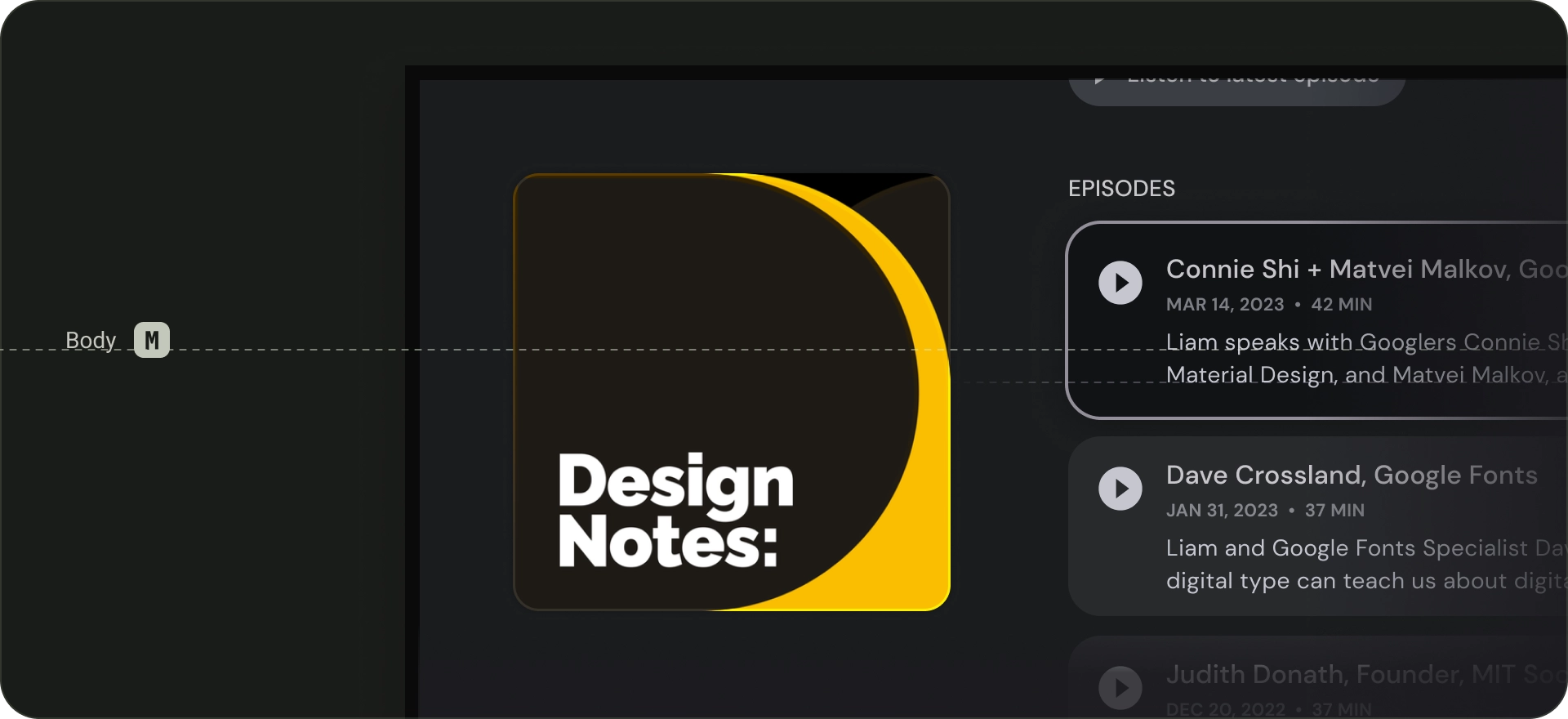
Body
Body styles are used for longer text passages in your app. Use typefaces that are readable at smaller sizes and can be comfortably read in longer passages. Avoid decorative fonts for body text since these can be hard to read from far away.
Label
Label styles are smaller, utilitarian styles, used for things like the text inside components or for very small text in the content body, such as captions. Buttons, for example, use the label large style.