
Unlike touch interfaces, TV heavily relies on different main states (default, focused, pressed) to draw the user's attention to the focused element. This serves as the starting point for navigation.
Highlights
- A focus system consists of sections of focusable elements.
- Focus indicators are visual devices that emphasize focused elements.
- Scale indication adjusts an element by x factor when focused or selected.
- While background color is static, surface color can change when focused.
Focus
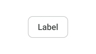
Focus is the key state definition for TV design. Navigation is constrained to D-Pad interactions available on the remote control. Users can use arrow keys to move, center button to select, and back key to return. The remote allows users to move through one interaction at a time. The state change of an element is represented using focus indicators to aid the user in visualization.
Focusable elements and groups
"Focusable elements" are an integral part of the TV interface. "Focusable elements" can be any component such as buttons, cards, list items or a custom defined surface. At any given time, users should be able to focus on only one focusable element.
"Focusable groups", on the other hand, contain one or more "focusable elements". There can be any number of nested "focusable groups". Focusable groups are used to logically group different focusable elements for user friendly navigation.
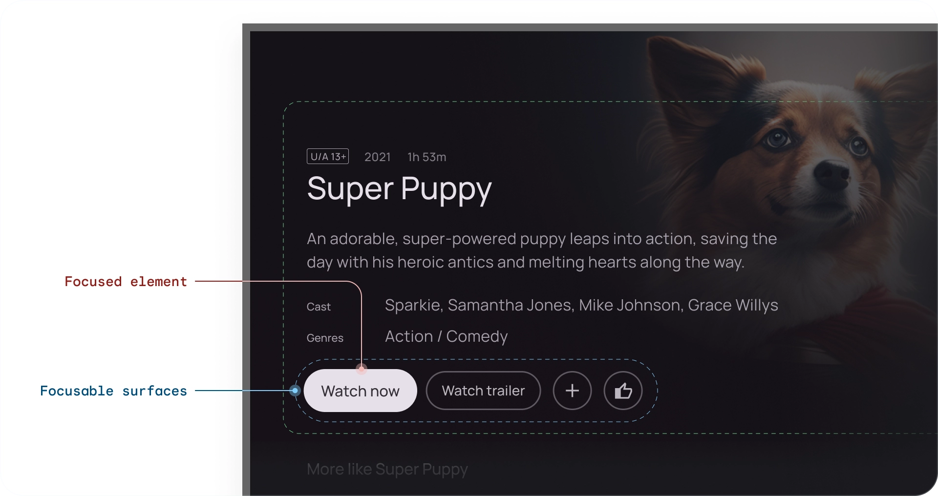
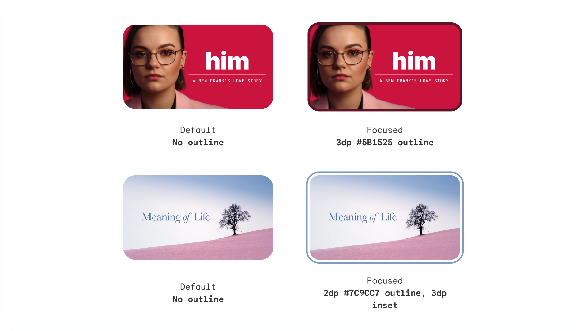
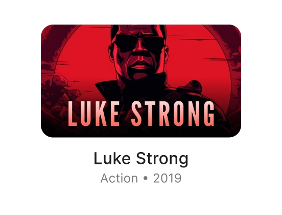
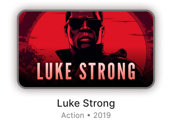
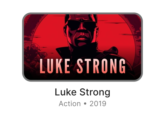
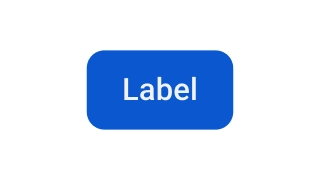
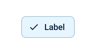
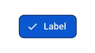
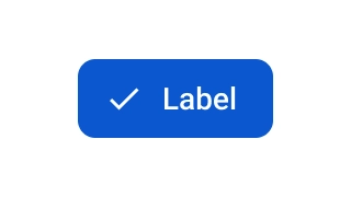
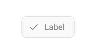
Focus indicators
Focus indicators are a distinct visualization of a focused element. When an element is selected, it enters a "pressed" state until the remote button is released.
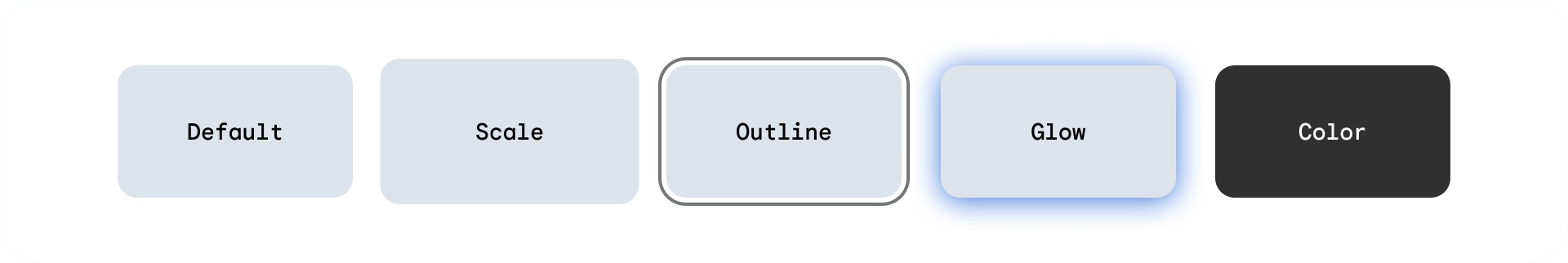
Each state of a focusable element is configured by adjusting the following properties:
- Scale — Change the size of a focused element
- Border — Draw an outline around the element
- Glow — Create a shadow under element (commonly used on cards)
- Colors — Change element background and content color
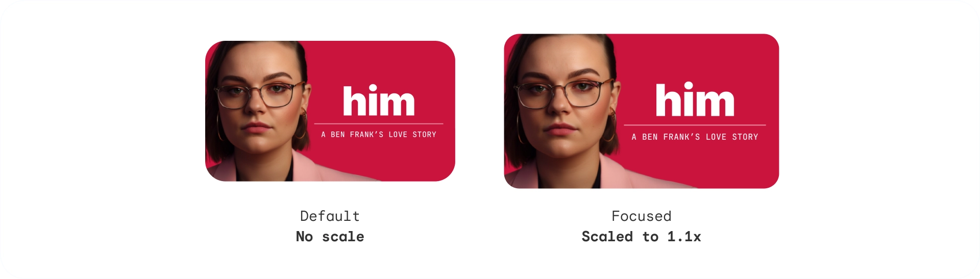
Scale indication
Scales the element when focused or selected. Default scaling values are: 1.025, 1.05 and 1.1x. Use this indication for clear feedback on navigation. The scaling values for different elements can vary based on their size.
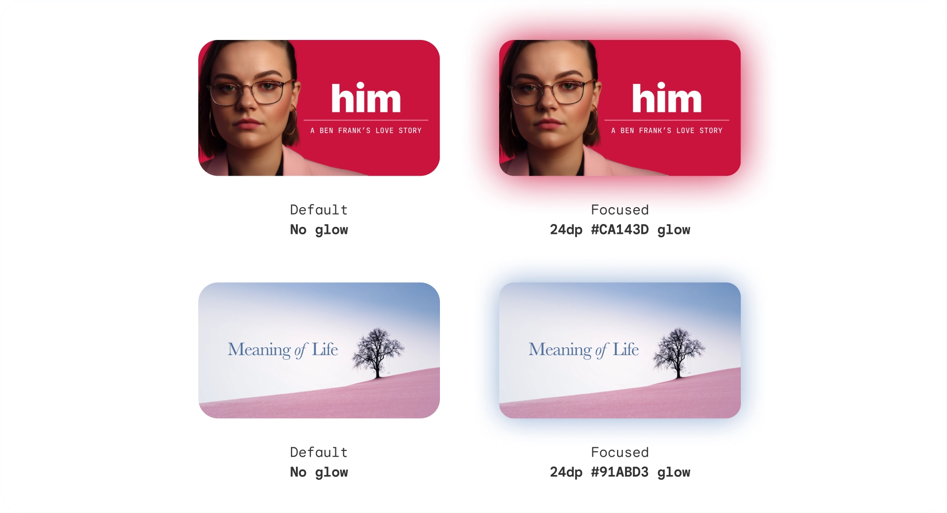
Glow indication
Adds a diffused glow or shadow around the element. Glow indication takes the following parameters:
- Glow level: suggests elevation of the element, ranging from 2dp - 32dp
- Glow color: can be specified according to image or brand color
Outline indication
Adds an outline around the element independent from the border. The outline indication uses the following parameters:
- Outline width: forms outside the element
- Outline inset: spacing between the element and its outline
- Outline color: can be specified according to image or brand color \
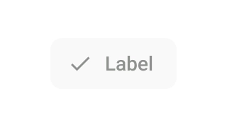
Color indication
Elements can change state by adapting to colors. The color indication uses the following parameters:
- Background color: Changes the surface color of an element
- Content color: Changes the color of content over a surface

Tonal elevation
While background color is static, surface color can change. Surfaces at elevation levels +1 to +5 are tinted via color overlays based on the primary color. This introduces tonal variation to the surface baseline.
Tonal surfaces provide many benefits:
- Create the effect of elevation to create differentiate the various elements and text
- Establish contrast for accessibility benefits
- Create visual engagement, and soften transitions between interactive elements
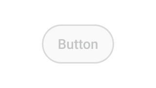
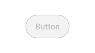
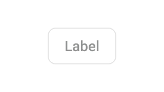
Disabled
In disabled state, the background color and opacity display a lower prominence to express that the object is not clickable.
Use cases
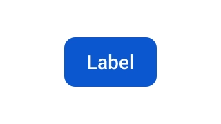
A focusable element has the 3 main states: default, focused and pressed, with additional states: enabled, disabled and selected forming a matrix.
Cards
| Default | Focused | Pressed | |
|---|---|---|---|
| Enabled |
|
|
|
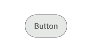
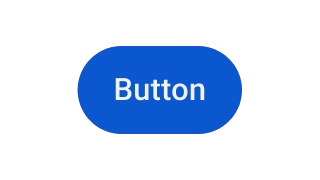
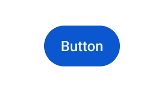
Buttons
| Default | Focused | Pressed | |
|---|---|---|---|
| Enabled |
|
|
|
| Disabled |
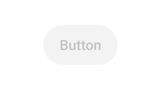
|
|
|
Chips
| Default | Focused | Pressed | |
|---|---|---|---|
| Enabled |
|
|
|
| Enabled + Selected |
|
|
|
| Disabled |

|
|

|
| Disabled + selected |
|

|
|