
Jetpack Compose پیادهسازی از طراحی متریال (Material Design)، یک سیستم طراحی جامع برای ایجاد رابطهای دیجیتال، را ارائه میدهد. اجزای طراحی متریال (دکمهها، کارتها، سوئیچها و غیره) بر اساس قالببندی متریال (Material Theming ) ساخته شدهاند که روشی سیستماتیک برای سفارشیسازی طراحی متریال برای انعکاس بهتر برند محصول شما است. یک قالب متریال شامل ویژگیهای رنگ ، تایپوگرافی و شکل است. هنگامی که این ویژگیها را سفارشی میکنید، تغییرات شما به طور خودکار در اجزایی که برای ساخت برنامه خود استفاده میکنید، منعکس میشود.
Jetpack Compose این مفاهیم را با MaterialTheme composable پیادهسازی میکند:
MaterialTheme( colors = // ... typography = // ... shapes = // ... ) { // app content }
پارامترهایی را که برای تمبندی برنامهتان به MaterialTheme ارسال میکنید، پیکربندی کنید.
رنگ
رنگها در Compose با کلاس Color ، یک کلاس نگهدارنده داده، مدلسازی میشوند.
val Red = Color(0xffff0000) val Blue = Color(red = 0f, green = 0f, blue = 1f)
اگرچه میتوانید این موارد را به هر شکلی که دوست دارید سازماندهی کنید (به عنوان ثابتهای سطح بالا، درون یک singleton یا تعریف شده به صورت درونخطی)، اکیداً توصیه میکنیم رنگها را در قالب خود مشخص کنید و رنگها را از آنجا بازیابی کنید. این رویکرد پشتیبانی از قالب تیره و قالبهای تو در تو را ممکن میسازد.
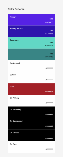
Compose کلاس Colors را برای مدلسازی سیستم رنگ Material ارائه میدهد. Colors توابع سازنده را برای ایجاد مجموعههایی از رنگهای روشن یا تیره فراهم میکند:
private val Yellow200 = Color(0xffffeb46) private val Blue200 = Color(0xff91a4fc) // ... private val DarkColors = darkColors( primary = Yellow200, secondary = Blue200, // ... ) private val LightColors = lightColors( primary = Yellow500, primaryVariant = Yellow400, secondary = Blue700, // ... )
بعد از اینکه Colors خود را تعریف کردید، میتوانید آنها را به MaterialTheme ارسال کنید:
MaterialTheme( colors = if (darkTheme) DarkColors else LightColors ) { // app content }
از رنگهای تم استفاده کنید
شما میتوانید Colors ارائه شده به MaterialTheme composable را با استفاده از MaterialTheme.colors بازیابی کنید.
Text( text = "Hello theming", color = MaterialTheme.colors.primary )
رنگ سطح و محتوا
بسیاری از کامپوننتها یک جفت رنگ و رنگ محتوا را میپذیرند:
Surface( color = MaterialTheme.colors.surface, contentColor = contentColorFor(color), // ... ) { /* ... */ } TopAppBar( backgroundColor = MaterialTheme.colors.primarySurface, contentColor = contentColorFor(backgroundColor), // ... ) { /* ... */ }
این به شما امکان میدهد نه تنها رنگ یک composable را تنظیم کنید، بلکه یک رنگ پیشفرض برای محتوا، composableهای موجود در آن، نیز ارائه دهید. بسیاری از composableها به طور پیشفرض از این رنگ محتوا استفاده میکنند. به عنوان مثال، Text رنگ خود را بر اساس رنگ محتوای والد خود تعیین میکند و Icon از آن رنگ برای تنظیم ته رنگ خود استفاده میکند.
متد contentColorFor() رنگ مناسب "روشن" را برای هر رنگ تم بازیابی میکند. برای مثال، اگر یک رنگ پسزمینه primary را روی Surface تنظیم کنید، از این تابع برای تنظیم onPrimary به عنوان رنگ محتوا استفاده میکند. اگر یک رنگ پسزمینه غیر تم تنظیم کنید، باید یک رنگ محتوای مناسب نیز مشخص کنید. از LocalContentColor برای بازیابی رنگ محتوای ترجیحی برای پسزمینه فعلی، در یک موقعیت مشخص در سلسله مراتب، استفاده کنید.
آلفای محتوا
اغلب شما میخواهید میزان تأکید بر محتوا را تغییر دهید تا اهمیت آن را منتقل کنید و سلسله مراتب بصری ایجاد کنید. توصیههای مربوط به خوانایی متن در طراحی متریال، استفاده از سطوح مختلف شفافیت را برای انتقال سطوح مختلف اهمیت توصیه میکند.
Jetpack Compose این را با استفاده از LocalContentAlpha پیادهسازی میکند. شما میتوانید با ارائه مقداری برای CompositionLocal یک آلفای محتوا برای یک سلسله مراتب مشخص کنید. Composableهای تو در تو میتوانند از این مقدار برای اعمال آلفا به محتوای خود استفاده کنند. به عنوان مثال، Text و Icon به طور پیشفرض از ترکیب LocalContentColor تنظیم شده برای استفاده از LocalContentAlpha استفاده میکنند. Material برخی از مقادیر آلفای استاندارد ( high ، medium ، disabled ) را مشخص میکند که توسط شیء ContentAlpha مدلسازی میشوند.
// By default, both Icon & Text use the combination of LocalContentColor & // LocalContentAlpha. De-emphasize content by setting content alpha CompositionLocalProvider(LocalContentAlpha provides ContentAlpha.medium) { Text( // ... ) } CompositionLocalProvider(LocalContentAlpha provides ContentAlpha.disabled) { Icon( // ... ) Text( // ... ) }
برای کسب اطلاعات بیشتر در مورد CompositionLocal ، به دادههای محلی با CompositionLocal مراجعه کنید.
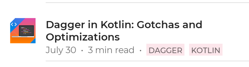
ContentAlpha.high استفاده میکند. خط دوم شامل فرادادههای کماهمیتتر است، بنابراین از ContentAlpha.medium استفاده میکند.تم تاریک
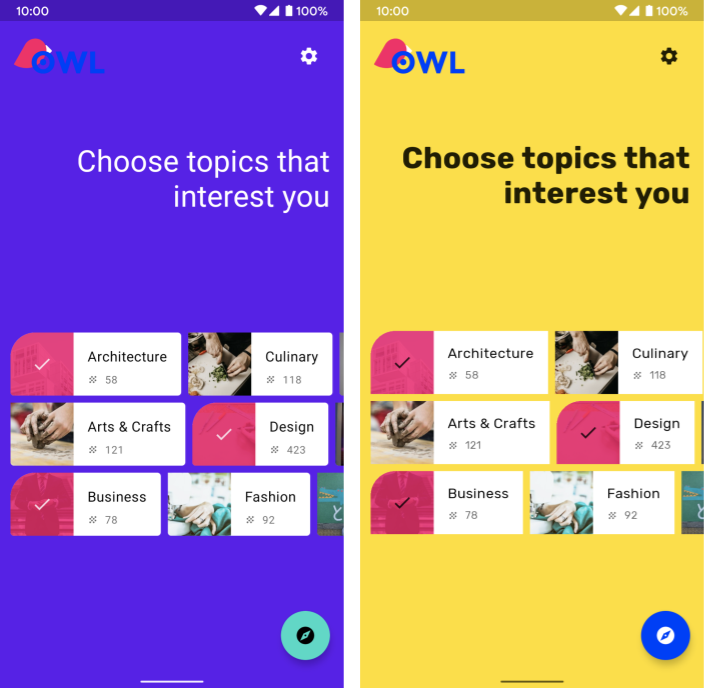
در Compose، شما با ارائه مجموعههای مختلفی از Colors به MaterialTheme composable، تمهای روشن و تیره را پیادهسازی میکنید:
@Composable fun MyTheme( darkTheme: Boolean = isSystemInDarkTheme(), content: @Composable () -> Unit ) { MaterialTheme( colors = if (darkTheme) DarkColors else LightColors, /*...*/ content = content ) }
در این مثال، MaterialTheme در تابع ترکیبپذیر خود قرار گرفته است که پارامتری را میپذیرد که مشخص میکند آیا از تم تیره استفاده شود یا خیر. در این حالت، تابع با پرسوجو از تنظیمات تم دستگاه ، مقدار پیشفرض darkTheme را دریافت میکند.
میتوانید از کدی مانند این برای بررسی روشن یا تیره بودن Colors فعلی استفاده کنید:
val isLightTheme = MaterialTheme.colors.isLight Icon( painterResource( id = if (isLightTheme) { R.drawable.ic_sun_24 } else { R.drawable.ic_moon_24 } ), contentDescription = "Theme" )
پوششهای ارتفاعی
در متریال، سطوح در تمهای تیره با ارتفاعات بالاتر، پوششهای ارتفاعی دریافت میکنند که پسزمینه آنها را روشنتر میکند. هرچه ارتفاع یک سطح بیشتر باشد (آن را به یک منبع نور ضمنی نزدیکتر کند)، آن سطح روشنتر میشود.
کامپوننت Surface هنگام استفاده از رنگهای تیره، این پوششها را به طور خودکار اعمال میکند، و هر کامپوننت Material دیگری که از یک سطح استفاده میکند نیز به همین صورت عمل میکند:
Surface( elevation = 2.dp, color = MaterialTheme.colors.surface, // color will be adjusted for elevation /*...*/ ) { /*...*/ }
surface به عنوان پسزمینه خود استفاده میکنند. از آنجایی که کارتها و نوار ناوبری پایین در سطوح ارتفاعی مختلفی نسبت به پسزمینه قرار دارند، رنگهای کمی متفاوتی دارند - کارتها روشنتر از پسزمینه و نوار ناوبری پایین روشنتر از کارتها است. برای سناریوهای سفارشی که شامل Surface نمیشوند، از LocalElevationOverlay ، یک CompositionLocal حاوی ElevationOverlay مورد استفاده توسط اجزای Surface استفاده کنید:
// Elevation overlays // Implemented in Surface (and any components that use it) val color = MaterialTheme.colors.surface val elevation = 4.dp val overlaidColor = LocalElevationOverlay.current?.apply( color, elevation )
برای غیرفعال کردن همپوشانیهای ارتفاعی، در نقطه انتخاب شده در یک سلسله مراتب قابل ترکیب، مقدار null وارد کنید:
MyTheme { CompositionLocalProvider(LocalElevationOverlay provides null) { // Content without elevation overlays } }
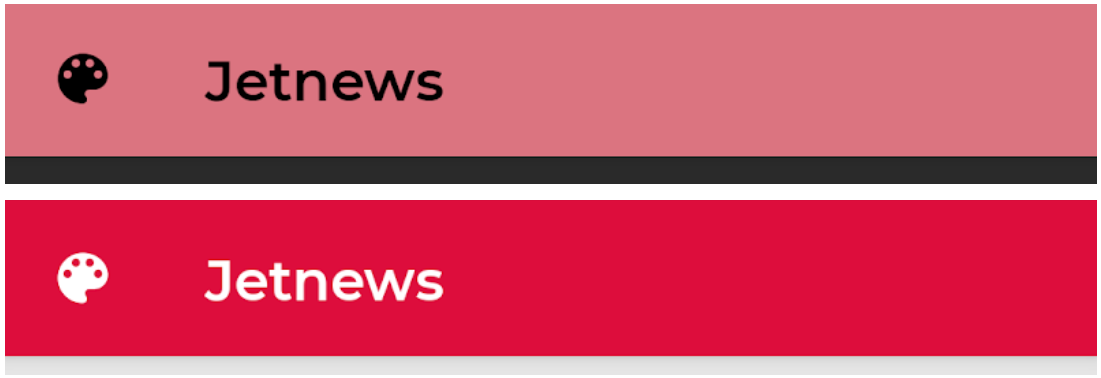
رنگهای محدود
متریال توصیه میکند که برای تمهای تیره، با ترجیح استفاده از رنگ surface به جای رنگ primary در بیشتر موارد، از رنگهای محدود استفاده شود. کامپوننتهای متریال مانند TopAppBar و BottomNavigation این رفتار را به طور پیشفرض پیادهسازی میکنند.
برای سناریوهای سفارشی، از ویژگی افزونه primarySurface استفاده کنید:
Surface( // Switches between primary in light theme and surface in dark theme color = MaterialTheme.colors.primarySurface, /*...*/ ) { /*...*/ }
تایپوگرافی
Material یک سیستم نوع تعریف میکند و شما را تشویق میکند که از تعداد کمی از سبکهای نامگذاریشده از نظر معنایی استفاده کنید.
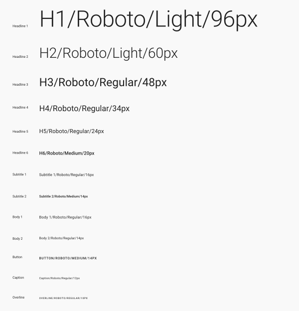
Compose سیستم نوع را با کلاسهای Typography ، TextStyle و کلاسهای مرتبط با فونت پیادهسازی میکند. سازندهی Typography برای هر سبک پیشفرضهایی ارائه میدهد، بنابراین میتوانید هر کدام را که نمیخواهید سفارشی کنید، حذف کنید:
val raleway = FontFamily( Font(R.font.raleway_regular), Font(R.font.raleway_medium, FontWeight.W500), Font(R.font.raleway_semibold, FontWeight.SemiBold) ) val myTypography = Typography( h1 = TextStyle( fontFamily = raleway, fontWeight = FontWeight.W300, fontSize = 96.sp ), body1 = TextStyle( fontFamily = raleway, fontWeight = FontWeight.W600, fontSize = 16.sp ) /*...*/ ) MaterialTheme(typography = myTypography, /*...*/) { /*...*/ }
اگر میخواهید از یک فونت در کل متن استفاده کنید، پارامتر defaultFontFamily را مشخص کنید و fontFamily مربوط به هر عنصر TextStyle را حذف کنید:
val typography = Typography(defaultFontFamily = raleway) MaterialTheme(typography = typography, /*...*/) { /*...*/ }
استفاده از سبکهای متن
عناصر TextStyle با استفاده از MaterialTheme.typography قابل دسترسی هستند. عناصر TextStyle را به صورت زیر بازیابی کنید:
Text( text = "Subtitle2 styled", style = MaterialTheme.typography.subtitle2 )
شکل
متریال یک سیستم شکلدهی تعریف میکند که به شما امکان میدهد شکلهایی را برای اجزای بزرگ، متوسط و کوچک تعریف کنید.
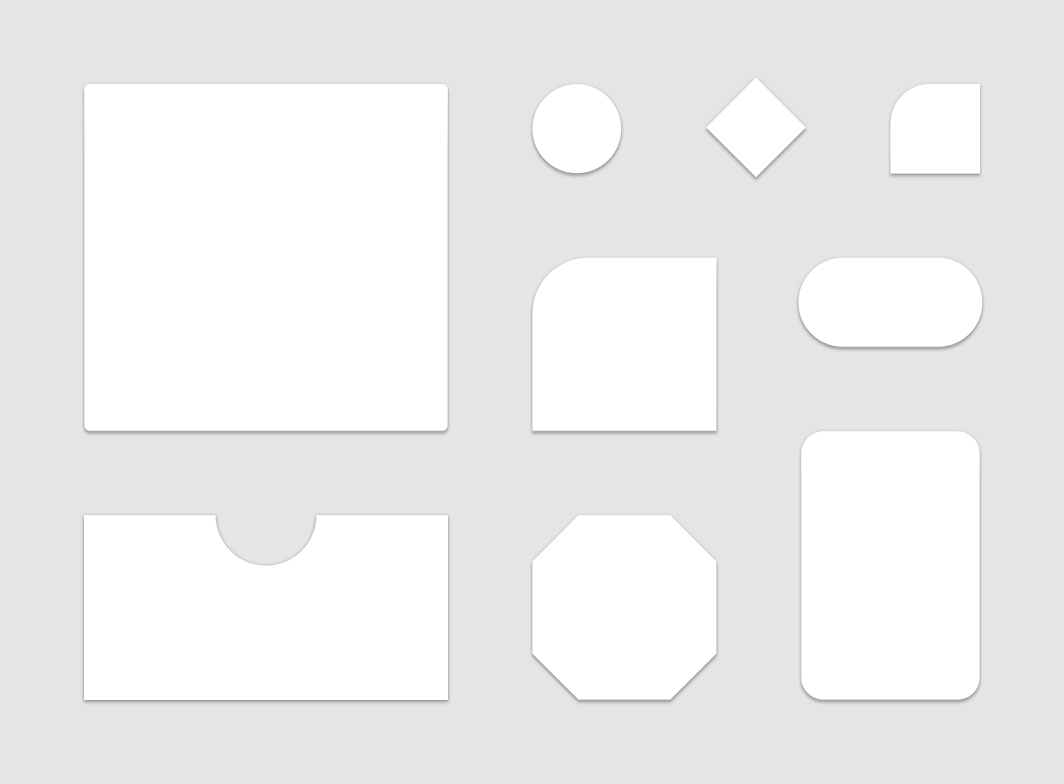
Compose سیستم شکل را با کلاس Shapes پیادهسازی میکند، که به شما امکان میدهد برای هر دسته اندازه، یک CornerBasedShape مشخص کنید:
val shapes = Shapes( small = RoundedCornerShape(percent = 50), medium = RoundedCornerShape(0f), large = CutCornerShape( topStart = 16.dp, topEnd = 0.dp, bottomEnd = 0.dp, bottomStart = 16.dp ) ) MaterialTheme(shapes = shapes, /*...*/) { /*...*/ }
بسیاری از کامپوننتها به طور پیشفرض از این شکلها استفاده میکنند. برای مثال، Button ، TextField و FloatingActionButton به طور پیشفرض کوچک، AlertDialog به طور پیشفرض متوسط و ModalDrawer به طور پیشفرض بزرگ هستند - برای نگاشت کامل به مرجع طرح شکل مراجعه کنید.
از شکلها استفاده کنید
عناصر Shape با استفاده از MaterialTheme.shapes قابل دسترسی هستند. عناصر Shape را با کدی مانند این بازیابی کنید:
Surface( shape = MaterialTheme.shapes.medium, /*...*/ ) { /*...*/ }
سبکهای پیشفرض
هیچ مفهوم معادلی در Compose برای استایلهای پیشفرض از Android Views وجود ندارد. شما میتوانید با ایجاد توابع Composable overload خودتان که کامپوننتهای Material را در بر میگیرند، عملکرد مشابهی را ارائه دهید. به عنوان مثال، برای ایجاد استایل دکمه، یک دکمه را در تابع Composable خودتان در بر بگیرید، پارامترهایی را که میخواهید یا نیاز به تغییر دارند، مستقیماً تنظیم کنید و سایر پارامترها را به عنوان پارامترهایی در Composable حاوی آن قرار دهید.
@Composable fun MyButton( onClick: () -> Unit, modifier: Modifier = Modifier, content: @Composable RowScope.() -> Unit ) { Button( colors = ButtonDefaults.buttonColors( backgroundColor = MaterialTheme.colors.secondary ), onClick = onClick, modifier = modifier, content = content ) }
پوششهای تم
شما میتوانید با تودرتو کردن Composableهای MaterialTheme ، معادل پوششهای تم از Android Views را در Compose به دست آورید. از آنجا که MaterialTheme رنگها، تایپوگرافی و شکلها را به طور پیشفرض روی مقدار تم فعلی تنظیم میکند، تمام پارامترهای دیگر وقتی یک تم فقط یکی از آن پارامترها را تنظیم میکند، مقادیر پیشفرض خود را حفظ میکنند.
علاوه بر این، هنگام انتقال صفحات نمایش مبتنی بر View به Compose، مراقب کاربردهای ویژگی android:theme باشید. احتمالاً به یک MaterialTheme جدید در آن بخش از درخت رابط کاربری Compose نیاز دارید.
در این مثال، صفحه جزئیات برای بیشتر صفحه از یک PinkTheme و سپس برای بخش مرتبط از یک BlueTheme استفاده میکند. تصویر و کد زیر این مفهوم را نشان میدهد:
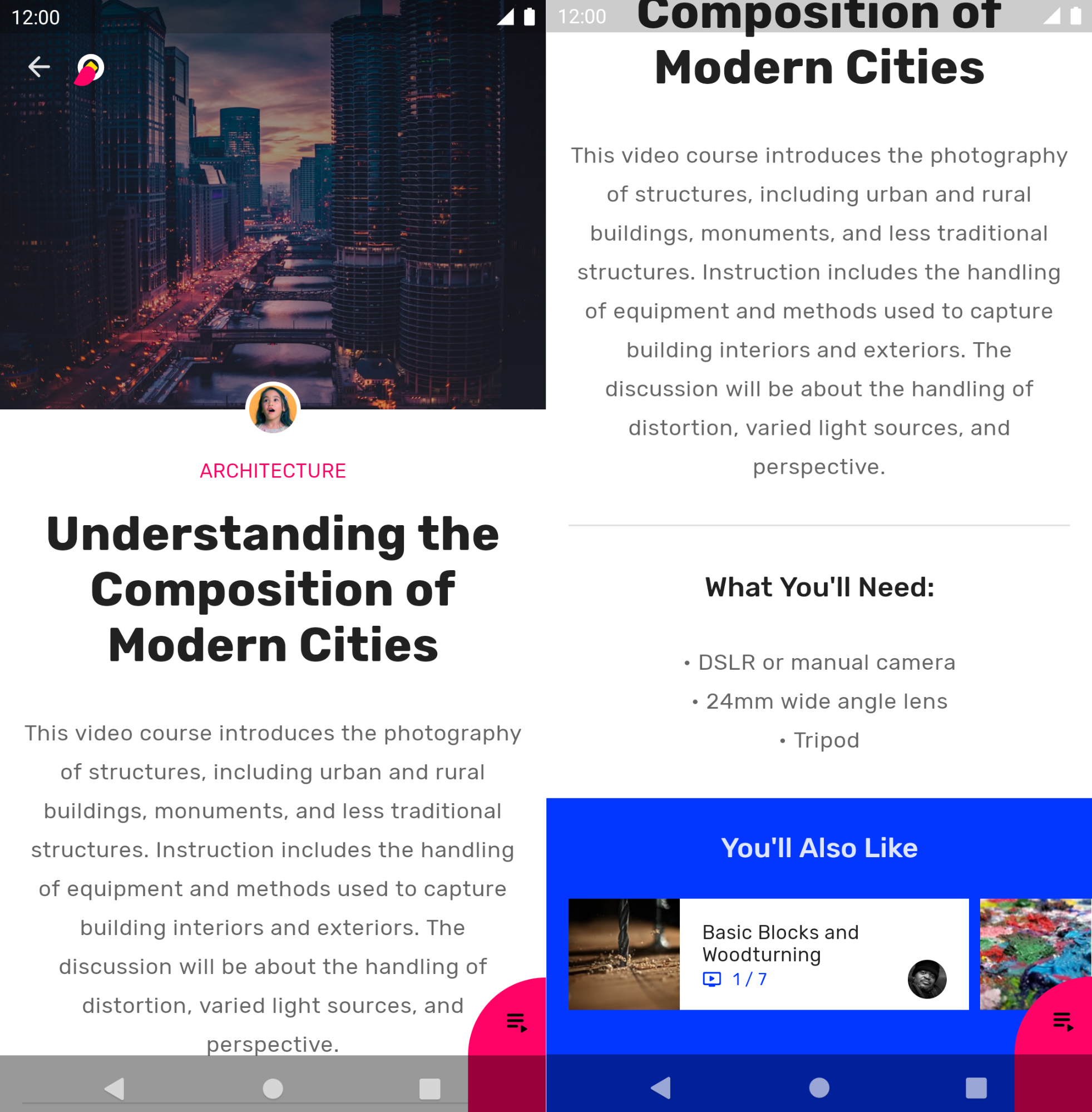
@Composable fun DetailsScreen(/* ... */) { PinkTheme { // other content RelatedSection() } } @Composable fun RelatedSection(/* ... */) { BlueTheme { // content } }
حالتهای کامپوننت
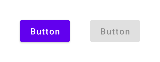
اجزای متریال که میتوانند با آنها تعامل داشته باشند (کلیک شوند، تغییر وضعیت دهند و غیره) میتوانند در حالتهای بصری مختلفی باشند. حالتها شامل فعال، غیرفعال، فشرده شده و غیره میشوند.
کامپوننتهای ترکیبی اغلب یک پارامتر enabled دارند. تنظیم آن روی false از تعامل جلوگیری میکند و ویژگیهایی مانند رنگ و ارتفاع را تغییر میدهد تا حالت کامپوننت را به صورت بصری منتقل کند.
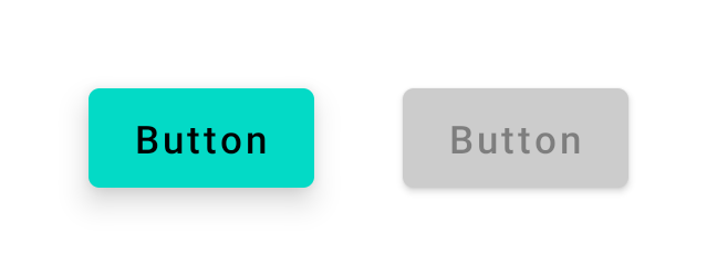
enabled = true (چپ) و enabled = false (راست).در بیشتر موارد، میتوانید برای مقادیری مانند رنگ و ارتفاع به مقادیر پیشفرض تکیه کنید. اگر نیاز به پیکربندی مقادیر مورد استفاده در حالتهای مختلف دارید، کلاسها و توابع راحتی در دسترس هستند. مثال دکمه زیر را در نظر بگیرید:
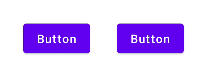
Button( onClick = { /* ... */ }, enabled = true, // Custom colors for different states colors = ButtonDefaults.buttonColors( backgroundColor = MaterialTheme.colors.secondary, disabledBackgroundColor = MaterialTheme.colors.onBackground .copy(alpha = 0.2f) .compositeOver(MaterialTheme.colors.background) // Also contentColor and disabledContentColor ), // Custom elevation for different states elevation = ButtonDefaults.elevation( defaultElevation = 8.dp, disabledElevation = 2.dp, // Also pressedElevation ) ) { /* ... */ }
enabled = true (چپ) و enabled = false (راست)، به همراه مقادیر رنگ و ارتفاع تنظیمشده.موجها
اجزای متریال از موجها برای نشان دادن تعامل با خود استفاده میکنند. اگر در سلسله مراتب خود از MaterialTheme استفاده میکنید، یک Ripple به عنوان Indication پیشفرض درون اصلاحکنندههایی مانند clickable و indication استفاده میشود.
در بیشتر موارد میتوانید به Ripple پیشفرض اعتماد کنید. اگر نیاز به پیکربندی ظاهر آنها دارید، میتوانید از RippleTheme برای تغییر ویژگیهایی مانند رنگ و آلفا استفاده کنید.
شما میتوانید RippleTheme بسط دهید و از توابع کاربردی defaultRippleColor و defaultRippleAlpha استفاده کنید. سپس میتوانید با استفاده از LocalRippleTheme ، تم ripple سفارشی خود را در سلسله مراتب خود ارائه دهید:
@Composable fun MyApp() { MaterialTheme { CompositionLocalProvider( LocalRippleTheme provides SecondaryRippleTheme ) { // App content } } } @Immutable private object SecondaryRippleTheme : RippleTheme { @Composable override fun defaultColor() = RippleTheme.defaultRippleColor( contentColor = MaterialTheme.colors.secondary, lightTheme = MaterialTheme.colors.isLight ) @Composable override fun rippleAlpha() = RippleTheme.defaultRippleAlpha( contentColor = MaterialTheme.colors.secondary, lightTheme = MaterialTheme.colors.isLight ) }
RippleTheme ارائه شدهاند.بیشتر بدانید
برای کسب اطلاعات بیشتر در مورد قالببندی متریال در Compose، به منابع اضافی زیر مراجعه کنید.
کدلبز
ویدیوها
{% کلمه به کلمه %}برای شما توصیه میشود
- توجه: متن لینک زمانی نمایش داده میشود که جاوا اسکریپت غیرفعال باشد.
- سیستمهای طراحی سفارشی در Compose
- مهاجرت از متریال ۲ به متریال ۳ در Compose
- دسترسیپذیری در نوشتن