
本頁說明如何在 Compose 應用程式中設定字型。
設定字型
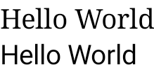
Text 有 fontFamily 參數,可設定在可組合函式中使用的字型。系統預設包含 Serif、Sans Serif、等寬和草寫字型系列:
@Composable fun DifferentFonts() { Column { Text("Hello World", fontFamily = FontFamily.Serif) Text("Hello World", fontFamily = FontFamily.SansSerif) } }
您可以使用 fontFamily 屬性搭配 res/font 資料夾中定義的自訂字型和字體:
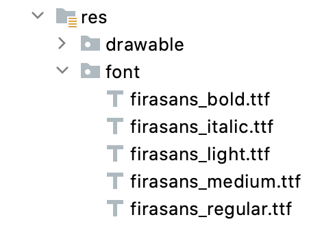
以下範例說明如何根據這些字型檔案以及使用 Font 函式定義 fontFamily:
val firaSansFamily = FontFamily( Font(R.font.firasans_light, FontWeight.Light), Font(R.font.firasans_regular, FontWeight.Normal), Font(R.font.firasans_italic, FontWeight.Normal, FontStyle.Italic), Font(R.font.firasans_medium, FontWeight.Medium), Font(R.font.firasans_bold, FontWeight.Bold) )
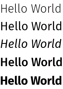
您可以將此 fontFamily 傳遞給 Text 的組件。由於 fontFamily 可包含不同的粗細,因此您可以手動設定 fontWeight,選取適當的文字粗細:
Column { Text(text = "text", fontFamily = firaSansFamily, fontWeight = FontWeight.Light) Text(text = "text", fontFamily = firaSansFamily, fontWeight = FontWeight.Normal) Text( text = "text", fontFamily = firaSansFamily, fontWeight = FontWeight.Normal, fontStyle = FontStyle.Italic ) Text(text = "text", fontFamily = firaSansFamily, fontWeight = FontWeight.Medium) Text(text = "text", fontFamily = firaSansFamily, fontWeight = FontWeight.Bold) }
如要瞭解如何在整個應用程式中設定字型樣式,請參閱「Compose 中的自訂設計系統」。
可下載的字型
從 Compose 1.2.0 開始,您可以使用 Compose 應用程式中的可下載字型 API,以非同步方式下載 Google 字型,然後在應用程式中使用。
目前暫不支援自訂提供者提供的可下載字型。
透過程式輔助方式使用可下載字型
如要透過程式輔助方式從應用程式內下載字型,請按照下列步驟操作:
- 新增依附元件:
Groovy
dependencies {
    ...
    implementation "androidx.compose.ui:ui-text-google-fonts:1.11.3"
}
Kotlin
dependencies {
    ...
    implementation("androidx.compose.ui:ui-text-google-fonts:1.11.3")
}
- 使用 Google Fonts 的憑證初始化
GoogleFont.Provider:val provider = GoogleFont.Provider( providerAuthority = "com.google.android.gms.fonts", providerPackage = "com.google.android.gms", certificates = R.array.com_google_android_gms_fonts_certs )
- Google Fonts 的字型提供者授權。
- 用於驗證供應程式身分的字型供應程式套件。
- 憑證的雜湊組合,用於驗證供應者的身分。您可以在 JetChat 範例應用程式的
font_certs.xml檔案中找到 Google Fonts 供應者所需的雜湊。
- 定義
FontFamily:// ... import androidx.compose.ui.text.googlefonts.GoogleFont import androidx.compose.ui.text.font.FontFamily import androidx.compose.ui.text.googlefonts.Font // ... val fontName = GoogleFont("Lobster Two") val fontFamily = FontFamily( Font(googleFont = fontName, fontProvider = provider) )
FontWeight和FontStyle查詢字型使用的其他參數 (例如粗細和樣式):// ... import androidx.compose.ui.text.googlefonts.GoogleFont import androidx.compose.ui.text.font.FontFamily import androidx.compose.ui.text.googlefonts.Font // ... val fontName = GoogleFont("Lobster Two") val fontFamily = FontFamily( Font( googleFont = fontName, fontProvider = provider, weight = FontWeight.Bold, style = FontStyle.Italic ) )
- 設定要在文字可組合函式中使用的
FontFamily:
Text( fontFamily = fontFamily, text = "Hello World!" )

您也可以定義字體排版,使用您的 FontFamily:
val MyTypography = Typography( bodyMedium = TextStyle( fontFamily = fontFamily, fontWeight = FontWeight.Normal, fontSize = 12.sp/*...*/ ), bodyLarge = TextStyle( fontFamily = fontFamily, fontWeight = FontWeight.Bold, letterSpacing = 2.sp, /*...*/ ), headlineMedium = TextStyle( fontFamily = fontFamily, fontWeight = FontWeight.SemiBold/*...*/ ), /*...*/ )
接著,請將字型設為應用程式的主題:
MyAppTheme( typography = MyTypography )/*...*/
如需在 Compose 中搭配 Material3 實作可下載字型的應用程式範例,請參閱 Jetchat 範例應用程式。
新增備用字型
您可以決定字型的備用鏈,以防字型無法正確下載。舉例來說,如果您設定了可下載的字型,如下所示:
// ... import androidx.compose.ui.text.googlefonts.Font // ... val fontName = GoogleFont("Lobster Two") val fontFamily = FontFamily( Font(googleFont = fontName, fontProvider = provider), Font(googleFont = fontName, fontProvider = provider, weight = FontWeight.Bold) )
您可以同時定義兩種粗細的字型預設值,如下所示:
// ... import androidx.compose.ui.text.font.Font import androidx.compose.ui.text.googlefonts.Font // ... val fontName = GoogleFont("Lobster Two") val fontFamily = FontFamily( Font(googleFont = fontName, fontProvider = provider), Font(resId = R.font.my_font_regular), Font(googleFont = fontName, fontProvider = provider, weight = FontWeight.Bold), Font(resId = R.font.my_font_regular_bold, weight = FontWeight.Bold) )
確認您新增的是正確的匯入項目。
定義這種 FontFamily 會建立一個 FontFamily,其中包含兩個鏈結,每種粗細一個。載入機制會嘗試先解析線上字型,然後再處理本機 R.font 資源資料夾中的字型。
偵錯實作
為協助您確認字型下載是否正確,您可以定義偵錯協同程式處理常式。您的控點可提供字型無法以非同步方式載入時的處理方式。
首先,請建立 CoroutineExceptionHandler:
val handler = CoroutineExceptionHandler { _, throwable -> // process the Throwable Log.e(TAG, "There has been an issue: ", throwable) }
將其傳遞至 createFontFamilyResolver 方法,讓解析器使用新的處理常式:
CompositionLocalProvider( LocalFontFamilyResolver provides createFontFamilyResolver(LocalContext.current, handler) ) { Column { Text( text = "Hello World!", style = MaterialTheme.typography.bodyMedium ) } }
您也可以使用提供者的 isAvailableOnDevice API 來測試提供者是否可用,以及憑證設定是否正確無誤。如要執行此操作,您可以呼叫 isAvailableOnDevice 方法,若提供者設定錯誤,則會傳回 false。
val context = LocalContext.current LaunchedEffect(Unit) { if (provider.isAvailableOnDevice(context)) { Log.d(TAG, "Success!") } }
注意事項
Google Fonts 需要數個月的時間才能在 Android 上提供新字型。當字型在 fonts.google.com 中新增後,需要一段時間才可透過可下載字型 API 提供 (在檢視系統或 Compose 中)。使用 IllegalStateException 載入的新字型可能無法在應用程式中載入。為了協助開發人員判斷該錯誤,並與其他類型的字型載入錯誤進行比較,我們已針對 Compose 使用這裡的變更新增例外狀況訊息。如有任何問題,請使用 Issue Tracker 回報。
使用變數字型
可變字型是一種字型格式,可讓單一字型檔案包含不同樣式。使用可變字型時,您可以修改軸 (或參數) 來產生偏好的樣式。這些軸可以是標準軸 (例如粗細、寬度、傾斜和斜體),也可以是自訂軸 (因可變字型而異)。
使用可變字型而非一般字型檔案,可讓您只使用一個字型檔案,而非多個。
如要進一步瞭解可變字型,請參閱 Google Fonts 知識、整個目錄的可變字型,以及每種字型支援的軸表格。
本文說明如何在 Compose 應用程式中實作可變字型。
載入變數字型
下載要使用的可變字型 (例如 Roboto Flex),並將其放在應用程式的
app/res/font資料夾中。請確認 .ttf檔案是字型的可變字型版本,且字型檔案名稱全為小寫,不含任何特殊字元。如要載入可變字型,請使用放在
res/font/目錄中的字型定義FontFamily:// In Typography.kt @OptIn(ExperimentalTextApi::class) val displayLargeFontFamily = FontFamily( Font( R.font.robotoflex_variable, variationSettings = FontVariation.Settings( FontVariation.weight(950), FontVariation.width(30f), FontVariation.slant(-6f), ) ) )
FontVariationAPI 可讓您設定標準字型軸,例如粗細、寬度和傾斜度。這些是標準軸,適用於任何可變字型。您可以根據字型的使用位置,建立不同的字型設定。可變字型僅適用於 Android O 以上版本,因此請新增安全護欄並設定適當的回退:
// In Typography.kt val default = FontFamily( /* * This can be any font that makes sense */ Font( R.font.robotoflex_static_regular ) ) @OptIn(ExperimentalTextApi::class) val displayLargeFontFamily = if (Build.VERSION.SDK_INT >= Build.VERSION_CODES.O) { FontFamily( Font( R.font.robotoflex_variable, variationSettings = FontVariation.Settings( FontVariation.weight(950), FontVariation.width(30f), FontVariation.slant(-6f), ) ) ) } else { default }
將設定擷取至一組常數,方便重複使用,並以這些常數取代字型設定:
// VariableFontDimension.kt object DisplayLargeVFConfig { const val WEIGHT = 950 const val WIDTH = 30f const val SLANT = -6f const val ASCENDER_HEIGHT = 800f const val COUNTER_WIDTH = 500 } @OptIn(ExperimentalTextApi::class) val displayLargeFontFamily = if (Build.VERSION.SDK_INT >= Build.VERSION_CODES.O) { FontFamily( Font( R.font.robotoflex_variable, variationSettings = FontVariation.Settings( FontVariation.weight(DisplayLargeVFConfig.WEIGHT), FontVariation.width(DisplayLargeVFConfig.WIDTH), FontVariation.slant(DisplayLargeVFConfig.SLANT), ) ) ) } else { default }
設定 Material Design 3 排版,使用
FontFamily:// Type.kt val Typography = Typography( displayLarge = TextStyle( fontFamily = displayLargeFontFamily, fontSize = 50.sp, lineHeight = 64.sp, letterSpacing = 0.sp, /***/ ) )
這個範例使用
displayLargeMaterial 3 字體排版,其中包含不同的預設字型設定和建議用途。舉例來說,您應該使用displayLarge顯示簡短的重要文字,因為這是畫面上最大的文字。使用 Material 3 時,您可以變更
TextStyle和fontFamily的預設值,自訂字體。在上述程式碼片段中,您會設定TextStyle的例項,為每個字型系列自訂字型設定。定義字體排版後,請將其傳遞至 M3
MaterialTheme:MaterialTheme( colorScheme = MaterialTheme.colorScheme, typography = Typography, content = content )
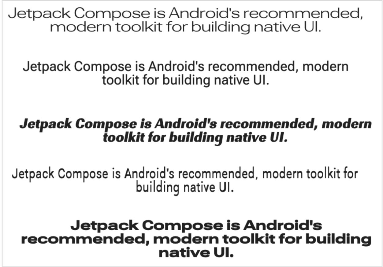
最後,使用
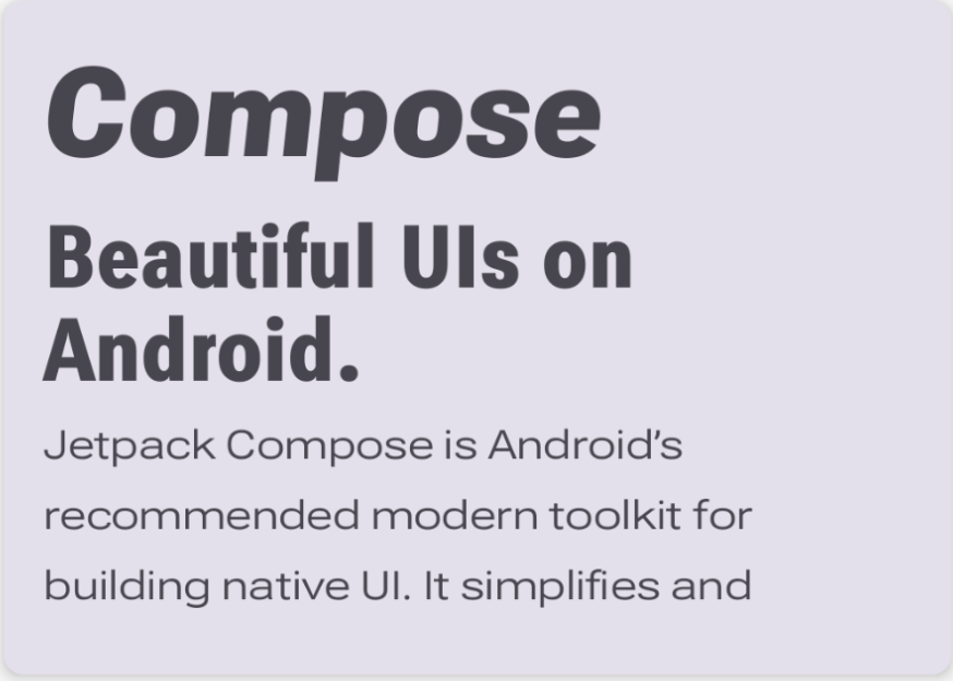
Text可組合函式,並將樣式指定為其中一種已定義的排版樣式MaterialTheme.typography.displayLarge:@Composable @Preview fun CardDetails() { MyCustomTheme { Card( shape = RoundedCornerShape(8.dp), elevation = CardDefaults.cardElevation(defaultElevation = 4.dp), modifier = Modifier .fillMaxWidth() .padding(16.dp) ) { Column( modifier = Modifier.padding(16.dp) ) { Text( text = "Compose", style = MaterialTheme.typography.displayLarge, modifier = Modifier.padding(bottom = 8.dp), maxLines = 1 ) Text( text = "Beautiful UIs on Android", style = MaterialTheme.typography.headlineMedium, modifier = Modifier.padding(bottom = 8.dp), maxLines = 2 ) Text( text = "Jetpack Compose is Android’s recommended modern toolkit for building native UI. It simplifies and accelerates UI development on Android. Quickly bring your app to life with less code, powerful tools, and intuitive Kotlin APIs.", style = MaterialTheme.typography.bodyLarge, modifier = Modifier.padding(bottom = 8.dp), maxLines = 3 ) } } } }
每個
Text可組合項都會透過 Material 主題的樣式進行設定,並包含不同的可變字型設定。您可以使用MaterialTheme.typography擷取提供給 M3MaterialTheme可組合項的字體排版。

使用自訂軸
字型也可以有自訂軸。這些定義位於字型檔案本身。
舉例來說,Roboto Flex 字型有升部高度 ("YTAS") 軸,可調整小寫升部的高度,而字碗寬度 ("XTRA") 則可調整每個字母的寬度。
你可以使用 FontVariation 設定變更這些軸的值。
如要進一步瞭解可為字型設定的自訂軸,請參閱各字型的支援軸表格。
如要使用自訂軸,請為自訂
ascenderHeight和counterWidth軸定義函式:fun ascenderHeight(ascenderHeight: Float): FontVariation.Setting { require(ascenderHeight in 649f..854f) { "'Ascender Height' must be in 649f..854f" } return FontVariation.Setting("YTAS", ascenderHeight) } fun counterWidth(counterWidth: Int): FontVariation.Setting { require(counterWidth in 323..603) { "'Counter width' must be in 323..603" } return FontVariation.Setting("XTRA", counterWidth.toFloat()) }
這些函式會執行以下作業:
- 為可接受的值定義防護措施。如「可變字型目錄」所示,
ascenderHeight (YTAS)的最小值為649f,最大值為854f。 - 傳回字型設定,以便將設定新增至字型。在
FontVariation.Setting()方法中,軸名稱 (YTAS, XTRA) 是硬式編碼,並將值做為參數。
- 為可接受的值定義防護措施。如「可變字型目錄」所示,
使用字型設定的軸,將其他參數傳遞至載入的每個
Font:@OptIn(ExperimentalTextApi::class) val displayLargeFontFamily = if (Build.VERSION.SDK_INT >= Build.VERSION_CODES.O) { FontFamily( Font( R.font.robotoflex_variable, variationSettings = FontVariation.Settings( FontVariation.weight(DisplayLargeVFConfig.WEIGHT), FontVariation.width(DisplayLargeVFConfig.WIDTH), FontVariation.slant(DisplayLargeVFConfig.SLANT), ascenderHeight(DisplayLargeVFConfig.ASCENDER_HEIGHT), counterWidth(DisplayLargeVFConfig.COUNTER_WIDTH) ) ) ) } else { default }
請注意,小寫字母的升部現在變高了,其他文字也變寬了:
其他資源
如要瞭解詳情,請參閱以下有關可變字型的網誌文章:
為您推薦
- 注意:系統會在 JavaScript 關閉時顯示連結文字
- Compose 中的資源
- 設定文字樣式
- Compose 中的 Material Design 2