کامپوننت Dialog ، پیامهای محاورهای را نمایش میدهد یا از کاربر ورودی درخواست میکند و این کار را در لایهای بالاتر از محتوای اصلی برنامه انجام میدهد. این کامپوننت یک تجربه کاربری جذاب ایجاد میکند تا توجه کاربر را جلب کند.
از جمله موارد استفاده از دیالوگ میتوان به موارد زیر اشاره کرد:
- تأیید اقدام کاربر، مانند حذف یک فایل.
- درخواست ورودی از کاربر، مانند یک برنامه لیست کارها.
- ارائه فهرستی از گزینهها برای انتخاب کاربر، مانند انتخاب کشور در تنظیمات پروفایل.

پنجره هشدار
کامپوننت AlertDialog یک API مناسب برای ایجاد یک دیالوگ با تم طراحی متریال ارائه میدهد. AlertDialog پارامترهای خاصی برای مدیریت عناصر خاص دیالوگ دارد. از جمله آنها میتوان به موارد زیر اشاره کرد:
-
title: متنی که در بالای کادر محاورهای ظاهر میشود. -
text: متنی که در وسط کادر محاورهای نمایش داده میشود. -
icon: تصویری که در بالای کادر محاورهای ظاهر میشود. -
onDismissRequest: تابعی که وقتی کاربر کادر محاورهای را میبندد، مثلاً با ضربه زدن به خارج از آن، فراخوانی میشود. -
dismissButton: یک ترکیبکننده که به عنوان دکمهی رد کردن عمل میکند. -
confirmButton: یک عنصر ترکیبی که به عنوان دکمه تأیید عمل میکند.
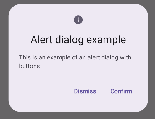
مثال زیر دو دکمه را در یک کادر محاورهای هشدار پیادهسازی میکند، یکی که کادر محاورهای را رد میکند و دیگری که درخواست آن را تأیید میکند.
@Composable fun AlertDialogExample( onDismissRequest: () -> Unit, onConfirmation: () -> Unit, dialogTitle: String, dialogText: String, icon: ImageVector, ) { AlertDialog( icon = { Icon(icon, contentDescription = "Example Icon") }, title = { Text(text = dialogTitle) }, text = { Text(text = dialogText) }, onDismissRequest = { onDismissRequest() }, confirmButton = { TextButton( onClick = { onConfirmation() } ) { Text("Confirm") } }, dismissButton = { TextButton( onClick = { onDismissRequest() } ) { Text("Dismiss") } } ) }
این پیادهسازی مستلزم یک composable والد است که آرگومانها را به composable فرزند به این روش ارسال میکند:
@Composable fun DialogExamples() { // ... val openAlertDialog = remember { mutableStateOf(false) } // ... when { // ... openAlertDialog.value -> { AlertDialogExample( onDismissRequest = { openAlertDialog.value = false }, onConfirmation = { openAlertDialog.value = false println("Confirmation registered") // Add logic here to handle confirmation. }, dialogTitle = "Alert dialog example", dialogText = "This is an example of an alert dialog with buttons.", icon = Icons.Default.Info ) } } } }
این پیادهسازی به صورت زیر ظاهر میشود:
دیالوگ قابل ترکیب
Dialog یک ترکیببندی ساده است که هیچ استایل یا جایگاه از پیش تعریفشدهای برای محتوا ارائه نمیدهد. این یک ظرف نسبتاً سرراست است که باید آن را با ظرفی مانند Card پر کنید. در زیر برخی از پارامترهای کلیدی یک دیالوگ آمده است:
-
onDismissRequest: لامبدا زمانی فراخوانی میشود که کاربر کادر محاورهای را میبندد. -
properties: نمونهای ازDialogPropertiesکه امکان سفارشیسازی بیشتری را فراهم میکند.
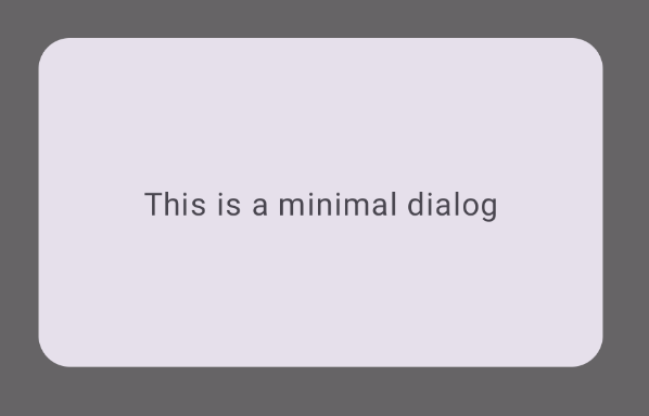
مثال پایه
مثال زیر یک پیادهسازی اولیه از کامپوننت Dialog است. توجه داشته باشید که از یک Card (Card) به عنوان کانتینر ثانویه استفاده میکند. بدون Card ، کامپوننت Text به تنهایی بالای محتوای اصلی برنامه ظاهر میشود.
@Composable fun MinimalDialog(onDismissRequest: () -> Unit) { Dialog(onDismissRequest = { onDismissRequest() }) { Card( modifier = Modifier .fillMaxWidth() .height(200.dp) .padding(16.dp), shape = RoundedCornerShape(16.dp), ) { Text( text = "This is a minimal dialog", modifier = Modifier .fillMaxSize() .wrapContentSize(Alignment.Center), textAlign = TextAlign.Center, ) } } }
این پیادهسازی به شکل زیر است. توجه داشته باشید که وقتی کادر محاورهای باز است، محتوای برنامه اصلی در زیر آن تیره و خاکستری به نظر میرسد:
مثال پیشرفته
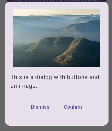
در ادامه، پیادهسازی پیشرفتهتری از کامپوننت Dialog Composable ارائه شده است. در این حالت، کامپوننت به صورت دستی رابطی مشابه مثال AlertDialog در بالا را پیادهسازی میکند.
@Composable fun DialogWithImage( onDismissRequest: () -> Unit, onConfirmation: () -> Unit, painter: Painter, imageDescription: String, ) { Dialog(onDismissRequest = { onDismissRequest() }) { // Draw a rectangle shape with rounded corners inside the dialog Card( modifier = Modifier .fillMaxWidth() .height(375.dp) .padding(16.dp), shape = RoundedCornerShape(16.dp), ) { Column( modifier = Modifier .fillMaxSize(), verticalArrangement = Arrangement.Center, horizontalAlignment = Alignment.CenterHorizontally, ) { Image( painter = painter, contentDescription = imageDescription, contentScale = ContentScale.Fit, modifier = Modifier .height(160.dp) ) Text( text = "This is a dialog with buttons and an image.", modifier = Modifier.padding(16.dp), ) Row( modifier = Modifier .fillMaxWidth(), horizontalArrangement = Arrangement.Center, ) { TextButton( onClick = { onDismissRequest() }, modifier = Modifier.padding(8.dp), ) { Text("Dismiss") } TextButton( onClick = { onConfirmation() }, modifier = Modifier.padding(8.dp), ) { Text("Confirm") } } } } } }
این پیادهسازی به صورت زیر ظاهر میشود: