
Uygulamaların verileri genellikle benzer şekilde biçimlendirilmiş kapsayıcılarda (ör. listedeki öğelerle ilgili bilgileri içeren kapsayıcılar) göstermesi gerekir. Sistem, platform genelinde tutarlı bir görünüme sahip kartlarda bilgi göstermeniz için CardView API'sini sağlar. Örneğin, kartlar, kapsayan görünüm grubunun üzerinde varsayılan bir yüksekliğe sahiptir. Bu nedenle sistem, bunların altına gölge çizer. Kartlar, bir grup görünümü içeren ve kapsayıcı için tutarlı bir stil sağlayan bir yöntem sunar.
Bağımlılıkları ekleme
CardView widget'ı AndroidX'in bir parçasıdır. Widget'ı projenizde kullanmak için aşağıdaki bağımlılığı uygulama modülünüzün build.gradle dosyasına ekleyin:
Eski
dependencies {
    implementation "androidx.cardview:cardview:1.0.0"
}
Kotlin
dependencies {
    implementation("androidx.cardview:cardview:1.0.0")
}
Kart oluşturma
CardView'ı kullanmak için onu düzen dosyanıza ekleyin. Diğer görünümleri içeren bir görünüm grubu olarak kullanın. Aşağıdaki örnekte, kullanıcıya bazı bilgileri göstermek için CardView içinde bir ImageView ve birkaç TextViews bulunuyor:
<?xml version="1.0" encoding="utf-8"?>
<androidx.constraintlayout.widget.ConstraintLayout
    xmlns:android="http://schemas.android.com/apk/res/android"
    xmlns:app="http://schemas.android.com/apk/res-auto"
    android:padding="16dp"
    android:background="#E0F7FA"
    android:layout_width="match_parent"
    android:layout_height="match_parent">

    <androidx.cardview.widget.CardView
        android:layout_width="match_parent"
        android:layout_height="wrap_content"
        app:layout_constraintBottom_toBottomOf="parent"
        app:layout_constraintEnd_toEndOf="parent"
        app:layout_constraintStart_toStartOf="parent"
        app:layout_constraintTop_toTopOf="parent">

        <androidx.constraintlayout.widget.ConstraintLayout
            android:padding="4dp"
            android:layout_width="match_parent"
            android:layout_height="match_parent">

            <ImageView
                android:id="@+id/header_image"
                android:layout_width="match_parent"
                android:layout_height="200dp"
                android:src="@drawable/logo"
                app:layout_constraintEnd_toEndOf="parent"
                app:layout_constraintStart_toStartOf="parent"
                app:layout_constraintTop_toTopOf="parent" />

            <TextView
                android:id="@+id/title"
                style="@style/TextAppearance.MaterialComponents.Headline3"
                android:layout_width="match_parent"
                android:layout_height="wrap_content"
                android:layout_marginTop="4dp"
                android:text="I'm a title"
                app:layout_constraintEnd_toEndOf="parent"
                app:layout_constraintStart_toStartOf="parent"
                app:layout_constraintTop_toBottomOf="@id/header_image" />

            <TextView
                android:id="@+id/subhead"
                style="@style/TextAppearance.MaterialComponents.Subtitle2"
                android:layout_width="match_parent"
                android:layout_height="wrap_content"
                android:layout_marginTop="4dp"
                android:text="I'm a subhead"
                app:layout_constraintEnd_toEndOf="parent"
                app:layout_constraintStart_toStartOf="parent"
                app:layout_constraintTop_toBottomOf="@id/title" />

            <TextView
                android:id="@+id/body"
                style="@style/TextAppearance.MaterialComponents.Body1"
                android:layout_width="match_parent"
                android:layout_height="wrap_content"
                android:layout_marginTop="4dp"
                android:text="I'm a supporting text. Very Lorem ipsum dolor sit amet, consectetur adipiscing elit, sed do eiusmod tempor incididunt ut labore et dolore magna aliqua. Ut enim ad minim veniam, quis nostrud exercitation ullamco laboris nisi ut aliquip ex ea commodo consequat. Duis aute irure dolor in reprehenderit in voluptate velit esse cillum dolore eu fugiat nulla pariatur. Excepteur sint occaecat cupidatat non proident, sunt in culpa qui officia deserunt mollit anim id est laborum."
                app:layout_constraintEnd_toEndOf="parent"
                app:layout_constraintStart_toStartOf="parent"
                app:layout_constraintTop_toBottomOf="@id/subhead" />
        </androidx.constraintlayout.widget.ConstraintLayout>
    </androidx.cardview.widget.CardView>
</androidx.constraintlayout.widget.ConstraintLayout>
Önceki kod snippet'i, aynı Android logosu resmini kullandığınız varsayılarak aşağıdakine benzer bir sonuç üretir:
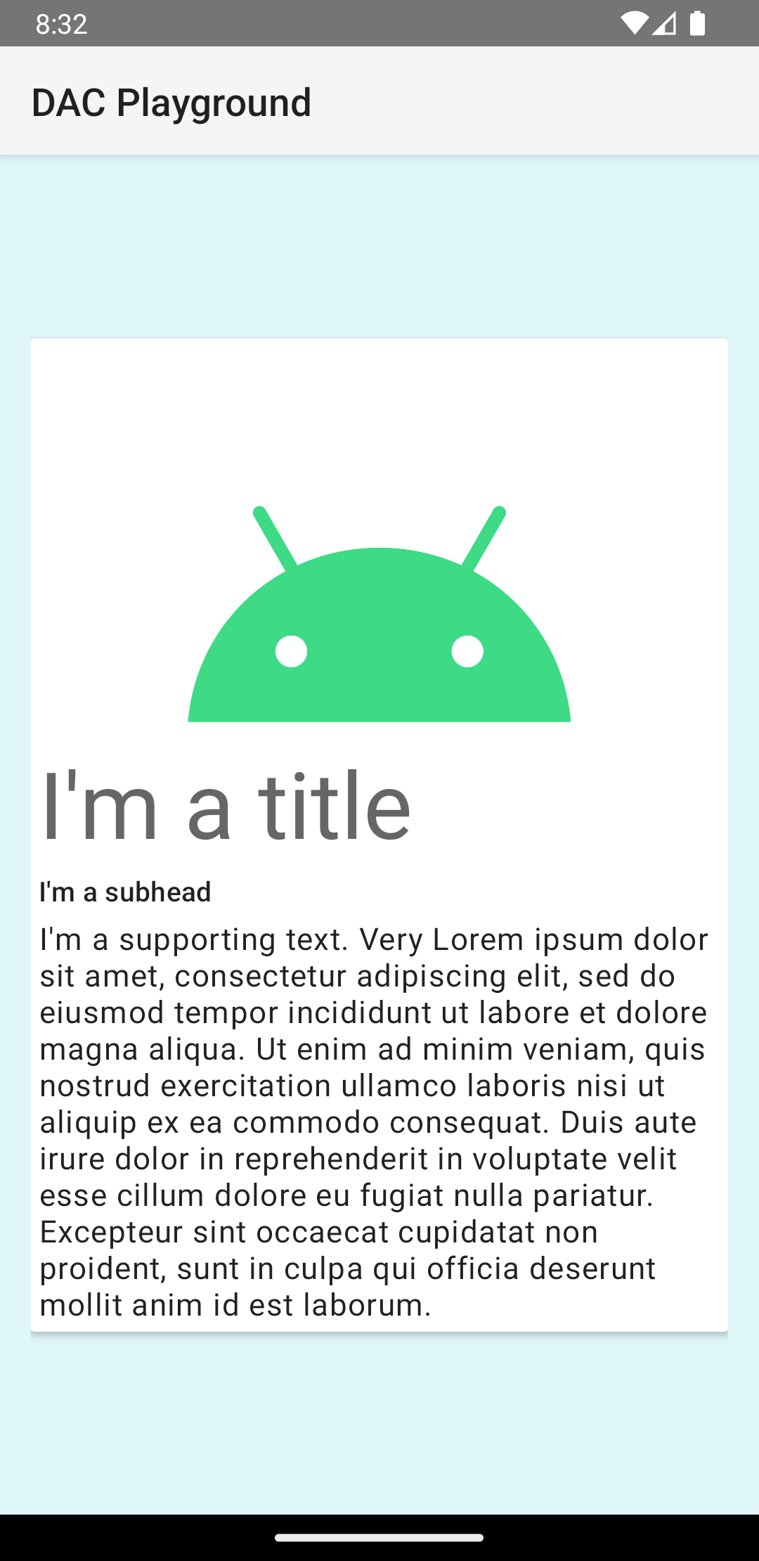
Bu örnekteki kart, ekrana varsayılan bir yükseklikle çizilir. Bu durum, sistemin kartın altına gölge çizmesine neden olur. card_view:cardElevation özelliğiyle bir kart için özel yükseklik sağlayabilirsiniz. Daha yüksek bir yükseklikteki kartın gölgesi daha belirgin, daha düşük bir yükseklikteki kartın gölgesi ise daha silik olur. CardView, Android 5.0 (API düzeyi 21) ve sonraki sürümlerde gerçek yükseklik ve dinamik gölgeler kullanır.
CardView widget'ının görünümünü özelleştirmek için aşağıdaki özellikleri kullanın:
- Düzenlerinizde köşe yarıçapını ayarlamak için
card_view:cardCornerRadiusözelliğini kullanın. - Kodunuzda köşe yarıçapını ayarlamak için
CardView.setRadiusyöntemini kullanın. - Kartın arka plan rengini ayarlamak için
card_view:cardBackgroundColorözelliğini kullanın.