
앱에서는 데이터를 비슷한 스타일의 컨테이너에 표시해야 할 때가 많습니다. 예를 들어 목록의 항목에 관한 정보를 보관하는 컨테이너가 있습니다. 시스템은
CardView API를 제공하여
플랫폼 전반에서 일관된 모양을 갖는 카드에 정보를 표시할 수 있습니다. 예를 들어 카드는 시스템이 카드 아래 그림자를 그릴 수 있도록 카드가 포함된 뷰 그룹 위에 기본 고도를 설정합니다. 카드를 사용하면 컨테이너의 스타일을 일관되게 유지하면서 뷰 그룹을 포함할 수 있습니다.
종속 항목 추가
CardView 위젯은 AndroidX의 일부입니다. 프로젝트에서 이 위젯을 사용하려면 앱 모듈의 build.gradle 파일에 다음 종속 항목을 추가합니다.
Groovy
dependencies {
    implementation "androidx.cardview:cardview:1.0.0"
}
Kotlin
dependencies {
    implementation("androidx.cardview:cardview:1.0.0")
}
카드 만들기
CardView를 사용하려면 레이아웃 파일에 추가합니다. 다른 뷰를 포함하려면 CardView를 뷰 그룹으로 사용합니다. 다음 예에서 CardView는 사용자에게 일부 정보를 표시하기 위해 ImageView와 몇 개의 TextViews를 포함합니다.
<?xml version="1.0" encoding="utf-8"?>
<androidx.constraintlayout.widget.ConstraintLayout
    xmlns:android="http://schemas.android.com/apk/res/android"
    xmlns:app="http://schemas.android.com/apk/res-auto"
    android:padding="16dp"
    android:background="#E0F7FA"
    android:layout_width="match_parent"
    android:layout_height="match_parent">

    <androidx.cardview.widget.CardView
        android:layout_width="match_parent"
        android:layout_height="wrap_content"
        app:layout_constraintBottom_toBottomOf="parent"
        app:layout_constraintEnd_toEndOf="parent"
        app:layout_constraintStart_toStartOf="parent"
        app:layout_constraintTop_toTopOf="parent">

        <androidx.constraintlayout.widget.ConstraintLayout
            android:padding="4dp"
            android:layout_width="match_parent"
            android:layout_height="match_parent">

            <ImageView
                android:id="@+id/header_image"
                android:layout_width="match_parent"
                android:layout_height="200dp"
                android:src="@drawable/logo"
                app:layout_constraintEnd_toEndOf="parent"
                app:layout_constraintStart_toStartOf="parent"
                app:layout_constraintTop_toTopOf="parent" />

            <TextView
                android:id="@+id/title"
                style="@style/TextAppearance.MaterialComponents.Headline3"
                android:layout_width="match_parent"
                android:layout_height="wrap_content"
                android:layout_marginTop="4dp"
                android:text="I'm a title"
                app:layout_constraintEnd_toEndOf="parent"
                app:layout_constraintStart_toStartOf="parent"
                app:layout_constraintTop_toBottomOf="@id/header_image" />

            <TextView
                android:id="@+id/subhead"
                style="@style/TextAppearance.MaterialComponents.Subtitle2"
                android:layout_width="match_parent"
                android:layout_height="wrap_content"
                android:layout_marginTop="4dp"
                android:text="I'm a subhead"
                app:layout_constraintEnd_toEndOf="parent"
                app:layout_constraintStart_toStartOf="parent"
                app:layout_constraintTop_toBottomOf="@id/title" />

            <TextView
                android:id="@+id/body"
                style="@style/TextAppearance.MaterialComponents.Body1"
                android:layout_width="match_parent"
                android:layout_height="wrap_content"
                android:layout_marginTop="4dp"
                android:text="I'm a supporting text. Very Lorem ipsum dolor sit amet, consectetur adipiscing elit, sed do eiusmod tempor incididunt ut labore et dolore magna aliqua. Ut enim ad minim veniam, quis nostrud exercitation ullamco laboris nisi ut aliquip ex ea commodo consequat. Duis aute irure dolor in reprehenderit in voluptate velit esse cillum dolore eu fugiat nulla pariatur. Excepteur sint occaecat cupidatat non proident, sunt in culpa qui officia deserunt mollit anim id est laborum."
                app:layout_constraintEnd_toEndOf="parent"
                app:layout_constraintStart_toStartOf="parent"
                app:layout_constraintTop_toBottomOf="@id/subhead" />
        </androidx.constraintlayout.widget.ConstraintLayout>
    </androidx.cardview.widget.CardView>
</androidx.constraintlayout.widget.ConstraintLayout>
이전 코드 스니펫은 동일한 Android 로고 이미지를 사용한다고 가정할 때 다음과 비슷한 결과를 생성합니다.
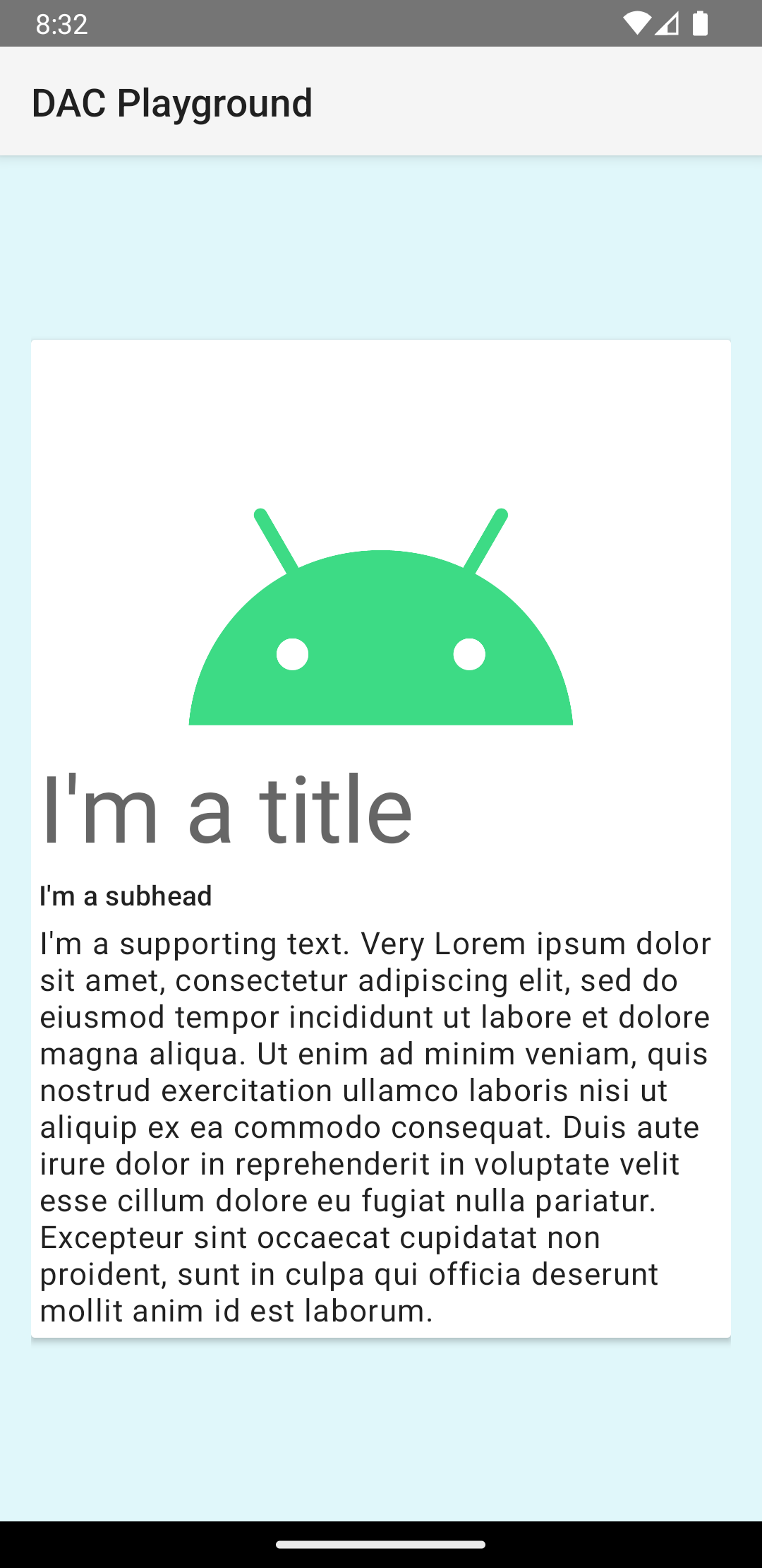
이 예의 카드는 기본 고도로 화면에 그려지며, 시스템은 카드 아래에 그림자를 그립니다. card_view:cardElevation 속성을 사용하여 카드에 맞춤 고도를 제공할 수 있습니다. 고도가 높은 카드는 그림자가 더 진하고 고도가 낮은 카드는 그림자가 더 연합니다. CardView 는 Android 5.0 (API 수준 21) 이상에서 실제 고도와 동적 그림자를 사용합니다.
다음 속성을 사용하여 CardView 위젯의 모양을 맞춤설정합니다.
- 레이아웃에서 모서리 반경을 설정하려면
card_view:cardCornerRadius속성을 사용합니다. - 코드에서 모서리 반경을 설정하려면
CardView.setRadius메서드를 사용합니다. - 카드의 배경색을 설정하려면
card_view:cardBackgroundColor속성을 사용합니다.