
When you need to display static images in your app, you can use the Drawable class and its subclasses to draw shapes and
images. A Drawable is a general abstraction for
something that can be drawn. The various subclasses help with specific image
scenarios, and you can extend them to define your own drawable objects
that behave in unique ways.
There are two ways to define and instantiate a Drawable besides using the class constructors:
- Inflate an image resource (a bitmap file) saved in your project.
- Inflate an XML resource that defines the drawable properties.
Note: You might instead prefer using a vector drawable, which defines an image with a set of points, lines, and curves, along with associated color information. This allows vector drawables to be scaled for different sizes without a loss of quality. For more information, see Vector drawables overview.
Create drawables from resource images
You can add graphics to your app by referencing an image file from your project resources. Supported file types are PNG (preferred), JPG (acceptable), and GIF (discouraged). App icons, logos, and other graphics, such as those used in games, are well suited for this technique.
To use an image resource, add your file to the res/drawable/
directory of your project. Once in your project, you can reference the image
resource from your code or your XML layout. Either way, it's referred to using a
resource ID, which is the file name without the file type extension. For
example, refer to my_image.png as my_image.
Note: Image resources placed in the
res/drawable/ directory may be automatically optimized with
lossless image compression by the aapt tool during the build
process. For example, a true-color PNG that doesn't require more than 256 colors
may be converted to an 8-bit PNG with a color palette. This results in an image
of equal quality but which requires less memory. As a result, the image binaries
placed in this directory can change at build time. If you plan on reading an
image as a bitstream in order to convert it to a bitmap, put your images in the
res/raw/ folder instead, where the aapt tool doesn't
modify them.
The following code snippet demonstrates how to build an ImageView that uses
an image created from a drawable resource and adds it to the layout:
Kotlin
private lateinit var constraintLayout: ConstraintLayout

override fun onCreate(savedInstanceState: Bundle?) {
    super.onCreate(savedInstanceState)

    // Instantiate an ImageView and define its properties
    val i = ImageView(this).apply {
        setImageResource(R.drawable.my_image)
        contentDescription = resources.getString(R.string.my_image_desc)

        // set the ImageView bounds to match the Drawable's dimensions
        adjustViewBounds = true
        layoutParams = ViewGroup.LayoutParams(
                ViewGroup.LayoutParams.WRAP_CONTENT,
                ViewGroup.LayoutParams.WRAP_CONTENT)
    }

    // Create a ConstraintLayout in which to add the ImageView
    constraintLayout = ConstraintLayout(this).apply {

        // Add the ImageView to the layout.
        addView(i)
    }

    // Set the layout as the content view.
    setContentView(constraintLayout)
}
Java
ConstraintLayout constraintLayout;

protected void onCreate(Bundle savedInstanceState) {
  super.onCreate(savedInstanceState);

  // Create a ConstraintLayout in which to add the ImageView
  constraintLayout = new ConstraintLayout(this);

  // Instantiate an ImageView and define its properties
  ImageView i = new ImageView(this);
  i.setImageResource(R.drawable.my_image);
  i.setContentDescription(getResources().getString(R.string.my_image_desc));

  // set the ImageView bounds to match the Drawable's dimensions
  i.setAdjustViewBounds(true);
  i.setLayoutParams(new ViewGroup.LayoutParams(
          ViewGroup.LayoutParams.WRAP_CONTENT,
          ViewGroup.LayoutParams.WRAP_CONTENT));

  // Add the ImageView to the layout and set the layout as the content view.
  constraintLayout.addView(i);
  setContentView(constraintLayout);
}
In other cases, you may want to handle your image resource as a Drawable object, as shown in the following
example:
Kotlin
val myImage: Drawable = ResourcesCompat.getDrawable(context.resources, R.drawable.my_image, null)
Java
Resources res = context.getResources();
Drawable myImage = ResourcesCompat.getDrawable(res, R.drawable.my_image, null);
Warning: Each unique resource in your project
can maintain only one state, no matter how many different objects you
instantiate for it. For example, if you instantiate two Drawable objects from the same image resource and
change a property (such as the alpha) for one object, then it also affects
the other. When dealing with multiple instances of an image resource, instead
of directly transforming the Drawable object you should perform a
tween
animation.
The XML snippet below shows how to add a drawable resource to an ImageView in the XML layout:
<ImageView
        android:layout_width="wrap_content"
        android:layout_height="wrap_content"
        android:src="@drawable/my_image"
        android:contentDescription="@string/my_image_desc" />
For more information about using project resources, see Resources and assets.
Note: When using image resources as the source of your drawables, be sure the images are the appropriate size for various pixel densities. If the images are not correct they will be scaled up to fit, which can cause artifacting in your drawables. For more information, read Support different pixel densities.
Create drawables from XML resources
If there is a Drawable
object that you'd like to create, which isn't initially dependent on variables defined by your
code or user interaction, then defining the Drawable in XML is a good option. Even
if you expect your Drawable to change its properties during the user's interaction
with your app, you should consider defining the object in XML, as you can modify properties after
the object has been instantiated.
After you've defined your Drawable in XML, save the file in the
res/drawable/ directory of your project. The following example shows the XML that
defines a
TransitionDrawable
resource, which inherits from Drawable:
<!-- res/drawable/expand_collapse.xml -->
<transition xmlns:android="http://schemas.android.com/apk/res/android">
    <item android:drawable="@drawable/image_expand"/>
    <item android:drawable="@drawable/image_collapse"/>
</transition>
Then, retrieve and instantiate the object by calling
Resources#getDrawable()
and passing the resource ID of your XML file. Any
Drawable subclass
that supports the inflate() method can be defined in XML and instantiated
by your app.
Each drawable class that supports XML inflation utilizes specific XML attributes
that help define the object properties. The following code instantiates the
TransitionDrawable
and sets it as the content of an
ImageView object:
Kotlin
val transition= ResourcesCompat.getDrawable(
        context.resources,
        R.drawable.expand_collapse,
        null
) as TransitionDrawable

val image: ImageView = findViewById(R.id.toggle_image)
image.setImageDrawable(transition)

// Description of the initial state that the drawable represents.
image.contentDescription = resources.getString(R.string.collapsed)

// Then you can call the TransitionDrawable object's methods.
transition.startTransition(1000)

// After the transition is complete, change the image's content description
// to reflect the new state.
Java
Resources res = context.getResources();
TransitionDrawable transition =
    (TransitionDrawable) ResourcesCompat.getDrawable(res, R.drawable.expand_collapse, null);

ImageView image = (ImageView) findViewById(R.id.toggle_image);
image.setImageDrawable(transition);

// Description of the initial state that the drawable represents.
image.setContentDescription(getResources().getString(R.string.collapsed));

// Then you can call the TransitionDrawable object's methods.
transition.startTransition(1000);

// After the transition is complete, change the image's content description
// to reflect the new state.
For more information about the XML attributes supported, refer to the classes listed above.
Shape drawables
A ShapeDrawable object can be a good option
when you want to dynamically draw a two-dimensional graphic. You can
programmatically draw primitive shapes on a ShapeDrawable object
and apply the styles that your app needs.
ShapeDrawable is a subclass of Drawable. For this reason, you can use a
ShapeDrawable wherever a Drawable is expected. For
example, you can use a ShapeDrawable object to set the background
of a view by passing it to the setBackgroundDrawable() method of the view. You can also draw your shape as its
own custom view and add it to a layout in your app.
Because ShapeDrawable has its own draw() method, you can create a
subclass of View that draws the ShapeDrawable
object during the onDraw() event, as shown in
the following code example:
Kotlin
class CustomDrawableView(context: Context) : View(context) {
    private val drawable: ShapeDrawable = run {
        val x = 10
        val y = 10
        val width = 300
        val height = 50
        contentDescription = context.resources.getString(R.string.my_view_desc)

        ShapeDrawable(OvalShape()).apply {
            // If the color isn't set, the shape uses black as the default.
            paint.color = 0xff74AC23.toInt()
            // If the bounds aren't set, the shape can't be drawn.
            setBounds(x, y, x + width, y + height)
        }
    }

    override fun onDraw(canvas: Canvas) {
        drawable.draw(canvas)
    }
}
Java
public class CustomDrawableView extends View {
  private ShapeDrawable drawable;

  public CustomDrawableView(Context context) {
    super(context);

    int x = 10;
    int y = 10;
    int width = 300;
    int height = 50;
    setContentDescription(context.getResources().getString(
            R.string.my_view_desc));

    drawable = new ShapeDrawable(new OvalShape());
    // If the color isn't set, the shape uses black as the default.
    drawable.getPaint().setColor(0xff74AC23);
    // If the bounds aren't set, the shape can't be drawn.
    drawable.setBounds(x, y, x + width, y + height);
  }

  protected void onDraw(Canvas canvas) {
    drawable.draw(canvas);
  }
}
You can use the CustomDrawableView class in the code sample
above as you would use any other custom view. For example, you can
programmatically add it to an activity in your app, as shown in the following
example:
Kotlin
private lateinit var customDrawableView: CustomDrawableView

override fun onCreate(savedInstanceState: Bundle?) {
    super.onCreate(savedInstanceState)
    customDrawableView = CustomDrawableView(this)

    setContentView(customDrawableView)
}
Java
CustomDrawableView customDrawableView;

protected void onCreate(Bundle savedInstanceState) {
  super.onCreate(savedInstanceState);
  customDrawableView = new CustomDrawableView(this);

  setContentView(customDrawableView);
}
If you want to use the custom view in the XML layout instead, then the
CustomDrawableView class must override the View(Context, AttributeSet) constructor, which is called when the class is
inflated from XML. The following example shows how to declare the
CustomDrawableView in the XML layout:
<com.example.shapedrawable.CustomDrawableView
        android:layout_width="fill_parent"
        android:layout_height="wrap_content"
        />
The ShapeDrawable class, like many other
drawable types in the android.graphics.drawable package, allows you to
define various properties of the object by using public methods. Some example
properties you might want to adjust include alpha transparency, color filter,
dither, opacity, and color.
You can also define primitive drawable shapes using XML resources. For more information, see Shape drawable in Drawable resource types.
NinePatch drawables
A NinePatchDrawable graphic is a
stretchable bitmap image that you can use as the background of a view. Android
automatically resizes the graphic to accommodate the contents of the view. An
example use of a NinePatch image is the background used by standard Android
buttons—buttons must stretch to accommodate strings of various lengths. A
NinePatch graphic is a standard PNG image that includes an extra 1-pixel border.
It must be saved with the 9.png extension in the
res/drawable/ directory of your project.
Use the border to define the stretchable and static areas of the image. You indicate a stretchable section by drawing one (or more) 1-pixel wide black line(s) in the left and top part of the border (the other border pixels should be fully transparent or white). You can have as many stretchable sections as you want. The relative size of the stretchable sections stays the same, so the largest section always remains the largest.
You can also define an optional drawable section of the image (effectively,
the padding lines) by drawing a line on the right and a line on the bottom. If a
View object sets the NinePatch graphic as its background
and then specifies the view's text, it stretches itself so that all the text
occupies only the area designated by the right and bottom lines (if included).
If the padding lines aren't included, Android uses the left and top lines to
define this drawable area.
To clarify the difference between the lines, the left and top lines define which pixels of the image are allowed to be replicated in order to stretch the image. The bottom and right lines define the relative area within the image that the contents of the view are allowed to occupy.
Figure 1 shows an example of a NinePatch graphic used to define a button:
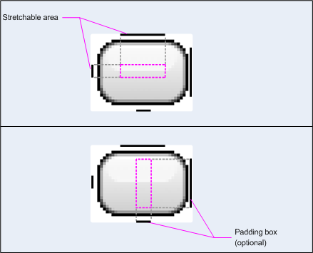
Figure 1: Example of a NinePatch graphic that defines a button
This NinePatch graphic defines one stretchable area with the left and top lines, and the drawable area with the bottom and right lines. In the top image, the dotted grey lines identify the regions of the image that are replicated in order to stretch the image. The pink rectangle in the bottom image identifies the region in which the contents of the view are allowed. If the contents don't fit in this region, then the image is stretched to make them fit.
The Draw 9-patch tool offers an extremely handy way to create your NinePatch images, using a WYSIWYG graphics editor. It even raises warnings if the region you've defined for the stretchable area is at risk of producing drawing artifacts as a result of the pixel replication.
The following sample layout XML demonstrates how to add a NinePatch graphic
to a couple of buttons. The NinePatch image is saved to
res/drawable/my_button_background.9.png.
<Button android:id="@+id/tiny"
        android:layout_width="wrap_content"
        android:layout_height="wrap_content"
        android:layout_alignParentTop="true"
        android:layout_centerInParent="true"
        android:text="Tiny"
        android:textSize="8sp"
        android:background="@drawable/my_button_background"/>

<Button android:id="@+id/big"
        android:layout_width="wrap_content"
        android:layout_height="wrap_content"
        android:layout_alignParentBottom="true"
        android:layout_centerInParent="true"
        android:text="Biiiiiiig text!"
        android:textSize="30sp"
        android:background="@drawable/my_button_background"/>
Note that the layout_width and layout_height
attributes are set to wrap_content to make the button fit neatly
around the text.
Figure 2 shows the two buttons rendered from the XML and NinePatch image shown above. Notice how the width and height of the button varies with the text, and the background image stretches to accommodate it.
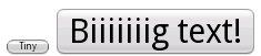
Figure 2: Buttons rendered using an XML resource and a NinePatch graphic
Custom drawables
When you want to create some custom drawings, you can do so by extending the Drawable class (or any of its subclasses).
The most important method to implement is draw(Canvas)
because this provides the Canvas object you must use to provide
your drawing instructions.
The following code shows a simple subclass of Drawable
that draws a circle:
Kotlin
class MyDrawable : Drawable() {
    private val redPaint: Paint = Paint().apply { setARGB(255, 255, 0, 0) }

    override fun draw(canvas: Canvas) {
        // Get the drawable's bounds
        val width: Int = bounds.width()
        val height: Int = bounds.height()
        val radius: Float = Math.min(width, height).toFloat() / 2f

        // Draw a red circle in the center
        canvas.drawCircle((width / 2).toFloat(), (height / 2).toFloat(), radius, redPaint)
    }

    override fun setAlpha(alpha: Int) {
        // This method is required
    }

    override fun setColorFilter(colorFilter: ColorFilter?) {
        // This method is required
    }

    override fun getOpacity(): Int =
        // Must be PixelFormat.UNKNOWN, TRANSLUCENT, TRANSPARENT, or OPAQUE
        PixelFormat.OPAQUE
}
Java
public class MyDrawable extends Drawable {
    private final Paint redPaint;

    public MyDrawable() {
        // Set up color and text size
        redPaint = new Paint();
        redPaint.setARGB(255, 255, 0, 0);
    }

    @Override
    public void draw(Canvas canvas) {
        // Get the drawable's bounds
        int width = getBounds().width();
        int height = getBounds().height();
        float radius = Math.min(width, height) / 2;

        // Draw a red circle in the center
        canvas.drawCircle(width/2, height/2, radius, redPaint);
    }

    @Override
    public void setAlpha(int alpha) {
        // This method is required
    }

    @Override
    public void setColorFilter(ColorFilter colorFilter) {
        // This method is required
    }

    @Override
    public int getOpacity() {
        // Must be PixelFormat.UNKNOWN, TRANSLUCENT, TRANSPARENT, or OPAQUE
        return PixelFormat.OPAQUE;
    }
}
Then you can add your drawable wherever you'd like, such as to an
ImageView as shown here:
Kotlin
val myDrawing = MyDrawable()
val image: ImageView = findViewById(R.id.imageView)
image.setImageDrawable(myDrawing)
image.contentDescription = resources.getString(R.string.my_image_desc)
Java
MyDrawable mydrawing = new MyDrawable();
ImageView image = findViewById(R.id.imageView);
image.setImageDrawable(mydrawing);
image.setContentDescription(getResources().getString(R.string.my_image_desc));
On Android 7.0 (API level 24) and higher, you can also define instances of your custom drawable with XML in the following ways:
- Using the fully-qualified class name as the XML element name. For this approach, the custom
drawable class must be a public top-level class:
<com.myapp.MyDrawable xmlns:android="http://schemas.android.com/apk/res/android"
    android:color="#ffff0000" />
- Using
drawableas the XML tag name and specifying the fully-qualified class name from the class attribute. This approach may be used for both public top-level classes and public static inner classes:<drawable xmlns:android="http://schemas.android.com/apk/res/android" class="com.myapp.MyTopLevelClass$MyDrawable" android:color="#ffff0000" />
Add tint to drawables
With Android 5.0 (API level 21) and above, you can tint bitmaps and nine-patches defined as
alpha masks. You can tint them with color resources or theme attributes that resolve to color
resources (for example, ?android:attr/colorPrimary). Usually, you create these assets
only once and color them automatically to match your theme.
You can apply a tint to BitmapDrawable, NinePatchDrawable or VectorDrawable
objects with the setTint() method. You can
also set the tint color and mode in your layouts with the android:tint and
android:tintMode attributes.
Extract prominent colors from an image
The Android Support Library includes the Palette class, which lets you extract prominent colors from an image.
You can load your drawables as a Bitmap and pass it to Palette to access its colors.
For more information, read Selecting colors with
the Palette API.