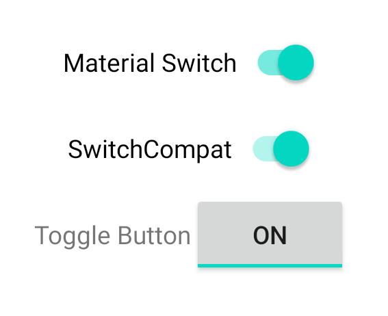
เพิ่มปุ่มเปิด/ปิด
จัดทุกอย่างให้เป็นระเบียบอยู่เสมอด้วยคอลเล็กชัน
บันทึกและจัดหมวดหมู่เนื้อหาตามค่ากำหนดของคุณ
ลองใช้วิธีเขียน
Jetpack Compose เป็นชุดเครื่องมือ UI ที่แนะนำสำหรับ Android ดูวิธีเพิ่มคอมโพเนนต์ใน Compose
หากใช้เลย์เอาต์ตาม View
คุณจะมีตัวเลือกหลัก 3 ตัวเลือกในการใช้ปุ่มเปิด/ปิด เราขอแนะนำให้ใช้คอมโพเนนต์ SwitchMaterial
จากไลบรารีคอมโพเนนต์เนื้อหา ดังนี้
<androidx.constraintlayout.widget.ConstraintLayout xmlns:android="http://schemas.android.com/apk/res/android"
xmlns:app="http://schemas.android.com/apk/res-auto"
android:layout_width="match_parent"
android:layout_height="match_parent"
android:padding="16dp">
<com.google.android.material.switchmaterial.SwitchMaterial
android:id="@+id/material_switch"
android:layout_width="wrap_content"
android:layout_height="wrap_content"
android:text="@string/material_switch"
app:layout_constraintEnd_toEndOf="parent"
app:layout_constraintStart_toStartOf="parent"
app:layout_constraintTop_toTopOf="parent" />
</androidx.constraintlayout.widget.ConstraintLayout>
แอปเดิมอาจยังใช้คอมโพเนนต์ SwitchCompat
AppCompat เวอร์ชันเก่าอยู่ ดังตัวอย่างต่อไปนี้
<androidx.constraintlayout.widget.ConstraintLayout xmlns:android="http://schemas.android.com/apk/res/android"
xmlns:app="http://schemas.android.com/apk/res-auto"
android:layout_width="match_parent"
android:layout_height="match_parent"
android:padding="16dp">
<androidx.appcompat.widget.SwitchCompat
android:id="@+id/switchcompat"
android:layout_width="wrap_content"
android:layout_height="wrap_content"
android:text="@string/switchcompat"
app:layout_constraintEnd_toEndOf="parent"
app:layout_constraintStart_toStartOf="parent"
app:layout_constraintTop_toTopOf="parent" />
</androidx.constraintlayout.widget.ConstraintLayout>
ตัวอย่างต่อไปนี้แสดง AppCompatToggleButton
ซึ่งเป็นคอมโพเนนต์เดิมอีกรายการที่มี UI แตกต่างออกไปอย่างเห็นได้ชัด
<androidx.constraintlayout.widget.ConstraintLayout xmlns:android="http://schemas.android.com/apk/res/android"
xmlns:app="http://schemas.android.com/apk/res-auto"
android:layout_width="match_parent"
android:layout_height="match_parent"
android:padding="16dp">
<TextView
android:id="@+id/toggle_button_label"
android:layout_width="wrap_content"
android:layout_height="wrap_content"
app:layout_constraintStart_toStartOf="parent"
app:layout_constraintEnd_toStartOf="@id/toggle"
app:layout_constraintHorizontal_chainStyle="packed"
app:layout_constraintBaseline_toBaselineOf="@id/toggle"
android:text="@string/toggle_button" />
<androidx.appcompat.widget.AppCompatToggleButton
android:id="@+id/toggle"
android:layout_width="wrap_content"
android:layout_height="wrap_content"
app:layout_constraintEnd_toEndOf="parent"
app:layout_constraintStart_toEndOf="@id/toggle_button_label"
app:layout_constraintTop_toTopOf="parent"
app:layout_constraintBottom_toBottomOf="parent"/>
</androidx.constraintlayout.widget.ConstraintLayout>
คอมโพเนนต์ทั้ง 3 รายการนี้ทํางานเหมือนกันแต่มีลักษณะแตกต่างกัน ความแตกต่างระหว่าง SwitchMaterial
กับ SwitchCompat
นั้นไม่ชัดเจน แต่ AppCompatToggleButton
นั้นต่างออกไปอย่างเห็นได้ชัด
รูปที่ 1 ปุ่มเปิด/ปิด 3 ประเภท
จัดการการเปลี่ยนแปลงสถานะ
SwitchMaterial
, SwitchCompat
และ AppCompatToggleButton
ล้วนเป็นคลาสย่อยของ CompoundButton
ซึ่งทำให้มีกลไกทั่วไปสำหรับจัดการการเปลี่ยนแปลงสถานะ "เลือกแล้ว" คุณใช้อินสแตนซ์ของ CompoundButton.OnCheckedChangeListener
และเพิ่มลงในปุ่ม ดังที่แสดงในตัวอย่างต่อไปนี้
Kotlin
class MainActivity : AppCompatActivity() {
override fun onCreate(savedInstanceState: Bundle?) {
super.onCreate(savedInstanceState)
val binding: SwitchLayoutBinding = SwitchLayoutBinding.inflate(layoutInflater)
setContentView(binding.root)
binding.materialSwitch.setOnCheckedChangeListener { _, isChecked ->
if (isChecked) {
// The switch is checked.
} else {
// The switch isn't checked.
}
}
}
}
Java
public class MainActivity extends AppCompatActivity {
@Override
protected void onCreate(Bundle savedInstanceState) {
super.onCreate(savedInstanceState);
SwitchLayoutBinding binding = SwitchLayoutBinding.inflate(getLayoutInflater());
setContentView(binding.getRoot());
binding.materialSwitch.setOnCheckedChangeListener((buttonView, isChecked) -> {
if (isChecked) {
// The switch is checked.
} else {
// The switch isn't checked.
}
});
}
}
CompoundButton.OnCheckedChangeListener
เป็นอินเทอร์เฟซเมธอดนามธรรมเดียว (หรืออินเทอร์เฟซ SAM) คุณจึงนำไปใช้เป็น LAMBDA ได้ ระบบจะเรียกแลมบ์ดาเมื่อสถานะที่ตรวจสอบมีการเปลี่ยนแปลง และค่าบูลีน isChecked
ที่ส่งไปยัง lambda จะบ่งบอกถึงสถานะที่เลือกใหม่
ตัวอย่างเนื้อหาและโค้ดในหน้าเว็บนี้ขึ้นอยู่กับใบอนุญาตที่อธิบายไว้ในใบอนุญาตการใช้เนื้อหา Java และ OpenJDK เป็นเครื่องหมายการค้าหรือเครื่องหมายการค้าจดทะเบียนของ Oracle และ/หรือบริษัทในเครือ
อัปเดตล่าสุด 2025-07-27 UTC
[[["เข้าใจง่าย","easyToUnderstand","thumb-up"],["แก้ปัญหาของฉันได้","solvedMyProblem","thumb-up"],["อื่นๆ","otherUp","thumb-up"]],[["ไม่มีข้อมูลที่ฉันต้องการ","missingTheInformationINeed","thumb-down"],["ซับซ้อนเกินไป/มีหลายขั้นตอนมากเกินไป","tooComplicatedTooManySteps","thumb-down"],["ล้าสมัย","outOfDate","thumb-down"],["ปัญหาเกี่ยวกับการแปล","translationIssue","thumb-down"],["ตัวอย่าง/ปัญหาเกี่ยวกับโค้ด","samplesCodeIssue","thumb-down"],["อื่นๆ","otherDown","thumb-down"]],["อัปเดตล่าสุด 2025-07-27 UTC"],[],[],null,["# Add toggle buttons\n\nTry the Compose way \nJetpack Compose is the recommended UI toolkit for Android. Learn how to add components in Compose. \n[Switch →](/develop/ui/compose/components/switch) \n\n\u003cbr /\u003e\n\nIf you're using a `View`-based layout, there are three main choices for\nimplementing toggles. We recommend using the\n[`SwitchMaterial`](https://m3.material.io/components/switch/overview) component\nfrom the [Material\nComponents](https://m3.material.io/develop/android/mdc-android) library: \n\n \u003candroidx.constraintlayout.widget.ConstraintLayout xmlns:android=\"http://schemas.android.com/apk/res/android\"\n xmlns:app=\"http://schemas.android.com/apk/res-auto\"\n android:layout_width=\"match_parent\"\n android:layout_height=\"match_parent\"\n android:padding=\"16dp\"\u003e\n\n \u003ccom.google.android.material.switchmaterial.SwitchMaterial\n android:id=\"@+id/material_switch\"\n android:layout_width=\"wrap_content\"\n android:layout_height=\"wrap_content\"\n android:text=\"@string/material_switch\"\n app:layout_constraintEnd_toEndOf=\"parent\"\n app:layout_constraintStart_toStartOf=\"parent\"\n app:layout_constraintTop_toTopOf=\"parent\" /\u003e\n\n \u003c/androidx.constraintlayout.widget.ConstraintLayout\u003e\n\nLegacy apps might still use the older\n[`SwitchCompat`](/reference/androidx/appcompat/widget/SwitchCompat) AppCompat\ncomponent, as shown in the following example: \n\n \u003candroidx.constraintlayout.widget.ConstraintLayout xmlns:android=\"http://schemas.android.com/apk/res/android\"\n xmlns:app=\"http://schemas.android.com/apk/res-auto\"\n android:layout_width=\"match_parent\"\n android:layout_height=\"match_parent\"\n android:padding=\"16dp\"\u003e\n\n \u003candroidx.appcompat.widget.SwitchCompat\n android:id=\"@+id/switchcompat\"\n android:layout_width=\"wrap_content\"\n android:layout_height=\"wrap_content\"\n android:text=\"@string/switchcompat\"\n app:layout_constraintEnd_toEndOf=\"parent\"\n app:layout_constraintStart_toStartOf=\"parent\"\n app:layout_constraintTop_toTopOf=\"parent\" /\u003e\n\n \u003c/androidx.constraintlayout.widget.ConstraintLayout\u003e\n\nThe following example shows\n[`AppCompatToggleButton`](/reference/androidx/appcompat/widget/AppCompatToggleButton),\nwhich is another legacy component that has a noticeably different UI: \n\n \u003candroidx.constraintlayout.widget.ConstraintLayout xmlns:android=\"http://schemas.android.com/apk/res/android\"\n xmlns:app=\"http://schemas.android.com/apk/res-auto\"\n android:layout_width=\"match_parent\"\n android:layout_height=\"match_parent\"\n android:padding=\"16dp\"\u003e\n\n \u003cTextView\n android:id=\"@+id/toggle_button_label\"\n android:layout_width=\"wrap_content\"\n android:layout_height=\"wrap_content\"\n app:layout_constraintStart_toStartOf=\"parent\"\n app:layout_constraintEnd_toStartOf=\"@id/toggle\"\n app:layout_constraintHorizontal_chainStyle=\"packed\"\n app:layout_constraintBaseline_toBaselineOf=\"@id/toggle\"\n android:text=\"@string/toggle_button\" /\u003e\n\n \u003candroidx.appcompat.widget.AppCompatToggleButton\n android:id=\"@+id/toggle\"\n android:layout_width=\"wrap_content\"\n android:layout_height=\"wrap_content\"\n app:layout_constraintEnd_toEndOf=\"parent\"\n app:layout_constraintStart_toEndOf=\"@id/toggle_button_label\"\n app:layout_constraintTop_toTopOf=\"parent\"\n app:layout_constraintBottom_toBottomOf=\"parent\"/\u003e\n\n \u003c/androidx.constraintlayout.widget.ConstraintLayout\u003e\n\nThese three components offer the same behavior but look different. The\ndifferences between the `SwitchMaterial` and `SwitchCompat` are subtle, but\n`AppCompatToggleButton` is noticeably different:\n\n\n**Figure 1.** Three toggle button types.\n\n\u003cbr /\u003e\n\n### Handle state changes\n\n`SwitchMaterial`, `SwitchCompat`, and `AppCompatToggleButton` are all subclasses\nof [`CompoundButton`](/reference/android/widget/CompoundButton), which\ngives them a common mechanism for handling checked state changes. You implement\nan instance of\n[`CompoundButton.OnCheckedChangeListener`](/reference/android/widget/CompoundButton.OnCheckedChangeListener)\nand add it to the button, as shown in the following example: \n\n### Kotlin\n\n```kotlin\nclass MainActivity : AppCompatActivity() {\n override fun onCreate(savedInstanceState: Bundle?) {\n super.onCreate(savedInstanceState)\n\n val binding: SwitchLayoutBinding = SwitchLayoutBinding.inflate(layoutInflater)\n setContentView(binding.root)\n\n binding.materialSwitch.setOnCheckedChangeListener { _, isChecked -\u003e\n if (isChecked) {\n // The switch is checked.\n } else {\n // The switch isn't checked.\n }\n }\n }\n}\n```\n\n### Java\n\n```java\npublic class MainActivity extends AppCompatActivity {\n\n @Override\n protected void onCreate(Bundle savedInstanceState) {\n super.onCreate(savedInstanceState);\n\n SwitchLayoutBinding binding = SwitchLayoutBinding.inflate(getLayoutInflater());\n setContentView(binding.getRoot());\n\n binding.materialSwitch.setOnCheckedChangeListener((buttonView, isChecked) -\u003e {\n if (isChecked) {\n // The switch is checked.\n } else {\n // The switch isn't checked.\n }\n });\n }\n}\n```\n\n`CompoundButton.OnCheckedChangeListener` is a single abstract method interface\n(or *SAM interface* ), so you can implement it as a lambda. The lambda is called\nwhenever the checked state changes, and the value of the `isChecked` boolean\nthat is passed to the lambda indicates the new checked state."]]