
اگر از یک طرحبندی مبتنی بر View استفاده میکنید، سه انتخاب اصلی برای پیادهسازی دکمههای تغییر وضعیت وجود دارد. توصیه میکنیم از کامپوننت SwitchMaterial از کتابخانه Material Components استفاده کنید:
<androidx.constraintlayout.widget.ConstraintLayout xmlns:android="http://schemas.android.com/apk/res/android"
    xmlns:app="http://schemas.android.com/apk/res-auto"
    android:layout_width="match_parent"
    android:layout_height="match_parent"
    android:padding="16dp">

    <com.google.android.material.switchmaterial.SwitchMaterial
        android:id="@+id/material_switch"
        android:layout_width="wrap_content"
        android:layout_height="wrap_content"
        android:text="@string/material_switch"
        app:layout_constraintEnd_toEndOf="parent"
        app:layout_constraintStart_toStartOf="parent"
        app:layout_constraintTop_toTopOf="parent" />

</androidx.constraintlayout.widget.ConstraintLayout>
برنامههای قدیمی ممکن است همچنان از کامپوننت قدیمیتر SwitchCompat AppCompat استفاده کنند، همانطور که در مثال زیر نشان داده شده است:
<androidx.constraintlayout.widget.ConstraintLayout xmlns:android="http://schemas.android.com/apk/res/android"
    xmlns:app="http://schemas.android.com/apk/res-auto"
    android:layout_width="match_parent"
    android:layout_height="match_parent"
    android:padding="16dp">

    <androidx.appcompat.widget.SwitchCompat
        android:id="@+id/switchcompat"
        android:layout_width="wrap_content"
        android:layout_height="wrap_content"
        android:text="@string/switchcompat"
        app:layout_constraintEnd_toEndOf="parent"
        app:layout_constraintStart_toStartOf="parent"
        app:layout_constraintTop_toTopOf="parent" />

</androidx.constraintlayout.widget.ConstraintLayout>
مثال زیر AppCompatToggleButton را نشان میدهد که یکی دیگر از کامپوننتهای قدیمی است که رابط کاربری کاملاً متفاوتی دارد:
<androidx.constraintlayout.widget.ConstraintLayout xmlns:android="http://schemas.android.com/apk/res/android"
    xmlns:app="http://schemas.android.com/apk/res-auto"
    android:layout_width="match_parent"
    android:layout_height="match_parent"
    android:padding="16dp">

    <TextView
        android:id="@+id/toggle_button_label"
        android:layout_width="wrap_content"
        android:layout_height="wrap_content"
        app:layout_constraintStart_toStartOf="parent"
        app:layout_constraintEnd_toStartOf="@id/toggle"
        app:layout_constraintHorizontal_chainStyle="packed"
        app:layout_constraintBaseline_toBaselineOf="@id/toggle"
        android:text="@string/toggle_button" />

    <androidx.appcompat.widget.AppCompatToggleButton
        android:id="@+id/toggle"
        android:layout_width="wrap_content"
        android:layout_height="wrap_content"
        app:layout_constraintEnd_toEndOf="parent"
        app:layout_constraintStart_toEndOf="@id/toggle_button_label"
        app:layout_constraintTop_toTopOf="parent"
        app:layout_constraintBottom_toBottomOf="parent"/>

</androidx.constraintlayout.widget.ConstraintLayout>
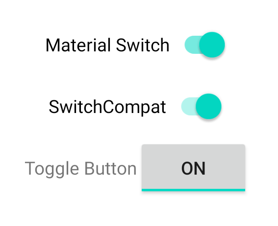
این سه کامپوننت رفتار یکسانی ارائه میدهند اما ظاهر متفاوتی دارند. تفاوتهای بین SwitchMaterial و SwitchCompat نامحسوس است، اما AppCompatToggleButton به طور قابل توجهی متفاوت است:
مدیریت تغییرات وضعیت
SwitchMaterial ، SwitchCompat و AppCompatToggleButton همگی زیرکلاسهای CompoundButton هستند که به آنها یک مکانیزم مشترک برای مدیریت تغییرات وضعیت بررسیشده میدهد. شما یک نمونه از CompoundButton.OnCheckedChangeListener پیادهسازی میکنید و آن را به دکمه اضافه میکنید، همانطور که در مثال زیر نشان داده شده است:
کاتلین
class MainActivity : AppCompatActivity() {
    override fun onCreate(savedInstanceState: Bundle?) {
        super.onCreate(savedInstanceState)

        val binding: SwitchLayoutBinding = SwitchLayoutBinding.inflate(layoutInflater)
        setContentView(binding.root)

        binding.materialSwitch.setOnCheckedChangeListener { _, isChecked ->
            if (isChecked) {
                // The switch is checked.
            } else {
                // The switch isn't checked.
            }
        }
    }
}
جاوا
public class MainActivity extends AppCompatActivity {

    @Override
    protected void onCreate(Bundle savedInstanceState) {
        super.onCreate(savedInstanceState);

        SwitchLayoutBinding binding = SwitchLayoutBinding.inflate(getLayoutInflater());
        setContentView(binding.getRoot());

        binding.materialSwitch.setOnCheckedChangeListener((buttonView, isChecked) -> {
            if (isChecked) {
                // The switch is checked.
            } else {
                // The switch isn't checked.
            }
        });
    }
}
CompoundButton.OnCheckedChangeListener یک رابط متد انتزاعی (یا رابط SAM ) است، بنابراین میتوانید آن را به عنوان یک لامبدا پیادهسازی کنید. لامبدا هر زمان که حالت بررسیشده تغییر کند، فراخوانی میشود و مقدار بولی isChecked که به لامبدا منتقل میشود، حالت بررسیشده جدید را نشان میدهد.