
یک دکمه شامل متن یا یک آیکون یا هر دو است که نشان میدهد وقتی کاربر روی آن ضربه میزند، چه عملی انجام میشود.
شما میتوانید یک دکمه در طرح خود به یکی از سه روش زیر ایجاد کنید، بسته به اینکه آیا میخواهید دکمهای با متن، آیکون یا هر دو داشته باشید:
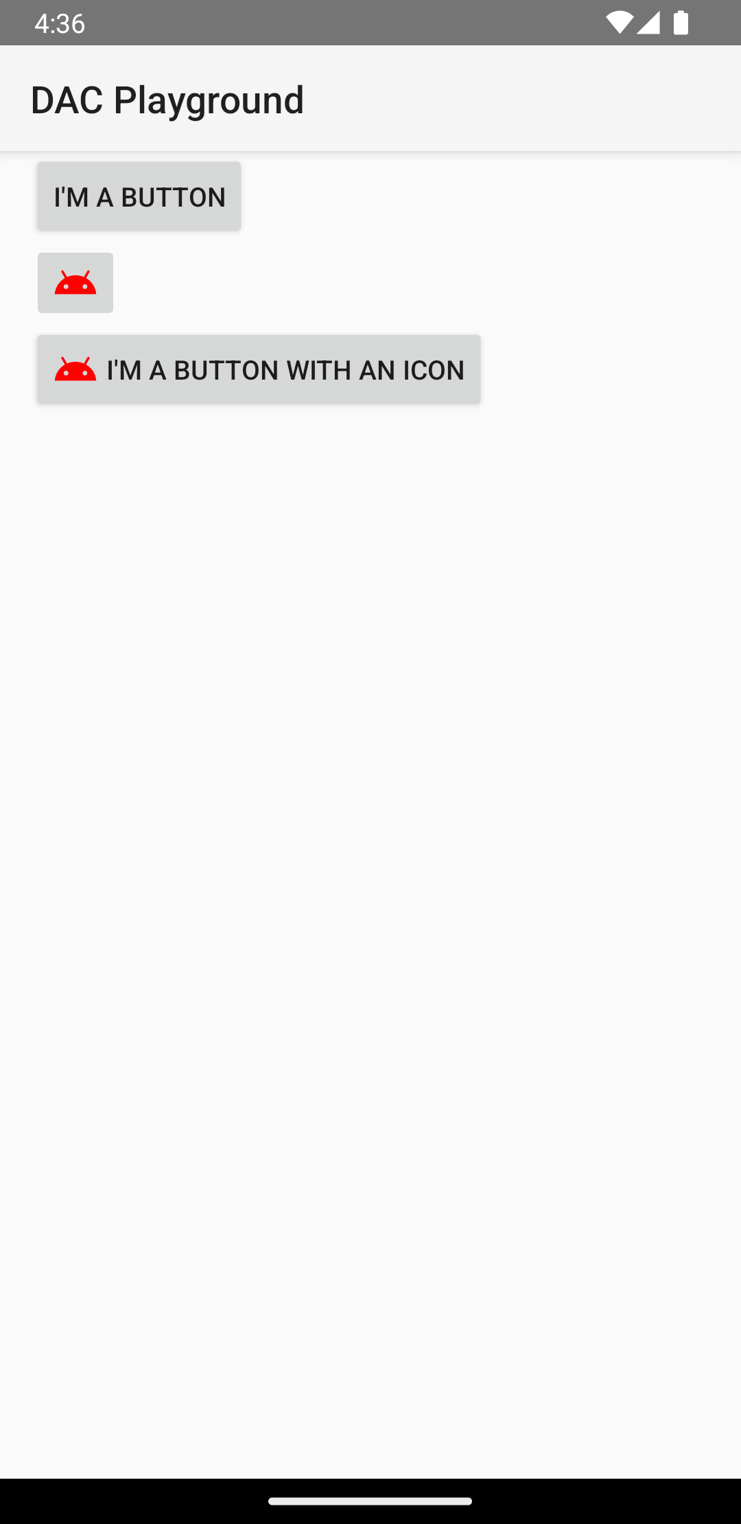
  <LinearLayout xmlns:android="http://schemas.android.com/apk/res/android"
      xmlns:app="http://schemas.android.com/apk/res-auto"
      android:layout_width="match_parent"
      android:layout_height="match_parent"
      android:paddingLeft="16dp"
      android:paddingRight="16dp"
      android:orientation="vertical" >

      <Button
          android:id="@+id/supabutton"
          android:layout_width="wrap_content"
          android:layout_height="wrap_content"
          android:text="I'm a button" />

      <ImageButton
          android:layout_width="wrap_content"
          android:layout_height="wrap_content"
          android:contentDescription="A tiny Android icon"
          android:src="@drawable/baseline_android_24"
          app:tint="#ff0000" />

      <Button
          android:layout_width="wrap_content"
          android:layout_height="wrap_content"
          android:drawableStart="@drawable/baseline_android_24"
          android:drawablePadding="4dp"
          android:drawableTint="#ff0000"
          android:text="I'm a button with an icon" />
  </LinearLayout>
کد قبلی چیزی شبیه به این تولید میکند:
پاسخ به رویدادهای کلیک
وقتی کاربر روی یک دکمه ضربه میزند، شیء Button یک رویداد کلیک دریافت میکند.
برای تعریف کنترلکنندهی رویداد به صورت برنامهنویسی، یک شیء View.OnClickListener ایجاد کنید و آن را با فراخوانی setOnClickListener(View.OnClickListener) به دکمه اختصاص دهید، همانطور که در مثال زیر آمده است:
کاتلین
findViewById<Button>(R.id.supabutton)
  .setOnClickListener {
      Log.d("BUTTONS", "User tapped the Supabutton")
  }
جاوا
Button button = (Button) findViewById(R.id.supabutton);
button.setOnClickListener(new View.OnClickListener() {
    public void onClick(View v) {
      Log.d("BUTTONS", "User tapped the Supabutton");
    }
});
دکمه خود را سبک دهید
ظاهر دکمه شما - تصویر پسزمینه و فونت - بین دستگاهها متفاوت است، زیرا دستگاههای سازندگان مختلف اغلب سبکهای پیشفرض متفاوتی برای کنترلهای ورودی دارند.
برای سفارشیسازی دکمههای تکی با پسزمینه متفاوت، ویژگی android:background با یک منبع drawable یا color مشخص کنید. همچنین، میتوانید یک استایل برای دکمه اعمال کنید که مشابه استایلهای HTML عمل میکند تا چندین ویژگی استایل مانند پسزمینه، فونت و اندازه را تعریف کند. برای اطلاعات بیشتر در مورد اعمال استایلها، به Styles and themes مراجعه کنید.
دکمه بدون حاشیه
یکی از طرحهایی که میتواند مفید باشد، دکمههای «بدون حاشیه» است. دکمههای بدون حاشیه شبیه دکمههای ساده هستند، با این تفاوت که هیچ حاشیه یا پسزمینهای ندارند، اما همچنان ظاهرشان در حالتهای مختلف، مانند زمانی که ضربه زده میشود، تغییر میکند.
برای ایجاد یک دکمه بدون حاشیه، استایل borderlessButtonStyle را مانند مثال زیر به دکمه اعمال کنید:
<Button
  android:id="@+id/supabutton"
  style="?android:attr/borderlessButtonStyle"
  android:layout_width="wrap_content"
  android:layout_height="wrap_content"
  android:text="I'm a button" />
پسزمینه سفارشی
اگر میخواهید ظاهر دکمه خود را واقعاً از نو تعریف کنید، میتوانید یک پسزمینه سفارشی مشخص کنید. با این حال، به جای ارائه یک بیتمپ یا رنگ ساده، پسزمینه شما باید یک منبع فهرست وضعیت باشد که ظاهر آن بسته به وضعیت فعلی دکمه تغییر میکند.
شما میتوانید لیست وضعیتها را در یک فایل XML تعریف کنید که سه تصویر یا رنگ را برای استفاده در وضعیتهای مختلف دکمه تعریف میکند.
برای ایجاد یک لیست وضعیت قابل ترسیم برای پسزمینه دکمه، موارد زیر را انجام دهید:
- سه تصویر بیتمپ برای پسزمینه دکمه ایجاد کنید که نشاندهنده حالتهای پیشفرض، لمسشده و متمرکز دکمه باشند. برای اطمینان از اینکه تصاویر شما با دکمههایی با اندازههای مختلف متناسب هستند، بیتمپها را به صورت بیتمپهای نهتکه ایجاد کنید.
- بیتمپها را در پوشه
res/drawable/پروژه خود قرار دهید. هر بیتمپ را طوری نامگذاری کنید که منعکس کننده حالت دکمهای باشد که نمایش میدهد، مانندbutton_default.9.png،button_pressed.9.pngوbutton_focused.9.png. - یک فایل XML جدید در دایرکتوری
res/drawable/ایجاد کنید. نام آن را چیزی شبیه بهbutton_custom.xmlبگذارید. کدهای XML را مانند زیر وارد کنید:<?xml version="1.0" encoding="utf-8"?> <selector xmlns:android="http://schemas.android.com/apk/res/android"> <item android:drawable="@drawable/button_pressed" android:state_pressed="true" /> <item android:drawable="@drawable/button_focused" android:state_focused="true" /> <item android:drawable="@drawable/button_default" /> </selector>
این یک منبع قابل ترسیم واحد تعریف میکند که تصویر آن بر اساس وضعیت فعلی دکمه تغییر میکند.
- اولین
<item>بیتمپ مورد استفاده هنگام ضربه زدن (فعال شدن) دکمه را تعریف میکند. - دومین
<item>بیتمپ مورد استفاده را هنگام فوکوس روی دکمه تعریف میکند، مانند زمانی که دکمه با استفاده از ترکبال یا پد جهتدار هایلایت میشود. - سومین
<item>بیتمپ را تعریف میکند تا زمانی که دکمه در حالت پیشفرض است، نه لمس شده و نه فوکوس روی آن قرار دارد، از آن استفاده شود.
این فایل XML یک منبع قابل ترسیم واحد را نشان میدهد. وقتی یک
Buttonبرای پسزمینه به آن ارجاع میدهد، تصویر نمایش داده شده بر اساس وضعیت دکمه تغییر میکند. - اولین
- فایل XML قابل ترسیم را به عنوان پسزمینه دکمه اعمال کنید:
<Button
    android:id="@+id/button_send"
    android:layout_width="wrap_content"
    android:layout_height="wrap_content"
    android:text="@string/button_send"
    android:onClick="sendMessage"
    android:background="@drawable/button_custom"  />
برای اطلاعات بیشتر در مورد این سینتکس XML، از جمله نحوه تعریف دکمهای که غیرفعال، معلق یا در حالت دیگری باشد، درباره StateListDrawable مطالعه کنید.