
WindowInsets는 시스템 UI에 의해 부분적으로 또는 완전히 가려진 화면 영역을 처리하기 위한 Jetpack Compose의 표준 API입니다. 이러한 영역에는 상태 표시줄, 탐색 메뉴, 터치 키보드가 포함됩니다. 또는 SafeDrawing과 같은 사전 정의된 WindowInsetsRulers을 Modifier.fitInside 또는 Modifier.fitOutside에 전달하여 콘텐츠를 시스템 표시줄 및 디스플레이 컷아웃에 정렬하거나 맞춤 WindowInsetsRulers을 만들 수 있습니다.
WindowInsetsRulers의 장점
- 소비 복잡성 방지: 레이아웃의 배치 단계 중에 작동합니다. 즉, 인셋 소비 체인을 완전히 우회하며 부모 레이아웃이 무엇을 했는지와 관계없이 항상 시스템 표시줄과 디스플레이 컷아웃의 올바른 절대 위치를 제공할 수 있습니다.
Modifier.fitInside또는Modifier.fitOutside메서드를 사용하면 상위 컴포저블이 인셋을 잘못 소비할 때 문제를 해결하는 데 도움이 됩니다. - 시스템 표시줄을 쉽게 피하기: 앱 콘텐츠가 시스템 표시줄과 디스플레이 컷아웃을 피하도록 지원하며
WindowInsets를 직접 사용하는 것보다 더 간단할 수 있습니다. - 맞춤설정 가능: 개발자는 콘텐츠를 맞춤 눈금자에 정렬하고 맞춤 레이아웃으로 레이아웃을 정밀하게 제어할 수 있습니다.
WindowInsetsRulers의 단점
- 측정에 사용할 수 없음: 게재 단계에서 작동하므로 제공하는 위치 정보는 이전 측정 단계에서 사용할 수 없습니다.
수정자 메서드를 사용하여 콘텐츠 정렬
Modifier.fitInside를 사용하면 앱이 콘텐츠를 시스템 표시줄 및 디스플레이 컷아웃에 정렬할 수 있습니다. WindowInsets 대신 사용할 수 있습니다.
Modifier.fitOutside은 일반적으로 Modifier.fitInside의 역함수입니다.
예를 들어 앱 콘텐츠가 시스템 표시줄과 디스플레이 컷아웃을 피하는지 확인하려면 fitInside(WindowInsetsRulers.safeDrawing.current)를 사용하면 됩니다.
@Composable fun FitInsideDemo(modifier: Modifier) { Box( modifier = modifier .fillMaxSize() // Or DisplayCutout, Ime, NavigationBars, StatusBar, etc... .fitInside(WindowInsetsRulers.SafeDrawing.current) ) }
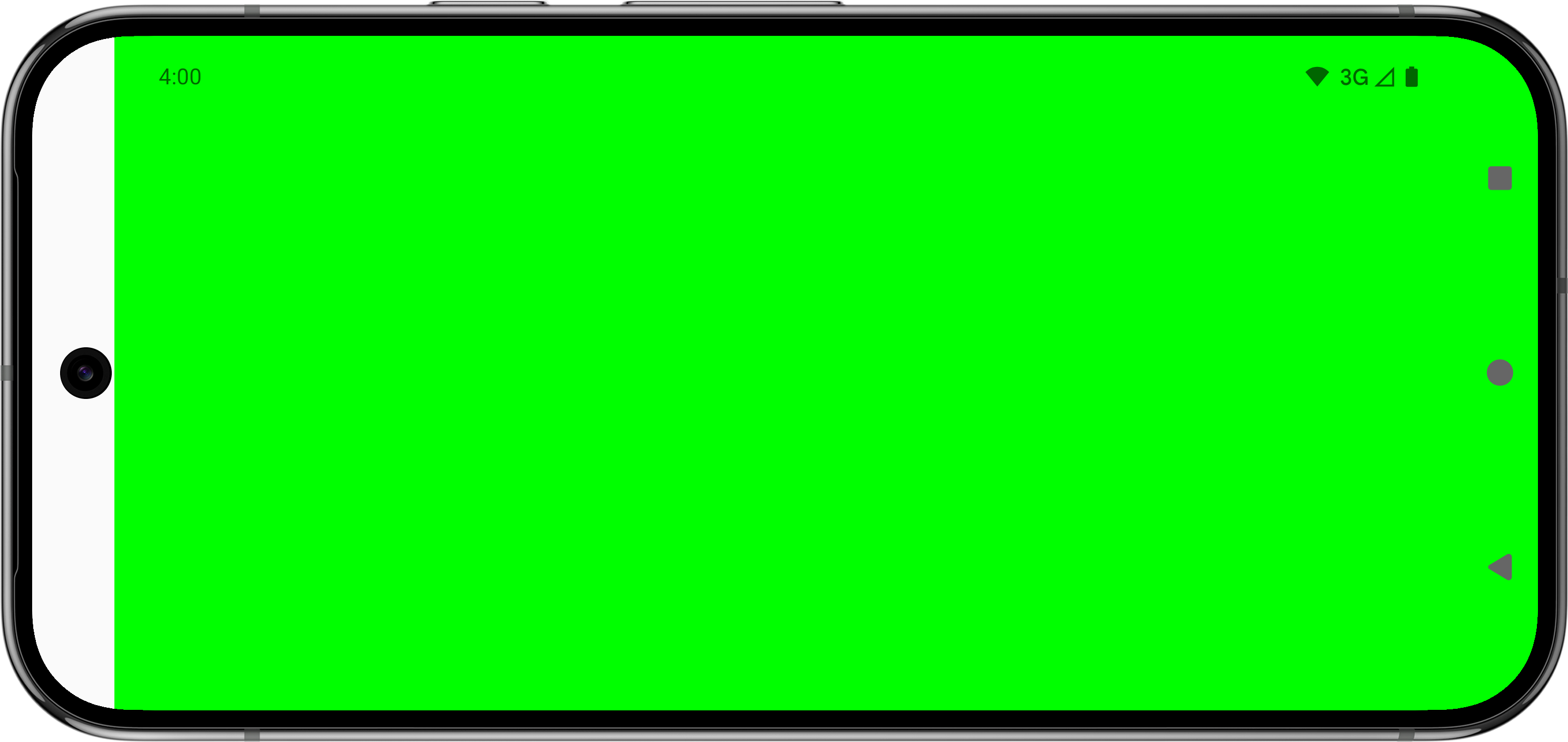
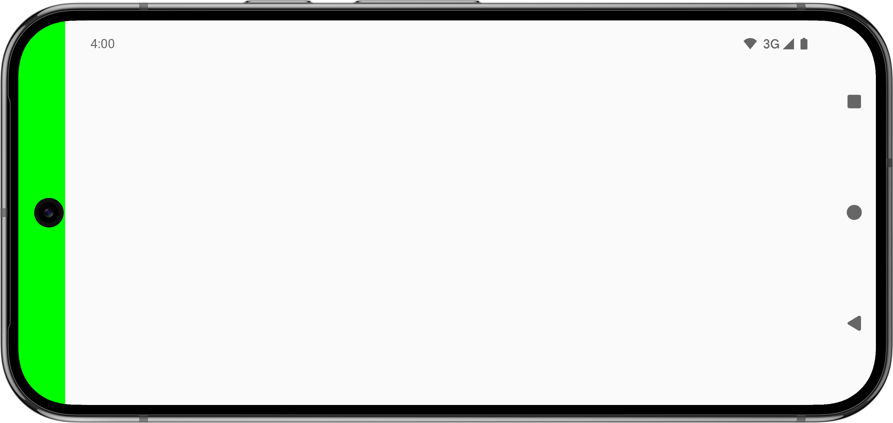
다음 표는 Modifier.fitInside 또는 Modifier.fitOutside이 포함된 사전 정의된 눈금자를 사용하여 앱 콘텐츠가 어떻게 표시되는지 보여줍니다.
| 사전 정의된 눈금자 유형 | ||
|---|---|---|
 |
 |
|
 |
해당 사항 없음 |
|
 |
 |
|
 |
해당 사항 없음 (대신 |
|
 |
 |
Modifier.fitInside 및 Modifier.fitOutside을 사용하려면 컴포저블이 제한되어야 합니다. 즉, Modifier.size 또는 Modifier.fillMaxSize과 같은 수정자를 정의해야 합니다.
SafeDrawing 및 SystemBars의 Modifier.fitOutside과 같은 일부 규칙은 여러 규칙을 반환합니다. 이 경우 Android는 왼쪽, 상단, 오른쪽, 하단의 눈금자 중 하나를 사용하여 컴포저블을 배치합니다.
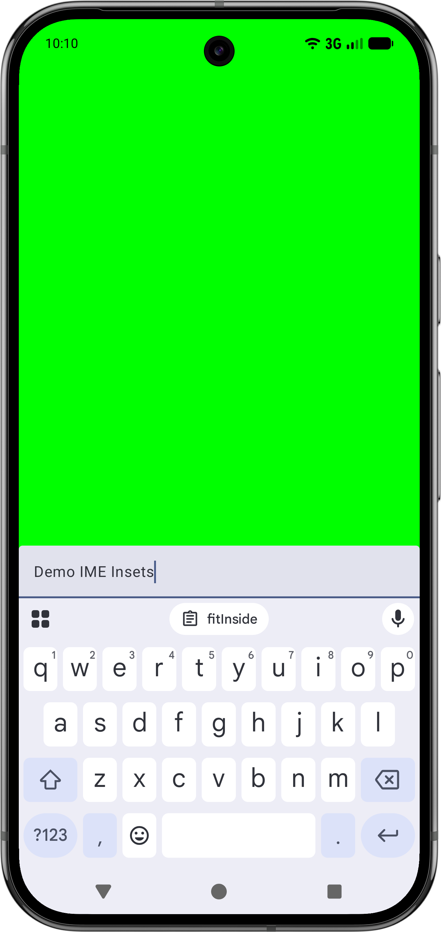
Modifier.fitInside로 IME 방지
Modifier.fitInside가 있는 IME로 하단 요소를 처리하려면 NavigationBar 및 Ime의 가장 안쪽 값을 사용하는 RectRuler를 전달하세요.
@Composable fun FitInsideWithImeDemo(modifier: Modifier) { Box( modifier = modifier .fillMaxSize() .fitInside( RectRulers.innermostOf( WindowInsetsRulers.NavigationBars.current, WindowInsetsRulers.Ime.current ) ) ) { TextField( value = "Demo IME Insets", onValueChange = {}, modifier = modifier.align(Alignment.BottomStart).fillMaxWidth() ) } }
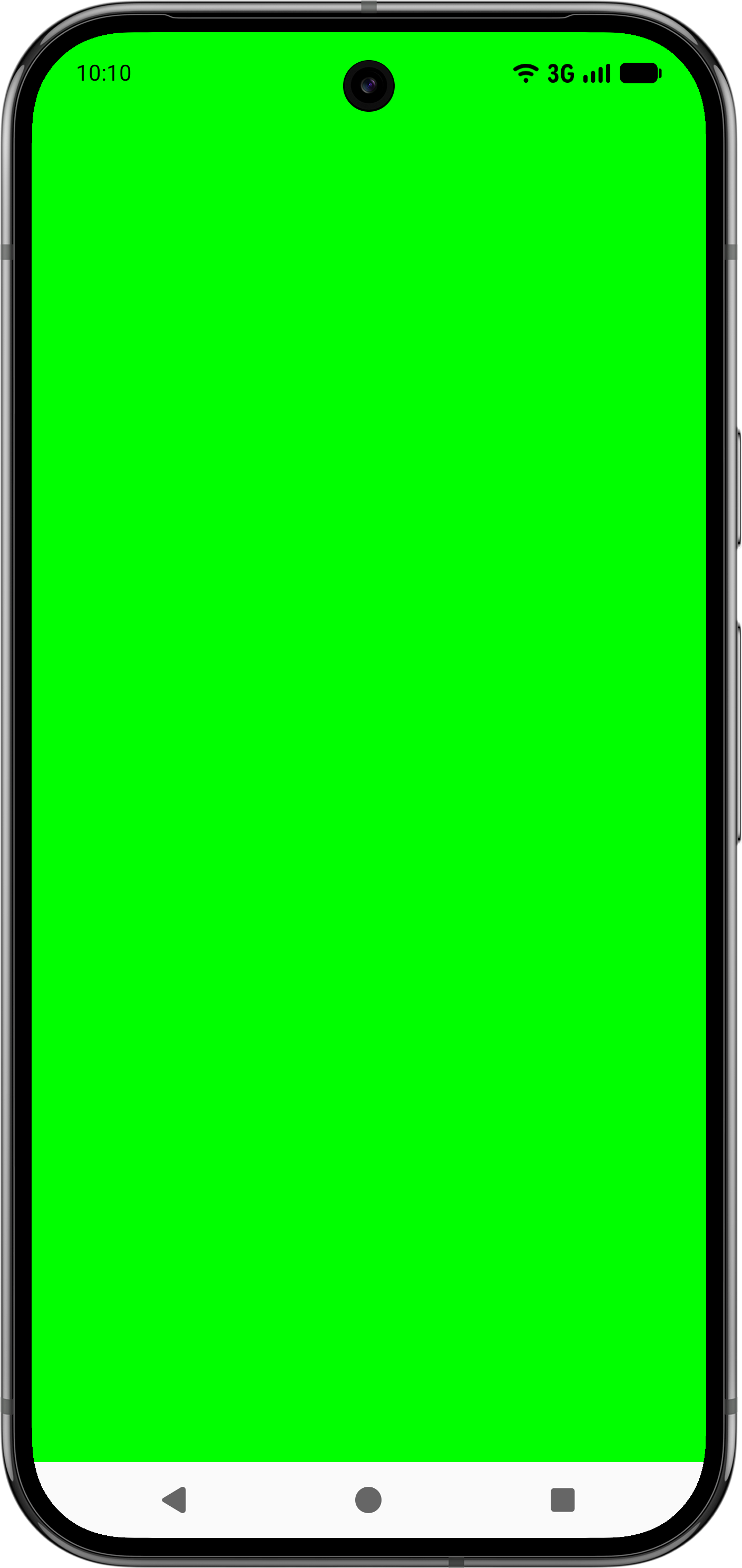
Modifier.fitInside를 사용하여 상태 표시줄과 캡션 표시줄 피하기
마찬가지로 상단 요소가 Modifier.fitInsider와 함께 상태 표시줄과 자막 표시줄을 피하는지 확인하려면 StatusBars 및 CaptionBar의 가장 안쪽 값을 사용하는 RectRuler를 전달하세요.
@Composable fun FitInsideWithStatusAndCaptionBarDemo(modifier: Modifier) { Box( modifier = modifier .fillMaxSize() .fitInside( RectRulers.innermostOf( WindowInsetsRulers.StatusBars.current, WindowInsetsRulers.CaptionBar.current ) ) ) }
맞춤 WindowInsetsRulers 만들기
콘텐츠를 맞춤 눈금자에 정렬할 수 있습니다. 예를 들어 상위 컴포저블이 인셋을 잘못 처리하여 다운스트림 하위 요소에 패딩 문제가 발생하는 사용 사례를 생각해 보세요. Modifier.fitInside를 사용하는 등 다른 방법으로 이 문제를 해결할 수 있지만, 다음 예와 동영상에 표시된 것처럼 상위 업스트림에서 문제를 수정하지 않고도 맞춤 눈금자를 만들어 하위 컴포저블을 정확하게 정렬할 수도 있습니다.
@Composable fun WindowInsetsRulersDemo(modifier: Modifier) { Box( contentAlignment = BottomCenter, modifier = modifier .fillMaxSize() // The mistake that causes issues downstream, as .padding doesn't consume insets. // While it's correct to instead use .windowInsetsPadding(WindowInsets.navigationBars), // assume it's difficult to identify this issue to see how WindowInsetsRulers can help. .padding(WindowInsets.navigationBars.asPaddingValues()) ) { TextField( value = "Demo IME Insets", onValueChange = {}, modifier = modifier // Use alignToSafeDrawing() instead of .imePadding() to precisely place this child // Composable without having to fix the parent upstream. .alignToSafeDrawing() // .imePadding() // .fillMaxWidth() ) } } fun Modifier.alignToSafeDrawing(): Modifier { return layout { measurable, constraints -> if (constraints.hasBoundedWidth && constraints.hasBoundedHeight) { val placeable = measurable.measure(constraints) val width = placeable.width val height = placeable.height layout(width, height) { val bottom = WindowInsetsRulers.SafeDrawing.current.bottom .current(0f).roundToInt() - height val right = WindowInsetsRulers.SafeDrawing.current.right .current(0f).roundToInt() val left = WindowInsetsRulers.SafeDrawing.current.left .current(0f).roundToInt() measurable.measure(Constraints.fixed(right - left, height)) .place(left, bottom) } } else { val placeable = measurable.measure(constraints) layout(placeable.width, placeable.height) { placeable.place(0, 0) } } } }
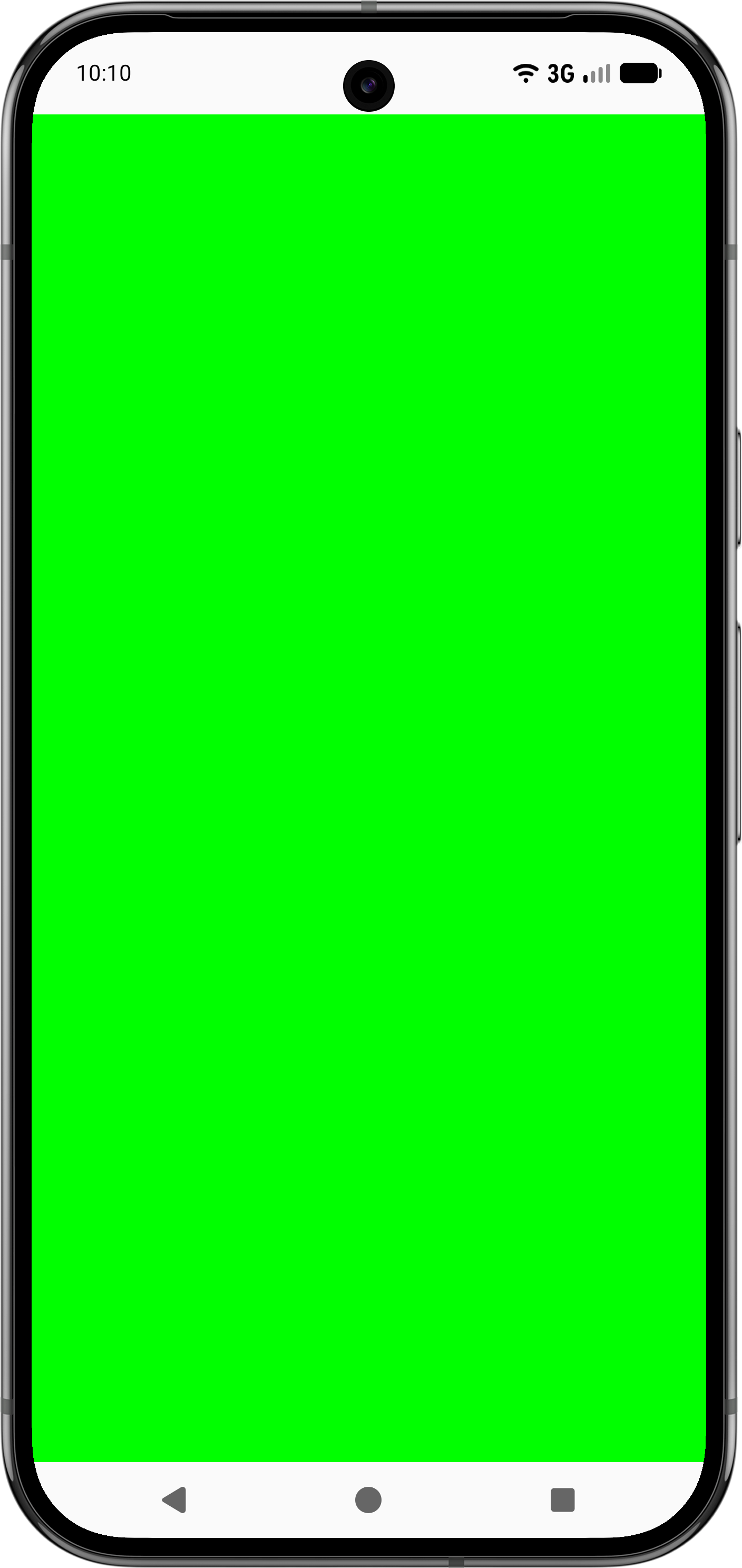
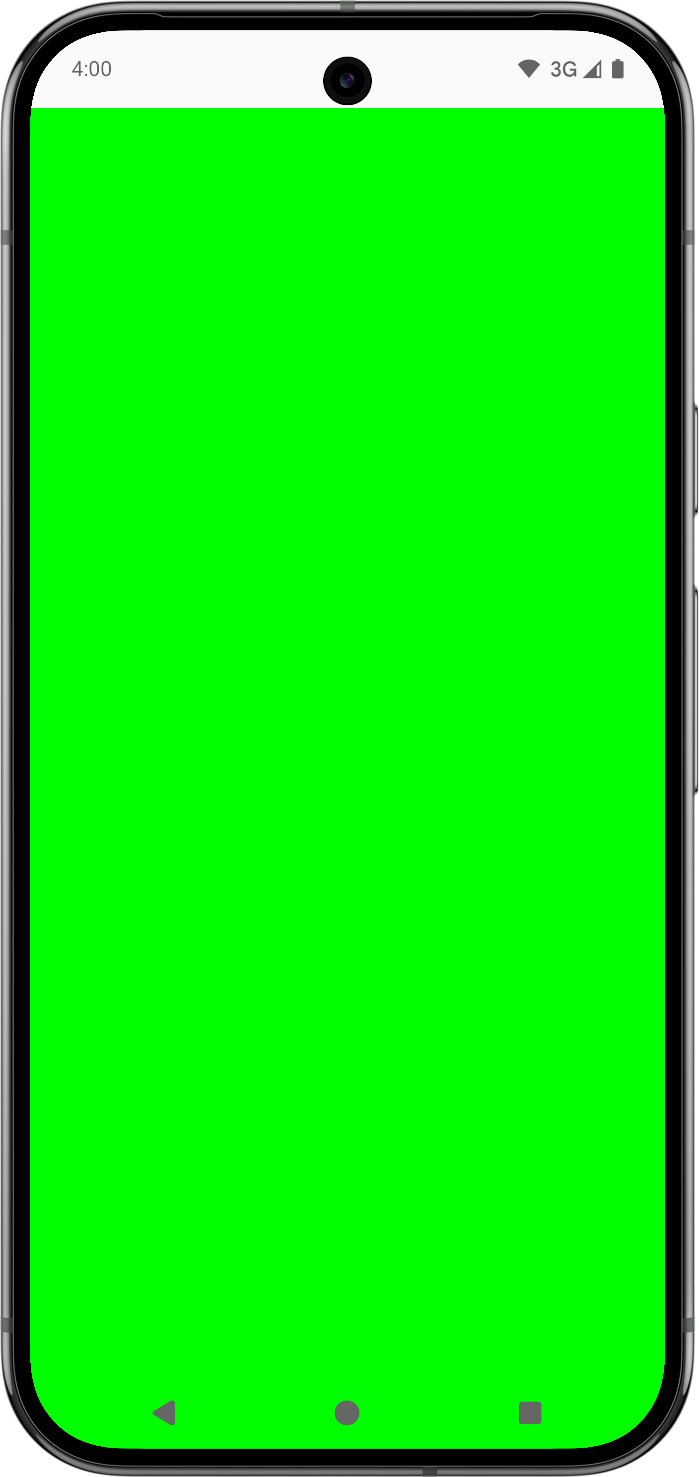
다음 동영상은 왼쪽 이미지에서 업스트림 상위 요소로 인해 발생하는 문제 있는 IME 인셋 소비의 예를 보여주고 오른쪽에서는 맞춤 눈금자를 사용하여 문제를 해결합니다. 탐색 메뉴 패딩이 상위 요소에 의해 사용되지 않았으므로 TextField 컴포저블 아래에 추가 패딩이 표시됩니다. 이전 코드 샘플에 표시된 대로 맞춤 눈금자를 사용하여 오른쪽 이미지의 올바른 위치에 자녀가 배치됩니다.
부모가 제한되는지 확인
WindowInsetsRulers를 안전하게 사용하려면 부모가 유효한 제약 조건을 제공해야 합니다. 상위 요소는 정의된 크기가 있어야 하며 WindowInsetsRulers를 사용하는 하위 요소의 크기에 의존할 수 없습니다. 상위 컴포저블에서 fillMaxSize 또는 기타 크기 수정자를 사용합니다.
마찬가지로 WindowInsetsRulers를 사용하는 컴포저블을 verticalScroll와 같은 스크롤 컨테이너 내에 배치하면 스크롤 컨테이너가 무한 높이 제약 조건을 제공하여 눈금자의 논리와 호환되지 않으므로 예기치 않은 동작이 발생할 수 있습니다.