
En las siguientes secciones, se describe cómo crear un widget básico de la app con Glance.
Cómo declarar AppWidget en el manifiesto
Después de completar los pasos de configuración, declara AppWidget y sus metadatos en tu app.
Extiende el receptor
AppWidgetdesdeGlanceAppWidgetReceiver:class MyAppWidgetReceiver : GlanceAppWidgetReceiver() { override val glanceAppWidget: GlanceAppWidget = TODO("Create GlanceAppWidget") }
Registra el proveedor del widget de la app en tu archivo
AndroidManifest.xmly en el archivo de metadatos asociado:<receiver android:name=".glance.MyReceiver" android:exported="true"> <intent-filter> <action android:name="android.appwidget.action.APPWIDGET_UPDATE" /> </intent-filter> <meta-data android:name="android.appwidget.provider" android:resource="@xml/my_app_widget_info" /> </receiver>
Agrega los metadatos de AppWidgetProviderInfo
A continuación, sigue la guía Crea un widget para crear y definir la información del widget de la app en el archivo @xml/my_app_widget_info.
La única diferencia para Glance es que no hay XML de initialLayout, pero debes definir uno. Puedes usar el diseño de carga predefinido que se proporciona en la biblioteca:
<appwidget-provider xmlns:android="http://schemas.android.com/apk/res/android"
android:initialLayout="@layout/glance_default_loading_layout">
</appwidget-provider>
Declara el XML de AppWidgetProviderInfo
El objeto AppWidgetProviderInfo define las cualidades esenciales de tu widget. Define AppWidgetProviderInfo en tu archivo de recursos de metadatos XML (res/xml/my_app_widget_info.xml) dentro de un elemento <appwidget-provider>:
<appwidget-provider xmlns:android="http://schemas.android.com/apk/res/android"
    android:minWidth="40dp"
    android:minHeight="40dp"
    android:targetCellWidth="1"
    android:targetCellHeight="1"
    android:maxResizeWidth="250dp"
    android:maxResizeHeight="120dp"
    android:updatePeriodMillis="86400000"
    android:description="@string/example_appwidget_description"
    android:previewLayout="@layout/example_appwidget_preview"
    android:initialLayout="@layout/glance_default_loading_layout"
    android:configure="com.example.android.ExampleAppWidgetConfigurationActivity"
    android:resizeMode="horizontal|vertical"
    android:widgetCategory="home_screen"
    android:widgetFeatures="reconfigurable|configuration_optional">
</appwidget-provider>
Atributos de tamaño del widget
La pantalla principal predeterminada coloca los widgets en su ventana según una cuadrícula de celdas que tienen una altura y un ancho definidos. La mayoría de las pantallas principales solo permiten que los widgets adopten tamaños que sean múltiplos enteros de las celdas de la cuadrícula, por ejemplo, dos celdas horizontalmente por tres celdas verticalmente.
Los atributos de tamaño del widget te permiten especificar un tamaño predeterminado para tu widget y proporcionar límites inferior y superior para su tamaño. En este contexto, el tamaño predeterminado de un widget es el tamaño que adopta el widget cuando se agrega por primera vez a la pantalla principal.
En la siguiente tabla, se describen los atributos de <appwidget-provider> relacionados con el tamaño del widget:
| Atributos y descripción | |
|---|---|
targetCellWidth y
targetCellHeight (Android 12),
minWidth y minHeight |
targetCellWidth y targetCellHeight, y minWidth y minHeight, de modo que tu app pueda recurrir al uso de minWidth y minHeight si el dispositivo del usuario no admite targetCellWidth y targetCellHeight. Si se admiten, los atributos
targetCellWidth y targetCellHeight tienen prioridad
sobre los atributos minWidth y minHeight.
|
minResizeWidth y
minResizeHeight |
Especifica el tamaño mínimo absoluto del widget. Estos valores especifican el tamaño por debajo del cual el widget es ilegible o inutilizable. El uso de estos atributos permite al usuario cambiar el tamaño del widget por uno más pequeño que el predeterminado. El atributo minResizeWidth se ignora si es mayor que minWidth o si el cambio de tamaño horizontal no está habilitado. Consulta
resizeMode. Del mismo modo, el atributo minResizeHeight se ignora si es mayor que minHeight o si el cambio de tamaño vertical no está habilitado. |
maxResizeWidth y
maxResizeHeight |
Especifica el tamaño máximo recomendado del widget. Si los valores no son múltiplos de las dimensiones de la celda de la cuadrícula, se redondean hacia arriba al tamaño de celda más cercano. El atributo maxResizeWidth se ignora si es menor que minWidth o si el cambio de tamaño horizontal no está habilitado. Consulta resizeMode. Del mismo modo, el atributo maxResizeHeight se ignora si es menor que minHeight o si el cambio de tamaño vertical no está habilitado.
Se introdujo en Android 12. |
resizeMode |
Especifica las reglas por las que se puede cambiar el tamaño de un widget. Puedes usar este atributo para hacer que se pueda cambiar el tamaño de los widgets de la pantalla principal de forma horizontal o vertical, o en ambos ejes. Los usuarios deben mantener presionado un widget para mostrar los controladores de cambio de tamaño y, luego, arrastrar los controladores horizontales o verticales para cambiar su tamaño en la cuadrícula de diseño. Los valores para el atributo resizeMode incluyen horizontal, vertical y none. Para declarar un widget como horizontal y vertical, usa horizontal|vertical. |
Ejemplo
Para ilustrar cómo los atributos de la tabla anterior afectan el tamaño del widget, supongamos las siguientes especificaciones:
- Una celda de la cuadrícula tiene 30 dp de ancho y 50 dp de alto.
- Se proporciona la siguiente especificación de atributos:
<appwidget-provider xmlns:android="http://schemas.android.com/apk/res/android"
    android:minWidth="80dp"
    android:minHeight="80dp"
    android:targetCellWidth="2"
    android:targetCellHeight="2"
    android:minResizeWidth="40dp"
    android:minResizeHeight="40dp"
    android:maxResizeWidth="120dp"
    android:maxResizeHeight="120dp"
    android:resizeMode="horizontal|vertical" />
A partir de Android 12:
Usa los atributos targetCellWidth y targetCellHeight como el tamaño predeterminado del widget.
El tamaño predeterminado del widget es de 2 x 2. El widget se puede reducir hasta 2x1 o aumentar hasta 4x3.
Android 11 y versiones anteriores:
Usa los atributos minWidth y minHeight para calcular el tamaño predeterminado del widget.
El ancho predeterminado = Math.ceil(80 / 30) = 3
La altura predeterminada = Math.ceil(80 / 50) = 2
El tamaño predeterminado del widget es de 3 x 2. El widget se puede reducir a 2 x 1 o expandir a pantalla completa.
Atributos adicionales del widget
En la siguiente tabla, se describen los atributos de <appwidget-provider> relacionados con cualidades que no son el tamaño del widget.
| Atributos y descripción | |
|---|---|
updatePeriodMillis |
Define la frecuencia con la que el marco de trabajo del widget solicita una actualización desde el GlanceAppWidgetReceiver llamando al método de devolución de llamada onUpdate(). Te recomendamos que realices la actualización con la menor frecuencia posible (no más de una vez por hora) para conservar la batería.
Para obtener más información, consulta la sección Cuándo actualizar widgets en Administración del estado de Glance. |
initialLayout |
Apunta al recurso de diseño que define el diseño de carga del widget antes de que se rendericen las composiciones de la IU de Glance. Puedes usar el diseño de carga predefinido que se proporciona en la biblioteca: @layout/glance_default_loading_layout. |
configure |
Define la actividad de configuración que se inicia cuando el usuario agrega el widget. Consulta la sección Implementa una actividad de configuración del widget en esta página. |
description |
Especifica la descripción que se mostrará en el selector de widgets para tu widget. Se introdujo en Android 12. |
previewLayout (Android 12) y previewImage (Android 11 y versiones anteriores) |
|
autoAdvanceViewId |
Especifica el ID de vista de la subvista del widget que el host del widget hace avanzar automáticamente. |
widgetCategory |
Declara si el widget se puede mostrar en la pantalla principal (home_screen), la pantalla de bloqueo (keyguard) o ambas. Para Android 5.0 y versiones posteriores, solo es válido home_screen. |
widgetFeatures |
Declara las funciones que admite el widget. Por ejemplo, si la configuración del widget es opcional, especifica configuration_optional y reconfigurable. |
Define GlanceAppWidget
Crea una clase nueva que extienda
GlanceAppWidgety anule el métodoprovideGlance. Este es el método en el que puedes cargar los datos necesarios para renderizar tu widget:class MyAppWidget : GlanceAppWidget() { override suspend fun provideGlance(context: Context, id: GlanceId) { // In this method, load data needed to render the AppWidget. // Use `withContext` to switch to another thread for long running // operations. provideContent { // create your AppWidget here Text("Hello World") } } }
Crea una instancia en el
glanceAppWidgetde tuGlanceAppWidgetReceiver:class MyAppWidgetReceiver : GlanceAppWidgetReceiver() { // Let MyAppWidgetReceiver know which GlanceAppWidget to use override val glanceAppWidget: GlanceAppWidget = MyAppWidget() }
Ya configuraste un AppWidget con Glance.
Usa la clase GlanceAppWidgetReceiver para controlar las transmisiones de widgets
El widget de coordenadas GlanceAppWidgetReceiver transmite y actualiza el estado de la plataforma extendiendo el AppWidgetProvider subyacente. Recibe eventos de la plataforma cuando se actualiza, borra, habilita o inhabilita tu widget, y los traduce en solicitudes de ciclo de vida de Compose.
Cómo declarar un widget en el manifiesto
Declara tu subclase de la clase GlanceAppWidgetReceiver como un receptor de transmisiones en tu archivo AndroidManifest.xml:
<receiver android:name="ExampleAppWidgetReceiver"
          android:exported="false">
    <intent-filter>
        <action android:name="android.appwidget.action.APPWIDGET_UPDATE" />
    </intent-filter>
    <meta-data android:name="android.appwidget.provider"
               android:resource="@xml/my_app_widget_info" />
</receiver>
El elemento <receiver> requiere el atributo android:name, que especifica la clase del receptor. El receptor debe aceptar la acción de emisión ACTION_APPWIDGET_UPDATE dentro de <intent-filter>.
El elemento <meta-data> debe identificar su nombre como android.appwidget.provider, y el atributo android:resource debe apuntar a tu recurso de metadatos XML de AppWidgetProviderInfo (@xml/my_app_widget_info).
Implementa la clase GlanceAppWidgetReceiver
En Glance, extiendes GlanceAppWidgetReceiver en lugar de AppWidgetProvider directamente. Para implementarlo, vincula tu receptor a tu instancia de GlanceAppWidget. Las devoluciones de llamada principales disponibles en GlanceAppWidgetReceiver funcionan de la siguiente manera:
onUpdate(): Glance lo anula automáticamente para ejecutar actualizaciones de composición. Si anulasonUpdatede forma manual, debes llamar asuper.onUpdatepara permitir que Glance inicie correctamente los subprocesos de composición.onAppWidgetOptionsChanged(): Se llama cuando se coloca o cambia el tamaño del widget por primera vez. Glance lee los elementos del paquete de opciones de forma interna para que tu diseño se ajuste sin problemas según las dimensiones del tiempo de ejecución.onDeleted(Context, IntArray): Se invoca cada vez que el usuario borra una instancia de widget específica.onEnabled(Context): Se activa cuando se crea correctamente la primera instancia de tu widget. Excelente para ejecutar migraciones globales.onDisabled(Context): Se llama cuando se quita la última instancia activa del proveedor.onReceive(Context, Intent): Intercepta cada transmisión de la plataforma antes de los métodos de devolución de llamada específicos. Debes asegurarte de que cualquier lógica del receptor personalizada que escribas llame asuper.onReceive(context, intent)y nunca llame agoAsyncpor tu cuenta, ya que Glance enruta el trabajo de forma asíncrona automáticamente.
Cómo recibir intents de emisión del widget
De forma interna, GlanceAppWidgetReceiver filtra y controla los siguientes intents de transmisión de widgets de la plataforma fundamentales:
ACTION_APPWIDGET_UPDATEACTION_APPWIDGET_DELETEDACTION_APPWIDGET_ENABLEDACTION_APPWIDGET_DISABLEDACTION_APPWIDGET_OPTIONS_CHANGED
Crea la IU
En el siguiente fragmento, se muestra cómo crear la IU:
/* Import Glance Composables In the event there is a name clash with the Compose classes of the same name, you may rename the imports per https://kotlinlang.org/docs/packages.html#imports using the `as` keyword. import androidx.glance.Button import androidx.glance.layout.Column import androidx.glance.layout.Row import androidx.glance.text.Text */ class MyAppWidget : GlanceAppWidget() { override suspend fun provideGlance(context: Context, id: GlanceId) { // Load data needed to render the AppWidget. // Use `withContext` to switch to another thread for long running // operations. provideContent { // create your AppWidget here MyContent() } } @Composable private fun MyContent() { Column( modifier = GlanceModifier.fillMaxSize(), verticalAlignment = Alignment.Top, horizontalAlignment = Alignment.CenterHorizontally ) { Text(text = "Where to?", modifier = GlanceModifier.padding(12.dp)) Row(horizontalAlignment = Alignment.CenterHorizontally) { Button( text = "Home", onClick = actionStartActivity<MyActivity>() ) Button( text = "Work", onClick = actionStartActivity<MyActivity>() ) } } } }
La muestra de código anterior hace lo siguiente:
- En el
Columnde nivel superior, los elementos se colocan verticalmente uno después del otro. - El elemento
Columnexpande su tamaño para que coincida con el espacio disponible (a través deGlanceModifiery alinea su contenido en la parte superior (verticalAlignment) y lo centra horizontalmente (horizontalAlignment). - El contenido del
Columnse define con la expresión lambda. El orden es importante.- El primer elemento de
Columnes un componenteTextcon un relleno de12.dp. - El segundo elemento es un
Row, en el que los elementos se colocan horizontalmente uno después del otro, con dosButtonscentrados horizontalmente (horizontalAlignment). La visualización final depende del espacio disponible. La siguiente imagen es un ejemplo de cómo podría verse:
- El primer elemento de
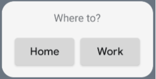
Puedes cambiar los valores de alineación o aplicar diferentes valores de modificadores (como padding) para cambiar la ubicación y el tamaño de los componentes. Consulta la documentación de referencia para obtener una lista completa de los componentes, los parámetros y los modificadores disponibles para cada clase.
Cómo implementar esquinas redondeadas
Android 12 introduce parámetros del sistema para personalizar los radios de las esquinas de los widgets de tu app de forma dinámica:
system_app_widget_background_radius: Especifica el radio de la esquina del contenedor de fondo del widget (nunca superior a 28 dp).- Radio interior: Para evitar el recorte de contenido, calcula un radio proporcional para tu contenido interior en función del contorno del fondo del sistema:
systemRadiusValue - widgetPadding
En Glance, puedes aplicar propiedades de tamaño del radio de esquina de forma dinámica en la composición con GlanceModifier.cornerRadius(android.R.dimen.system_app_widget_background_radius).
Para garantizar la retrocompatibilidad en dispositivos que ejecutan Android 11 (nivel de API 30) o versiones anteriores, implementa atributos personalizados y recursos de temas personalizados alternativos:
/values/attrs.xml<resources> <attr name="backgroundRadius" format="dimension" /> </resources>/values/styles.xml<resources> <style name="MyWidgetTheme"> <item name="backgroundRadius">@dimen/my_background_radius_dimen</item> </style> </resources>/values-31/styles.xml<resources> <style name="MyWidgetTheme" parent="@android:style/Theme.DeviceDefault.DayNight"> <item name="backgroundRadius">@android:dimen/system_app_widget_background_radius</item> </style> </resources>/drawable/my_widget_background.xml<shape xmlns:android="http://schemas.android.com/apk/res/android" android:shape="rectangle"> <corners android:radius="?attr/backgroundRadius" /> </shape>