Sử dụng bộ sưu tập để sắp xếp ngăn nắp các trang
Lưu và phân loại nội dung dựa trên lựa chọn ưu tiên của bạn.
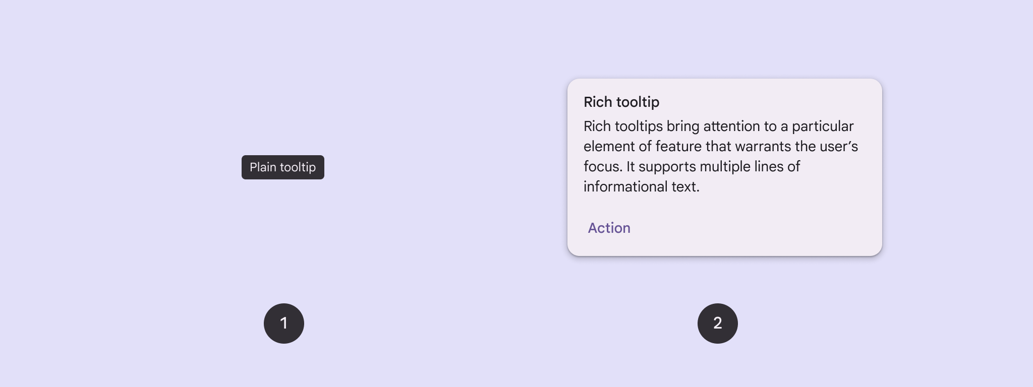
Sử dụng chú thích để thêm ngữ cảnh cho một nút hoặc thành phần khác trên giao diện người dùng.
Có hai loại chú thích:
Chú giải công cụ đơn giản: Mô tả các phần tử hoặc hành động của nút biểu tượng.
Chú thích đa dạng: Cung cấp thêm thông tin chi tiết, chẳng hạn như mô tả giá trị của một tính năng. Bạn cũng có thể thêm tiêu đề, đường liên kết và nút (không bắt buộc).
Hình 1. Chú giải công cụ đơn giản (1) và chú giải công cụ nhiều định dạng (2).
Nền tảng API
Bạn có thể dùng thành phần kết hợp TooltipBox để triển khai chú thích trong ứng dụng. Bạn có thể kiểm soát giao diện của TooltipBox bằng các tham số chính sau:
positionProvider: Đặt chú thích tương ứng với nội dung của phần tử liên kết. Thông thường, bạn sẽ sử dụng một trình cung cấp vị trí mặc định từ TooltipDefaults hoặc bạn có thể cung cấp trình cung cấp vị trí của riêng mình nếu cần logic định vị tuỳ chỉnh.
tooltip: Thành phần kết hợp chứa nội dung của chú thích. Thông thường, bạn sẽ dùng thành phần kết hợp PlainTooltip hoặc RichTooltip.
Sử dụng PlainTooltip để mô tả các phần tử hoặc hành động của nút biểu tượng.
Sử dụng RichTooltip để cung cấp thêm thông tin chi tiết, chẳng hạn như mô tả giá trị của một tính năng. Chú thích nhiều định dạng có thể bao gồm tiêu đề, đường liên kết và các nút (không bắt buộc).
state: Phần tử giữ trạng thái chứa logic giao diện người dùng và trạng thái phần tử cho chú thích này.
content: Nội dung có thể kết hợp mà chú thích được liên kết.
Hiển thị chú giải công cụ đơn giản
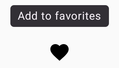
Sử dụng chú thích đơn giản để mô tả ngắn gọn một phần tử trên giao diện người dùng. Đoạn mã này hiển thị một chú thích đơn giản ở trên cùng của nút biểu tượng, được gắn nhãn "Thêm vào mục ưa thích":
@ComposablefunPlainTooltipExample(modifier:Modifier=Modifier,plainTooltipText:String="Add to favorites"){TooltipBox(modifier=modifier,positionProvider=TooltipDefaults.rememberPlainTooltipPositionProvider(),tooltip={PlainTooltip{Text(plainTooltipText)}},state=rememberTooltipState()){IconButton(onClick={/* Do something... */}){Icon(imageVector=Icons.Filled.Favorite,contentDescription="Add to favorites")}}}
IconButton tạo một nút có thể nhấp vào có biểu tượng.
Icon(...) hiển thị biểu tượng trái tim trong nút.
Khi người dùng tương tác với IconButton, TooltipBox sẽ hiển thị chú thích có văn bản "Thêm vào mục yêu thích". Tuỳ thuộc vào thiết bị, người dùng có thể kích hoạt chú thích theo những cách sau:
Di chuột lên biểu tượng
Nhấn và giữ biểu tượng trên thiết bị di động
Kết quả
Ví dụ này tạo ra một chú thích đơn giản ở trên cùng của biểu tượng:
Hình 2. Một chú giải công cụ đơn giản xuất hiện khi người dùng di chuột qua hoặc nhấn và giữ biểu tượng trái tim.
Hiển thị chú giải công cụ đa dạng
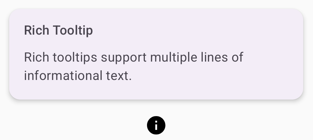
Sử dụng chú thích đa dạng thức để cung cấp thêm bối cảnh về một phần tử trên giao diện người dùng. Ví dụ này tạo một chú thích đa dòng có định dạng với tiêu đề được liên kết với một Icon:
@ComposablefunRichTooltipExample(modifier:Modifier=Modifier,richTooltipSubheadText:String="Rich Tooltip",richTooltipText:String="Rich tooltips support multiple lines of informational text."){TooltipBox(modifier=modifier,positionProvider=TooltipDefaults.rememberRichTooltipPositionProvider(),tooltip={RichTooltip(title={Text(richTooltipSubheadText)}){Text(richTooltipText)}},state=rememberTooltipState()){IconButton(onClick={/* Icon button's click event */}){Icon(imageVector=Icons.Filled.Info,contentDescription="Show more information")}}}
TooltipBox xử lý trình nghe sự kiện cho các hoạt động tương tác của người dùng và cập nhật TooltipState cho phù hợp. Khi TooltipState cho biết rằng chú giải công cụ sẽ xuất hiện, lambda chú giải công cụ sẽ thực thi và TooltipBox sẽ hiển thị RichTooltip. TooltipBox đóng vai trò là điểm neo và vùng chứa cho cả nội dung và chú thích.
Trong trường hợp này, nội dung là một thành phần IconButton, cung cấp hành vi thao tác có thể nhấn. Khi được nhấn và giữ (trên thiết bị cảm ứng) hoặc di chuột qua (như khi dùng con trỏ chuột) ở bất kỳ vị trí nào trong nội dung của TooltipBox, chú thích sẽ xuất hiện để cho biết thêm thông tin.
Ví dụ này tạo ra một chú thích mở rộng có tiêu đề được đính kèm vào biểu tượng thông tin:
Hình 3. Một chú thích nhiều định dạng có tiêu đề và biểu tượng thông tin.
Tuỳ chỉnh chú thích đa dạng thức
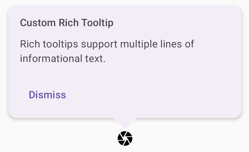
Đoạn mã này hiển thị một chú thích đa dạng thức có tiêu đề, các thao tác tuỳ chỉnh và một dấu mũ (mũi tên) tuỳ chỉnh xuất hiện ở trên cùng của nút biểu tượng máy ảnh:
@ComposablefunAdvancedRichTooltipExample(modifier:Modifier=Modifier,richTooltipSubheadText:String="Custom Rich Tooltip",richTooltipText:String="Rich tooltips support multiple lines of informational text.",richTooltipActionText:String="Dismiss"){valtooltipState=rememberTooltipState()valcoroutineScope=rememberCoroutineScope()TooltipBox(modifier=modifier,positionProvider=TooltipDefaults.rememberRichTooltipPositionProvider(),tooltip={RichTooltip(title={Text(richTooltipSubheadText)},action={Row{TextButton(onClick={coroutineScope.launch{tooltipState.dismiss()}}){Text(richTooltipActionText)}}},caretSize=DpSize(32.dp,16.dp)){Text(richTooltipText)}},state=tooltipState){IconButton(onClick={coroutineScope.launch{tooltipState.show()}}){Icon(imageVector=Icons.Filled.Camera,contentDescription="Open camera")}}}
RichToolTip hiển thị một chú thích có tiêu đề và thao tác đóng.
Khi được kích hoạt bằng cách nhấn và giữ hoặc di chuột lên nội dung ToolTipBox bằng con trỏ chuột, chú giải công cụ sẽ xuất hiện trong khoảng một giây.
Bạn có thể đóng chú thích này bằng cách nhấn vào một vị trí khác trên màn hình hoặc dùng nút hành động đóng.
Khi thao tác loại bỏ thực thi, hệ thống sẽ khởi chạy một coroutine để gọi tooltipState.dismiss. Điều này xác minh rằng quá trình thực thi thao tác không bị chặn trong khi chú giải công cụ hiển thị.
onClick = coroutineScope.launch { tooltipState.show() } } khởi chạy một coroutine để hiện chú thích theo cách thủ công bằng tooltipState.show.
Tham số action cho phép thêm các phần tử tương tác vào một chú thích, chẳng hạn như nút.
Tham số caretSize sửa đổi kích thước của mũi tên chú thích.
Kết quả
Ví dụ này tạo ra kết quả sau:
Hình 4. Một chú thích chi tiết tuỳ chỉnh có thao tác đóng được liên kết với biểu tượng camera.
Nội dung và mã mẫu trên trang này phải tuân thủ các giấy phép như mô tả trong phần Giấy phép nội dung. Java và OpenJDK là nhãn hiệu hoặc nhãn hiệu đã đăng ký của Oracle và/hoặc đơn vị liên kết của Oracle.
Cập nhật lần gần đây nhất: 2025-08-28 UTC.
[[["Dễ hiểu","easyToUnderstand","thumb-up"],["Giúp tôi giải quyết được vấn đề","solvedMyProblem","thumb-up"],["Khác","otherUp","thumb-up"]],[["Thiếu thông tin tôi cần","missingTheInformationINeed","thumb-down"],["Quá phức tạp/quá nhiều bước","tooComplicatedTooManySteps","thumb-down"],["Đã lỗi thời","outOfDate","thumb-down"],["Vấn đề về bản dịch","translationIssue","thumb-down"],["Vấn đề về mẫu/mã","samplesCodeIssue","thumb-down"],["Khác","otherDown","thumb-down"]],["Cập nhật lần gần đây nhất: 2025-08-28 UTC."],[],[],null,["Use [tooltips](https://m3.material.io/components/tooltips/overview) to add context to a button or other UI element.\nThere are two types of tooltips:\n\n- **Plain tooltips**: Describe elements or actions of icon buttons.\n- **Rich tooltips**: Provide more detail, such as describing the value of a feature. Can also include an optional title, link, and buttons.\n\n**Figure 1.** A plain tooltip (1) and a rich tooltip (2).\n\nAPI surface\n\nYou can use the [`TooltipBox`](/reference/kotlin/androidx/compose/material3/package-summary#TooltipBox(androidx.compose.ui.window.PopupPositionProvider,kotlin.Function1,androidx.compose.material3.TooltipState,androidx.compose.ui.Modifier,kotlin.Function0,kotlin.Boolean,kotlin.Boolean,kotlin.Function0)) composable to implement tooltips in your app.\nYou control [`TooltipBox`](/reference/kotlin/androidx/compose/material3/package-summary#TooltipBox(androidx.compose.ui.window.PopupPositionProvider,kotlin.Function1,androidx.compose.material3.TooltipState,androidx.compose.ui.Modifier,kotlin.Function0,kotlin.Boolean,kotlin.Boolean,kotlin.Function0)) appearance with these main parameters:\n\n- `positionProvider`: Places the tooltip relative to the anchor content. You typically use a default position provider from the `TooltipDefaults`, or you can provide your own if you need custom positioning logic.\n- `tooltip`: The composable that contains the tooltip's content. You typically use either the `PlainTooltip` or `RichTooltip` composables.\n - Use `PlainTooltip` to describe elements or actions of icon buttons.\n - Use `RichTooltip` to provide more details, like describing the value of a feature. Rich tooltips can include an optional title, link, and buttons.\n- `state`: The state holder that contains the UI logic and element state for this tooltip.\n- `content`: The composable content that the tooltip is anchored to.\n\nDisplay a plain tooltip\n\nUse a plain tooltip to briefly describe a UI element. This code snippet displays\na plain tooltip on top of an icon button, labeled \"Add to favorites\":\n\n\n```kotlin\n@Composable\nfun PlainTooltipExample(\n modifier: Modifier = Modifier,\n plainTooltipText: String = \"Add to favorites\"\n) {\n TooltipBox(\n modifier = modifier,\n positionProvider = TooltipDefaults.rememberPlainTooltipPositionProvider(),\n tooltip = {\n PlainTooltip { Text(plainTooltipText) }\n },\n state = rememberTooltipState()\n ) {\n IconButton(onClick = { /* Do something... */ }) {\n Icon(\n imageVector = Icons.Filled.Favorite,\n contentDescription = \"Add to favorites\"\n )\n }\n }\n}\nhttps://github.com/android/snippets/blob/dd30aee903e8c247786c064faab1a9ca8d10b46e/compose/snippets/src/main/java/com/example/compose/snippets/components/Tooltips.kt#L74-L95\n```\n\n\u003cbr /\u003e\n\nKey points about the code\n\n- `TooltipBox` generates a tooltip with the text \"Add to favorites\".\n - [`TooltipDefaults.rememberPlainTooltipPositionProvider()`](/reference/kotlin/androidx/compose/material3/TooltipDefaults?#rememberPlainTooltipPositionProvider(androidx.compose.ui.unit.Dp)) provides default positioning for plain tooltips.\n - `tooltip` is a lambda function that defines the tooltip's content using the [`PlainTooltip`](/reference/kotlin/androidx/compose/material3/TooltipScope#(androidx.compose.material3.TooltipScope).PlainTooltip(androidx.compose.ui.Modifier,androidx.compose.ui.unit.DpSize,androidx.compose.ui.unit.Dp,androidx.compose.ui.graphics.Shape,androidx.compose.ui.graphics.Color,androidx.compose.ui.graphics.Color,androidx.compose.ui.unit.Dp,androidx.compose.ui.unit.Dp,kotlin.Function0)) composable.\n - `Text(plainTooltipText)` displays the text within the tooltip.\n - [`tooltipState`](/reference/kotlin/androidx/compose/material3/TooltipState) controls the state of the tooltip.\n- `IconButton` creates a clickable button with an icon.\n - `Icon(...)` displays a heart icon within the button.\n - When a user interacts with the `IconButton`, `TooltipBox` shows the tooltip with the text \"Add to favorites\". Depending on the device, users can trigger the tooltip in the following ways:\n - Hovering over the icon with a cursor\n - Long-pressing the icon on a mobile device\n\nResult\n\nThis example produces a plain tooltip on top of an icon:\n**Figure 2.**A plain tooltip that appears when a user hovers over or long-presses the heart icon.\n\nDisplay a rich tooltip\n\nUse a rich tooltip to provide additional context about a UI element. This\nexample creates a multi-line rich tooltip with a title that is anchored to an\n`Icon`:\n\n\n```kotlin\n@Composable\nfun RichTooltipExample(\n modifier: Modifier = Modifier,\n richTooltipSubheadText: String = \"Rich Tooltip\",\n richTooltipText: String = \"Rich tooltips support multiple lines of informational text.\"\n) {\n TooltipBox(\n modifier = modifier,\n positionProvider = TooltipDefaults.rememberRichTooltipPositionProvider(),\n tooltip = {\n RichTooltip(\n title = { Text(richTooltipSubheadText) }\n ) {\n Text(richTooltipText)\n }\n },\n state = rememberTooltipState()\n ) {\n IconButton(onClick = { /* Icon button's click event */ }) {\n Icon(\n imageVector = Icons.Filled.Info,\n contentDescription = \"Show more information\"\n )\n }\n }\n}https://github.com/android/snippets/blob/dd30aee903e8c247786c064faab1a9ca8d10b46e/compose/snippets/src/main/java/com/example/compose/snippets/components/Tooltips.kt#L106-L131\n```\n\n\u003cbr /\u003e\n\nKey points about the code\n\n- `TooltipBox` handles the event listeners for user interactions and updates `TooltipState` accordingly. When `TooltipState` indicates that the tooltip should be shown, the tooltip lambda executes, and `TooltipBox` displays the `RichTooltip`. The `TooltipBox` acts as the anchor and container for both content and the tooltip.\n - In this case, the content is an `IconButton` component, which provides the tappable action behavior. When long-pressed (on touch devices) or hovered over (as with the mouse pointer) anywhere in `TooltipBox`'s content, the tooltip will display to show more information.\n- The `RichTooltip` composable defines the tooltip's content, including the title and body text. [`TooltipDefaults.rememberRichTooltipPositionProvider()`](/reference/kotlin/androidx/compose/material3/TooltipDefaults?#rememberRichTooltipPositionProvider(androidx.compose.ui.unit.Dp)) provides positioning information for rich tooltips.\n\nResult\n\nThis example produces a rich tooltip with a title attached to an information\nicon:\n**Figure 3.**A rich tooltip with a title and an information icon.\n\nCustomize a rich tooltip\n\nThis code snippet displays a rich tooltip with a title, custom actions, and a\ncustom caret (arrow) displayed on top of a camera icon button:\n\n\n```kotlin\n@Composable\nfun AdvancedRichTooltipExample(\n modifier: Modifier = Modifier,\n richTooltipSubheadText: String = \"Custom Rich Tooltip\",\n richTooltipText: String = \"Rich tooltips support multiple lines of informational text.\",\n richTooltipActionText: String = \"Dismiss\"\n) {\n val tooltipState = rememberTooltipState()\n val coroutineScope = rememberCoroutineScope()\n\n TooltipBox(\n modifier = modifier,\n positionProvider = TooltipDefaults.rememberRichTooltipPositionProvider(),\n tooltip = {\n RichTooltip(\n title = { Text(richTooltipSubheadText) },\n action = {\n Row {\n TextButton(onClick = {\n coroutineScope.launch {\n tooltipState.dismiss()\n }\n }) {\n Text(richTooltipActionText)\n }\n }\n },\n caretSize = DpSize(32.dp, 16.dp)\n ) {\n Text(richTooltipText)\n }\n },\n state = tooltipState\n ) {\n IconButton(onClick = {\n coroutineScope.launch {\n tooltipState.show()\n }\n }) {\n Icon(\n imageVector = Icons.Filled.Camera,\n contentDescription = \"Open camera\"\n )\n }\n }\n}https://github.com/android/snippets/blob/dd30aee903e8c247786c064faab1a9ca8d10b46e/compose/snippets/src/main/java/com/example/compose/snippets/components/Tooltips.kt#L142-L187\n```\n\n\u003cbr /\u003e\n\nKey points about the code\n\n- A `RichToolTip` displays a tooltip with a title and dismiss action.\n- When activated, either by a long-press or hovering over the `ToolTipBox` content with the mouse pointer, the tooltip is displayed for about one second. You can dismiss this tooltip by either tapping elsewhere on the screen or using the dismiss action button.\n- When the dismiss action executes, the system launches a coroutine to call `tooltipState.dismiss`. This verifies the action execution isn't blocked while the tooltip is displayed.\n- `onClick = coroutineScope.launch { tooltipState.show() } }` launches a coroutine to manually show the tooltip using `tooltipState.show`.\n- The `action` parameter allows for the adding of interactive elements to a tooltip, such as a button.\n- The `caretSize` parameter modifies the size of the tooltip's arrow.\n\nResult\n\nThis example produces the following:\n**Figure 4.** A custom rich tooltip with a dismiss action anchored to a camera icon.\n\nAdditional resources\n\n- Material Design: [Tooltips](https://m3.material.io/components/tooltips/overview)"]]