
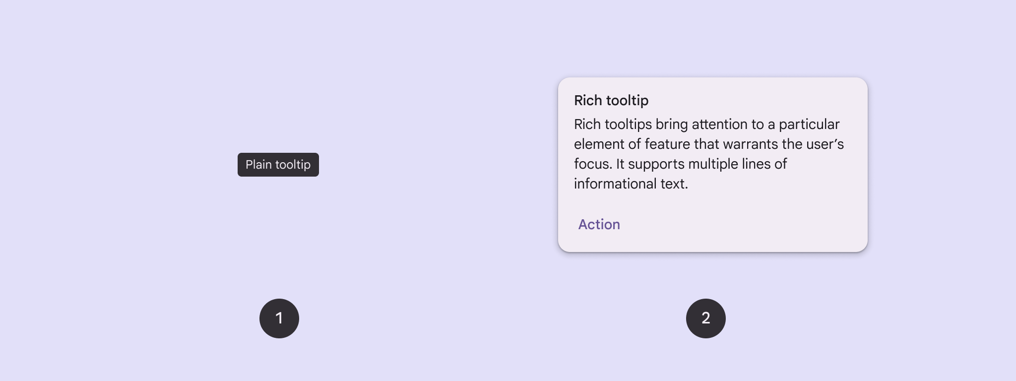
אפשר להשתמש בהסברים קצרים כדי להוסיף הקשר ללחצן או לרכיב אחר בממשק המשתמש. יש שני סוגים של תיאורי כלים:
- הסברים קצרים: תיאור של אלמנטים או פעולות של לחצני סמלים.
- תגי מידע עשירים: מספקים פרטים נוספים, כמו תיאור של הערך של תכונה. אפשר גם לכלול כותרת, קישור ולחצנים (אופציונלי).
פלטפורמת ה-API
אפשר להשתמש ב-composable TooltipBox כדי להטמיע תיאורי כלים באפליקציה.
אתם שולטים במראה של TooltipBox באמצעות הפרמטרים הראשיים האלה:
-
positionProvider: מיקום ה-tooltip ביחס לתוכן העוגן. בדרך כלל משתמשים בספק מיקום שמוגדר כברירת מחדל מתוךTooltipDefaults, או שאפשר לספק ספק משלכם אם אתם צריכים לוגיקת מיקום מותאמת אישית. -
tooltip: רכיב ה-Composable שמכיל את התוכן של תיאור הכלי. בדרך כלל משתמשים ב-PlainTooltipאו ב-RichTooltip.- משתמשים ב-
PlainTooltipכדי לתאר אלמנטים או פעולות של לחצני סמלים. - אפשר להשתמש ב-
RichTooltipכדי לספק פרטים נוספים, למשל תיאור של הערך של תכונה. תיבות מידע מתקדמות יכולות לכלול כותרת, קישור ולחצנים אופציונליים.
- משתמשים ב-
-
state: מחזיק המצב שמכיל את הלוגיקה של ממשק המשתמש ואת מצב הרכיב של תיאור הכלי הזה. -
content: התוכן שאליו מוצמד ה-tooltip.
הצגת הסבר קצר פשוט
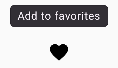
משתמשים בתיאור קצר ופשוט כדי לתאר רכיב בממשק המשתמש. קטע הקוד הזה מציג הסבר קצר פשוט מעל לחצן עם סמל, שנקרא 'הוספה למועדפים':
@Composable fun PlainTooltipExample( modifier: Modifier = Modifier, plainTooltipText: String = "Add to favorites" ) { TooltipBox( modifier = modifier, positionProvider = TooltipDefaults.rememberPlainTooltipPositionProvider(), tooltip = { PlainTooltip { Text(plainTooltipText) } }, state = rememberTooltipState() ) { IconButton(onClick = { /* Do something... */ }) { Icon( imageVector = Icons.Filled.Favorite, contentDescription = "Add to favorites" ) } } }
מידע חשוב על הקוד
-
TooltipBoxיוצרת תיאור קצר עם הטקסט 'הוספה למועדפים'.-
TooltipDefaults.rememberPlainTooltipPositionProvider()מספק מיקום ברירת מחדל לתיאורי כלים פשוטים. -
tooltipהיא פונקציית למדה שמגדירה את התוכן של תיאור הכלי באמצעות הקומפוזבלPlainTooltip. Text(plainTooltipText)מציג את הטקסט בתיבת הטיפ.tooltipStateקובעת את מצב הכלי לטיפים.
-
-
IconButtonיוצר לחצן שאפשר ללחוץ עליו עם סמל.-
Icon(...)מציג סמל של לב בתוך הכפתור. - כשמשתמש מקיים אינטראקציה עם
IconButton, מוצג בTooltipBoxתיאור הכלי עם הטקסט 'הוספה למועדפים'. בהתאם למכשיר, המשתמשים יכולים להפעיל את תיאור הכלים בדרכים הבאות: - העברת הסמן מעל הסמל
- לחיצה ארוכה על הסמל במכשיר נייד
-
התוצאה
בדוגמה הזו נוצר תיאור קצר ופשוט שמופיע מעל סמל:
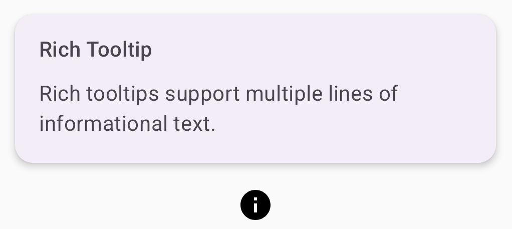
הצגת הסבר קצר עשיר
משתמשים בתיבת מידע עשירה כדי לספק הקשר נוסף לגבי רכיב בממשק המשתמש. בדוגמה הזו נוצר תיאור כלים עשיר עם כמה שורות וכותרת, שמעוגן ל-Icon:
@Composable fun RichTooltipExample( modifier: Modifier = Modifier, richTooltipSubheadText: String = "Rich Tooltip", richTooltipText: String = "Rich tooltips support multiple lines of informational text." ) { TooltipBox( modifier = modifier, positionProvider = TooltipDefaults.rememberRichTooltipPositionProvider(), tooltip = { RichTooltip( title = { Text(richTooltipSubheadText) } ) { Text(richTooltipText) } }, state = rememberTooltipState() ) { IconButton(onClick = { /* Icon button's click event */ }) { Icon( imageVector = Icons.Filled.Info, contentDescription = "Show more information" ) } } }
מידע חשוב על הקוד
-
TooltipBoxמטפל ב-event listeners של אינטראקציות עם המשתמשים ומעדכן אתTooltipStateבהתאם. כש-TooltipStateמציין שצריך להציג את ההסבר הקצר, מתבצעת ההוראה למדה של ההסבר הקצר, ו-TooltipBoxמציג אתRichTooltip. התגTooltipBoxמשמש כעוגן וכקונטיינר גם לתוכן וגם לתיבת הטיפים.- במקרה הזה, התוכן הוא רכיב
IconButton, שמספק את התנהגות הפעולה שאפשר להקיש עליה. כשלוחצים לחיצה ארוכה (במכשירי מגע) או מעבירים את העכבר מעל (כמו עם מצביע העכבר) בכל מקום בתוכן שלTooltipBox, יוצג הסבר קצר עם מידע נוסף.
- במקרה הזה, התוכן הוא רכיב
- רכיב ה-Composable
RichTooltipמגדיר את התוכן של תיאור הכלי, כולל הכותרת וגוף הטקסט. TooltipDefaults.rememberRichTooltipPositionProvider()מספק מידע על המיקום של תיאורי הכלים העשירים.
התוצאה
בדוגמה הזו נוצרת תיבת מידע עשירה עם שם שמוצמד לסמל מידע:
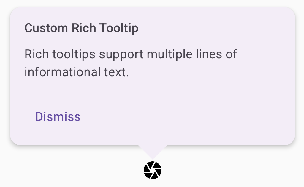
התאמה אישית של הסבר קצר עם טקסט עשיר
קטע הקוד הזה מציג תיאור כלי עשיר עם כותרת, פעולות מותאמות אישית וסמן מותאם אישית (חץ) שמוצג מעל לחצן עם סמל של מצלמה:
@Composable fun AdvancedRichTooltipExample( modifier: Modifier = Modifier, richTooltipSubheadText: String = "Custom Rich Tooltip", richTooltipText: String = "Rich tooltips support multiple lines of informational text.", richTooltipActionText: String = "Dismiss" ) { val tooltipState = rememberTooltipState() val coroutineScope = rememberCoroutineScope() TooltipBox( modifier = modifier, positionProvider = TooltipDefaults.rememberRichTooltipPositionProvider(), tooltip = { RichTooltip( title = { Text(richTooltipSubheadText) }, action = { Row { TextButton(onClick = { coroutineScope.launch { tooltipState.dismiss() } }) { Text(richTooltipActionText) } } }, ) { Text(richTooltipText) } }, state = tooltipState ) { IconButton(onClick = { coroutineScope.launch { tooltipState.show() } }) { Icon( imageVector = Icons.Filled.Camera, contentDescription = "Open camera" ) } } }
מידע חשוב על הקוד
RichToolTipמוצג טולטיפ עם כותרת ופעולת סגירה.- כשהתכונה מופעלת, בלחיצה ארוכה או בהעברת סמן העכבר מעל התוכן
ToolTipBoxמוצג הסבר קצר למשך שנייה אחת. כדי לסגור את בועת העזרה הזו, אפשר להקיש במקום אחר במסך או להשתמש בלחצן הפעולה לסגירה. - כשפעולת ההתעלמות מופעלת, המערכת מפעילה קורוטינה כדי לקרוא ל-
tooltipState.dismiss. כך מוודאים שביצוע הפעולה לא נחסם בזמן שההסבר הקצר מוצג. -
onClick = coroutineScope.launch { tooltipState.show() } }מפעיל קורוטינה כדי להציג את תיאור הכלי באופן ידני באמצעותtooltipState.show. - הפרמטר
actionמאפשר להוסיף רכיבים אינטראקטיביים לתיבת טיפ, כמו לחצן. - הפרמטר
caretSizeמשנה את גודל החץ של תיאור הכלים.
התוצאה
הדוגמה הזו יוצרת את הפלט הבא:
מקורות מידע נוספים
- Material Design: Tooltips