
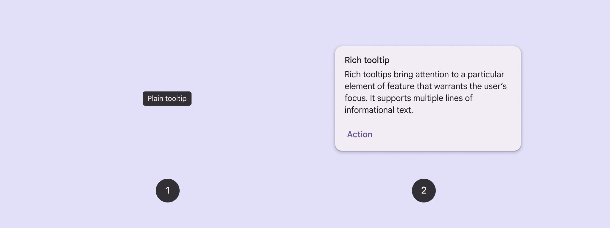
از tooltip ها برای اضافه کردن متن به یک دکمه یا عنصر رابط کاربری دیگر استفاده کنید. دو نوع tooltip وجود دارد:
- نکات راهنمای ساده : عناصر یا عملکردهای دکمههای آیکون را شرح دهید.
- نکات راهنمای غنی : جزئیات بیشتری مانند توصیف ارزش یک ویژگی ارائه میدهد. همچنین میتواند شامل عنوان، لینک و دکمههای اختیاری باشد.
سطح API
شما میتوانید از TooltipBox composable برای پیادهسازی tooltipها در برنامه خود استفاده کنید. شما میتوانید ظاهر TooltipBox را با این پارامترهای اصلی کنترل کنید:
-
positionProvider: ابزارک را نسبت به محتوای لنگر قرار میدهد. شما معمولاً از یک ارائهدهنده موقعیت پیشفرض ازTooltipDefaultsاستفاده میکنید، یا در صورت نیاز به منطق موقعیتیابی سفارشی، میتوانید مورد دلخواه خود را ارائه دهید. -
tooltip: ترکیبی که شامل محتوای tooltip است. معمولاً از ترکیبهایPlainTooltipیاRichTooltipاستفاده میکنید.- از
PlainTooltipبرای توصیف عناصر یا عملکردهای دکمههای آیکون استفاده کنید. - از
RichTooltipبرای ارائه جزئیات بیشتر، مانند توصیف مقدار یک ویژگی، استفاده کنید. RichTooltipها میتوانند شامل عنوان، لینک و دکمههای اختیاری باشند.
- از
-
state: نگهدارندهی حالتی که شامل منطق رابط کاربری و حالت عنصر برای این tooltip است. -
content: محتوای قابل ترکیبی که tooltip به آن متصل شده است.
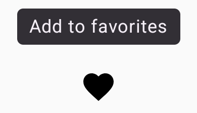
نمایش یک راهنمای ابزار ساده
از یک راهنمای ابزار ساده برای توصیف مختصر یک عنصر رابط کاربری استفاده کنید. این قطعه کد یک راهنمای ابزار ساده را در بالای یک دکمه آیکون با برچسب "افزودن به موارد دلخواه" نمایش میدهد:
@Composable fun PlainTooltipExample( modifier: Modifier = Modifier, plainTooltipText: String = "Add to favorites" ) { TooltipBox( modifier = modifier, positionProvider = TooltipDefaults.rememberPlainTooltipPositionProvider(), tooltip = { PlainTooltip { Text(plainTooltipText) } }, state = rememberTooltipState() ) { IconButton(onClick = { /* Do something... */ }) { Icon( imageVector = Icons.Filled.Favorite, contentDescription = "Add to favorites" ) } } }
نکات کلیدی در مورد کد
-
TooltipBoxیک tooltip با متن "افزودن به علاقهمندیها" تولید میکند.-
TooltipDefaults.rememberPlainTooltipPositionProvider()موقعیت پیشفرض را برای tooltipهای ساده فراهم میکند. -
tooltipیک تابع لامبدا است که محتوای tooltip را با استفاده ازPlainTooltipcomposable تعریف میکند. -
Text(plainTooltipText)متن درون tooltip را نمایش میدهد. -
tooltipStateوضعیت tooltip را کنترل میکند.
-
-
IconButtonیک دکمه قابل کلیک با یک آیکون ایجاد میکند.-
Icon(...)یک آیکون قلب را درون دکمه نمایش میدهد. - وقتی کاربر با
IconButtonتعامل میکند،TooltipBoxتولتیپ را با متن "افزودن به علاقهمندیها" نشان میدهد. بسته به دستگاه، کاربران میتوانند تولتیپ را به روشهای زیر فعال کنند: - قرار دادن نشانگر ماوس روی آیکون
- فشار دادن طولانی مدت آیکون در دستگاه تلفن همراه
-
نتیجه
این مثال یک tooltip ساده روی یک آیکون تولید میکند:
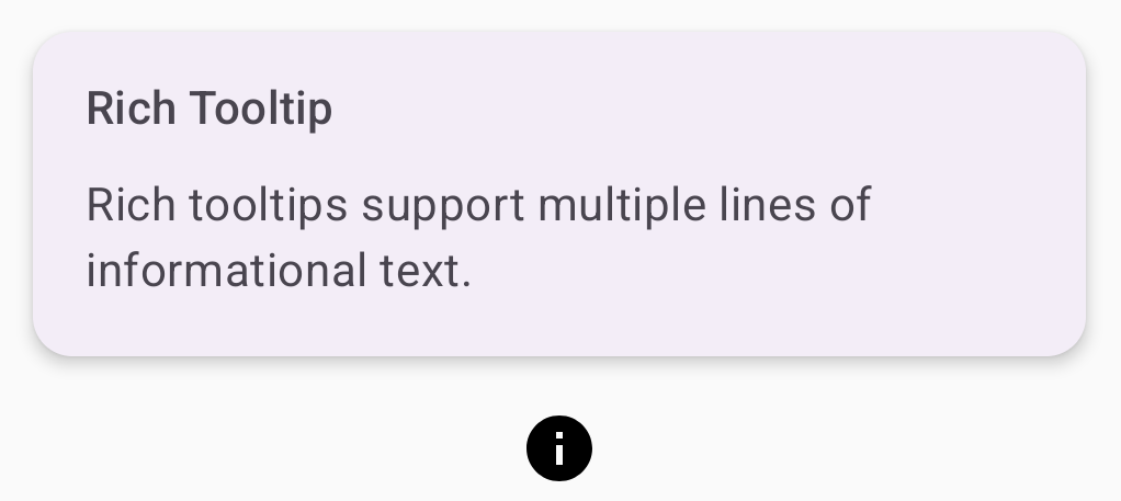
نمایش یک راهنمای ابزار غنی
از یک راهنمای ابزار غنی برای ارائه اطلاعات بیشتر در مورد یک عنصر رابط کاربری استفاده کنید. این مثال یک راهنمای ابزار غنی چند خطی با عنوانی که به یک Icon متصل است، ایجاد میکند:
@Composable fun RichTooltipExample( modifier: Modifier = Modifier, richTooltipSubheadText: String = "Rich Tooltip", richTooltipText: String = "Rich tooltips support multiple lines of informational text." ) { TooltipBox( modifier = modifier, positionProvider = TooltipDefaults.rememberRichTooltipPositionProvider(), tooltip = { RichTooltip( title = { Text(richTooltipSubheadText) } ) { Text(richTooltipText) } }, state = rememberTooltipState() ) { IconButton(onClick = { /* Icon button's click event */ }) { Icon( imageVector = Icons.Filled.Info, contentDescription = "Show more information" ) } } }
نکات کلیدی در مورد کد
-
TooltipBoxشنوندههای رویداد را برای تعاملات کاربر مدیریت میکند وTooltipStateرا بر اساس آن بهروزرسانی میکند. وقتیTooltipStateاعلام میکند که tooltip باید نمایش داده شود، لامبدا tooltip اجرا میشود وTooltipBoxRichTooltipرا نمایش میدهد.TooltipBoxبه عنوان لنگر و ظرف برای محتوا و tooltip عمل میکند.- در این حالت، محتوا یک کامپوننت
IconButtonاست که رفتار عملی قابل لمس را فراهم میکند. وقتی روی هر جایی از محتوایTooltipBoxبه مدت طولانی فشار داده شود (در دستگاههای لمسی) یا ماوس روی آن قرار گیرد (مانند اشارهگر ماوس)، tooltip برای نمایش اطلاعات بیشتر نمایش داده میشود.
- در این حالت، محتوا یک کامپوننت
- تابع
RichTooltipمحتوای tooltip، شامل عنوان و متن بدنه را تعریف میکند.TooltipDefaults.rememberRichTooltipPositionProvider()اطلاعات موقعیتیابی را برای tooltipهای غنی فراهم میکند.
نتیجه
این مثال یک راهنمای ابزار غنی با عنوانی متصل به یک آیکون اطلاعات تولید میکند:
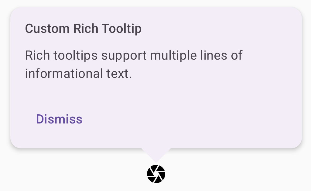
یک راهنمای ابزار غنی را سفارشی کنید
این قطعه کد یک راهنمای ابزار غنی با عنوان، اقدامات سفارشی و یک هشتک (فلش) سفارشی را که در بالای دکمه نماد دوربین نمایش داده میشود، نمایش میدهد:
@Composable fun AdvancedRichTooltipExample( modifier: Modifier = Modifier, richTooltipSubheadText: String = "Custom Rich Tooltip", richTooltipText: String = "Rich tooltips support multiple lines of informational text.", richTooltipActionText: String = "Dismiss" ) { val tooltipState = rememberTooltipState() val coroutineScope = rememberCoroutineScope() TooltipBox( modifier = modifier, positionProvider = TooltipDefaults.rememberRichTooltipPositionProvider(), tooltip = { RichTooltip( title = { Text(richTooltipSubheadText) }, action = { Row { TextButton(onClick = { coroutineScope.launch { tooltipState.dismiss() } }) { Text(richTooltipActionText) } } }, ) { Text(richTooltipText) } }, state = tooltipState ) { IconButton(onClick = { coroutineScope.launch { tooltipState.show() } }) { Icon( imageVector = Icons.Filled.Camera, contentDescription = "Open camera" ) } } }
نکات کلیدی در مورد کد
- یک
RichToolTipیک tooltip با عنوان و عملکرد رد کردن نمایش میدهد. - وقتی این گزینه فعال میشود، چه با نگه داشتن طولانی مدت انگشت روی
ToolTipBoxو چه با نگه داشتن ماوس روی محتوای آن، حدود یک ثانیه نمایش داده میشود. میتوانید با ضربه زدن روی هر جای دیگری از صفحه یا استفاده از دکمهی رد کردن، این ابزار را غیرفعال کنید. - وقتی اکشن dismiss اجرا میشود، سیستم یک coroutine برای فراخوانی
tooltipState.dismissاجرا میکند. این کار تأیید میکند که اجرای اکشن در حین نمایش tooltip مسدود نشده باشد. -
onClick = coroutineScope.launch { tooltipState.show() } }یک کوروتین را برای نمایش دستی tooltip با استفاده ازtooltipState.showاجرا میکند. - پارامتر
actionامکان اضافه کردن عناصر تعاملی به یک tooltip، مانند یک دکمه، را فراهم میکند. - پارامتر
caretSizeاندازه فلش tooltip را تغییر میدهد.
نتیجه
این مثال موارد زیر را تولید میکند:
منابع اضافی
- طراحی متریال: نکات راهنما