Sử dụng bộ sưu tập để sắp xếp ngăn nắp các trang
Lưu và phân loại nội dung dựa trên lựa chọn ưu tiên của bạn.
Bộ chọn thời gian thường xuất hiện trong các hộp thoại. Bạn có thể sử dụng một phương thức triển khai tương đối chung chung và tối thiểu của hộp thoại, hoặc bạn có thể triển khai một hộp thoại tuỳ chỉnh linh hoạt hơn.
Để biết thêm thông tin về hộp thoại nói chung, bao gồm cả cách sử dụng trạng thái bộ chọn thời gian, hãy xem Hướng dẫn về bộ chọn thời gian.
Ví dụ cơ bản
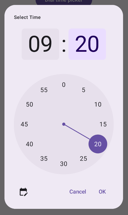
Cách đơn giản nhất để tạo hộp thoại cho bộ chọn thời gian là tạo một thành phần kết hợp triển khai AlertDialog. Đoạn mã sau đây cung cấp ví dụ về một hộp thoại tương đối tối giản bằng cách sử dụng phương pháp này:
Thành phần kết hợp DialWithDialogExample bao bọc TimePicker trong một hộp thoại.
TimePickerDialog là một thành phần kết hợp tuỳ chỉnh tạo ra một AlertDialog với các tham số sau:
onDismiss: Một hàm được gọi khi người dùng đóng hộp thoại (thông qua nút đóng hoặc thao tác quay lại).
onConfirm: Một hàm được gọi khi người dùng nhấp vào nút "OK".
content: Một thành phần kết hợp hiển thị bộ chọn giờ trong hộp thoại.
AlertDialog bao gồm:
Một nút đóng có nhãn "Đóng".
Một nút xác nhận có nhãn "OK".
Nội dung của bộ chọn thời gian được truyền dưới dạng tham số text.
DialWithDialogExample khởi tạo TimePickerState bằng thời gian hiện tại và truyền nó vào cả hàm TimePicker và onConfirm.
Hình 1. Bộ chọn giờ trong AlertDialog.
Ví dụ nâng cao
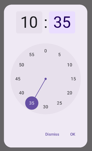
Đoạn mã này minh hoạ một cách triển khai nâng cao của hộp thoại bộ chọn thời gian có thể tuỳ chỉnh trong Jetpack Compose.
@ComposablefunAdvancedTimePickerExample(onConfirm:(TimePickerState)->Unit,onDismiss:()->Unit,){valcurrentTime=Calendar.getInstance()valtimePickerState=rememberTimePickerState(initialHour=currentTime.get(Calendar.HOUR_OF_DAY),initialMinute=currentTime.get(Calendar.MINUTE),is24Hour=true,)/** Determines whether the time picker is dial or input */varshowDialbyremember{mutableStateOf(true)}/** The icon used for the icon button that switches from dial to input */valtoggleIcon=if(showDial){Icons.Filled.EditCalendar}else{Icons.Filled.AccessTime}AdvancedTimePickerDialog(onDismiss={onDismiss()},onConfirm={onConfirm(timePickerState)},toggle={IconButton(onClick={showDial=!showDial}){Icon(imageVector=toggleIcon,contentDescription="Time picker type toggle",)}},){if(showDial){TimePicker(state=timePickerState,)}else{TimeInput(state=timePickerState,)}}}@ComposablefunAdvancedTimePickerDialog(title:String="Select Time",onDismiss:()->Unit,onConfirm:()->Unit,toggle:@Composable()->Unit={},content:@Composable()->Unit,){Dialog(onDismissRequest=onDismiss,properties=DialogProperties(usePlatformDefaultWidth=false),){Surface(shape=MaterialTheme.shapes.extraLarge,tonalElevation=6.dp,modifier=Modifier.width(IntrinsicSize.Min).height(IntrinsicSize.Min).background(shape=MaterialTheme.shapes.extraLarge,color=MaterialTheme.colorScheme.surface),){Column(modifier=Modifier.padding(24.dp),horizontalAlignment=Alignment.CenterHorizontally){Text(modifier=Modifier.fillMaxWidth().padding(bottom=20.dp),text=title,style=MaterialTheme.typography.labelMedium)content()Row(modifier=Modifier.height(40.dp).fillMaxWidth()){toggle()Spacer(modifier=Modifier.weight(1f))TextButton(onClick=onDismiss){Text("Cancel")}TextButton(onClick=onConfirm){Text("OK")}}}}}}
Thành phần kết hợp AdvancedTimePickerExample tạo một hộp thoại bộ chọn thời gian có thể tuỳ chỉnh.
Thành phần này sử dụng thành phần kết hợp Dialog để linh hoạt hơn so với AlertDialog.
Hộp thoại này có tiêu đề có thể tuỳ chỉnh và một nút bật/tắt để chuyển đổi giữa chế độ quay số và chế độ nhập.
Surface áp dụng hình dạng và độ cao cho hộp thoại, với IntrinsicSize.Min cho cả chiều rộng và chiều cao.
Bố cục Column và Row cung cấp các thành phần cấu trúc của hộp thoại.
Ví dụ này theo dõi chế độ bộ chọn bằng showDial.
IconButton sẽ chuyển đổi giữa các chế độ và cập nhật biểu tượng cho phù hợp.
Nội dung hộp thoại chuyển đổi giữa TimePicker và TimeInput dựa trên trạng thái showDial.
Việc triển khai nâng cao này cung cấp một hộp thoại bộ chọn thời gian có khả năng tuỳ chỉnh cao và có thể dùng lại, đồng thời có thể thích ứng với nhiều trường hợp sử dụng trong ứng dụng của bạn.
Nội dung và mã mẫu trên trang này phải tuân thủ các giấy phép như mô tả trong phần Giấy phép nội dung. Java và OpenJDK là nhãn hiệu hoặc nhãn hiệu đã đăng ký của Oracle và/hoặc đơn vị liên kết của Oracle.
Cập nhật lần gần đây nhất: 2025-08-28 UTC.
[[["Dễ hiểu","easyToUnderstand","thumb-up"],["Giúp tôi giải quyết được vấn đề","solvedMyProblem","thumb-up"],["Khác","otherUp","thumb-up"]],[["Thiếu thông tin tôi cần","missingTheInformationINeed","thumb-down"],["Quá phức tạp/quá nhiều bước","tooComplicatedTooManySteps","thumb-down"],["Đã lỗi thời","outOfDate","thumb-down"],["Vấn đề về bản dịch","translationIssue","thumb-down"],["Vấn đề về mẫu/mã","samplesCodeIssue","thumb-down"],["Khác","otherDown","thumb-down"]],["Cập nhật lần gần đây nhất: 2025-08-28 UTC."],[],[],null,["[Time pickers](/develop/ui/compose/components/time-pickers) often appear in dialogs. You can use a relatively generic and\nminimal implementation of a dialog, or you can implement a custom dialog with\nmore flexibility.\n\nFor more information on dialogs in general, including how to use the time picker\nstate, see the [Time pickers guide](/develop/ui/compose/components/time-pickers).\n\nBasic example\n\nThe most straightforward way to create a dialog for your time picker is to\ncreate a composable that implements [`AlertDialog`](/reference/kotlin/androidx/compose/material3/package-summary#AlertDialog(kotlin.Function0,kotlin.Function0,androidx.compose.ui.Modifier,kotlin.Function0,kotlin.Function0,kotlin.Function0,kotlin.Function0,androidx.compose.ui.graphics.Shape,androidx.compose.ui.graphics.Color,androidx.compose.ui.graphics.Color,androidx.compose.ui.graphics.Color,androidx.compose.ui.graphics.Color,androidx.compose.ui.unit.Dp,androidx.compose.ui.window.DialogProperties)). The following snippet\nprovides an example of a relatively minimal dialog using this approach:\n\n\n```kotlin\n@Composable\nfun DialWithDialogExample(\n onConfirm: (TimePickerState) -\u003e Unit,\n onDismiss: () -\u003e Unit,\n) {\n val currentTime = Calendar.getInstance()\n\n val timePickerState = rememberTimePickerState(\n initialHour = currentTime.get(Calendar.HOUR_OF_DAY),\n initialMinute = currentTime.get(Calendar.MINUTE),\n is24Hour = true,\n )\n\n TimePickerDialog(\n onDismiss = { onDismiss() },\n onConfirm = { onConfirm(timePickerState) }\n ) {\n TimePicker(\n state = timePickerState,\n )\n }\n}\n\n@Composable\nfun TimePickerDialog(\n onDismiss: () -\u003e Unit,\n onConfirm: () -\u003e Unit,\n content: @Composable () -\u003e Unit\n) {\n AlertDialog(\n onDismissRequest = onDismiss,\n dismissButton = {\n TextButton(onClick = { onDismiss() }) {\n Text(\"Dismiss\")\n }\n },\n confirmButton = {\n TextButton(onClick = { onConfirm() }) {\n Text(\"OK\")\n }\n },\n text = { content() }\n )\n}https://github.com/android/snippets/blob/7a0ebbee11495f628cf9d574f6b6069c2867232a/compose/snippets/src/main/java/com/example/compose/snippets/components/TimePickers.kt#L294-L337\n```\n\n\u003cbr /\u003e\n\nNote the key points in this snippet:\n\n1. The `DialWithDialogExample` composable wraps [`TimePicker`](/develop/ui/compose/components/time-pickers) in a dialog.\n2. `TimePickerDialog` is a custom composable that creates an `AlertDialog` with the following parameters:\n - `onDismiss`: A function called when the user dismisses the dialog (via the dismiss button or navigation back).\n - `onConfirm`: A function called when the user clicks the \"OK\" button.\n - `content`: A composable that displays the time picker within the dialog.\n3. The `AlertDialog` includes:\n - A dismiss button labeled \"Dismiss\".\n - A confirm button labeled \"OK\".\n - The time picker content passed as the `text` parameter.\n4. The `DialWithDialogExample` initializes the `TimePickerState` with the current time and passes it to both the `TimePicker` and the `onConfirm` function.\n\n**Figure 1.** A time picker in an AlertDialog.\n\nAdvanced example\n\nThis snippet demonstrates an advanced implementation of a customizable time\npicker dialog in Jetpack Compose.\n\n\n```kotlin\n@Composable\nfun AdvancedTimePickerExample(\n onConfirm: (TimePickerState) -\u003e Unit,\n onDismiss: () -\u003e Unit,\n) {\n\n val currentTime = Calendar.getInstance()\n\n val timePickerState = rememberTimePickerState(\n initialHour = currentTime.get(Calendar.HOUR_OF_DAY),\n initialMinute = currentTime.get(Calendar.MINUTE),\n is24Hour = true,\n )\n\n /** Determines whether the time picker is dial or input */\n var showDial by remember { mutableStateOf(true) }\n\n /** The icon used for the icon button that switches from dial to input */\n val toggleIcon = if (showDial) {\n Icons.Filled.EditCalendar\n } else {\n Icons.Filled.AccessTime\n }\n\n AdvancedTimePickerDialog(\n onDismiss = { onDismiss() },\n onConfirm = { onConfirm(timePickerState) },\n toggle = {\n IconButton(onClick = { showDial = !showDial }) {\n Icon(\n imageVector = toggleIcon,\n contentDescription = \"Time picker type toggle\",\n )\n }\n },\n ) {\n if (showDial) {\n TimePicker(\n state = timePickerState,\n )\n } else {\n TimeInput(\n state = timePickerState,\n )\n }\n }\n}\n\n@Composable\nfun AdvancedTimePickerDialog(\n title: String = \"Select Time\",\n onDismiss: () -\u003e Unit,\n onConfirm: () -\u003e Unit,\n toggle: @Composable () -\u003e Unit = {},\n content: @Composable () -\u003e Unit,\n) {\n Dialog(\n onDismissRequest = onDismiss,\n properties = DialogProperties(usePlatformDefaultWidth = false),\n ) {\n Surface(\n shape = MaterialTheme.shapes.extraLarge,\n tonalElevation = 6.dp,\n modifier =\n Modifier\n .width(IntrinsicSize.Min)\n .height(IntrinsicSize.Min)\n .background(\n shape = MaterialTheme.shapes.extraLarge,\n color = MaterialTheme.colorScheme.surface\n ),\n ) {\n Column(\n modifier = Modifier.padding(24.dp),\n horizontalAlignment = Alignment.CenterHorizontally\n ) {\n Text(\n modifier = Modifier\n .fillMaxWidth()\n .padding(bottom = 20.dp),\n text = title,\n style = MaterialTheme.typography.labelMedium\n )\n content()\n Row(\n modifier = Modifier\n .height(40.dp)\n .fillMaxWidth()\n ) {\n toggle()\n Spacer(modifier = Modifier.weight(1f))\n TextButton(onClick = onDismiss) { Text(\"Cancel\") }\n TextButton(onClick = onConfirm) { Text(\"OK\") }\n }\n }\n }\n }\n}https://github.com/android/snippets/blob/7a0ebbee11495f628cf9d574f6b6069c2867232a/compose/snippets/src/main/java/com/example/compose/snippets/components/TimePickers.kt#L342-L439\n```\n\n\u003cbr /\u003e\n\nNote the key points in this snippet:\n\n1. The `AdvancedTimePickerExample` composable creates a customizable time picker dialog.\n2. It uses a [`Dialog`](/reference/kotlin/androidx/compose/ui/window/package-summary#Dialog(kotlin.Function0,androidx.compose.ui.window.DialogProperties,kotlin.Function0)) composable for more flexibility than `AlertDialog`.\n3. The dialog includes a customizable title and a toggle button to switch between dial and input modes.\n4. `Surface` applies shape and elevation to the dialog, with `IntrinsicSize.Min` for both width and height.\n5. `Column` and `Row` layout provide the dialog's structure components.\n6. The example tracks the picker mode using `showDial`.\n - An `IconButton` toggles between modes, updating the icon accordingly.\n - The dialog content switches between `TimePicker` and `TimeInput` based on the `showDial` state.\n\nThis advanced implementation provides a highly customizable and reusable time\npicker dialog that can adapt to different use cases in your app.\n\nThis implementation appears as follows:\n**Figure 2.** A time picker in a custom dialog.\n\nAdditional resources\n\n- [Time pickers guide](/develop/ui/compose/components/time-pickers)\n- [Material Design - Time Pickers](https://m3.material.io/components/time-pickers/overview)"]]