시간 선택 도구는 대화상자에 자주 표시됩니다. 비교적 일반적이고 최소한의 대화상자 구현을 사용하거나 더 많은 유연성을 갖춘 맞춤 대화상자를 구현할 수 있습니다.
시간 선택 도구 상태를 사용하는 방법을 비롯한 일반적인 대화상자에 관한 자세한 내용은 시간 선택 도구 가이드를 참고하세요.
기본 예시
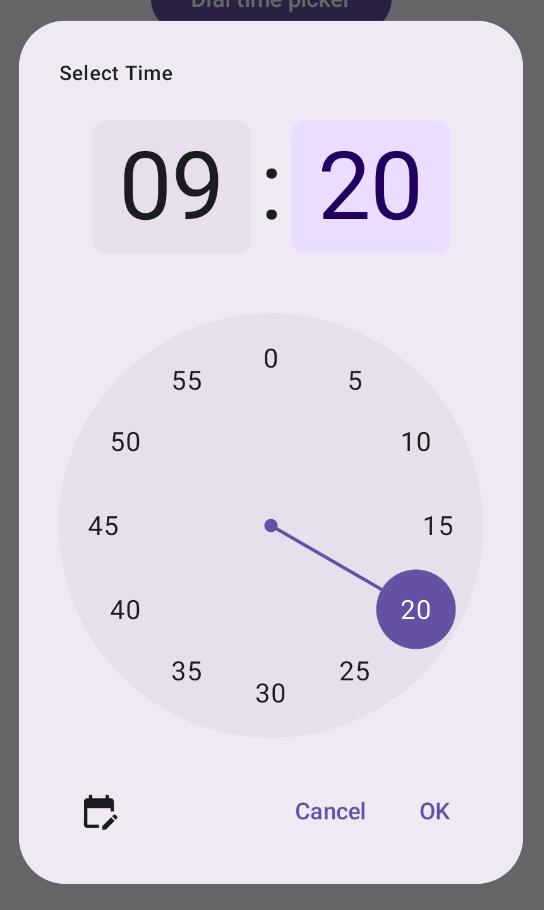
시간 선택 도구의 대화상자를 만드는 가장 간단한 방법은
AlertDialog를 구현하는 컴포저블을 만드는 것입니다. 다음 스니펫은 이 접근 방식을 사용하는 비교적 최소한의 대화상자의 예를 제공합니다.
@Composable fun DialWithDialogExample( onConfirm: (TimePickerState) -> Unit, onDismiss: () -> Unit, ) { val currentTime = Calendar.getInstance() val timePickerState = rememberTimePickerState( initialHour = currentTime.get(Calendar.HOUR_OF_DAY), initialMinute = currentTime.get(Calendar.MINUTE), is24Hour = true, ) TimePickerDialog( onDismiss = { onDismiss() }, onConfirm = { onConfirm(timePickerState) } ) { TimePicker( state = timePickerState, ) } } @Composable fun TimePickerDialog( onDismiss: () -> Unit, onConfirm: () -> Unit, content: @Composable () -> Unit ) { AlertDialog( onDismissRequest = onDismiss, dismissButton = { TextButton(onClick = { onDismiss() }) { Text("Dismiss") } }, confirmButton = { TextButton(onClick = { onConfirm() }) { Text("OK") } }, text = { content() } ) }
이 스니펫의 주요 사항을 참고하세요.
DialWithDialogExample컴포저블은 대화상자에서TimePicker을 래핑합니다.TimePickerDialog는 다음 매개변수로AlertDialog를 만드는 맞춤 컴포저블입니다.onDismiss: 사용자가 닫기 버튼 또는 뒤로 탐색을 통해 대화상자를 닫을 때 호출되는 함수입니다.onConfirm: 사용자가 '확인' 버튼을 클릭할 때 호출되는 함수입니다.content: 대화상자 내에 시간 선택 도구를 표시하는 컴포저블입니다.
AlertDialog에는 다음이 포함됩니다.- '닫기' 라벨이 지정된 닫기 버튼
- '확인' 라벨이 지정된 확인 버튼
text매개변수로 전달된 시간 선택 도구 콘텐츠
DialWithDialogExample은TimePickerState을 현재 시간으로 초기화하고TimePicker와onConfirm함수 모두에 전달합니다.
고급 예시
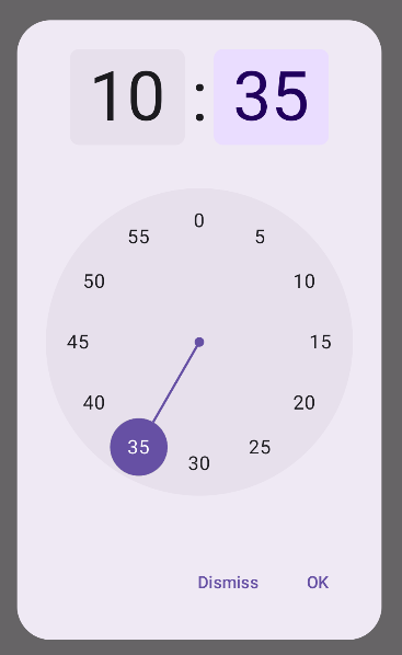
이 스니펫은 Jetpack Compose에서 맞춤설정 가능한 시간 선택 도구 대화상자의 고급 구현을 보여줍니다.
@Composable fun AdvancedTimePickerExample( onConfirm: (TimePickerState) -> Unit, onDismiss: () -> Unit, ) { val currentTime = Calendar.getInstance() val timePickerState = rememberTimePickerState( initialHour = currentTime.get(Calendar.HOUR_OF_DAY), initialMinute = currentTime.get(Calendar.MINUTE), is24Hour = true, ) /** Determines whether the time picker is dial or input */ var showDial by remember { mutableStateOf(true) } /** The icon used for the icon button that switches from dial to input */ val toggleIcon = if (showDial) { Icons.Filled.EditCalendar } else { Icons.Filled.AccessTime } AdvancedTimePickerDialog( onDismiss = { onDismiss() }, onConfirm = { onConfirm(timePickerState) }, toggle = { IconButton(onClick = { showDial = !showDial }) { Icon( imageVector = toggleIcon, contentDescription = "Time picker type toggle", ) } }, ) { if (showDial) { TimePicker( state = timePickerState, ) } else { TimeInput( state = timePickerState, ) } } } @Composable fun AdvancedTimePickerDialog( title: String = "Select Time", onDismiss: () -> Unit, onConfirm: () -> Unit, toggle: @Composable () -> Unit = {}, content: @Composable () -> Unit, ) { Dialog( onDismissRequest = onDismiss, properties = DialogProperties(usePlatformDefaultWidth = false), ) { Surface( shape = MaterialTheme.shapes.extraLarge, tonalElevation = 6.dp, modifier = Modifier .width(IntrinsicSize.Min) .height(IntrinsicSize.Min) .background( shape = MaterialTheme.shapes.extraLarge, color = MaterialTheme.colorScheme.surface ), ) { Column( modifier = Modifier.padding(24.dp), horizontalAlignment = Alignment.CenterHorizontally ) { Text( modifier = Modifier .fillMaxWidth() .padding(bottom = 20.dp), text = title, style = MaterialTheme.typography.labelMedium ) content() Row( modifier = Modifier .height(40.dp) .fillMaxWidth() ) { toggle() Spacer(modifier = Modifier.weight(1f)) TextButton(onClick = onDismiss) { Text("Cancel") } TextButton(onClick = onConfirm) { Text("OK") } } } } } }
이 스니펫의 주요 사항을 참고하세요.
AdvancedTimePickerExample컴포저블은 맞춤설정 가능한 시간 선택 도구 대화상자를 만듭니다.- 더 많은 유연성을 위해
AlertDialog보다Dialog컴포저블을 사용합니다. - 대화상자에는 맞춤설정 가능한 제목과 다이얼 모드와 입력 모드 간에 전환하는 전환 버튼이 포함됩니다.
Surface는 너비와 높이 모두에IntrinsicSize.Min을 사용하여 대화상자에 도형과 고도를 적용합니다.Column및Row레이아웃은 대화상자의 구조 구성요소를 제공합니다.- 이 예에서는
showDial을 사용하여 선택 도구 모드를 추적합니다.IconButton은 모드 간에 전환하고 그에 따라 아이콘을 업데이트합니다.- 대화상자 콘텐츠는
showDial상태에 따라TimePicker와TimeInput간에 전환됩니다.
이 고급 구현은 앱의 다양한 사용 사례에 맞게 조정할 수 있는 맞춤설정 가능성이 높고 재사용 가능한 시간 선택 도구 대화상자를 제공합니다.
이 구현은 다음과 같이 표시됩니다.