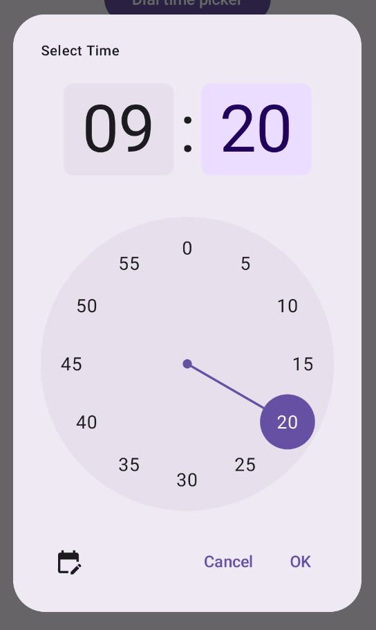
تظهر أدوات اختيار الوقت غالبًا في مربّعات الحوار. يمكنك استخدام تنفيذ عام وبسيط نسبيًا لمربّع حوار، أو يمكنك تنفيذ مربّع حوار مخصّص يتمتّع بمرونة أكبر.
لمزيد من المعلومات عن مربّعات الحوار بشكلٍ عام، بما في ذلك كيفية استخدام حالة أداة اختيار الوقت ، يُرجى الاطّلاع على دليل أدوات اختيار الوقت.
مثال أساسي
إنّ الطريقة الأسهل لإنشاء مربّع حوار لأداة اختيار الوقت هي
إنشاء عنصر مركّب ينفّذ AlertDialog. يقدّم المقتطف التالي مثالاً على مربّع حوار بسيط نسبيًا باستخدام هذه الطريقة:
@Composable fun DialWithDialogExample( onConfirm: (TimePickerState) -> Unit, onDismiss: () -> Unit, ) { val currentTime = Calendar.getInstance() val timePickerState = rememberTimePickerState( initialHour = currentTime.get(Calendar.HOUR_OF_DAY), initialMinute = currentTime.get(Calendar.MINUTE), is24Hour = true, ) TimePickerDialog( onDismiss = { onDismiss() }, onConfirm = { onConfirm(timePickerState) } ) { TimePicker( state = timePickerState, ) } } @Composable fun TimePickerDialog( onDismiss: () -> Unit, onConfirm: () -> Unit, content: @Composable () -> Unit ) { AlertDialog( onDismissRequest = onDismiss, dismissButton = { TextButton(onClick = { onDismiss() }) { Text("Dismiss") } }, confirmButton = { TextButton(onClick = { onConfirm() }) { Text("OK") } }, text = { content() } ) }
تجدر الإشارة إلى النقاط الرئيسية في هذا المقتطف:
- يغلّف العنصر المركّب
DialWithDialogExampleالعنصرTimePickerفي مربّع حوار. TimePickerDialogهو عنصر مركّب مخصّص ينشئAlertDialogبالمعلّمات التالية:onDismiss: دالة يتم استدعاؤها عندما يرفض المستخدم مربّع الحوار (عبر زرّ الرفض أو الرجوع إلى الصفحة السابقة).onConfirm: دالة يتم استدعاؤها عندما ينقر المستخدم على الزر "حسنًا".content: عنصر مركّب يعرض أداة اختيار الوقت داخل مربّع الحوار.
- يتضمّن
AlertDialogما يلي:- زرّ رفض يحمل التصنيف "رفض"
- زرّ تأكيد يحمل التصنيف "حسنًا"
- محتوى أداة اختيار الوقت الذي تم تمريره كمعلّمة
text
- يهيّئ
DialWithDialogExampleالسمةTimePickerStateبالوقت الحالي ويمرّرها إلى كل منTimePickerوالدالةonConfirm
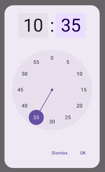
مثال متقدّم
يوضّح هذا المقتطف تنفيذًا متقدّمًا لمربّع حوار قابل للتخصيص لأداة اختيار الوقت في Jetpack Compose.
@Composable fun AdvancedTimePickerExample( onConfirm: (TimePickerState) -> Unit, onDismiss: () -> Unit, ) { val currentTime = Calendar.getInstance() val timePickerState = rememberTimePickerState( initialHour = currentTime.get(Calendar.HOUR_OF_DAY), initialMinute = currentTime.get(Calendar.MINUTE), is24Hour = true, ) /** Determines whether the time picker is dial or input */ var showDial by remember { mutableStateOf(true) } /** The icon used for the icon button that switches from dial to input */ val toggleIcon = if (showDial) { Icons.Filled.EditCalendar } else { Icons.Filled.AccessTime } AdvancedTimePickerDialog( onDismiss = { onDismiss() }, onConfirm = { onConfirm(timePickerState) }, toggle = { IconButton(onClick = { showDial = !showDial }) { Icon( imageVector = toggleIcon, contentDescription = "Time picker type toggle", ) } }, ) { if (showDial) { TimePicker( state = timePickerState, ) } else { TimeInput( state = timePickerState, ) } } } @Composable fun AdvancedTimePickerDialog( title: String = "Select Time", onDismiss: () -> Unit, onConfirm: () -> Unit, toggle: @Composable () -> Unit = {}, content: @Composable () -> Unit, ) { Dialog( onDismissRequest = onDismiss, properties = DialogProperties(usePlatformDefaultWidth = false), ) { Surface( shape = MaterialTheme.shapes.extraLarge, tonalElevation = 6.dp, modifier = Modifier .width(IntrinsicSize.Min) .height(IntrinsicSize.Min) .background( shape = MaterialTheme.shapes.extraLarge, color = MaterialTheme.colorScheme.surface ), ) { Column( modifier = Modifier.padding(24.dp), horizontalAlignment = Alignment.CenterHorizontally ) { Text( modifier = Modifier .fillMaxWidth() .padding(bottom = 20.dp), text = title, style = MaterialTheme.typography.labelMedium ) content() Row( modifier = Modifier .height(40.dp) .fillMaxWidth() ) { toggle() Spacer(modifier = Modifier.weight(1f)) TextButton(onClick = onDismiss) { Text("Cancel") } TextButton(onClick = onConfirm) { Text("OK") } } } } } }
تجدر الإشارة إلى النقاط الرئيسية في هذا المقتطف:
- ينشئ العنصر المركّب
AdvancedTimePickerExampleمربّع حوار قابل للتخصيص لأداة اختيار الوقت. - يستخدم العنصر المركّب
Dialogللحصول على مرونة أكبر منAlertDialog. - يتضمّن مربّع الحوار عنوانًا قابلاً للتخصيص وزر تبديل للتبديل بين وضعَي الاتصال والإدخال.
- يطبّق
Surfaceالشكل والارتفاع على مربّع الحوار، معIntrinsicSize.Minلكل من العرض والارتفاع. - يوفّر تنسيقا
ColumnوRowمكوّنات بنية مربّع الحوار. - يتتبّع المثال وضع أداة الاختيار باستخدام
showDial.- يبدّل
IconButtonبين الوضعَين، ويعدّل الرمز وفقًا لذلك. - يتم تبديل محتوى مربّع الحوار بين
TimePickerوTimeInputاستنادًا إلى حالةshowDial.
- يبدّل
يوفّر هذا التنفيذ المتقدّم مربّع حوار قابل للتخصيص بدرجة كبيرة وقابل لإعادة الاستخدام لأداة اختيار الوقت، ويمكنه التكيّف مع حالات الاستخدام المختلفة في تطبيقك.
يظهر هذا التنفيذ على النحو التالي: