כלי לבחירת שעה מופיעים בדרך כלל בתיבות דו-שיח. אפשר להשתמש בהטמעה כללית ופשוטה יחסית של תיבת דו-שיח, או להטמיע תיבת דו-שיח בהתאמה אישית עם יותר גמישות.
מידע נוסף על תיבות דו-שיח באופן כללי, כולל איך להשתמש במצב של כלי לבחירת שעה, זמין במדריך לכלי לבחירת שעה.
דוגמה בסיסית
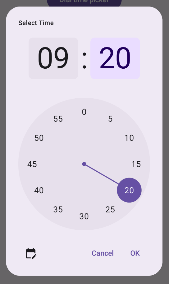
הדרך הכי פשוטה ליצור תיבת דו-שיח לבחירת שעה היא ליצור קומפוזיציה שמטמיעה את AlertDialog. בקטע הקוד הבא יש דוגמה לתיבת דו-שיח מינימלית יחסית שנוצרת באמצעות הגישה הזו:
@Composable fun DialWithDialogExample( onConfirm: (TimePickerState) -> Unit, onDismiss: () -> Unit, ) { val currentTime = Calendar.getInstance() val timePickerState = rememberTimePickerState( initialHour = currentTime.get(Calendar.HOUR_OF_DAY), initialMinute = currentTime.get(Calendar.MINUTE), is24Hour = true, ) TimePickerDialog( onDismiss = { onDismiss() }, onConfirm = { onConfirm(timePickerState) } ) { TimePicker( state = timePickerState, ) } } @Composable fun TimePickerDialog( onDismiss: () -> Unit, onConfirm: () -> Unit, content: @Composable () -> Unit ) { AlertDialog( onDismissRequest = onDismiss, dismissButton = { TextButton(onClick = { onDismiss() }) { Text("Dismiss") } }, confirmButton = { TextButton(onClick = { onConfirm() }) { Text("OK") } }, text = { content() } ) }
שימו לב לנקודות העיקריות בקטע הקוד הזה:
- רכיב הקומפוזבילי
DialWithDialogExampleעוטף אתTimePickerבתיבת דו-שיח. -
TimePickerDialogהוא קומפוזיציה מותאמת אישית שיוצרתAlertDialogעם הפרמטרים הבאים:-
onDismiss: פונקציה שמופעלת כשהמשתמש סוגר את תיבת הדו-שיח (באמצעות לחצן הסגירה או הניווט חזרה). -
onConfirm: פונקציה שמופעלת כשהמשתמש לוחץ על הלחצן 'אישור'. -
content: רכיב קומפוזבילי שמציג את בורר השעה בתוך תיבת הדו-שיח.
-
-
AlertDialogכולל את השדות האלה:- לחצן סגירה עם התווית 'סגירה'.
- לחצן אישור עם התווית 'אישור'.
- התוכן של הכלי לבחירת שעות שמועבר כפרמטר
text.
- הפונקציה
DialWithDialogExampleמאתחלת אתTimePickerStateעם השעה הנוכחית ומעבירה אותה גם לפונקציהTimePickerוגם לפונקציהonConfirm.
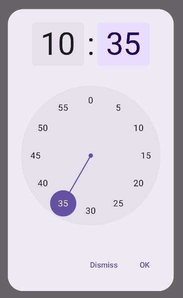
דוגמה מתקדמת
בקטע הקוד הזה מוצגת הטמעה מתקדמת של תיבת דו-שיח של בחירת שעה שניתנת להתאמה אישית ב-Jetpack פיתוח נייטיב.
@Composable fun AdvancedTimePickerExample( onConfirm: (TimePickerState) -> Unit, onDismiss: () -> Unit, ) { val currentTime = Calendar.getInstance() val timePickerState = rememberTimePickerState( initialHour = currentTime.get(Calendar.HOUR_OF_DAY), initialMinute = currentTime.get(Calendar.MINUTE), is24Hour = true, ) /** Determines whether the time picker is dial or input */ var showDial by remember { mutableStateOf(true) } /** The icon used for the icon button that switches from dial to input */ val toggleIcon = if (showDial) { Icons.Filled.EditCalendar } else { Icons.Filled.AccessTime } AdvancedTimePickerDialog( onDismiss = { onDismiss() }, onConfirm = { onConfirm(timePickerState) }, toggle = { IconButton(onClick = { showDial = !showDial }) { Icon( imageVector = toggleIcon, contentDescription = "Time picker type toggle", ) } }, ) { if (showDial) { TimePicker( state = timePickerState, ) } else { TimeInput( state = timePickerState, ) } } } @Composable fun AdvancedTimePickerDialog( title: String = "Select Time", onDismiss: () -> Unit, onConfirm: () -> Unit, toggle: @Composable () -> Unit = {}, content: @Composable () -> Unit, ) { Dialog( onDismissRequest = onDismiss, properties = DialogProperties(usePlatformDefaultWidth = false), ) { Surface( shape = MaterialTheme.shapes.extraLarge, tonalElevation = 6.dp, modifier = Modifier .width(IntrinsicSize.Min) .height(IntrinsicSize.Min) .background( shape = MaterialTheme.shapes.extraLarge, color = MaterialTheme.colorScheme.surface ), ) { Column( modifier = Modifier.padding(24.dp), horizontalAlignment = Alignment.CenterHorizontally ) { Text( modifier = Modifier .fillMaxWidth() .padding(bottom = 20.dp), text = title, style = MaterialTheme.typography.labelMedium ) content() Row( modifier = Modifier .height(40.dp) .fillMaxWidth() ) { toggle() Spacer(modifier = Modifier.weight(1f)) TextButton(onClick = onDismiss) { Text("Cancel") } TextButton(onClick = onConfirm) { Text("OK") } } } } } }
שימו לב לנקודות העיקריות בקטע הקוד הזה:
- רכיב ה-
AdvancedTimePickerExampleיוצר תיבת דו-שיח של בוחר שעות שאפשר להתאים אישית. - הוא משתמש בקוד
Dialogקומפוזבילי כדי לספק יותר גמישות מאשרAlertDialog. - תיבת הדו-שיח כוללת כותרת שאפשר להתאים אישית ולחצן להחלפה בין מצב חיוג למצב קלט.
-
Surfaceמחיל צורה וגובה על תיבת הדו-שיח, עםIntrinsicSize.Minגם לרוחב וגם לגובה. - פריסת
ColumnופריסתRowמספקות את רכיבי המבנה של תיבת הדו-שיח. - בדוגמה הזו נעקוב אחרי מצב הכלי לבחירת תאריכים באמצעות
showDial.- סמל
IconButtonמשמש למעבר בין מצבים, והוא מתעדכן בהתאם. - תוכן תיבת הדו-שיח משתנה בין
TimePickerל-TimeInputבהתאם למצבshowDial.
- סמל
ההטמעה המתקדמת הזו מספקת תיבת דו-שיח לבחירת שעה שניתנת להתאמה אישית רבה ולשימוש חוזר, ויכולה להתאים לתרחישי שימוש שונים באפליקציה.
ההטמעה הזו נראית כך: