Sử dụng bộ sưu tập để sắp xếp ngăn nắp các trang
Lưu và phân loại nội dung dựa trên lựa chọn ưu tiên của bạn.
Thẻ giúp bạn sắp xếp các nhóm nội dung có liên quan. Có hai loại thẻ:
Thẻ chính: Nằm ở đầu ngăn nội dung bên dưới thanh ứng dụng trên cùng.
Chúng hiển thị các đích đến nội dung chính và bạn nên sử dụng khi chỉ cần một bộ thẻ.
Thẻ phụ: Được dùng trong một vùng nội dung để phân tách thêm nội dung có liên quan và thiết lập hệ phân cấp. Chúng là cần thiết khi một màn hình yêu cầu nhiều cấp thẻ.
Hình 1. Thẻ chính (1) và thẻ phụ (2).
Trang này cho biết cách hiển thị các thẻ chính trong ứng dụng của bạn cùng với các màn hình liên quan và chế độ điều hướng cơ bản.
Nền tảng API
Sử dụng các thành phần kết hợp Tab, PrimaryTabRow và SecondaryTabRow để triển khai các thẻ. Thành phần kết hợp Tab biểu thị một thẻ riêng lẻ trong hàng và thường được dùng bên trong PrimaryTabRow (đối với thẻ chỉ báo chính) hoặc SecondaryTabRow (đối với thẻ chỉ báo phụ).
Tab bao gồm các thông số chính sau:
selected: Xác định xem thẻ hiện tại có được làm nổi bật bằng hình ảnh hay không.
onClick(): Một hàm lambda bắt buộc xác định hành động sẽ được thực hiện khi người dùng nhấp vào thẻ. Đây là nơi bạn thường xử lý các sự kiện điều hướng, cập nhật trạng thái thẻ đã chọn hoặc tải nội dung tương ứng.
text: Hiển thị văn bản trong thẻ. Không bắt buộc.
icon: Hiển thị một biểu tượng trong thẻ. Không bắt buộc.
enabled: Kiểm soát việc thẻ có được bật và có thể tương tác hay không. Nếu bạn đặt thành false, thẻ sẽ xuất hiện ở trạng thái tắt và không phản hồi các lượt nhấp.
Ví dụ: Thanh điều hướng dựa trên thẻ
Đoạn mã sau đây triển khai một thanh điều hướng trên cùng có các thẻ để di chuyển giữa các màn hình trong một ứng dụng:
PrimaryTabRow hiển thị một hàng thẻ ngang, mỗi thẻ tương ứng với một Destination.
val navController = rememberNavController() tạo và ghi nhớ một thực thể của NavHostController, đối tượng này quản lý hoạt động điều hướng trong một NavHost.
var selectedDestination by rememberSaveable {
mutableIntStateOf(startDestination.ordinal) } quản lý trạng thái của thẻ đã chọn.
startDestination.ordinal lấy chỉ mục số (vị trí) của mục nhập enum Destination.SONGS.
Khi bạn nhấp vào một thẻ, biểu thức lambda onClick sẽ gọi navController.navigate(route = destination.route) để chuyển đến màn hình tương ứng.
Hàm lambda onClick của Tab sẽ cập nhật trạng thái selectedDestination để làm nổi bật thẻ được nhấp một cách trực quan.
Thao tác này gọi thành phần kết hợp AppNavHost, truyền navController và startDestination để hiển thị nội dung thực tế của màn hình đã chọn.
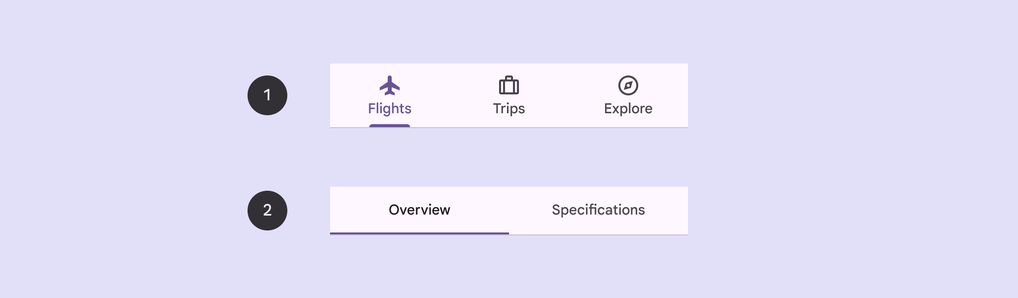
Kết quả
Hình ảnh sau đây cho thấy kết quả của đoạn mã trước:
Hình 2. 3 thẻ (Bài hát, Đĩa nhạc và Danh sách phát) được sắp xếp theo chiều ngang.
Nội dung và mã mẫu trên trang này phải tuân thủ các giấy phép như mô tả trong phần Giấy phép nội dung. Java và OpenJDK là nhãn hiệu hoặc nhãn hiệu đã đăng ký của Oracle và/hoặc đơn vị liên kết của Oracle.
Cập nhật lần gần đây nhất: 2025-08-27 UTC.
[[["Dễ hiểu","easyToUnderstand","thumb-up"],["Giúp tôi giải quyết được vấn đề","solvedMyProblem","thumb-up"],["Khác","otherUp","thumb-up"]],[["Thiếu thông tin tôi cần","missingTheInformationINeed","thumb-down"],["Quá phức tạp/quá nhiều bước","tooComplicatedTooManySteps","thumb-down"],["Đã lỗi thời","outOfDate","thumb-down"],["Vấn đề về bản dịch","translationIssue","thumb-down"],["Vấn đề về mẫu/mã","samplesCodeIssue","thumb-down"],["Khác","otherDown","thumb-down"]],["Cập nhật lần gần đây nhất: 2025-08-27 UTC."],[],[],null,["Tabs allow you to organize groups of related content. There are two types of\ntabs:\n\n- **Primary tabs**: Placed at the top of the content pane under a top app bar. They display the main content destinations, and should be used when just one set of tabs are needed.\n- **Secondary tabs**: Used within a content area to further separate related content and establish hierarchy. They are necessary when a screen requires more than one level of tabs.\n\n**Figure 1.** Primary tabs (1) and secondary tabs (2).\n\nThis page shows how to display primary tabs in your app with related screens and\nbasic navigation.\n\nAPI surface\n\nUse the [`Tab`](/reference/kotlin/androidx/compose/material3/package-summary#Tab(kotlin.Boolean,kotlin.Function0,androidx.compose.ui.Modifier,kotlin.Boolean,kotlin.Function0,kotlin.Function0,androidx.compose.ui.graphics.Color,androidx.compose.ui.graphics.Color,androidx.compose.foundation.interaction.MutableInteractionSource)), [`PrimaryTabRow`](/reference/kotlin/androidx/compose/material3/package-summary#PrimaryTabRow(kotlin.Int,androidx.compose.ui.Modifier,androidx.compose.ui.graphics.Color,androidx.compose.ui.graphics.Color,kotlin.Function1,kotlin.Function0,kotlin.Function0)), and [`SecondaryTabRow`](/reference/kotlin/androidx/compose/material3/package-summary#SecondaryTabRow(kotlin.Int,androidx.compose.ui.Modifier,androidx.compose.ui.graphics.Color,androidx.compose.ui.graphics.Color,kotlin.Function1,kotlin.Function0,kotlin.Function0)) composables\nto implement tabs. The `Tab` composable represents an individual tab within the\nrow, and is typically used inside of a `PrimaryTabRow` (for primary indicator\ntabs) or `SecondaryTabRow` (for secondary indicator tabs).\n\n`Tab` includes the following key parameters:\n\n- `selected`: Determines whether the current tab is visually highlighted.\n- `onClick()`: A required lambda function that defines the action to be performed when the user clicks on the tab. This is where you typically handle navigation events, update the selected tab state, or load corresponding content.\n- `text`: Displays text within the tab. Optional.\n- `icon`: Displays an icon within the tab. Optional.\n- `enabled`: Controls whether the tab is enabled and can be interacted with. If set to false, the tab appears in a disabled state and won't respond to clicks.\n\nExample: Tab-based navigation\n\nThe following snippet implements a top navigation bar with tabs to navigate\nbetween different screens in an app:\n| **Note:** The [full source code](https://github.com/android/snippets/blob/main/compose/snippets/src/main/java/com/example/compose/snippets/components/Navigation.kt) includes the code that establishes the basic navigation structure for the following example.\n\n\n```kotlin\n@Composable\nfun NavigationTabExample(modifier: Modifier = Modifier) {\n val navController = rememberNavController()\n val startDestination = Destination.SONGS\n var selectedDestination by rememberSaveable { mutableIntStateOf(startDestination.ordinal) }\n\n Scaffold(modifier = modifier) { contentPadding -\u003e\n PrimaryTabRow(selectedTabIndex = selectedDestination, modifier = Modifier.padding(contentPadding)) {\n Destination.entries.forEachIndexed { index, destination -\u003e\n Tab(\n selected = selectedDestination == index,\n onClick = {\n navController.navigate(route = destination.route)\n selectedDestination = index\n },\n text = {\n Text(\n text = destination.label,\n maxLines = 2,\n overflow = TextOverflow.Ellipsis\n )\n }\n )\n }\n }\n AppNavHost(navController, startDestination)\n }\n}https://github.com/android/snippets/blob/7a0ebbee11495f628cf9d574f6b6069c2867232a/compose/snippets/src/main/java/com/example/compose/snippets/components/Navigation.kt#L186-L213\n```\n\n\u003cbr /\u003e\n\nKey points\n\n- `PrimaryTabRow` displays a horizontal row of tabs, with each tab corresponding to a `Destination`.\n- `val navController = rememberNavController()` creates and remembers an instance of [`NavHostController`](/reference/androidx/navigation/NavHostController), which manages the navigation within a [`NavHost`](/reference/androidx/navigation/NavHost).\n- `var selectedDestination by rememberSaveable {\n mutableIntStateOf(startDestination.ordinal) }` manages the state of the selected tab.\n - `startDestination.ordinal` gets the numerical index (position) of the `Destination.SONGS` enum entry.\n- When you click a tab, the `onClick` lambda calls `navController.navigate(route = destination.route)` to navigate to the corresponding screen.\n- The `onClick` lambda of the `Tab` updates the `selectedDestination` state to visually highlight the clicked tab.\n- It calls the `AppNavHost` composable, passing the `navController` and `startDestination`, to display the actual content of the selected screen.\n\nResult\n\nThe following image shows the result of the previous snippet:\n**Figure 2.** 3 tabs--- Songs, Album, and Playlist--- arranged horizontally.\n\nAdditional resources\n\n- [Material 3 - Tabs](https://m3.material.io/components/tabs/guidelines)\n- [Navigation with Compose](/develop/ui/compose/navigation)"]]