Mit Sammlungen den Überblick behalten
Sie können Inhalte basierend auf Ihren Einstellungen speichern und kategorisieren.
Mit Tabs können Sie Gruppen verwandter Inhalte organisieren. Es gibt zwei Arten von Tabs:
Primäre Tabs: Sie befinden sich oben im Inhaltsbereich unter einer oberen App-Leiste.
Sie zeigen die wichtigsten Inhaltsziele an und sollten verwendet werden, wenn nur ein Satz von Tabs erforderlich ist.
Sekundäre Tabs: Werden in einem Inhaltsbereich verwendet, um zusammengehörige Inhalte weiter zu trennen und eine Hierarchie zu schaffen. Sie sind erforderlich, wenn für einen Bildschirm mehr als eine Tab-Ebene benötigt wird.
Abbildung 1: Primäre Tabs (1) und sekundäre Tabs (2).
Auf dieser Seite wird beschrieben, wie Sie primäre Tabs in Ihrer App mit zugehörigen Bildschirmen und grundlegender Navigation anzeigen.
API-Oberfläche
Verwenden Sie die Composables Tab, PrimaryTabRow und SecondaryTabRow, um Tabs zu implementieren. Die Tab-Composable-Funktion stellt einen einzelnen Tab in der Zeile dar und wird in der Regel in einem PrimaryTabRow (für Tabs mit primären Messwerten) oder SecondaryTabRow (für Tabs mit sekundären Messwerten) verwendet.
Tab umfasst die folgenden wichtigen Parameter:
selected: Legt fest, ob der aktuelle Tab visuell hervorgehoben wird.
onClick(): Eine erforderliche Lambda-Funktion, die die Aktion definiert, die ausgeführt werden soll, wenn der Nutzer auf den Tab klickt. Hier werden in der Regel Navigationsereignisse verarbeitet, der Status des ausgewählten Tabs aktualisiert oder entsprechende Inhalte geladen.
text: Zeigt Text auf dem Tab an. Optional:
icon: Zeigt ein Symbol auf dem Tab an. Optional:
enabled: Steuert, ob der Tab aktiviert ist und mit ihm interagiert werden kann. Wenn der Wert auf „false“ gesetzt ist, wird der Tab deaktiviert angezeigt und reagiert nicht auf Klicks.
Beispiel: Tab-basierte Navigation
Im folgenden Snippet wird eine obere Navigationsleiste mit Tabs zum Navigieren zwischen verschiedenen Bildschirmen in einer App implementiert:
PrimaryTabRow zeigt eine horizontale Reihe von Tabs an, wobei jeder Tab einem Destination entspricht.
val navController = rememberNavController() erstellt und speichert eine Instanz von NavHostController, die die Navigation in einem NavHost verwaltet.
var selectedDestination by rememberSaveable {
mutableIntStateOf(startDestination.ordinal) } verwaltet den Status des ausgewählten Tabs.
startDestination.ordinal ruft den numerischen Index (die Position) des Destination.SONGS-Enum-Eintrags ab.
Wenn Sie auf einen Tab klicken, werden die onClick-Lambda-AufrufenavController.navigate(route = destination.route) verwendet, um zum entsprechenden Bildschirm zu wechseln.
Die onClick-Lambda-Funktion von Tab aktualisiert den selectedDestination-Status, um den angeklickten Tab visuell hervorzuheben.
Dazu wird die AppNavHost-Composable-Funktion aufgerufen und navController und startDestination übergeben, um den tatsächlichen Inhalt des ausgewählten Bildschirms anzuzeigen.
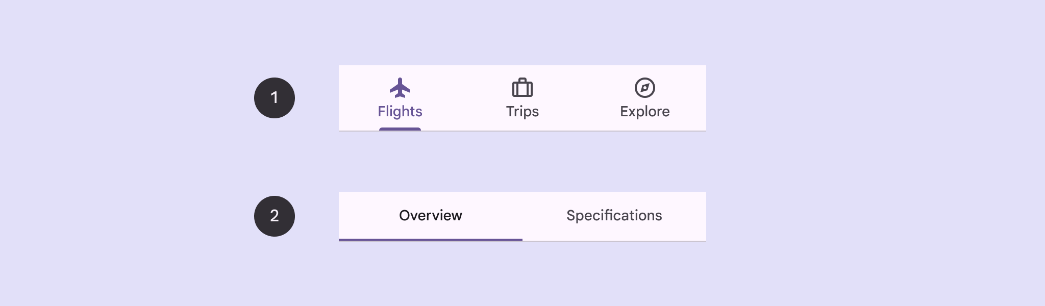
Ergebnis
Das folgende Bild zeigt das Ergebnis des vorherigen Snippets:
Abbildung 2: Drei Tabs – „Titel“, „Album“ und „Playlist“ – sind horizontal angeordnet.
Alle Inhalte und Codebeispiele auf dieser Seite unterliegen den Lizenzen wie im Abschnitt Inhaltslizenz beschrieben. Java und OpenJDK sind Marken oder eingetragene Marken von Oracle und/oder seinen Tochtergesellschaften.
Zuletzt aktualisiert: 2025-08-27 (UTC).
[[["Leicht verständlich","easyToUnderstand","thumb-up"],["Mein Problem wurde gelöst","solvedMyProblem","thumb-up"],["Sonstiges","otherUp","thumb-up"]],[["Benötigte Informationen nicht gefunden","missingTheInformationINeed","thumb-down"],["Zu umständlich/zu viele Schritte","tooComplicatedTooManySteps","thumb-down"],["Nicht mehr aktuell","outOfDate","thumb-down"],["Problem mit der Übersetzung","translationIssue","thumb-down"],["Problem mit Beispielen/Code","samplesCodeIssue","thumb-down"],["Sonstiges","otherDown","thumb-down"]],["Zuletzt aktualisiert: 2025-08-27 (UTC)."],[],[],null,["Tabs allow you to organize groups of related content. There are two types of\ntabs:\n\n- **Primary tabs**: Placed at the top of the content pane under a top app bar. They display the main content destinations, and should be used when just one set of tabs are needed.\n- **Secondary tabs**: Used within a content area to further separate related content and establish hierarchy. They are necessary when a screen requires more than one level of tabs.\n\n**Figure 1.** Primary tabs (1) and secondary tabs (2).\n\nThis page shows how to display primary tabs in your app with related screens and\nbasic navigation.\n\nAPI surface\n\nUse the [`Tab`](/reference/kotlin/androidx/compose/material3/package-summary#Tab(kotlin.Boolean,kotlin.Function0,androidx.compose.ui.Modifier,kotlin.Boolean,kotlin.Function0,kotlin.Function0,androidx.compose.ui.graphics.Color,androidx.compose.ui.graphics.Color,androidx.compose.foundation.interaction.MutableInteractionSource)), [`PrimaryTabRow`](/reference/kotlin/androidx/compose/material3/package-summary#PrimaryTabRow(kotlin.Int,androidx.compose.ui.Modifier,androidx.compose.ui.graphics.Color,androidx.compose.ui.graphics.Color,kotlin.Function1,kotlin.Function0,kotlin.Function0)), and [`SecondaryTabRow`](/reference/kotlin/androidx/compose/material3/package-summary#SecondaryTabRow(kotlin.Int,androidx.compose.ui.Modifier,androidx.compose.ui.graphics.Color,androidx.compose.ui.graphics.Color,kotlin.Function1,kotlin.Function0,kotlin.Function0)) composables\nto implement tabs. The `Tab` composable represents an individual tab within the\nrow, and is typically used inside of a `PrimaryTabRow` (for primary indicator\ntabs) or `SecondaryTabRow` (for secondary indicator tabs).\n\n`Tab` includes the following key parameters:\n\n- `selected`: Determines whether the current tab is visually highlighted.\n- `onClick()`: A required lambda function that defines the action to be performed when the user clicks on the tab. This is where you typically handle navigation events, update the selected tab state, or load corresponding content.\n- `text`: Displays text within the tab. Optional.\n- `icon`: Displays an icon within the tab. Optional.\n- `enabled`: Controls whether the tab is enabled and can be interacted with. If set to false, the tab appears in a disabled state and won't respond to clicks.\n\nExample: Tab-based navigation\n\nThe following snippet implements a top navigation bar with tabs to navigate\nbetween different screens in an app:\n| **Note:** The [full source code](https://github.com/android/snippets/blob/main/compose/snippets/src/main/java/com/example/compose/snippets/components/Navigation.kt) includes the code that establishes the basic navigation structure for the following example.\n\n\n```kotlin\n@Composable\nfun NavigationTabExample(modifier: Modifier = Modifier) {\n val navController = rememberNavController()\n val startDestination = Destination.SONGS\n var selectedDestination by rememberSaveable { mutableIntStateOf(startDestination.ordinal) }\n\n Scaffold(modifier = modifier) { contentPadding -\u003e\n PrimaryTabRow(selectedTabIndex = selectedDestination, modifier = Modifier.padding(contentPadding)) {\n Destination.entries.forEachIndexed { index, destination -\u003e\n Tab(\n selected = selectedDestination == index,\n onClick = {\n navController.navigate(route = destination.route)\n selectedDestination = index\n },\n text = {\n Text(\n text = destination.label,\n maxLines = 2,\n overflow = TextOverflow.Ellipsis\n )\n }\n )\n }\n }\n AppNavHost(navController, startDestination)\n }\n}https://github.com/android/snippets/blob/5673ffc60b614daf028ee936227128eb8c4f9781/compose/snippets/src/main/java/com/example/compose/snippets/components/Navigation.kt#L186-L213\n```\n\n\u003cbr /\u003e\n\nKey points\n\n- `PrimaryTabRow` displays a horizontal row of tabs, with each tab corresponding to a `Destination`.\n- `val navController = rememberNavController()` creates and remembers an instance of [`NavHostController`](/reference/androidx/navigation/NavHostController), which manages the navigation within a [`NavHost`](/reference/androidx/navigation/NavHost).\n- `var selectedDestination by rememberSaveable {\n mutableIntStateOf(startDestination.ordinal) }` manages the state of the selected tab.\n - `startDestination.ordinal` gets the numerical index (position) of the `Destination.SONGS` enum entry.\n- When you click a tab, the `onClick` lambda calls `navController.navigate(route = destination.route)` to navigate to the corresponding screen.\n- The `onClick` lambda of the `Tab` updates the `selectedDestination` state to visually highlight the clicked tab.\n- It calls the `AppNavHost` composable, passing the `navController` and `startDestination`, to display the actual content of the selected screen.\n\nResult\n\nThe following image shows the result of the previous snippet:\n**Figure 2.** 3 tabs--- Songs, Album, and Playlist--- arranged horizontally.\n\nAdditional resources\n\n- [Material 3 - Tabs](https://m3.material.io/components/tabs/guidelines)\n- [Navigation with Compose](/develop/ui/compose/navigation)"]]