Switch 구성요소를 사용하면 사용자가 선택됨과 선택되지 않음이라는 두 상태 간에 전환할 수 있습니다. 앱에서 스위치를 사용하여 사용자가 다음 중 하나를 실행하도록 할 수 있습니다.
- 설정을 사용 설정하거나 사용 중지합니다.
- 기능을 사용 설정 또는 사용 중지합니다.
- 옵션을 선택합니다.
이 구성요소는 엄지손가락과 트랙의 두 부분으로 구성됩니다. 썸은 스위치의 드래그 가능한 부분이고 트랙은 배경입니다. 사용자는 스위치의 상태를 변경하기 위해 엄지손가락을 왼쪽이나 오른쪽으로 드래그할 수 있습니다. 스위치를 탭하여 확인하고 지울 수도 있습니다.

기본 구현
전체 API 정의는 Switch 참조를 확인하세요. 다음은 사용할 수 있는 주요 매개변수입니다.
checked: 스위치의 초기 상태입니다.onCheckedChange: 스위치 상태가 변경될 때 호출되는 콜백입니다.enabled: 스위치가 사용 설정 또는 중지되었는지 여부입니다.colors: 스위치에 사용되는 색상입니다.
다음 예는 Switch 컴포저블의 최소 구현입니다.
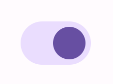
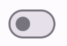
@Composable fun SwitchMinimalExample() { var checked by remember { mutableStateOf(true) } Switch( checked = checked, onCheckedChange = { checked = it } ) }
이 구현은 선택되지 않은 경우 다음과 같이 표시됩니다.
선택한 경우의 모습은 다음과 같습니다.

고급 구현
더 고급 스위치를 구현할 때 사용할 수 있는 기본 매개변수는 다음과 같습니다.
thumbContent: 선택된 경우 엄지의 모양을 맞춤설정하는 데 사용합니다.colors: 트랙과 썸의 색상을 맞춤설정하는 데 사용합니다.
맞춤 썸
thumbContent 매개변수에 컴포저블을 전달하여 맞춤 썸을 만들 수 있습니다. 다음은 엄지에 맞춤 아이콘을 사용하는 스위치의 예입니다.
@Composable fun SwitchWithIconExample() { var checked by remember { mutableStateOf(true) } Switch( checked = checked, onCheckedChange = { checked = it }, thumbContent = if (checked) { { Icon( imageVector = Icons.Filled.Check, contentDescription = null, modifier = Modifier.size(SwitchDefaults.IconSize), ) } } else { null } ) }
이 구현에서 선택되지 않은 모양은 이전 섹션의 예와 동일합니다. 하지만 선택하면 이 구현은 다음과 같이 표시됩니다.
맞춤 색상
다음 예에서는 스위치가 선택되었는지 여부를 고려하여 colors 매개변수를 사용하여 스위치의 썸과 트랙 색상을 변경하는 방법을 보여줍니다.
@Composable fun SwitchWithCustomColors() { var checked by remember { mutableStateOf(true) } Switch( checked = checked, onCheckedChange = { checked = it }, colors = SwitchDefaults.colors( checkedThumbColor = MaterialTheme.colorScheme.primary, checkedTrackColor = MaterialTheme.colorScheme.primaryContainer, uncheckedThumbColor = MaterialTheme.colorScheme.secondary, uncheckedTrackColor = MaterialTheme.colorScheme.secondaryContainer, ) ) }
이 구현은 다음과 같이 표시됩니다.