רכיב Switch מאפשר למשתמשים לעבור בין שני מצבים: מסומן ולא מסומן. באפליקציה שלכם, אתם יכולים להשתמש במתג כדי לאפשר למשתמש לבצע אחת מהפעולות הבאות:
- מפעילים או משביתים את ההגדרה.
- מפעילים או משביתים תכונה.
- בוחרים באחת מהאפשרויות.
הרכיב כולל שני חלקים: האגודל והפס. החלק שאפשר לגרור הוא האגודל, והרקע הוא המסילה. המשתמש יכול לגרור את האגודל שמאלה או ימינה כדי לשנות את מצב המתג. הם יכולים גם להקיש על המתג כדי לסמן את התיבה ולבטל את הסימון שלה.

הטמעה בסיסית
הגדרה מלאה של ה-API מופיעה בהפניה אל Switch. אלה כמה מהפרמטרים העיקריים שבהם תצטרכו להשתמש:
-
checked: המצב ההתחלתי של המתג. -
onCheckedChange: קריאה חוזרת שמתבצעת כשמצב המתג משתנה. -
enabled: מצב המתג (מופעל או מושבת). -
colors: הצבעים שמשמשים למתג.
הדוגמה הבאה היא הטמעה מינימלית של ה-composable Switch.
@Composable fun SwitchMinimalExample() { var checked by remember { mutableStateOf(true) } Switch( checked = checked, onCheckedChange = { checked = it } ) }
כשהתיבה לא מסומנת, היישום נראה כך:
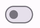
כך זה נראה כשהתיבה מסומנת:

הטמעה מתקדמת
הפרמטרים העיקריים שכדאי להשתמש בהם כשמטמיעים מתג מתקדם יותר הם:
-
thumbContent: משתמשים בזה כדי להתאים אישית את המראה של האגודל כשהוא מסומן. -
colors: משתמשים בזה כדי לשנות את הצבע של פס ההתקדמות והאגודל.
תמונה ממוזערת מותאמת אישית
אפשר להעביר כל קומפוזיציה לפרמטר thumbContent כדי ליצור תמונה ממוזערת בהתאמה אישית. הדוגמה הבאה היא של מתג שמשתמש בסמל מותאם אישית עבור
האגודל שלו:
@Composable fun SwitchWithIconExample() { var checked by remember { mutableStateOf(true) } Switch( checked = checked, onCheckedChange = { checked = it }, thumbContent = if (checked) { { Icon( imageVector = Icons.Filled.Check, contentDescription = null, modifier = Modifier.size(SwitchDefaults.IconSize), ) } } else { null } ) }
בהטמעה הזו, המראה של התיבה הלא מסומנת זהה לדוגמה שבקטע הקודם. אבל כשבודקים את היישום הזה, הוא נראה כך:
צבעים מותאמים אישית
בדוגמה הבאה אפשר לראות איך משתמשים בפרמטר colors כדי לשנות את הצבע של האגודל והפס של המתג, בהתאם למצב הסימון של המתג.
@Composable fun SwitchWithCustomColors() { var checked by remember { mutableStateOf(true) } Switch( checked = checked, onCheckedChange = { checked = it }, colors = SwitchDefaults.colors( checkedThumbColor = MaterialTheme.colorScheme.primary, checkedTrackColor = MaterialTheme.colorScheme.primaryContainer, uncheckedThumbColor = MaterialTheme.colorScheme.secondary, uncheckedTrackColor = MaterialTheme.colorScheme.secondaryContainer, ) ) }
ההטמעה הזו נראית כך: