کامپوننت Switch به کاربران اجازه میدهد تا بین دو حالت انتخاب کنند: انتخاب شده و انتخاب نشده. در برنامه خود میتوانید از یک سوئیچ برای انجام یکی از موارد زیر توسط کاربر استفاده کنید:
- یک تنظیم را روشن یا خاموش کنید.
- یک ویژگی را فعال یا غیرفعال کنید.
- یک گزینه را انتخاب کنید.
این قطعه دو بخش دارد: انگشت شست و مسیر. انگشت شست بخش قابل کشیدن سوئیچ است و مسیر، پسزمینه است. کاربر میتواند انگشت شست را به چپ یا راست بکشد تا وضعیت سوئیچ را تغییر دهد. همچنین میتواند برای بررسی و پاک کردن آن، روی سوئیچ ضربه بزند.

پیادهسازی اولیه
برای تعریف کامل API به مرجع Switch مراجعه کنید. در زیر برخی از پارامترهای کلیدی که ممکن است به آنها نیاز داشته باشید، آورده شده است:
-
checked: وضعیت اولیه سوئیچ. -
onCheckedChange: یک تابع فراخوانی است که هنگام تغییر وضعیت سوئیچ فراخوانی میشود. -
enabled: مشخص میکند که آیا سوئیچ فعال است یا غیرفعال. -
colors: رنگهای مورد استفاده برای سوئیچ.
مثال زیر یک پیادهسازی مینیمال از کامپوننت Switch است.
@Composable fun SwitchMinimalExample() { var checked by remember { mutableStateOf(true) } Switch( checked = checked, onCheckedChange = { checked = it } ) }
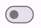
این پیادهسازی وقتی تیک نخورده باشد، به صورت زیر نمایش داده میشود:
این ظاهر هنگام بررسی است:

پیادهسازی پیشرفته
پارامترهای اصلی که ممکن است بخواهید هنگام پیادهسازی یک سوئیچ پیشرفتهتر استفاده کنید، موارد زیر هستند:
-
thumbContent: از این برای سفارشیسازی ظاهر thumb هنگام تیک زدن آن استفاده کنید. -
colors: از این گزینه برای سفارشیسازی رنگ مسیر و انگشت شست استفاده کنید.
انگشت شست سفارشی
شما میتوانید هر ترکیببندی را برای پارامتر thumbContent ارسال کنید تا یک thumb سفارشی ایجاد کنید. در زیر مثالی از یک سوئیچ که از یک آیکون سفارشی برای thumb خود استفاده میکند، آمده است:
@Composable fun SwitchWithIconExample() { var checked by remember { mutableStateOf(true) } Switch( checked = checked, onCheckedChange = { checked = it }, thumbContent = if (checked) { { Icon( imageVector = Icons.Filled.Check, contentDescription = null, modifier = Modifier.size(SwitchDefaults.IconSize), ) } } else { null } ) }
در این پیادهسازی، ظاهر بدون علامتگذاری مشابه مثال بخش قبل است. با این حال، وقتی علامتگذاری شود، این پیادهسازی به شکل زیر ظاهر میشود:
رنگهای سفارشی
مثال زیر نشان میدهد که چگونه میتوانید از پارامتر colors برای تغییر رنگ شست و مسیر یک سوئیچ، با در نظر گرفتن اینکه آیا سوئیچ تیک خورده است یا خیر، استفاده کنید.
@Composable fun SwitchWithCustomColors() { var checked by remember { mutableStateOf(true) } Switch( checked = checked, onCheckedChange = { checked = it }, colors = SwitchDefaults.colors( checkedThumbColor = MaterialTheme.colorScheme.primary, checkedTrackColor = MaterialTheme.colorScheme.primaryContainer, uncheckedThumbColor = MaterialTheme.colorScheme.secondary, uncheckedTrackColor = MaterialTheme.colorScheme.secondaryContainer, ) ) }
این پیادهسازی به صورت زیر ظاهر میشود: