
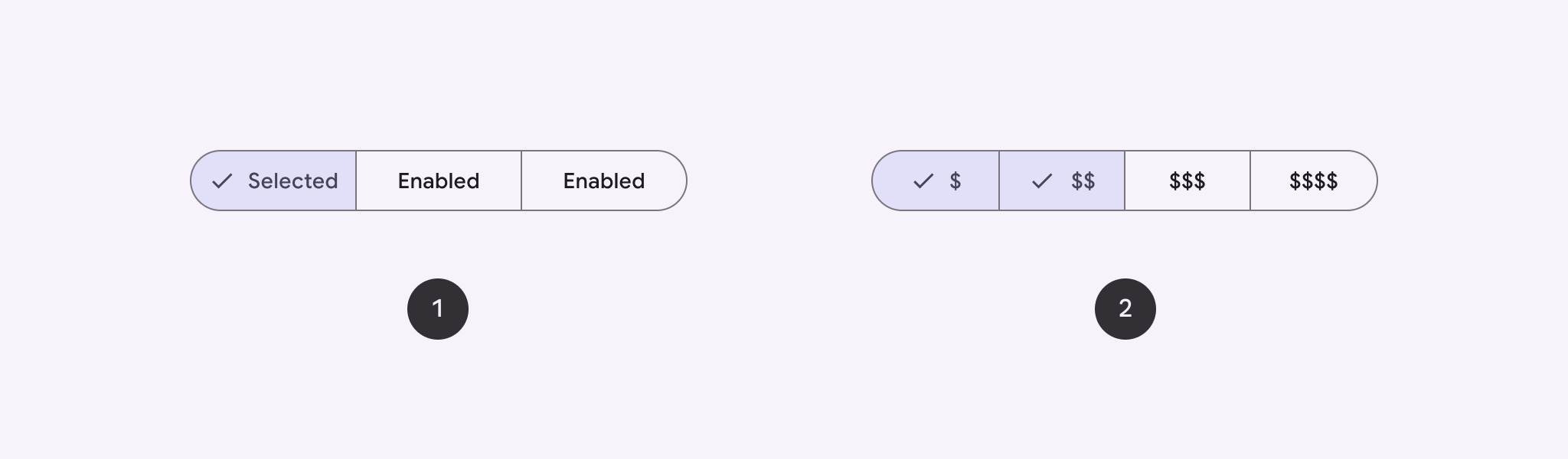
Sử dụng nút phân đoạn để cho phép người dùng chọn trong một tập hợp các lựa chọn, song song. Có hai loại nút phân đoạn:
- Nút chọn một: Cho phép người dùng chọn một lựa chọn.
- Nút chọn nhiều: Cho phép người dùng chọn từ 2 đến 5 mục. Đối với các lựa chọn phức tạp hơn hoặc có nhiều hơn 5 mục, hãy dùng thẻ.
Nền tảng API
Sử dụng bố cục SingleChoiceSegmentedButtonRow và MultiChoiceSegmentedButtonRow để tạo các nút phân đoạn. Các bố cục này định vị và điều chỉnh kích thước SegmentedButton một cách chính xác, đồng thời chia sẻ các thông số chính sau đây:
space: Điều chỉnh độ chồng chéo giữa các nút.content: Chứa nội dung của hàng nút phân đoạn, thường là một chuỗiSegmentedButton.
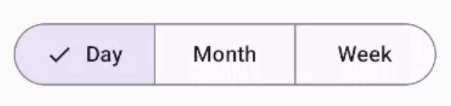
Tạo nút phân đoạn chọn một
Ví dụ này cho thấy cách tạo một nút phân đoạn chọn một:
@Composable fun SingleChoiceSegmentedButton(modifier: Modifier = Modifier) { var selectedIndex by remember { mutableIntStateOf(0) } val options = listOf("Day", "Month", "Week") SingleChoiceSegmentedButtonRow { options.forEachIndexed { index, label -> SegmentedButton( shape = SegmentedButtonDefaults.itemShape( index = index, count = options.size ), onClick = { selectedIndex = index }, selected = index == selectedIndex, label = { Text(label) } ) } } }
Các điểm chính về mã
- Khởi tạo một biến
selectedIndexbằng cách sử dụngremembervàmutableIntStateOfđể theo dõi chỉ mục nút đã chọn. - Xác định danh sách
optionsđại diện cho nhãn nút. SingleChoiceSegmentedButtonRowchỉ cho phép bạn chọn một nút.- Tạo một
SegmentedButtoncho mỗi lựa chọn, bên trong vòng lặpforEachIndexed:shapexác định hình dạng của nút dựa trên chỉ mục và tổng số lựa chọn bằng cách sử dụngSegmentedButtonDefaults.itemShape.onClickcập nhậtselectedIndexbằng chỉ mục của nút đã nhấp.selectedđặt trạng thái lựa chọn của nút dựa trênselectedIndex.labelhiển thị nhãn nút bằng thành phần kết hợpText.
Kết quả
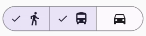
Tạo nút phân đoạn có thể chọn nhiều mục
Ví dụ này cho thấy cách tạo một nút phân đoạn có nhiều lựa chọn bằng các biểu tượng cho phép người dùng chọn nhiều lựa chọn:
@Composable fun MultiChoiceSegmentedButton(modifier: Modifier = Modifier) { val selectedOptions = remember { mutableStateListOf(false, false, false) } val options = listOf("Walk", "Ride", "Drive") MultiChoiceSegmentedButtonRow { options.forEachIndexed { index, label -> SegmentedButton( shape = SegmentedButtonDefaults.itemShape( index = index, count = options.size ), checked = selectedOptions[index], onCheckedChange = { selectedOptions[index] = !selectedOptions[index] }, icon = { SegmentedButtonDefaults.Icon(selectedOptions[index]) }, label = { when (label) { "Walk" -> Icon( imageVector = Icons.AutoMirrored.Filled.DirectionsWalk, contentDescription = "Directions Walk" ) "Ride" -> Icon( imageVector = Icons.Default.DirectionsBus, contentDescription = "Directions Bus" ) "Drive" -> Icon( imageVector = Icons.Default.DirectionsCar, contentDescription = "Directions Car" ) } } ) } } }
Các điểm chính về mã
- Mã này khởi chạy biến
selectedOptionsbằng cách sử dụngremembervàmutableStateListOf. Thao tác này theo dõi trạng thái đã chọn của từng nút. - Mã này sử dụng
MultiChoiceSegmentedButtonRowđể chứa các nút. - Bên trong vòng lặp
forEachIndexed, mã sẽ tạo mộtSegmentedButtoncho từng lựa chọn:shapexác định hình dạng của nút dựa trên chỉ mục và tổng số lựa chọn.checkedđặt trạng thái đã đánh dấu của nút dựa trên giá trị tương ứng trongselectedOptions.onCheckedChangesẽ bật/tắt trạng thái đã chọn của mục tương ứng trongselectedOptionskhi người dùng nhấp vào nút.iconhiển thị một biểu tượng dựa trênSegmentedButtonDefaults.Iconvà trạng thái đã đánh dấu của nút.labelhiển thị một biểu tượng tương ứng với nhãn, sử dụng thành phần kết hợpIconvới vectơ hình ảnh và nội dung mô tả phù hợp.
Kết quả
Tài nguyên khác
- Material 3: Nút phân đoạn