
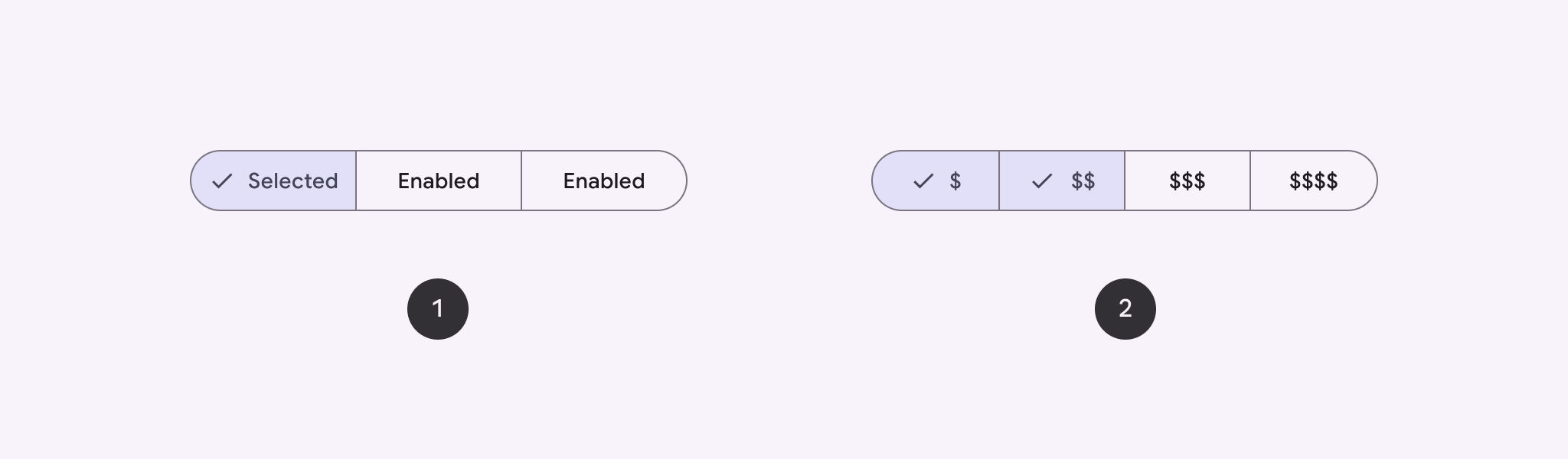
Kullanıcıların yan yana bir dizi seçenek arasından seçim yapmasına olanak tanımak için segmentli düğme kullanın. İki tür segmentlenmiş düğme vardır:
- Tek seçim düğmesi: Kullanıcıların tek bir seçenek belirlemesine olanak tanır.
- Çoklu seçim düğmesi: Kullanıcıların iki ila beş öğe arasında seçim yapmasına olanak tanır. Daha karmaşık seçimler veya beşten fazla öğe için çipleri kullanın.
API yüzeyi
Segmentli düğmeler oluşturmak için SingleChoiceSegmentedButtonRow ve MultiChoiceSegmentedButtonRow düzenlerini kullanın. Bu düzenler, SegmentedButtons doğru şekilde konumlandırıp boyutlandırır ve aşağıdaki temel parametreleri paylaşır:
space: Düğmeler arasındaki çakışmayı ayarlar.content: Segmentli düğme satırının içeriğini içerir. Bu içerik genellikleSegmentedButtondizisidir.
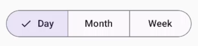
Tek seçimlik segment düğmesi oluşturma
Bu örnekte, tek seçimlik bir segment düğmesinin nasıl oluşturulacağı gösterilmektedir:
@Composable fun SingleChoiceSegmentedButton(modifier: Modifier = Modifier) { var selectedIndex by remember { mutableIntStateOf(0) } val options = listOf("Day", "Month", "Week") SingleChoiceSegmentedButtonRow { options.f>orEachIndexed { index, label - SegmentedButton( shape = SegmentedButtonDefaults.itemShape( index = index, count = options.size ), onClick = { selectedIndex = index }, selected = index == selectedIndex, label = { Text(label) } } } }SegmentedButton.kt
Kodla ilgili önemli noktalar
- Seçilen düğme dizinini izlemek için
remembervemutableIntStateOfkullanarak birselectedIndexdeğişkenini başlatır. - Düğme etiketlerini temsil eden
optionslistesini tanımlar. SingleChoiceSegmentedButtonRowyalnızca bir düğme seçmenize olanak tanır.forEachIndexeddöngüsünde her seçenek için birSegmentedButtonoluşturur:shape,SegmentedButtonDefaults.itemShapekullanılarak düğmenin şeklini dizinine ve toplam seçenek sayısına göre tanımlar.- Tıklanan düğmenin diziniyle
onClickgüncellenir.selectedIndex selected, düğmenin seçim durumunuselectedIndex'ye göre ayarlar.label,Textcomposable'ını kullanarak düğme etiketini gösterir.
Sonuç
Çoklu seçim segmentli düğme oluşturma
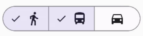
Bu örnekte, kullanıcıların birden fazla seçenek belirlemesine olanak tanıyan simgeler içeren çoktan seçmeli bir segment düğmesinin nasıl oluşturulacağı gösterilmektedir:
@Composable fun MultiChoiceSegmentedButton(modifier: Modifier = Modifier) { val selectedOptions = remember { mutableStateListOf(false, false, false) } val options = listOf("Walk", "Ride", "Drive") MultiChoiceSegmentedButtonRow { options.f>orEachIndexed { index, label - SegmentedButton( shape = SegmentedButtonDefaults.itemShape( index = index, count = options.size ), checked = selectedOptions[index], onCheckedChange = { selectedOptions[index] = !selectedOptions[index] }, icon = { SegmentedButtonDefaults.Icon(selectedOptions[index]) }, label = { when (label) { > "Walk" - Icon( imageVector = Icons.AutoMirrored.Filled.DirectionsWalk, contentDescription = "Directions Walk" > ) "Ride" - Icon( imageVector = Icons.Default.DirectionsBus, contentDescription = "Directions> Bus" ) "Drive" - Icon( imageVector = Icons.Default.DirectionsCar, contentDescription = "Directions Car" } } ) } } }SegmentedButton.kt
Kodla ilgili önemli noktalar
- Kod,
remembervemutableStateListOfkullanarakselectedOptionsdeğişkenini başlatır. Bu işlev, her düğmenin seçili durumunu izler. - Kod, düğmeleri içermek için
MultiChoiceSegmentedButtonRowkullanır. forEachIndexeddöngüsünde kod, her seçenek için birSegmentedButtonoluşturur:shape, düğmenin şeklini dizinine ve toplam seçenek sayısına göre tanımlar.checked, düğmenin işaretli durumunuselectedOptionsiçindeki ilgili değere göre ayarlar.onCheckedChangedüğmesi tıklandığındaselectedOptionsiçindeki ilgili öğenin seçili durumunu değiştirir.icon,SegmentedButtonDefaults.Iconve düğmenin işaretli durumuna göre bir simge gösterir.label, uygun resim vektörleri ve içerik açıklamaları içerenIconcomposable'larını kullanarak etikete karşılık gelen bir simge gösterir.
Sonuç
Ek kaynaklar
- Material 3: Segmentli düğmeler