
از یک دکمهی بخشبندیشده استفاده کنید تا به کاربران اجازه دهید از بین مجموعهای از گزینهها، در کنار هم، انتخاب کنند. دو نوع دکمهی بخشبندیشده وجود دارد:
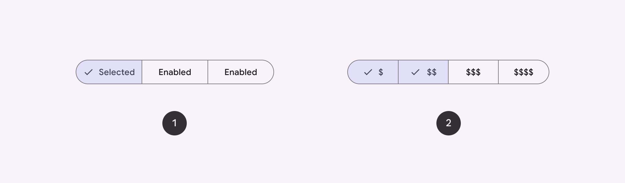
- دکمه تک انتخابی : به کاربران اجازه میدهد یک گزینه را انتخاب کنند.
- دکمه انتخاب چندگانه : به کاربران امکان میدهد بین دو تا پنج مورد انتخاب کنند. برای انتخابهای پیچیدهتر یا بیش از پنج مورد، از چیپها استفاده کنید.
سطح API
از طرحبندیهای SingleChoiceSegmentedButtonRow و MultiChoiceSegmentedButtonRow برای ایجاد دکمههای بخشبندیشده استفاده کنید. این طرحبندیها SegmentedButton ها را به درستی در موقعیت و اندازه قرار میدهند و پارامترهای کلیدی زیر را به اشتراک میگذارند:
-
space: همپوشانی بین دکمهها را تنظیم میکند. -
content: شامل محتوای ردیف دکمههای قطعهبندی شده است که معمولاً دنبالهای از دکمههایSegmentedButton) است.
یک دکمهی قطعهبندیشدهی تکگزینهای ایجاد کنید
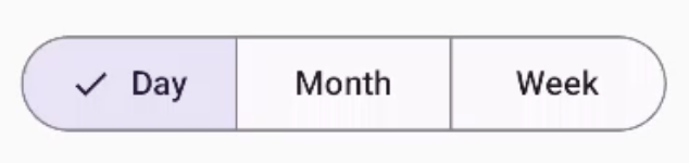
این مثال نحوه ایجاد یک دکمهی قطعهبندیشده با تکگزینه را نشان میدهد:
@Composable fun SingleChoiceSegmentedButton(modifier: Modifier = Modifier) { var selectedIndex by remember { mutableIntStateOf(0) } val options = listOf("Day", "Month", "Week") SingleChoiceSegmentedButtonRow { options.forEachIndexed { index, label -> SegmentedButton( shape = SegmentedButtonDefaults.itemShape( index = index, count = options.size ), onClick = { selectedIndex = index }, selected = index == selectedIndex, label = { Text(label) } ) } } }
نکات کلیدی در مورد کد
- با استفاده از
rememberوmutableIntStateOfیک متغیرselectedIndexرا برای ردیابی اندیس دکمهی انتخاب شده، مقداردهی اولیه میکند. - فهرستی از
optionsکه نشاندهندهی برچسبهای دکمه هستند را تعریف میکند. -
SingleChoiceSegmentedButtonRowبه شما امکان میدهد فقط یک دکمه را انتخاب کنید. - برای هر گزینه، درون حلقه
forEachIndexedیکSegmentedButtonایجاد میکند:-
shapeشکل دکمه را بر اساس اندیس آن و تعداد کل گزینهها با استفاده ازSegmentedButtonDefaults.itemShapeتعریف میکند. -
onClickselectedIndexبا اندیس دکمهی کلیکشده بهروزرسانی میکند. -
selectedحالت انتخاب دکمه را بر اساسselectedIndexتنظیم میکند. -
labelبرچسب دکمه را با استفاده ازTextcomposable نمایش میدهد.
-
نتیجه
یک دکمه چند انتخابی چند بخشی ایجاد کنید
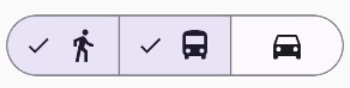
این مثال نحوه ایجاد یک دکمه چند گزینهای بخشبندیشده با آیکونها را نشان میدهد که به کاربران امکان انتخاب چندین گزینه را میدهد:
@Composable fun MultiChoiceSegmentedButton(modifier: Modifier = Modifier) { val selectedOptions = remember { mutableStateListOf(false, false, false) } val options = listOf("Walk", "Ride", "Drive") MultiChoiceSegmentedButtonRow { options.forEachIndexed { index, label -> SegmentedButton( shape = SegmentedButtonDefaults.itemShape( index = index, count = options.size ), checked = selectedOptions[index], onCheckedChange = { selectedOptions[index] = !selectedOptions[index] }, icon = { SegmentedButtonDefaults.Icon(selectedOptions[index]) }, label = { when (label) { "Walk" -> Icon( imageVector = Icons.AutoMirrored.Filled.DirectionsWalk, contentDescription = "Directions Walk" ) "Ride" -> Icon( imageVector = Icons.Default.DirectionsBus, contentDescription = "Directions Bus" ) "Drive" -> Icon( imageVector = Icons.Default.DirectionsCar, contentDescription = "Directions Car" ) } } ) } } }
نکات کلیدی در مورد کد
- این کد، متغیر
selectedOptionsرا با استفاده ازrememberوmutableStateListOfمقداردهی اولیه میکند. این کار، وضعیت انتخاب شدهی هر دکمه را ردیابی میکند. - این کد از
MultiChoiceSegmentedButtonRowبرای نگهداری دکمهها استفاده میکند. - درون حلقه
forEachIndexed، کد برای هر گزینه یکSegmentedButtonایجاد میکند:-
shapeشکل دکمه را بر اساس اندیس آن و تعداد کل گزینهها تعریف میکند. - حالت علامتگذاری
checkedدکمه را بر اساس مقدار متناظر درselectedOptionsتنظیم میکند. - متد
onCheckedChangeوضعیت انتخابشدهی آیتم مربوطه درselectedOptionsرا هنگام کلیک روی دکمه، تغییر میدهد. -
iconیک آیکون بر اساسSegmentedButtonDefaults.Iconو حالت تیک خوردهی دکمه نمایش میدهد. -
label، با استفاده از ترکیبپذیرهایIconبا بردارهای تصویر مناسب و توضیحات محتوا، نمادی مربوط به برچسب را نمایش میدهد.
-
نتیجه
منابع اضافی
- ماده ۳: دکمههای قطعهبندیشده