
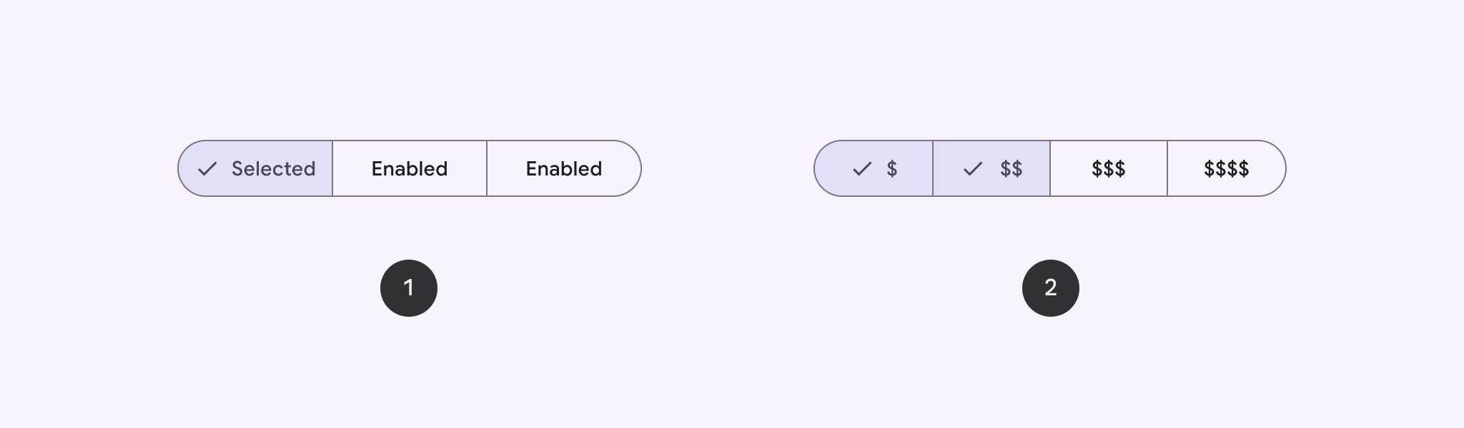
Usa un botón segmentado para permitir que los usuarios elijan entre un conjunto de opciones, una al lado de la otra. Existen dos tipos de botones segmentados:
- Botón de selección única: Permite que los usuarios elijan una opción.
- Botón de selección múltiple: Permite a los usuarios elegir entre dos y cinco elementos. Para opciones más complejas o más de cinco elementos, usa chips.
Superficie de la API
Usa los diseños SingleChoiceSegmentedButtonRow y MultiChoiceSegmentedButtonRow para crear botones segmentados. Estos diseños posicionan y dimensionan los SegmentedButtons correctamente, y comparten los siguientes parámetros clave:
space: Ajusta la superposición entre los botones.content: Contiene el contenido de la fila de botones segmentados, que suele ser una secuencia deSegmentedButtons.
Crea un botón segmentado de selección única
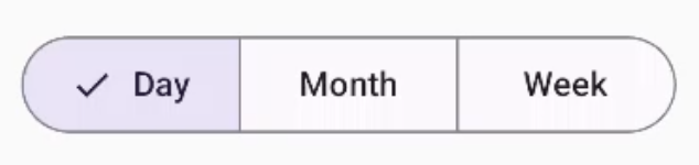
En este ejemplo, se muestra cómo crear un botón segmentado de selección única:
@Composable fun SingleChoiceSegmentedButton(modifier: Modifier = Modifier) { var selectedIndex by remember { mutableIntStateOf(0) } val options = listOf("Day", "Month", "Week") SingleChoiceSegmentedButtonRow { options.forEachIndexed { index, label -> SegmentedButton( shape = SegmentedButtonDefaults.itemShape( index = index, count = options.size ), onClick = { selectedIndex = index }, selected = index == selectedIndex, label = { Text(label) } ) } } }
Puntos clave sobre el código
- Inicializa una variable
selectedIndexconrememberymutableIntStateOfpara hacer un seguimiento del índice del botón seleccionado. - Define una lista de
optionsque representan las etiquetas de los botones. SingleChoiceSegmentedButtonRowte permite seleccionar solo un botón.- Crea un
SegmentedButtonpara cada opción, dentro del bucleforEachIndexed:shapedefine la forma del botón según su índice y el recuento total de opciones conSegmentedButtonDefaults.itemShape.onClickactualizaselectedIndexcon el índice del botón en el que se hizo clic.selectedestablece el estado de selección del botón segúnselectedIndex.labelmuestra la etiqueta del botón con el elementoTextcomponible.
Resultado
Crea un botón segmentado de selección múltiple
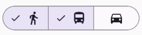
En este ejemplo, se muestra cómo crear un botón segmentado de opción múltiple con íconos que permite a los usuarios seleccionar varias opciones:
@Composable fun MultiChoiceSegmentedButton(modifier: Modifier = Modifier) { val selectedOptions = remember { mutableStateListOf(false, false, false) } val options = listOf("Walk", "Ride", "Drive") MultiChoiceSegmentedButtonRow { options.forEachIndexed { index, label -> SegmentedButton( shape = SegmentedButtonDefaults.itemShape( index = index, count = options.size ), checked = selectedOptions[index], onCheckedChange = { selectedOptions[index] = !selectedOptions[index] }, icon = { SegmentedButtonDefaults.Icon(selectedOptions[index]) }, label = { when (label) { "Walk" -> Icon( imageVector = Icons.AutoMirrored.Filled.DirectionsWalk, contentDescription = "Directions Walk" ) "Ride" -> Icon( imageVector = Icons.Default.DirectionsBus, contentDescription = "Directions Bus" ) "Drive" -> Icon( imageVector = Icons.Default.DirectionsCar, contentDescription = "Directions Car" ) } } ) } } }
Puntos clave sobre el código
- El código inicializa la variable
selectedOptionsconrememberymutableStateListOf. Esto hace un seguimiento del estado seleccionado de cada botón. - El código usa
MultiChoiceSegmentedButtonRowpara contener los botones. - Dentro del bucle
forEachIndexed, el código crea un objetoSegmentedButtonpara cada opción:shapedefine la forma del botón según su índice y el recuento total de opciones.checkedestablece el estado de activación del botón según el valor correspondiente enselectedOptions.onCheckedChangealterna el estado seleccionado del elemento correspondiente enselectedOptionscuando se hace clic en el botón.iconmuestra un ícono basado enSegmentedButtonDefaults.Icony el estado de activación del botón.labelmuestra un ícono correspondiente a la etiqueta, usando elementos componiblesIconcon vectores de imagen y descripciones de contenido adecuados.
Resultado
Recursos adicionales
- Material 3: Botones segmentados