
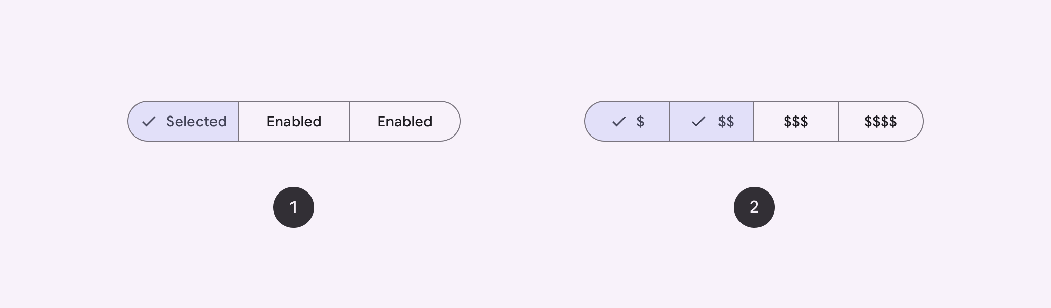
Mit segmentierten Schaltflächen können Nutzer aus einer Reihe von Optionen auswählen, die nebeneinander angezeigt werden. Es gibt zwei Arten von segmentierten Schaltflächen:
- Button für die Einzelauswahl: Nutzer können eine Option auswählen.
- Schaltfläche für die Mehrfachauswahl: Damit können Nutzer zwischen zwei und fünf Elementen auswählen. Bei komplexeren Auswahlmöglichkeiten oder mehr als fünf Elementen verwenden Sie Chips.
API-Oberfläche
Verwenden Sie die Layouts SingleChoiceSegmentedButtonRow und MultiChoiceSegmentedButtonRow, um segmentierte Schaltflächen zu erstellen. Bei diesen Layouts werden SegmentedButtons richtig positioniert und skaliert. Sie haben die folgenden wichtigen Parameter gemeinsam:
space: Passt die Überlappung zwischen den Schaltflächen an.content: Enthält den Inhalt der Zeile mit segmentierten Schaltflächen, der in der Regel eine Folge vonSegmentedButtons ist.
Segmentierten Button mit Einzelauswahl erstellen
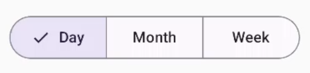
In diesem Beispiel wird gezeigt, wie Sie eine segmentierte Schaltfläche für die Einzelauswahl erstellen:
@Composable fun SingleChoiceSegmentedButton(modifier: Modifier = Modifier) { var selectedIndex by remember { mutableIntStateOf(0) } val options = listOf("Day", "Month", "Week") SingleChoiceSegmentedButtonRow { options.f>orEachIndexed { index, label - SegmentedButton( shape = SegmentedButtonDefaults.itemShape( index = index, count = options.size ), onClick = { selectedIndex = index }, selected = index == selectedIndex, label = { Text(label) } } } }SegmentedButton.kt
Wichtige Punkte zum Code
- Initialisiert eine
selectedIndex-Variable mitrememberundmutableIntStateOf, um den Index der ausgewählten Schaltfläche zu verfolgen. - Definiert eine Liste von
options, die die Schaltflächenlabels darstellen. - Mit
SingleChoiceSegmentedButtonRowkönnen Sie nur eine Schaltfläche auswählen. - Erstellt für jede Option eine
SegmentedButtoninnerhalb derforEachIndexed-Schleife:shapedefiniert die Form der Schaltfläche basierend auf ihrem Index und der Gesamtzahl der Optionen mitSegmentedButtonDefaults.itemShape.onClickwird mit dem Index der angeklickten Schaltfläche aktualisiert.selectedIndex- Mit
selectedwird der Auswahlstatus der Schaltfläche basierend aufselectedIndexfestgelegt. labelzeigt das Schaltflächenlabel mit der zusammensetzbaren FunktionTextan.
Ergebnis
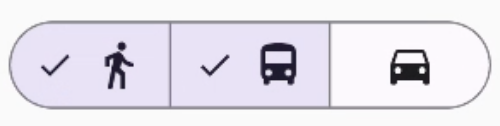
Segmentierte Schaltfläche mit Mehrfachauswahl erstellen
In diesem Beispiel wird gezeigt, wie Sie eine segmentierte Schaltfläche mit mehreren Auswahlmöglichkeiten und Symbolen erstellen, mit der Nutzer mehrere Optionen auswählen können:
@Composable fun MultiChoiceSegmentedButton(modifier: Modifier = Modifier) { val selectedOptions = remember { mutableStateListOf(false, false, false) } val options = listOf("Walk", "Ride", "Drive") MultiChoiceSegmentedButtonRow { options.f>orEachIndexed { index, label - SegmentedButton( shape = SegmentedButtonDefaults.itemShape( index = index, count = options.size ), checked = selectedOptions[index], onCheckedChange = { selectedOptions[index] = !selectedOptions[index] }, icon = { SegmentedButtonDefaults.Icon(selectedOptions[index]) }, label = { when (label) { > "Walk" - Icon( imageVector = Icons.AutoMirrored.Filled.DirectionsWalk, contentDescription = "Directions Walk" > ) "Ride" - Icon( imageVector = Icons.Default.DirectionsBus, contentDescription = "Directions> Bus" ) "Drive" - Icon( imageVector = Icons.Default.DirectionsCar, contentDescription = "Directions Car" } } ) } } }SegmentedButton.kt
Wichtige Punkte zum Code
- Der Code initialisiert die Variable
selectedOptionsmitrememberundmutableStateListOf. Damit wird der ausgewählte Status jeder Schaltfläche erfasst. - Im Code werden die Schaltflächen in
MultiChoiceSegmentedButtonRoweingefügt. - Innerhalb der
forEachIndexed-Schleife wird für jede Option einSegmentedButtonerstellt:shapedefiniert die Form der Schaltfläche basierend auf ihrem Index und der Gesamtzahl der Optionen.- Mit
checkedwird der Status der Schaltfläche basierend auf dem entsprechenden Wert inselectedOptionsfestgelegt. onCheckedChangeschaltet den ausgewählten Status des entsprechenden Elements inselectedOptionsum, wenn auf die Schaltfläche geklickt wird.iconzeigt ein Symbol basierend aufSegmentedButtonDefaults.Iconund dem angekreuzten Status der Schaltfläche an.labelzeigt ein Symbol an, das dem Label entspricht. Dazu werdenIcon-Composables mit entsprechenden Bildvektoren und Inhaltsbeschreibungen verwendet.
Ergebnis
Zusätzliche Ressourcen
- Material 3: Segmentierte Schaltflächen