Mit Sammlungen den Überblick behalten
Sie können Inhalte basierend auf Ihren Einstellungen speichern und kategorisieren.
Scaffold
In Material Design ist ein Scaffold eine grundlegende Struktur, die eine standardisierte Plattform für komplexe Benutzeroberflächen bietet. Sie fasst verschiedene Teile der Benutzeroberfläche zusammen, z. B. App-Leisten und Floating Action Buttons, und sorgt so für ein einheitliches Erscheinungsbild von Apps.
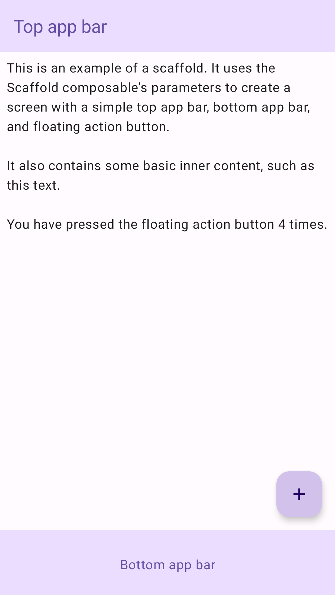
Beispiel
Das Scaffold-Composable bietet eine einfache API, mit der Sie die Struktur Ihrer App schnell gemäß den Material Design-Richtlinien zusammenstellen können.
Scaffold akzeptiert mehrere zusammensetzbare Funktionen als Parameter. Dazu gehören:
topBar: Die App-Leiste oben auf dem Bildschirm.
bottomBar: Die App-Leiste unten auf dem Bildschirm.
floatingActionButton: Eine Schaltfläche, die in der unteren rechten Ecke des Bildschirms angezeigt wird und mit der Sie wichtige Aktionen aufrufen können.
Sie können Scaffold-Inhalte auch wie bei anderen Containern übergeben. Es wird PaddingValues an die content-Lambda-Funktion übergeben, die Sie auf die Root-Composable-Funktion Ihres Inhalts anwenden sollten, um die Größe zu begrenzen.
Das folgende Beispiel zeigt eine vollständige Scaffold-Implementierung. Sie enthält eine obere und eine untere App-Leiste sowie eine unverankerte Aktionsschaltfläche.
@ComposablefunScaffoldExample(){varpressesbyremember{mutableIntStateOf(0)}Scaffold(topBar={TopAppBar(colors=topAppBarColors(containerColor=MaterialTheme.colorScheme.primaryContainer,titleContentColor=MaterialTheme.colorScheme.primary,),title={Text("Top app bar")})},bottomBar={BottomAppBar(containerColor=MaterialTheme.colorScheme.primaryContainer,contentColor=MaterialTheme.colorScheme.primary,){Text(modifier=Modifier.fillMaxWidth(),textAlign=TextAlign.Center,text="Bottom app bar",)}},floatingActionButton={FloatingActionButton(onClick={presses++}){Icon(Icons.Default.Add,contentDescription="Add")}}){innerPadding->
Column(modifier=Modifier.padding(innerPadding),verticalArrangement=Arrangement.spacedBy(16.dp),){Text(modifier=Modifier.padding(8.dp),text=""" This is an example of a scaffold. It uses the Scaffold composable's parameters to create a screen with a simple top app bar, bottom app bar, and floating action button. It also contains some basic inner content, such as this text. You have pressed the floating action button $presses times. """.trimIndent(),)}}}
Alle Inhalte und Codebeispiele auf dieser Seite unterliegen den Lizenzen wie im Abschnitt Inhaltslizenz beschrieben. Java und OpenJDK sind Marken oder eingetragene Marken von Oracle und/oder seinen Tochtergesellschaften.
Zuletzt aktualisiert: 2025-08-27 (UTC).
[[["Leicht verständlich","easyToUnderstand","thumb-up"],["Mein Problem wurde gelöst","solvedMyProblem","thumb-up"],["Sonstiges","otherUp","thumb-up"]],[["Benötigte Informationen nicht gefunden","missingTheInformationINeed","thumb-down"],["Zu umständlich/zu viele Schritte","tooComplicatedTooManySteps","thumb-down"],["Nicht mehr aktuell","outOfDate","thumb-down"],["Problem mit der Übersetzung","translationIssue","thumb-down"],["Problem mit Beispielen/Code","samplesCodeIssue","thumb-down"],["Sonstiges","otherDown","thumb-down"]],["Zuletzt aktualisiert: 2025-08-27 (UTC)."],[],[],null,["Scaffold\n\nIn Material Design, a scaffold is a fundamental structure that provides a\nstandardized platform for complex user interfaces. It holds together different\nparts of the UI, such as app bars and floating action buttons, giving apps a\ncoherent look and feel.\n\nExample\n\nThe [`Scaffold`](/reference/kotlin/androidx/compose/material3/package-summary#Scaffold(androidx.compose.ui.Modifier,kotlin.Function0,kotlin.Function0,kotlin.Function0,kotlin.Function0,androidx.compose.material3.FabPosition,androidx.compose.ui.graphics.Color,androidx.compose.ui.graphics.Color,androidx.compose.foundation.layout.WindowInsets,kotlin.Function1)) composable provides a straightforward API you can use to\nquickly assemble your app's structure according to Material Design guidelines.\n`Scaffold` accepts several composables as parameters. Among these are the\nfollowing:\n\n- `topBar`: The app bar across the top of the screen.\n- `bottomBar`: The app bar across the bottom of the screen.\n- `floatingActionButton`: A button that hovers over the bottom-right corner of the screen that you can use to expose key actions.\n\n| **Note:** For more detailed examples on how you can implement both top and bottom app bars, see the app bars page.\n\nYou can also pass `Scaffold` content as you would to other containers. It passes\n`PaddingValues` to the `content` lambda that you should apply to your\ncontent's root composable to constrain its size.\n\nThe following example shows a complete `Scaffold` implementation. It contains a\ntop app bar, a bottom app bar, and a floating action button.\n\n\n```kotlin\n@Composable\nfun ScaffoldExample() {\n var presses by remember { mutableIntStateOf(0) }\n\n Scaffold(\n topBar = {\n TopAppBar(\n colors = topAppBarColors(\n containerColor = MaterialTheme.colorScheme.primaryContainer,\n titleContentColor = MaterialTheme.colorScheme.primary,\n ),\n title = {\n Text(\"Top app bar\")\n }\n )\n },\n bottomBar = {\n BottomAppBar(\n containerColor = MaterialTheme.colorScheme.primaryContainer,\n contentColor = MaterialTheme.colorScheme.primary,\n ) {\n Text(\n modifier = Modifier\n .fillMaxWidth(),\n textAlign = TextAlign.Center,\n text = \"Bottom app bar\",\n )\n }\n },\n floatingActionButton = {\n FloatingActionButton(onClick = { presses++ }) {\n Icon(Icons.Default.Add, contentDescription = \"Add\")\n }\n }\n ) { innerPadding -\u003e\n Column(\n modifier = Modifier\n .padding(innerPadding),\n verticalArrangement = Arrangement.spacedBy(16.dp),\n ) {\n Text(\n modifier = Modifier.padding(8.dp),\n text =\n \"\"\"\n This is an example of a scaffold. It uses the Scaffold composable's parameters to create a screen with a simple top app bar, bottom app bar, and floating action button.\n\n It also contains some basic inner content, such as this text.\n\n You have pressed the floating action button $presses times.\n \"\"\".trimIndent(),\n )\n }\n }\n}https://github.com/android/snippets/blob/5673ffc60b614daf028ee936227128eb8c4f9781/compose/snippets/src/main/java/com/example/compose/snippets/components/Scaffold.kt#L47-L100\n```\n\n\u003cbr /\u003e\n\nThis implementation appears as follows:\n**Figure 1.** An implementation of scaffold.\n\nAdditional resources\n\n- [App bars](/develop/ui/compose/components/app-bars)"]]