라디오 버튼을 사용하면 사용자가 옵션 세트에서 옵션을 선택할 수 있습니다. 목록에서 하나의 항목만 선택할 수 있는 경우 라디오 버튼을 사용합니다. 사용자가 항목을 두 개 이상 선택해야 하는 경우 대신 스위치를 사용하세요.
그림 1. 하나의 옵션이 선택된 라디오 버튼 쌍
API 노출 영역
RadioButton 컴포저블을 사용하여 사용 가능한 옵션을 나열합니다. 각 RadioButton 옵션과 라벨을 Row 구성요소 내에 래핑하여 함께 그룹화합니다.
RadioButton에는 다음 주요 매개변수가 포함됩니다.
selected: 라디오 버튼이 선택되었는지 여부를 나타냅니다.
onClick: 사용자가 라디오 버튼을 클릭할 때 앱이 실행하는 람다 함수입니다. 이 값이 null이면 사용자가 라디오 버튼과 직접 상호작용할 수 없습니다.
enabled: 라디오 버튼이 사용 설정 또는 사용 중지되었는지 여부를 제어합니다. 사용자는 사용 중지된 라디오 버튼과 상호작용할 수 없습니다.
interactionSource: 버튼의 상호작용 상태(예: 눌림, 마우스 오버, 포커스)를 관찰할 수 있습니다.
기본 라디오 버튼 만들기
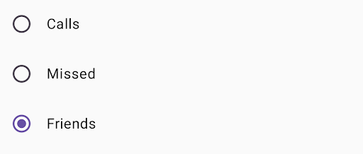
다음 코드 스니펫은 Column 내에 라디오 버튼 목록을 렌더링합니다.
@ComposablefunRadioButtonSingleSelection(modifier:Modifier=Modifier){valradioOptions=listOf("Calls","Missed","Friends")val(selectedOption,onOptionSelected)=remember{mutableStateOf(radioOptions[0])}// Note that Modifier.selectableGroup() is essential to ensure correct accessibility behaviorColumn(modifier.selectableGroup()){radioOptions.forEach{text->
Row(Modifier.fillMaxWidth().height(56.dp).selectable(selected=(text==selectedOption),onClick={onOptionSelected(text)},role=Role.RadioButton).padding(horizontal=16.dp),verticalAlignment=Alignment.CenterVertically){RadioButton(selected=(text==selectedOption),onClick=null// null recommended for accessibility with screen readers)Text(text=text,style=MaterialTheme.typography.bodyLarge,modifier=Modifier.padding(start=16.dp))}}}}
이 페이지에 나와 있는 콘텐츠와 코드 샘플에는 콘텐츠 라이선스에서 설명하는 라이선스가 적용됩니다. 자바 및 OpenJDK는 Oracle 및 Oracle 계열사의 상표 또는 등록 상표입니다.
최종 업데이트: 2025-08-23(UTC)
[[["이해하기 쉬움","easyToUnderstand","thumb-up"],["문제가 해결됨","solvedMyProblem","thumb-up"],["기타","otherUp","thumb-up"]],[["필요한 정보가 없음","missingTheInformationINeed","thumb-down"],["너무 복잡함/단계 수가 너무 많음","tooComplicatedTooManySteps","thumb-down"],["오래됨","outOfDate","thumb-down"],["번역 문제","translationIssue","thumb-down"],["샘플/코드 문제","samplesCodeIssue","thumb-down"],["기타","otherDown","thumb-down"]],["최종 업데이트: 2025-08-23(UTC)"],[],[],null,["# Radio button\n\nA [radio button](https://m3.material.io/components/radio-button/overview) lets a user select an option from a set of\noptions. You use a radio button when only one item can be selected from a\nlist. If users need to select more than one item, use a [switch](https://m3.material.io/components/switch/overview)\ninstead.\n**Figure 1.** A pair of radio buttons with one option selected.\n\nAPI surface\n-----------\n\nUse the [`RadioButton`](/reference/kotlin/androidx/compose/material3/package-summary#RadioButton(kotlin.Boolean,kotlin.Function0,androidx.compose.ui.Modifier,kotlin.Boolean,androidx.compose.material3.RadioButtonColors,androidx.compose.foundation.interaction.MutableInteractionSource)) composable to list the available options. Wrap each\n`RadioButton` option and its label inside a `Row` component to group them\ntogether.\n\n`RadioButton` includes the following key parameters:\n\n- `selected`: Indicates whether the radio button is selected.\n- `onClick`: A lambda function that your app executes when the user clicks the radio button. If this is `null`, the user can't interact directly with the radio button.\n- `enabled`: Controls whether the radio button is enabled or disabled. Users can't interact with disabled radio buttons.\n- `interactionSource`: Lets you observe the interaction state of the button, for example, whether it's pressed, hovered, or focused.\n\nCreate a basic radio button\n---------------------------\n\nThe following code snippet renders a list of radio buttons within a `Column`:\n\n\n```kotlin\n@Composable\nfun RadioButtonSingleSelection(modifier: Modifier = Modifier) {\n val radioOptions = listOf(\"Calls\", \"Missed\", \"Friends\")\n val (selectedOption, onOptionSelected) = remember { mutableStateOf(radioOptions[0]) }\n // Note that Modifier.selectableGroup() is essential to ensure correct accessibility behavior\n Column(modifier.selectableGroup()) {\n radioOptions.forEach { text -\u003e\n Row(\n Modifier\n .fillMaxWidth()\n .height(56.dp)\n .selectable(\n selected = (text == selectedOption),\n onClick = { onOptionSelected(text) },\n role = Role.RadioButton\n )\n .padding(horizontal = 16.dp),\n verticalAlignment = Alignment.CenterVertically\n ) {\n RadioButton(\n selected = (text == selectedOption),\n onClick = null // null recommended for accessibility with screen readers\n )\n Text(\n text = text,\n style = MaterialTheme.typography.bodyLarge,\n modifier = Modifier.padding(start = 16.dp)\n )\n }\n }\n }\n}https://github.com/android/snippets/blob/dd30aee903e8c247786c064faab1a9ca8d10b46e/compose/snippets/src/main/java/com/example/compose/snippets/components/RadioButton.kt#L39-L70\n```\n\n\u003cbr /\u003e\n\n### Key points about the code\n\n- `radioOptions` represents the labels for the radio buttons.\n- The `remember` composable function creates a state variable `selectedOption` and a function to update that state called `onOptionSelected`. This state holds the selected radio button option.\n - `mutableStateOf(radioOptions[0])` initializes the state to the first item in the list. \"Calls\" is the first item, so it's the radio button selected by default.\n- [`Modifier.selectableGroup()`](/reference/kotlin/androidx/compose/ui/Modifier#(androidx.compose.ui.Modifier).selectableGroup()) ensures proper accessibility behavior for screen readers. It informs the system that the elements within this `Column` are part of a selectable group, which enables proper screen reader support.\n- [`Modifier.selectable()`](/reference/kotlin/androidx/compose/ui/Modifier#(androidx.compose.ui.Modifier).selectable(kotlin.Boolean,kotlin.Boolean,androidx.compose.ui.semantics.Role,kotlin.Function0)) makes the entire `Row` act as a single selectable item.\n - `selected` indicates whether the current `Row` is selected based on the `selectedOption` state.\n - The `onClick` lambda function updates the `selectedOption` state to the clicked option when the `Row` is clicked.\n - `role = Role.RadioButton` informs accessibility services that the `Row` functions as a radio button.\n- `RadioButton(...)` creates the `RadioButton` composable.\n - `onClick = null` on the `RadioButton` improves accessibility. This prevents the radio button from handling the click event directly, and allows the `Row`'s `selectable` modifier to manage the selection state and accessibility behavior.\n\n### Result\n\n**Figure 2.** Three radio buttons with the \"Friends\" option selected.\n\nAdditional resources\n--------------------\n\n- Material Design: [Buttons](https://m3.material.io/components/buttons/overview)"]]