קל לארגן דפים בעזרת אוספים
אפשר לשמור ולסווג תוכן על סמך ההעדפות שלך.
לחצן בחירה מאפשר למשתמש לבחור אפשרות מתוך קבוצת אפשרויות. משתמשים בלחצן בחירה כשרוצים לאפשר בחירה של פריט אחד בלבד מתוך רשימה. אם המשתמשים צריכים לבחור יותר מפריט אחד, צריך להשתמש במקום זאת במתג.
איור 1. זוג לחצני בחירה שאחת מהאפשרויות שלהם נבחרה.
משטח API
כדי להציג את האפשרויות הזמינות, משתמשים בקומפוזבל RadioButton. כדי לקבץ את כל RadioButton האפשרויות והתוויות שלהן, צריך להוסיף אותן לרכיב Row.
RadioButton כולל את הפרמטרים העיקריים הבאים:
selected: מציין אם כפתור הבחירה נבחר.
onClick: פונקציית lambda שהאפליקציה מפעילה כשהמשתמש לוחץ על לחצן הבחירה. אם הערך הוא null, המשתמש לא יכול ליצור אינטראקציה ישירה עם לחצן הבחירה.
enabled: קובע אם כפתור הבחירה מופעל או מושבת. המשתמשים לא יכולים לבצע אינטראקציה עם לחצני רדיו מושבתים.
interactionSource: מאפשר לכם לראות את מצב האינטראקציה של הלחצן, למשל אם הוא נלחץ, אם העכבר מרחף מעליו או אם הוא במצב ממוקד.
יצירת לחצן רדיו בסיסי
קטע הקוד הבא מציג רשימה של כפתורי בחירה בתוך Column:
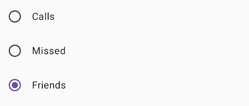
@ComposablefunRadioButtonSingleSelection(modifier:Modifier=Modifier){valradioOptions=listOf("Calls","Missed","Friends")val(selectedOption,onOptionSelected)=remember{mutableStateOf(radioOptions[0])}// Note that Modifier.selectableGroup() is essential to ensure correct accessibility behaviorColumn(modifier.selectableGroup()){radioOptions.forEach{text->
Row(Modifier.fillMaxWidth().height(56.dp).selectable(selected=(text==selectedOption),onClick={onOptionSelected(text)},role=Role.RadioButton).padding(horizontal=16.dp),verticalAlignment=Alignment.CenterVertically){RadioButton(selected=(text==selectedOption),onClick=null// null recommended for accessibility with screen readers)Text(text=text,style=MaterialTheme.typography.bodyLarge,modifier=Modifier.padding(start=16.dp))}}}}
הפונקציה הניתנת להרכבה remember יוצרת משתנה מצב selectedOption ופונקציה לעדכון המצב הזה שנקראת onOptionSelected. במצב הזה נשמרת האפשרות שנבחרה מתוך כפתורי הבחירה.
mutableStateOf(radioOptions[0]) מאתחל את המצב לפריט הראשון ברשימה. 'שיחות' הוא הפריט הראשון, ולכן לחצן הבחירה שלו מסומן כברירת מחדל.
Modifier.selectableGroup() מבטיח התנהגות נכונה של הנגישות עבור קוראי מסך. הוא מודיע למערכת שהרכיבים בתוך Column
הם חלק מקבוצה שאפשר לבחור בה, וכך מאפשר תמיכה נכונה בקורא מסך.
הערך selected מציין אם Row הנוכחי נבחר על סמך המצב selectedOption.
פונקציית ה-lambda onClick מעדכנת את המצב של selectedOption לאפשרות שנבחרה כשלוחצים על Row.
role = Role.RadioButton מודיע לשירותי הנגישות שהפונקציה Row
פועלת כמו לחצן אפשרויות.
RadioButton(...) יוצר את רכיב ה-RadioButton.
onClick = null ב-RadioButton משפר את הנגישות. כך נמנעת האפשרות של לחצן הבחירה לטפל ישירות באירוע הקליק, ומתאפשר לשינוי Row's selectable לנהל את מצב הבחירה ואת התנהגות הנגישות.
התוצאה
איור 2. שלושה לחצני בחירה עם האפשרות 'חברים' מסומנת.
דוגמאות התוכן והקוד שבדף הזה כפופות לרישיונות המפורטים בקטע רישיון לתוכן. Java ו-OpenJDK הם סימנים מסחריים או סימנים מסחריים רשומים של חברת Oracle ו/או של השותפים העצמאיים שלה.
עדכון אחרון: 2025-08-27 (שעון UTC).
[[["התוכן קל להבנה","easyToUnderstand","thumb-up"],["התוכן עזר לי לפתור בעיה","solvedMyProblem","thumb-up"],["סיבה אחרת","otherUp","thumb-up"]],[["חסרים לי מידע או פרטים","missingTheInformationINeed","thumb-down"],["התוכן מורכב מדי או עם יותר מדי שלבים","tooComplicatedTooManySteps","thumb-down"],["התוכן לא עדכני","outOfDate","thumb-down"],["בעיה בתרגום","translationIssue","thumb-down"],["בעיה בדוגמאות/בקוד","samplesCodeIssue","thumb-down"],["סיבה אחרת","otherDown","thumb-down"]],["עדכון אחרון: 2025-08-27 (שעון UTC)."],[],[],null,["A [radio button](https://m3.material.io/components/radio-button/overview) lets a user select an option from a set of\noptions. You use a radio button when only one item can be selected from a\nlist. If users need to select more than one item, use a [switch](https://m3.material.io/components/switch/overview)\ninstead.\n**Figure 1.** A pair of radio buttons with one option selected.\n\nAPI surface\n\nUse the [`RadioButton`](/reference/kotlin/androidx/compose/material3/package-summary#RadioButton(kotlin.Boolean,kotlin.Function0,androidx.compose.ui.Modifier,kotlin.Boolean,androidx.compose.material3.RadioButtonColors,androidx.compose.foundation.interaction.MutableInteractionSource)) composable to list the available options. Wrap each\n`RadioButton` option and its label inside a `Row` component to group them\ntogether.\n\n`RadioButton` includes the following key parameters:\n\n- `selected`: Indicates whether the radio button is selected.\n- `onClick`: A lambda function that your app executes when the user clicks the radio button. If this is `null`, the user can't interact directly with the radio button.\n- `enabled`: Controls whether the radio button is enabled or disabled. Users can't interact with disabled radio buttons.\n- `interactionSource`: Lets you observe the interaction state of the button, for example, whether it's pressed, hovered, or focused.\n\nCreate a basic radio button\n\nThe following code snippet renders a list of radio buttons within a `Column`:\n\n\n```kotlin\n@Composable\nfun RadioButtonSingleSelection(modifier: Modifier = Modifier) {\n val radioOptions = listOf(\"Calls\", \"Missed\", \"Friends\")\n val (selectedOption, onOptionSelected) = remember { mutableStateOf(radioOptions[0]) }\n // Note that Modifier.selectableGroup() is essential to ensure correct accessibility behavior\n Column(modifier.selectableGroup()) {\n radioOptions.forEach { text -\u003e\n Row(\n Modifier\n .fillMaxWidth()\n .height(56.dp)\n .selectable(\n selected = (text == selectedOption),\n onClick = { onOptionSelected(text) },\n role = Role.RadioButton\n )\n .padding(horizontal = 16.dp),\n verticalAlignment = Alignment.CenterVertically\n ) {\n RadioButton(\n selected = (text == selectedOption),\n onClick = null // null recommended for accessibility with screen readers\n )\n Text(\n text = text,\n style = MaterialTheme.typography.bodyLarge,\n modifier = Modifier.padding(start = 16.dp)\n )\n }\n }\n }\n}https://github.com/android/snippets/blob/5673ffc60b614daf028ee936227128eb8c4f9781/compose/snippets/src/main/java/com/example/compose/snippets/components/RadioButton.kt#L39-L70\n```\n\n\u003cbr /\u003e\n\nKey points about the code\n\n- `radioOptions` represents the labels for the radio buttons.\n- The `remember` composable function creates a state variable `selectedOption` and a function to update that state called `onOptionSelected`. This state holds the selected radio button option.\n - `mutableStateOf(radioOptions[0])` initializes the state to the first item in the list. \"Calls\" is the first item, so it's the radio button selected by default.\n- [`Modifier.selectableGroup()`](/reference/kotlin/androidx/compose/ui/Modifier#(androidx.compose.ui.Modifier).selectableGroup()) ensures proper accessibility behavior for screen readers. It informs the system that the elements within this `Column` are part of a selectable group, which enables proper screen reader support.\n- [`Modifier.selectable()`](/reference/kotlin/androidx/compose/ui/Modifier#(androidx.compose.ui.Modifier).selectable(kotlin.Boolean,kotlin.Boolean,androidx.compose.ui.semantics.Role,kotlin.Function0)) makes the entire `Row` act as a single selectable item.\n - `selected` indicates whether the current `Row` is selected based on the `selectedOption` state.\n - The `onClick` lambda function updates the `selectedOption` state to the clicked option when the `Row` is clicked.\n - `role = Role.RadioButton` informs accessibility services that the `Row` functions as a radio button.\n- `RadioButton(...)` creates the `RadioButton` composable.\n - `onClick = null` on the `RadioButton` improves accessibility. This prevents the radio button from handling the click event directly, and allows the `Row`'s `selectable` modifier to manage the selection state and accessibility behavior.\n\nResult **Figure 2.** Three radio buttons with the \"Friends\" option selected.\n\nAdditional resources\n\n- Material Design: [Buttons](https://m3.material.io/components/buttons/overview)"]]