Koleksiyonlar ile düzeninizi koruyun
İçeriği tercihlerinize göre kaydedin ve kategorilere ayırın.
Raylar, büyük ekranlı cihazlarda çalışan uygulamalardaki hedeflere erişim sağlar. Aşağıdaki durumlarda gezinme raylarını kullanmalısınız:
Bir uygulamanın herhangi bir yerinden erişilmesi gereken üst düzey hedefler
Üç ila yedi ana hedef
Tablet veya masaüstü düzenleri
1. Şekil. Dört hedef ve bir kayan işlem düğmesi içeren gezinme çubuğu.
Bu sayfada, uygulamanızda ilgili ekranlar ve temel gezinme ile birlikte nasıl bant göstereceğiniz açıklanmaktadır.
API yüzeyi
Uygulamanızda bir bant uygulamak için NavigationRail composable'ı NavigationRailItem ile birlikte kullanın. NavigationRailItem, ray sütunundaki tek bir ray öğesini temsil eder.
NavigationRailItem aşağıdaki temel parametreleri içerir:
selected: Mevcut ray öğesinin görsel olarak vurgulanıp vurgulanmayacağını belirler.
onClick(): Kullanıcı, bant öğesini tıkladığında gerçekleştirilecek işlemi tanımlayan zorunlu bir lambda işlevi. Genellikle gezinme etkinliklerini işlediğiniz, seçili ray öğesi durumunu güncellediğiniz veya ilgili içeriği yüklediğiniz yerdir.
label: Ray öğesindeki metni gösterir. İsteğe bağlıdır.
icon: Bant öğesinde bir simge gösterir. İsteğe bağlıdır.
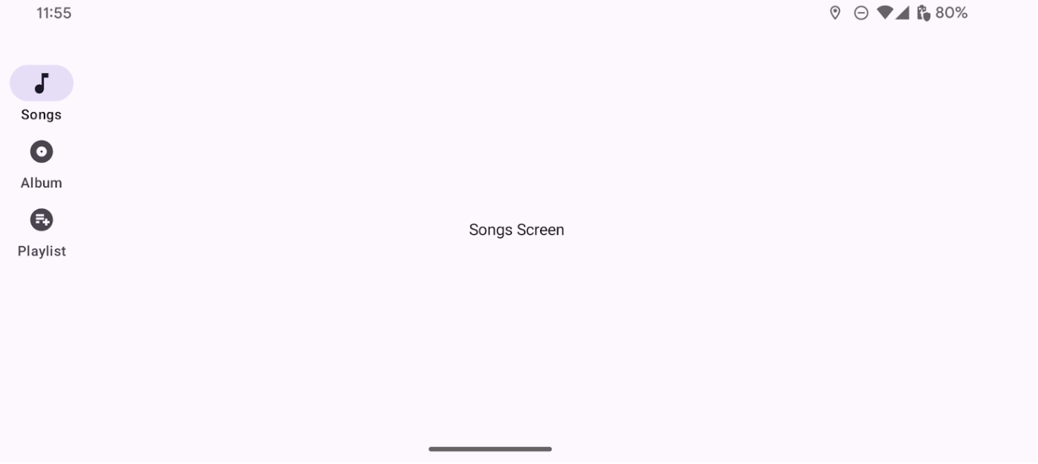
Örnek: Ray tabanlı gezinme
Aşağıdaki snippet, kullanıcıların bir uygulamadaki farklı ekranlar arasında gezinmesini sağlamak için bir gezinme sütunu uygular:
Bu sayfadaki içerik ve kod örnekleri, İçerik Lisansı sayfasında açıklanan lisanslara tabidir. Java ve OpenJDK, Oracle ve/veya satış ortaklarının tescilli ticari markasıdır.
Son güncelleme tarihi: 2025-08-28 UTC.
[[["Anlaması kolay","easyToUnderstand","thumb-up"],["Sorunumu çözdü","solvedMyProblem","thumb-up"],["Diğer","otherUp","thumb-up"]],[["İhtiyacım olan bilgiler yok","missingTheInformationINeed","thumb-down"],["Çok karmaşık / çok fazla adım var","tooComplicatedTooManySteps","thumb-down"],["Güncel değil","outOfDate","thumb-down"],["Çeviri sorunu","translationIssue","thumb-down"],["Örnek veya kod sorunu","samplesCodeIssue","thumb-down"],["Diğer","otherDown","thumb-down"]],["Son güncelleme tarihi: 2025-08-28 UTC."],[],[],null,["Rails provide access to destinations in apps that run on devices with large\nscreens. You should use navigation rails for:\n\n- Top-level destinations that need to be accessible anywhere in an app\n- Three to seven main destinations\n- Tablet or desktop layouts\n\n**Figure 1.** A navigation rail with four destinations and a floating action button.\n\nThis page shows you how to display rails in your app with related screens and\nbasic navigation.\n\nAPI surface\n\nUse the [`NavigationRail`](/reference/kotlin/androidx/compose/material3/package-summary#NavigationRail(androidx.compose.ui.Modifier,androidx.compose.ui.graphics.Color,androidx.compose.ui.graphics.Color,kotlin.Function1,androidx.compose.foundation.layout.WindowInsets,kotlin.Function1)) composable with [`NavigationRailItem`](/reference/kotlin/androidx/compose/material3/package-summary#NavigationRailItem(kotlin.Boolean,kotlin.Function0,kotlin.Function0,androidx.compose.ui.Modifier,kotlin.Boolean,kotlin.Function0,kotlin.Boolean,androidx.compose.material3.NavigationRailItemColors,androidx.compose.foundation.interaction.MutableInteractionSource)) to\nimplement a rail in your application. The `NavigationRailItem` represents a\nsingle rail item in the rail column.\n\n`NavigationRailItem` includes the following key parameters:\n\n- `selected`: Determines whether the current rail item is visually highlighted.\n- `onClick()`: A required lambda function that defines the action to be performed when the user clicks on the rail item. This is where you typically handle navigation events, update the selected rail item state, or load corresponding content.\n- `label`: Displays text within the rail item. Optional.\n- `icon`: Displays an icon within the rail item. Optional.\n\nExample: Rail-based navigation\n\nThe following snippet implements a navigation rail so users can navigate between\ndifferent screens in an app:\n| **Note:** The [full source code](https://github.com/android/snippets/blob/main/compose/snippets/src/main/java/com/example/compose/snippets/components/Navigation.kt) includes the code that establishes the basic navigation structure for the following example.\n\n\n```kotlin\n@Composable\nfun NavigationRailExample(modifier: Modifier = Modifier) {\n val navController = rememberNavController()\n val startDestination = Destination.SONGS\n var selectedDestination by rememberSaveable { mutableIntStateOf(startDestination.ordinal) }\n\n Scaffold(modifier = modifier) { contentPadding -\u003e\n NavigationRail(modifier = Modifier.padding(contentPadding)) {\n Destination.entries.forEachIndexed { index, destination -\u003e\n NavigationRailItem(\n selected = selectedDestination == index,\n onClick = {\n navController.navigate(route = destination.route)\n selectedDestination = index\n },\n icon = {\n Icon(\n destination.icon,\n contentDescription = destination.contentDescription\n )\n },\n label = { Text(destination.label) }\n )\n }\n }\n AppNavHost(navController, startDestination)\n }\n}https://github.com/android/snippets/blob/7a0ebbee11495f628cf9d574f6b6069c2867232a/compose/snippets/src/main/java/com/example/compose/snippets/components/Navigation.kt#L153-L180\n```\n\n\u003cbr /\u003e\n\nKey points\n\n- `NavigationRail` displays a vertical column of rail items, with each item corresponding to a `Destination`.\n- `val navController = rememberNavController()` creates and remembers an instance of [`NavHostController`](/reference/androidx/navigation/NavHostController), which manages the navigation within a [`NavHost`](/reference/androidx/navigation/NavHost).\n- `var selectedDestination by rememberSaveable {\n mutableIntStateOf(startDestination.ordinal) }` manages the state of the currently selected rail item.\n - `startDestination.ordinal` gets the numerical index (position) of the `Destination.SONGS` enum entry.\n- When a rail item is clicked, `navController.navigate(route =\n destination.route)` is called to navigate to the corresponding screen.\n- The `onClick` lambda of the `NavigationRailItem` updates the `selectedDestination` state to visually highlight the clicked rail item.\n- It calls the `AppNavHost` composable, passing the `navController` and `startDestination`, to display the actual content of the selected screen.\n\nResult\n\nThe following image shows the result of the previous snippet:\n**Figure 2.** A navigation rail that contains 3 destinations with associated icons: Songs, Album, and Playlist.\n\nAdditional resources\n\n- [Material 3 - Navigation rail](https://m3.material.io/components/navigation-rail/overview)\n- [Navigation with Compose](/develop/ui/compose/navigation)"]]