Gezinme çubuğu, kullanıcıların bir uygulamadaki hedefler arasında geçiş yapmasına olanak tanır. Gezinme çubuklarını şu amaçlarla kullanmalısınız:
- Eşit öneme sahip üç ila beş hedef
- Kompakt pencere boyutları
- Uygulama ekranlarında tutarlı hedefler

Bu sayfada, uygulamanızda ilgili ekranlar ve temel gezinme ile birlikte bir gezinme çubuğunu nasıl göstereceğiniz açıklanmaktadır.
API yüzeyi
Hedef değiştirme mantığını uygulamak için NavigationBar ve NavigationBarItem composable'larını kullanın. Her NavigationBarItem, tek bir hedefi temsil eder.
NavigationBarItem aşağıdaki temel parametreleri içerir:
selected: Geçerli öğenin görsel olarak vurgulanıp vurgulanmayacağını belirler.onClick(): Kullanıcı öğeyi tıkladığında gerçekleştirilecek işlemi tanımlar. Gezinme etkinliklerini işleme, seçili öğe durumunu güncelleme veya ilgili içeriği yükleme mantığı buraya aittir.label: Öğedeki metni gösterir. İsteğe bağlıdır.icon: Öğede bir simge gösterir. İsteğe bağlıdır.
Örnek: Alt gezinme çubuğu
Aşağıdaki snippet, kullanıcıların bir uygulamada farklı ekranlar arasında gezinmesini sağlamak için öğeler içeren bir alt gezinme çubuğu uygular:
@Composable fun NavigationBarExample(modifier: Modifier = Modifier) { val navController = rememberNavController() val startDestination = Destination.SONGS var selectedDestination by rememberSaveable { mutableIntStateOf(startDestination.ordinal) } Scaffold( modifier = modifier, bottomBar = { NavigationBar(windowInsets = NavigationBarDefaults.windowInsets) { Destination.entries.forEachIndexed { index, destination -> NavigationBarItem( selected = selectedDestination == index, onClick = { navController.navigate(route = destination.route) selectedDestination = index }, icon = { Icon( destination.icon, contentDescription = destination.contentDescription ) }, label = { Text(destination.label) } ) } } } ) { contentPadding -> AppNavHost(navController, startDestination, modifier = Modifier.padding(contentPadding)) } }
Önemli noktalar
NavigationBar, her öğenin birDestinationile eşleştiği bir öğe koleksiyonunu gösterir.val navController = rememberNavController(),NavHostControllerörneği oluşturur ve hatırlar. Bu örnek,NavHostiçindeki gezinmeyi yönetir.var selectedDestination by rememberSaveable { mutableIntStateOf(startDestination.ordinal) }, seçili öğenin durumunu yönetir.startDestination.ordinal,Destination.SONGSenum girişinin sayısal dizinini (konumunu) alır.
- Bir öğe tıklandığında, ilgili ekrana gitmek için
navController.navigate(route = destination.route)çağrılır. onClicklambda'sı, tıklanan öğeyi görsel olarak vurgulamak içinNavigationBarItemöğesininselectedDestinationdurumunu günceller.- Gezinme mantığı, seçilen ekranın gerçek içeriğini göstermek için
AppNavHostcomposable'ını çağıraraknavControllervestartDestinationdeğerlerini iletir.
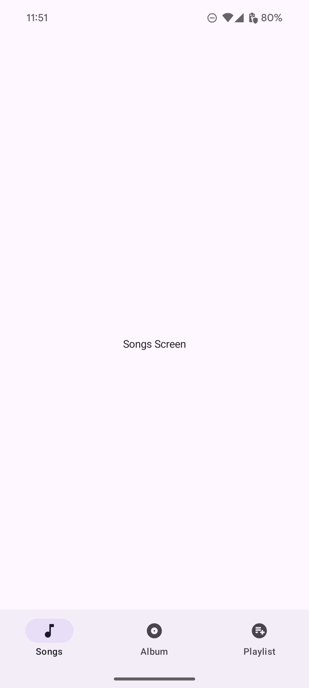
Sonuç
Aşağıdaki resimde, önceki snippet'ten elde edilen gezinme çubuğu gösterilmektedir: