
منوهای کشویی به کاربران اجازه میدهند روی یک آیکون، فیلد متنی یا سایر اجزا کلیک کنند و سپس از لیستی از گزینهها روی یک سطح موقت انتخاب کنند. این راهنما نحوه ایجاد منوهای پایه و منوهای پیچیدهتر با جداکنندهها و آیکونها را شرح میدهد.
سطح API
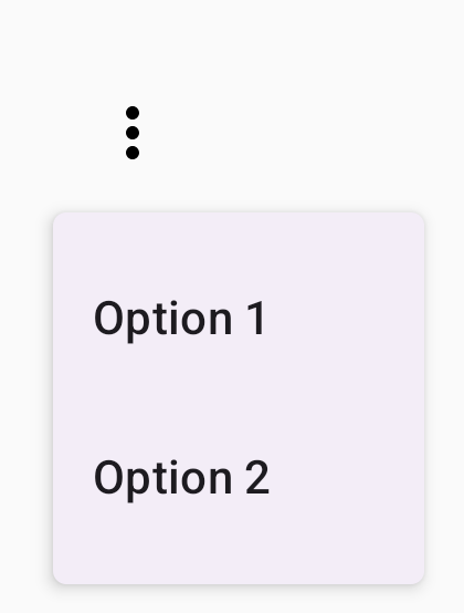
از کامپوننتهای DropdownMenu ، DropdownMenuItem و IconButton برای پیادهسازی یک منوی کشویی سفارشی استفاده کنید. کامپوننتهای DropdownMenu و DropdownMenuItem برای نمایش آیتمهای منو استفاده میشوند، در حالی که IconButton تریگر نمایش یا پنهان کردن منوی کشویی است.
پارامترهای کلیدی برای کامپوننت DropdownMenu شامل موارد زیر است:
-
expanded: نشان میدهد که آیا منو قابل مشاهده است یا خیر. -
onDismissRequest: برای مدیریت لغو منو استفاده میشود. -
content: محتوای قابل ترکیب منو، که معمولاً شامل کامپوننتهایDropdownMenuItemاست.
پارامترهای کلیدی برای DropdownMenuItem شامل موارد زیر است:
-
text: محتوای نمایش داده شده در آیتم منو را تعریف میکند. -
onClick: فراخوانی مجدد برای مدیریت تعامل با آیتم موجود در منو.
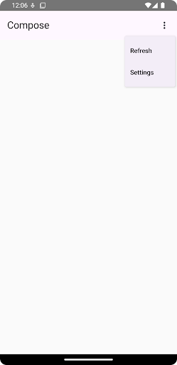
ایجاد یک منوی کشویی ساده
قطعه کد زیر، پیادهسازی مینیمال DropdownMenu را نشان میدهد:
@Composable fun MinimalDropdownMenu() { var expanded by remember { mutableStateOf(false) } Box( modifier = Modifier .padding(16.dp) ) { IconButton(onClick = { expanded = !expanded }) { Icon(Icons.Default.MoreVert, contentDescription = "More options") } DropdownMenu( expanded = expanded, onDismissRequest = { expanded = false } ) { DropdownMenuItem( text = { Text("Option 1") }, onClick = { /* Do something... */ } ) DropdownMenuItem( text = { Text("Option 2") }, onClick = { /* Do something... */ } ) } } }
نکات کلیدی در مورد کد
- یک منوی
DropdownMenuساده شامل دو آیتم منو تعریف میکند. - پارامتر
expandedمیزان نمایش منو را در حالت باز یا بسته کنترل میکند. - پارامتر
onDismissRequestیک تابع فراخوانی تعریف میکند که هنگام بستن منو توسط کاربر اجرا میشود. -
DropdownMenuItemcomposable نشان دهنده موارد قابل انتخاب در منوی کشویی است. - یک
IconButtonباعث باز و بسته شدن منو میشود.
نتیجه
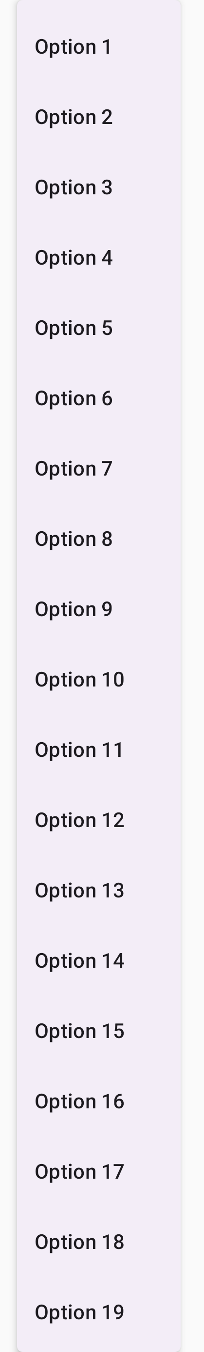
یک منوی کشویی طولانیتر ایجاد کنید
اگر همه آیتمهای منو نتوانند همزمان نمایش داده شوند، DropdownMenu به طور پیشفرض قابل اسکرول است. قطعه کد زیر یک منوی کشویی طولانیتر و قابل اسکرول ایجاد میکند:
@Composable fun LongBasicDropdownMenu() { var expanded by remember { mutableStateOf(false) } // Placeholder list of 100 strings for demonstration val menuItemData = List(100) { "Option ${it + 1}" } Box( modifier = Modifier .padding(16.dp) ) { IconButton(onClick = { expanded = !expanded }) { Icon(Icons.Default.MoreVert, contentDescription = "More options") } DropdownMenu( expanded = expanded, onDismissRequest = { expanded = false } ) { menuItemData.forEach { option -> DropdownMenuItem( text = { Text(option) }, onClick = { /* Do something... */ } ) } } } }
نکات کلیدی در مورد کد
-
DropdownMenuزمانی قابل اسکرول است که ارتفاع کل محتوای آن از فضای موجود بیشتر شود. این کد یکDropdownMenuقابل اسکرول ایجاد میکند که ۱۰۰ آیتم را نمایش میدهد. - حلقه
forEachبه صورت پویا کامپوننتهایDropdownMenuItemتولید میکند. این آیتمها به صورت تنبل (lazyly) ایجاد نمیشوند، به این معنی که هر ۱۰۰ آیتم کشویی ایجاد شده و در کامپوننت وجود دارند. -
IconButtonبا کلیک روی آن، منوی کشوییDropdownMenuرا باز و بسته میکند. - لامبدا
onClickدرون هرDropdownMenuItemبه شما امکان میدهد عملی را که هنگام انتخاب یک آیتم از منو توسط کاربر انجام میشود، تعریف کنید.
نتیجه
قطعه کد قبلی، منوی اسکرول شونده زیر را تولید میکند:
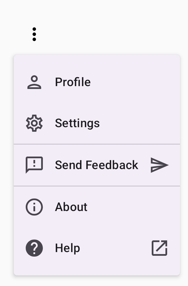
ایجاد یک منوی کشویی طولانیتر با استفاده از جداکنندهها
قطعه کد زیر پیادهسازی پیشرفتهتری از یک منوی کشویی را نشان میدهد. در این قطعه کد، آیکونهای ابتدایی و انتهایی به آیتمهای منو اضافه میشوند و جداکنندهها، گروههایی از آیتمهای منو را از هم جدا میکنند.
@Composable fun DropdownMenuWithDetails() { var expanded by remember { mutableStateOf(false) } Box( modifier = Modifier .fillMaxWidth() .padding(16.dp) ) { IconButton(onClick = { expanded = !expanded }) { Icon(Icons.Default.MoreVert, contentDescription = "More options") } DropdownMenu( expanded = expanded, onDismissRequest = { expanded = false } ) { // First section DropdownMenuItem( text = { Text("Profile") }, leadingIcon = { Icon(Icons.Outlined.Person, contentDescription = null) }, onClick = { /* Do something... */ } ) DropdownMenuItem( text = { Text("Settings") }, leadingIcon = { Icon(Icons.Outlined.Settings, contentDescription = null) }, onClick = { /* Do something... */ } ) HorizontalDivider() // Second section DropdownMenuItem( text = { Text("Send Feedback") }, leadingIcon = { Icon(Icons.Outlined.Feedback, contentDescription = null) }, trailingIcon = { Icon(Icons.AutoMirrored.Outlined.Send, contentDescription = null) }, onClick = { /* Do something... */ } ) HorizontalDivider() // Third section DropdownMenuItem( text = { Text("About") }, leadingIcon = { Icon(Icons.Outlined.Info, contentDescription = null) }, onClick = { /* Do something... */ } ) DropdownMenuItem( text = { Text("Help") }, leadingIcon = { Icon(Icons.AutoMirrored.Outlined.Help, contentDescription = null) }, trailingIcon = { Icon(Icons.AutoMirrored.Outlined.OpenInNew, contentDescription = null) }, onClick = { /* Do something... */ } ) } } }
این کد یک DropdownMenu را درون یک Box تعریف میکند.
نکات کلیدی در مورد کد
- پارامترهای
leadingIconوtrailingIconآیکونهایی را به ابتدا و انتهای یکDropdownMenuItemاضافه میکنند. - یک
IconButtonباعث باز شدن منو میشود. -
DropdownMenuشامل چندین ترکیبپذیرDropdownMenuItemاست که هر کدام نشاندهنده یک عمل قابل انتخاب هستند. - کامپوننتهای
HorizontalDividerیک خط افقی برای جدا کردن گروههایی از آیتمهای منو درج میکنند.
نتیجه
قطعه کد قبلی یک منوی کشویی با آیکونها و جداکنندهها ایجاد میکند:
منابع اضافی
- طراحی متریال: منوها