
드롭다운 메뉴를 사용하면 사용자가 아이콘, 텍스트 필드 또는 기타 구성요소를 클릭한 다음 일시적으로 나타나는 창의 옵션 목록에서 선택할 수 있습니다. 이 가이드에서는 기본 메뉴와 구분선 및 아이콘이 있는 더 복잡한 메뉴를 만드는 방법을 설명합니다.
API 노출 영역
DropdownMenu, DropdownMenuItem, IconButton
구성요소를 사용하여 맞춤 드롭다운 메뉴를 구현합니다. DropdownMenu 및
DropdownMenuItem 구성요소는 메뉴 항목을 표시하는 데 사용되며
IconButton은 드롭다운 메뉴를 표시하거나 숨기는 트리거입니다.
DropdownMenu 구성요소의 주요 매개변수는 다음과 같습니다.
expanded: 메뉴가 표시되는지 여부를 나타냅니다.onDismissRequest: 메뉴 닫기를 처리하는 데 사용됩니다.content: 메뉴의 컴포저블 콘텐츠로, 일반적으로DropdownMenuItem컴포저블을 포함합니다.
DropdownMenuItem의 주요 매개변수는 다음과 같습니다.
text: 메뉴 항목에 표시되는 콘텐츠를 정의합니다.onClick: 메뉴에서 항목과의 상호작용을 처리하는 콜백입니다.
기본 드롭다운 메뉴 만들기
다음 스니펫은 최소 DropdownMenu 구현을 보여줍니다.
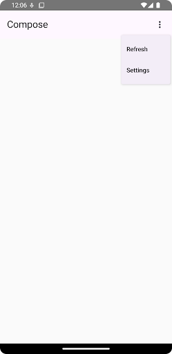
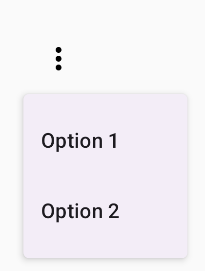
@Composable fun MinimalDropdownMenu() { var expanded by remember { mutableStateOf(false) } Box( modifier = Modifier .padding(16.dp) ) { IconButton(onClick = { expanded = !expanded }) { Icon(Icons.Default.MoreVert, contentDescription = "More options") } DropdownMenu( expanded = expanded, onDismissRequest = { expanded = false } ) { DropdownMenuItem( text = { Text("Option 1") }, onClick = { /* Do something... */ } ) DropdownMenuItem( text = { Text("Option 2") }, onClick = { /* Do something... */ } ) } } }
코드의 주요 사항
- 두 개의 메뉴 항목이 포함된 기본
DropdownMenu를 정의합니다. expanded매개변수는 메뉴의 표시 여부를 펼쳐지거나 접힌 상태로 제어합니다.onDismissRequest매개변수는 사용자가 메뉴를 닫을 때 실행되는 콜백을 정의합니다.DropdownMenuItem컴포저블은 드롭다운 메뉴에서 선택 가능한 항목을 나타냅니다.IconButton은 메뉴의 펼침 및 접힘을 트리거합니다.
결과
더 긴 드롭다운 메뉴 만들기
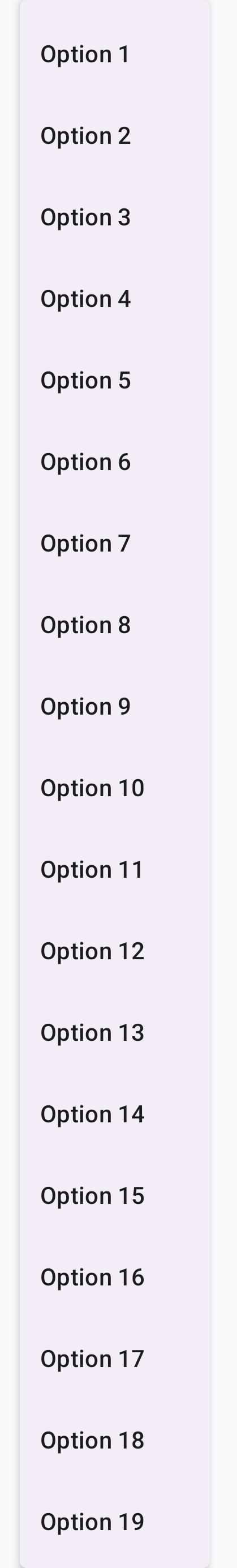
모든 메뉴 항목을 한 번에 표시할 수 없는 경우 DropdownMenu는 기본적으로 스크롤할 수 있습니다. 다음 스니펫은 더 길고 스크롤 가능한 드롭다운 메뉴를 만듭니다.
@Composable fun LongBasicDropdownMenu() { var expanded by remember { mutableStateOf(false) } // Placeholder list of 100 strings for demonstration val menuItemData = List(100) { "Option ${it + 1}" } Box( modifier = Modifier .padding(16.dp) ) { IconButton(onClick = { expanded = !expanded }) { Icon(Icons.Default.MoreVert, contentDescription = "More options") } DropdownMenu( expanded = expanded, onDismissRequest = { expanded = false } ) { menuItemData.forEach { option -> DropdownMenuItem( text = { Text(option) }, onClick = { /* Do something... */ } ) } } } }
코드의 주요 사항
- 콘텐츠의 총 높이가 사용 가능한 공간을 초과하면
DropdownMenu를 스크롤할 수 있습니다. 이 코드는 자리표시자 항목 100개를 표시하는 스크롤 가능한DropdownMenu를 만듭니다. forEach루프는DropdownMenuItem컴포저블을 동적으로 생성합니다. 항목이 지연 생성되지 않습니다. 즉, 100개의 드롭다운 항목이 모두 생성되어 컴포지션에 존재합니다.IconButton은 클릭 시DropdownMenu의 펼침 및 접힘을 트리거합니다.- 각
DropdownMenuItem내의onClick람다를 사용하면 사용자가 메뉴 항목을 선택할 때 실행되는 작업을 정의할 수 있습니다.
결과
앞의 코드 스니펫은 다음과 같은 스크롤 가능한 메뉴를 생성합니다.
구분선이 있는 더 긴 드롭다운 메뉴 만들기
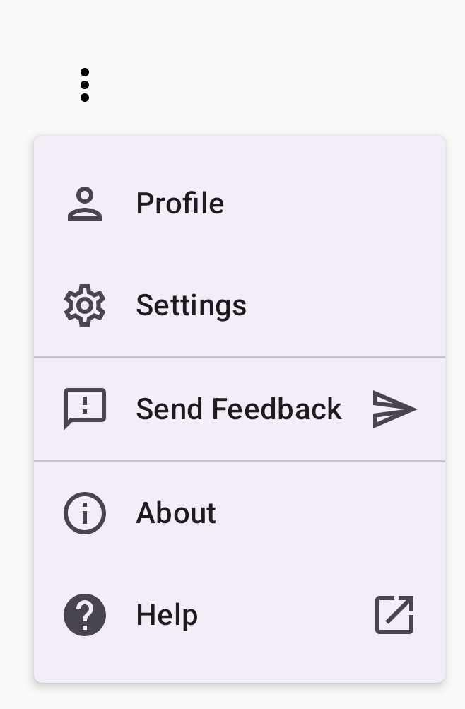
다음 스니펫은 드롭다운 메뉴의 더 고급 구현을 보여줍니다. 이 스니펫에서는 메뉴 항목에 선행 및 후행 아이콘이 추가되고 구분선이 메뉴 항목 그룹을 구분합니다.
@Composable fun DropdownMenuWithDetails() { var expanded by remember { mutableStateOf(false) } Box( modifier = Modifier .fillMaxWidth() .padding(16.dp) ) { IconButton(onClick = { expanded = !expanded }) { Icon(Icons.Default.MoreVert, contentDescription = "More options") } DropdownMenu( expanded = expanded, onDismissRequest = { expanded = false } ) { // First section DropdownMenuItem( text = { Text("Profile") }, leadingIcon = { Icon(Icons.Outlined.Person, contentDescription = null) }, onClick = { /* Do something... */ } ) DropdownMenuItem( text = { Text("Settings") }, leadingIcon = { Icon(Icons.Outlined.Settings, contentDescription = null) }, onClick = { /* Do something... */ } ) HorizontalDivider() // Second section DropdownMenuItem( text = { Text("Send Feedback") }, leadingIcon = { Icon(Icons.Outlined.Feedback, contentDescription = null) }, trailingIcon = { Icon(Icons.AutoMirrored.Outlined.Send, contentDescription = null) }, onClick = { /* Do something... */ } ) HorizontalDivider() // Third section DropdownMenuItem( text = { Text("About") }, leadingIcon = { Icon(Icons.Outlined.Info, contentDescription = null) }, onClick = { /* Do something... */ } ) DropdownMenuItem( text = { Text("Help") }, leadingIcon = { Icon(Icons.AutoMirrored.Outlined.Help, contentDescription = null) }, trailingIcon = { Icon(Icons.AutoMirrored.Outlined.OpenInNew, contentDescription = null) }, onClick = { /* Do something... */ } ) } } }
이 코드는 Box 내에 DropdownMenu를 정의합니다.
코드의 주요 사항
leadingIcon및trailingIcon매개변수는DropdownMenuItem의 시작과 끝에 아이콘을 추가합니다.IconButton은 메뉴의 펼침을 트리거합니다.DropdownMenu에는 선택 가능한 작업을 각각 나타내는 여러DropdownMenuItem컴포저블이 포함되어 있습니다.HorizontalDivider컴포저블은 메뉴 항목 그룹을 구분하기 위해 가로선을 삽입합니다.
결과
앞의 스니펫은 아이콘과 구분선이 있는 드롭다운 메뉴를 생성합니다.
추가 리소스
- Material Design: 메뉴