
تتيح القوائم المنسدلة للمستخدمين النقر على رمز أو حقل نص أو مكوّن آخر، ثم الاختيار من قائمة خيارات على سطح مؤقت. يصف هذا الدليل كيفية إنشاء قوائم أساسية وقوائم أكثر تعقيدًا تتضمّن فواصل ورموزًا.
واجهة برمجة التطبيقات
استخدِم المكوّنات DropdownMenu وDropdownMenuItem وIconButton
لتنفيذ قائمة منسدلة مخصّصة. يتم استخدام المكوّنين DropdownMenu و
DropdownMenuItem لعرض عناصر القائمة، بينما يكون
IconButton هو الزر الذي يؤدي إلى عرض القائمة المنسدلة أو إخفائها.
تشمل المعلمات الرئيسية للمكوّن DropdownMenu ما يلي:
expanded: يشير إلى ما إذا كانت القائمة مرئية.onDismissRequest: يُستخدَم للتعامل مع إغلاق القائمة.content: المحتوى القابل للإنشاء في القائمة، والذي يتضمّن عادةً الدوال القابلة للإنشاءDropdownMenuItem.
تشمل المعلمات الرئيسية لـ DropdownMenuItem ما يلي:
text: يحدّد المحتوى المعروض في عنصر القائمة.onClick: دالة معاودة الاتصال للتعامل مع التفاعل مع العنصر في القائمة.
إنشاء قائمة منسدلة أساسية
يوضّح المقتطف التالي عملية تنفيذ بسيطة لـ DropdownMenu:
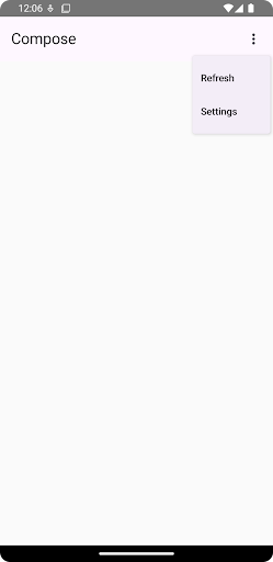
@Composable fun MinimalDropdownMenu() { var expanded by remember { mutableStateOf(false) } Box( modifier = Modifier .padding(16.dp) ) { IconButton(onClick = { expanded = !expanded }) { Icon(Icons.Default.MoreVert, contentDescription = "More options") } DropdownMenu( expanded = expanded, onDismissRequest = { expanded = false } ) { DropdownMenuItem( text = { Text("Option 1") }, onClick = { /* Do something... */ } ) DropdownMenuItem( text = { Text("Option 2") }, onClick = { /* Do something... */ } ) } } }
نقاط أساسية حول الرمز
- يحدّد
DropdownMenuأساسية تتضمّن عنصرَين في القائمة. - تتحكّم المعلمة
expandedفي مدى ظهور القائمة، سواء كانت موسّعة أو مصغّرة. - تحدّد المعلمة
onDismissRequestدالة معاودة اتصال يتم تنفيذها عندما يغلق المستخدم القائمة. - تمثّل الدالة القابلة للإنشاء
DropdownMenuItemالعناصر القابلة للاختيار في القائمة المنسدلة. - يؤدي
IconButtonإلى توسيع القائمة وتصغيرها.
النتيجة
إنشاء قائمة منسدلة أطول
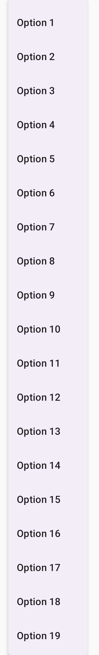
يمكن الانتقال عموديًا في DropdownMenu تلقائيًا إذا تعذّر عرض جميع عناصر القائمة في وقت واحد. ينشئ المقتطف التالي قائمة منسدلة أطول يمكن الانتقال عموديًا فيها:
@Composable fun LongBasicDropdownMenu() { var expanded by remember { mutableStateOf(false) } // Placeholder list of 100 strings for demonstration val menuItemData = List(100) { "Option ${it + 1}" } Box( modifier = Modifier .padding(16.dp) ) { IconButton(onClick = { expanded = !expanded }) { Icon(Icons.Default.MoreVert, contentDescription = "More options") } DropdownMenu( expanded = expanded, onDismissRequest = { expanded = false } ) { menuItemData.forEach { option -> DropdownMenuItem( text = { Text(option) }, onClick = { /* Do something... */ } ) } } } }
نقاط أساسية حول الرمز
- يمكن الانتقال عموديًا في
DropdownMenuعندما يتجاوز الارتفاع الإجمالي لمحتواه المساحة المتاحة. ينشئ هذا الرمزDropdownMenuيمكن الانتقال عموديًا فيها وتعرض 100 عنصر نائب. - تنشئ حلقة
forEachبشكل ديناميكي الدوال القابلة للإنشاءDropdownMenuItem. لا يتم إنشاء العناصر بشكل مؤجل، ما يعني أنّه يتم إنشاء جميع العناصر المنسدلة البالغ عددها 100 وتكون موجودة في التركيبة. - يؤدي
IconButtonإلى توسيعDropdownMenuوتصغيرها عند النقر عليها. - تتيح لك تعبير lambda
onClickضمن كلDropdownMenuItemتحديد الإجراء الذي يتم تنفيذه عندما يختار المستخدم عنصرًا في القائمة.
النتيجة
ينتج عن مقتطف الرمز البرمجي السابق القائمة القابلة للانتقال عموديًا التالية:
إنشاء قائمة منسدلة أطول تتضمّن فواصل
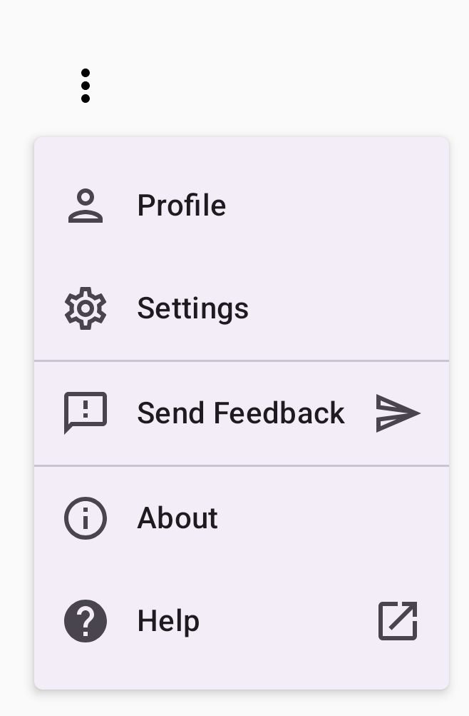
يوضّح المقتطف التالي عملية تنفيذ أكثر تقدّمًا لقائمة منسدلة. في هذا المقتطف، تتم إضافة رموز في بداية ونهاية عناصر القائمة، وتفصل الفواصل بين مجموعات عناصر القائمة.
@Composable fun DropdownMenuWithDetails() { var expanded by remember { mutableStateOf(false) } Box( modifier = Modifier .fillMaxWidth() .padding(16.dp) ) { IconButton(onClick = { expanded = !expanded }) { Icon(Icons.Default.MoreVert, contentDescription = "More options") } DropdownMenu( expanded = expanded, onDismissRequest = { expanded = false } ) { // First section DropdownMenuItem( text = { Text("Profile") }, leadingIcon = { Icon(Icons.Outlined.Person, contentDescription = null) }, onClick = { /* Do something... */ } ) DropdownMenuItem( text = { Text("Settings") }, leadingIcon = { Icon(Icons.Outlined.Settings, contentDescription = null) }, onClick = { /* Do something... */ } ) HorizontalDivider() // Second section DropdownMenuItem( text = { Text("Send Feedback") }, leadingIcon = { Icon(Icons.Outlined.Feedback, contentDescription = null) }, trailingIcon = { Icon(Icons.AutoMirrored.Outlined.Send, contentDescription = null) }, onClick = { /* Do something... */ } ) HorizontalDivider() // Third section DropdownMenuItem( text = { Text("About") }, leadingIcon = { Icon(Icons.Outlined.Info, contentDescription = null) }, onClick = { /* Do something... */ } ) DropdownMenuItem( text = { Text("Help") }, leadingIcon = { Icon(Icons.AutoMirrored.Outlined.Help, contentDescription = null) }, trailingIcon = { Icon(Icons.AutoMirrored.Outlined.OpenInNew, contentDescription = null) }, onClick = { /* Do something... */ } ) } } }
يحدّد هذا الرمز DropdownMenu ضمن Box.
نقاط أساسية حول الرمز
- تضيف المعلمتان
leadingIconوtrailingIconرموزًا في بداية ونهايةDropdownMenuItem. - يؤدي
IconButtonإلى توسيع القائمة. - تحتوي
DropdownMenuعلى عدة دوال قابلة للإنشاءDropdownMenuItem، يمثّل كل منها إجراءً قابلاً للاختيار. HorizontalDividerتُدرِج الدوال القابلة للإنشاء خطًا أفقيًا لفصل مجموعات عناصر القائمة.
النتيجة
ينتج عن المقتطف السابق قائمة منسدلة تتضمّن رموزًا وفواصل:
مراجع إضافية
- التصميم المتعدد الأبعاد: القوائم