Sử dụng bộ sưu tập để sắp xếp ngăn nắp các trang
Lưu và phân loại nội dung dựa trên lựa chọn ưu tiên của bạn.
Trình đơn thả xuống cho phép người dùng nhấp vào một biểu tượng, trường văn bản hoặc thành phần khác, rồi chọn trong danh sách các lựa chọn trên một giao diện tạm thời. Hướng dẫn này mô tả cách tạo cả trình đơn cơ bản và trình đơn phức tạp hơn bằng dấu phân cách và biểu tượng.
Hình 1. Một trình đơn thả xuống cơ bản có 2 mục.
Nền tảng API
Sử dụng DropdownMenu, DropdownMenuItem và các thành phần IconButton để triển khai một trình đơn thả xuống tuỳ chỉnh. Các thành phần DropdownMenu và DropdownMenuItem được dùng để hiển thị các mục trong trình đơn, trong khi IconButton là điều kiện kích hoạt để hiển thị hoặc ẩn trình đơn thả xuống.
Sau đây là các tham số chính cho thành phần DropdownMenu:
expanded: Cho biết liệu trình đơn có hiển thị hay không.
onDismissRequest: Dùng để xử lý việc đóng trình đơn.
content: Nội dung có khả năng kết hợp của trình đơn, thường chứa các thành phần kết hợp DropdownMenuItem.
Sau đây là các tham số chính cho DropdownMenuItem:
text: Xác định nội dung hiển thị trong mục trình đơn.
onClick: Lệnh gọi lại để xử lý hoạt động tương tác với mục trong trình đơn.
Tạo trình đơn thả xuống cơ bản
Đoạn mã sau đây minh hoạ cách triển khai DropdownMenu tối thiểu:
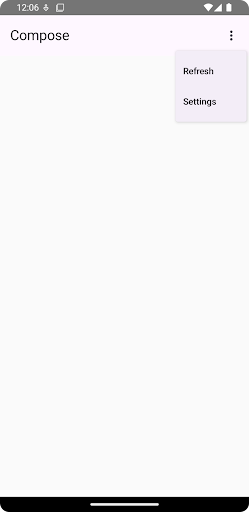
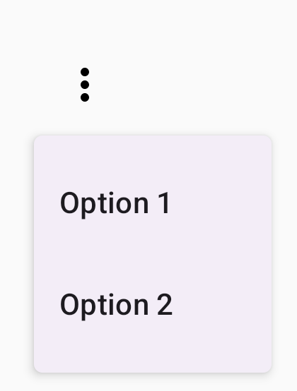
@ComposablefunMinimalDropdownMenu(){varexpandedbyremember{mutableStateOf(false)}Box(modifier=Modifier.padding(16.dp)){IconButton(onClick={expanded=!expanded}){Icon(Icons.Default.MoreVert,contentDescription="More options")}DropdownMenu(expanded=expanded,onDismissRequest={expanded=false}){DropdownMenuItem(text={Text("Option 1")},onClick={/* Do something... */})DropdownMenuItem(text={Text("Option 2")},onClick={/* Do something... */})}}}
Xác định một DropdownMenu cơ bản chứa 2 mục trong trình đơn.
Tham số expanded kiểm soát chế độ hiển thị của trình đơn ở trạng thái mở rộng hoặc thu gọn.
Tham số onDismissRequest xác định một lệnh gọi lại sẽ thực thi khi người dùng đóng trình đơn.
Thành phần kết hợp DropdownMenuItem đại diện cho các mục có thể chọn trong trình đơn thả xuống.
IconButton sẽ kích hoạt việc mở rộng và thu gọn trình đơn.
Kết quả
Hình 2. Một trình đơn thả xuống tối giản chỉ có hai lựa chọn.
Tạo trình đơn thả xuống dài hơn
DropdownMenu có thể di chuyển theo mặc định nếu không thể hiển thị tất cả các mục trong trình đơn cùng một lúc. Đoạn mã sau đây tạo một trình đơn thả xuống dài hơn và có thể cuộn:
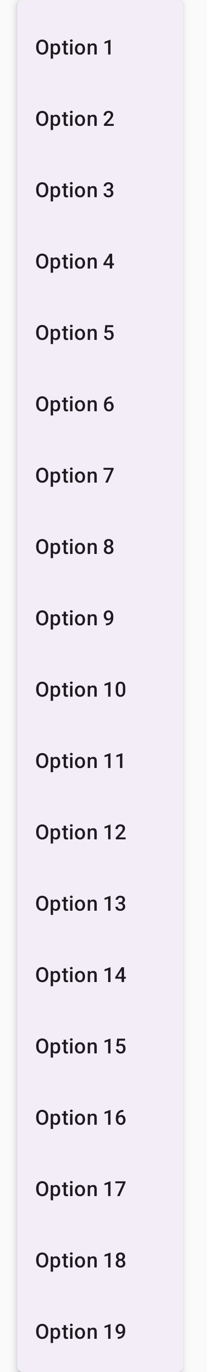
@ComposablefunLongBasicDropdownMenu(){varexpandedbyremember{mutableStateOf(false)}// Placeholder list of 100 strings for demonstrationvalmenuItemData=List(100){"Option ${it+1}"}Box(modifier=Modifier.padding(16.dp)){IconButton(onClick={expanded=!expanded}){Icon(Icons.Default.MoreVert,contentDescription="More options")}DropdownMenu(expanded=expanded,onDismissRequest={expanded=false}){menuItemData.forEach{option->
DropdownMenuItem(text={Text(option)},onClick={/* Do something... */})}}}}
DropdownMenu có thể cuộn khi tổng chiều cao nội dung vượt quá không gian có sẵn. Mã này tạo một DropdownMenu có thể di chuyển và hiển thị 100 mục giữ chỗ.
Vòng lặp forEach sẽ tạo động các thành phần kết hợp DropdownMenuItem. Các mục không được tạo một cách gián tiếp, tức là tất cả 100 mục trong trình đơn thả xuống đều được tạo và tồn tại trong thành phần.
IconButton sẽ kích hoạt việc mở rộng và thu gọn DropdownMenu khi được nhấp vào.
Lambda onClick trong mỗi DropdownMenuItem cho phép bạn xác định thao tác được thực hiện khi người dùng chọn một mục trong trình đơn.
Kết quả
Đoạn mã trên tạo ra trình đơn có thể di chuyển sau đây:
Hình 3. Một trình đơn thả xuống dài có thể cuộn.
Tạo trình đơn thả xuống dài hơn có đường phân chia
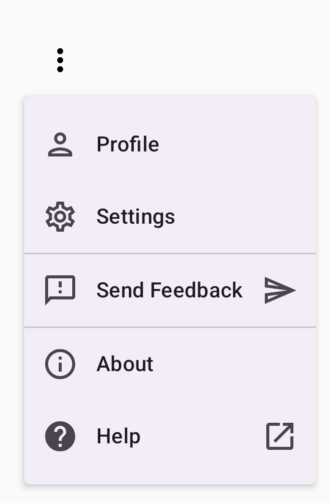
Đoạn mã sau đây cho thấy cách triển khai trình đơn thả xuống nâng cao hơn.
Trong đoạn mã này, các biểu tượng đầu và cuối được thêm vào các mục trong trình đơn và dấu phân cách sẽ tách các nhóm mục trong trình đơn.
@ComposablefunDropdownMenuWithDetails(){varexpandedbyremember{mutableStateOf(false)}Box(modifier=Modifier.fillMaxWidth().padding(16.dp)){IconButton(onClick={expanded=!expanded}){Icon(Icons.Default.MoreVert,contentDescription="More options")}DropdownMenu(expanded=expanded,onDismissRequest={expanded=false}){// First sectionDropdownMenuItem(text={Text("Profile")},leadingIcon={Icon(Icons.Outlined.Person,contentDescription=null)},onClick={/* Do something... */})DropdownMenuItem(text={Text("Settings")},leadingIcon={Icon(Icons.Outlined.Settings,contentDescription=null)},onClick={/* Do something... */})HorizontalDivider()// Second sectionDropdownMenuItem(text={Text("Send Feedback")},leadingIcon={Icon(Icons.Outlined.Feedback,contentDescription=null)},trailingIcon={Icon(Icons.AutoMirrored.Outlined.Send,contentDescription=null)},onClick={/* Do something... */})HorizontalDivider()// Third sectionDropdownMenuItem(text={Text("About")},leadingIcon={Icon(Icons.Outlined.Info,contentDescription=null)},onClick={/* Do something... */})DropdownMenuItem(text={Text("Help")},leadingIcon={Icon(Icons.AutoMirrored.Outlined.Help,contentDescription=null)},trailingIcon={Icon(Icons.AutoMirrored.Outlined.OpenInNew,contentDescription=null)},onClick={/* Do something... */})}}}
Nội dung và mã mẫu trên trang này phải tuân thủ các giấy phép như mô tả trong phần Giấy phép nội dung. Java và OpenJDK là nhãn hiệu hoặc nhãn hiệu đã đăng ký của Oracle và/hoặc đơn vị liên kết của Oracle.
Cập nhật lần gần đây nhất: 2025-08-27 UTC.
[[["Dễ hiểu","easyToUnderstand","thumb-up"],["Giúp tôi giải quyết được vấn đề","solvedMyProblem","thumb-up"],["Khác","otherUp","thumb-up"]],[["Thiếu thông tin tôi cần","missingTheInformationINeed","thumb-down"],["Quá phức tạp/quá nhiều bước","tooComplicatedTooManySteps","thumb-down"],["Đã lỗi thời","outOfDate","thumb-down"],["Vấn đề về bản dịch","translationIssue","thumb-down"],["Vấn đề về mẫu/mã","samplesCodeIssue","thumb-down"],["Khác","otherDown","thumb-down"]],["Cập nhật lần gần đây nhất: 2025-08-27 UTC."],[],[],null,["Drop-down menus let users click an icon, text field, or other component, and\nthen select from a list of options on a temporary surface. This guide describes\nhow to create both basic menus and more complex menus with dividers and icons.\n**Figure 1.** A basic drop-down menu with two items listed.\n\nAPI surface\n\nUse [`DropdownMenu`](/reference/kotlin/androidx/compose/material3/package-summary#DropdownMenu(kotlin.Boolean,kotlin.Function0,androidx.compose.ui.Modifier,androidx.compose.ui.unit.DpOffset,androidx.compose.foundation.ScrollState,androidx.compose.ui.window.PopupProperties,androidx.compose.ui.graphics.Shape,androidx.compose.ui.graphics.Color,androidx.compose.ui.unit.Dp,androidx.compose.ui.unit.Dp,androidx.compose.foundation.BorderStroke,kotlin.Function1)), [`DropdownMenuItem`](/reference/kotlin/androidx/compose/material3/package-summary#DropdownMenuItem(kotlin.Function0,kotlin.Function0,androidx.compose.ui.Modifier,kotlin.Function0,kotlin.Function0,kotlin.Boolean,androidx.compose.material3.MenuItemColors,androidx.compose.foundation.layout.PaddingValues,androidx.compose.foundation.interaction.MutableInteractionSource)), and the [`IconButton`](/reference/kotlin/androidx/compose/material3/package-summary#IconButton(kotlin.Function0,androidx.compose.ui.Modifier,kotlin.Boolean,androidx.compose.material3.IconButtonColors,androidx.compose.foundation.interaction.MutableInteractionSource,androidx.compose.ui.graphics.Shape,kotlin.Function0))\ncomponents to implement a custom drop-down menu. The `DropdownMenu` and\n`DropdownMenuItem` components are used to display the menu items, while the\n`IconButton` is the trigger to display or hide the drop-down menu.\n\nThe key parameters for the `DropdownMenu` component include the following:\n\n- `expanded`: Indicates whether the menu is visible.\n- `onDismissRequest`: Used to handle menu dismissal.\n- `content`: The composable content of the menu, typically containing `DropdownMenuItem` composables.\n\nThe key parameters for `DropdownMenuItem` include the following:\n\n- `text`: Defines the content displayed in the menu item.\n- `onClick`: Callback to handle interaction with the item in the menu.\n\nCreate a basic drop-down menu\n\nThe following snippet demonstrates a minimal `DropdownMenu` implementation:\n\n\n```kotlin\n@Composable\nfun MinimalDropdownMenu() {\n var expanded by remember { mutableStateOf(false) }\n Box(\n modifier = Modifier\n .padding(16.dp)\n ) {\n IconButton(onClick = { expanded = !expanded }) {\n Icon(Icons.Default.MoreVert, contentDescription = \"More options\")\n }\n DropdownMenu(\n expanded = expanded,\n onDismissRequest = { expanded = false }\n ) {\n DropdownMenuItem(\n text = { Text(\"Option 1\") },\n onClick = { /* Do something... */ }\n )\n DropdownMenuItem(\n text = { Text(\"Option 2\") },\n onClick = { /* Do something... */ }\n )\n }\n }\n}https://github.com/android/snippets/blob/7a0ebbee11495f628cf9d574f6b6069c2867232a/compose/snippets/src/main/java/com/example/compose/snippets/components/Menus.kt#L98-L122\n```\n\n\u003cbr /\u003e\n\nKey points about the code\n\n- Defines a basic `DropdownMenu` containing two menu items.\n- The `expanded` parameter controls the menu's visibility as expanded or collapsed.\n- The `onDismissRequest` parameter defines a callback that executes when the user closes the menu.\n- The `DropdownMenuItem` composable represents selectable items in the drop-down menu.\n- An `IconButton` triggers the expansion and collapse of the menu.\n\nResult **Figure 2.** A minimal drop-down menu with only two options.\n\nCreate a longer drop-down menu\n\n`DropdownMenu` is scrollable by default if all the menu items can't be displayed\nat once. The following snippet creates a longer, scrollable drop-down menu:\n\n\n```kotlin\n@Composable\nfun LongBasicDropdownMenu() {\n var expanded by remember { mutableStateOf(false) }\n // Placeholder list of 100 strings for demonstration\n val menuItemData = List(100) { \"Option ${it + 1}\" }\n\n Box(\n modifier = Modifier\n .padding(16.dp)\n ) {\n IconButton(onClick = { expanded = !expanded }) {\n Icon(Icons.Default.MoreVert, contentDescription = \"More options\")\n }\n DropdownMenu(\n expanded = expanded,\n onDismissRequest = { expanded = false }\n ) {\n menuItemData.forEach { option -\u003e\n DropdownMenuItem(\n text = { Text(option) },\n onClick = { /* Do something... */ }\n )\n }\n }\n }\n}https://github.com/android/snippets/blob/7a0ebbee11495f628cf9d574f6b6069c2867232a/compose/snippets/src/main/java/com/example/compose/snippets/components/Menus.kt#L132-L157\n```\n\n\u003cbr /\u003e\n\nKey points about the code\n\n- The `DropdownMenu` is scrollable when the total height of its content exceeds the available space. This code creates a scrollable `DropdownMenu` that displays 100 placeholder items.\n- The `forEach` loop dynamically generates `DropdownMenuItem` composables. The items are not lazily created, which means that all 100 drop-down items are created and exist in the composition.\n- The `IconButton` triggers the expansion and collapse of the `DropdownMenu` when clicked.\n- The `onClick` lambda within each `DropdownMenuItem` lets you define the action performed when the user selects a menu item.\n\nResult\n\nThe preceding code snippet produces the following scrollable menu:\n**Figure 3.** A long, scrollable drop-down menu.\n\nCreate a longer drop-down menu with dividers\n\nThe following snippet shows a more advanced implementation of a drop-down menu.\nIn this snippet, leading and trailing icons are added to menu items, and\ndividers separate groups of menu items.\n\n\n```kotlin\n@Composable\nfun DropdownMenuWithDetails() {\n var expanded by remember { mutableStateOf(false) }\n\n Box(\n modifier = Modifier\n .fillMaxWidth()\n .padding(16.dp)\n ) {\n IconButton(onClick = { expanded = !expanded }) {\n Icon(Icons.Default.MoreVert, contentDescription = \"More options\")\n }\n DropdownMenu(\n expanded = expanded,\n onDismissRequest = { expanded = false }\n ) {\n // First section\n DropdownMenuItem(\n text = { Text(\"Profile\") },\n leadingIcon = { Icon(Icons.Outlined.Person, contentDescription = null) },\n onClick = { /* Do something... */ }\n )\n DropdownMenuItem(\n text = { Text(\"Settings\") },\n leadingIcon = { Icon(Icons.Outlined.Settings, contentDescription = null) },\n onClick = { /* Do something... */ }\n )\n\n HorizontalDivider()\n\n // Second section\n DropdownMenuItem(\n text = { Text(\"Send Feedback\") },\n leadingIcon = { Icon(Icons.Outlined.Feedback, contentDescription = null) },\n trailingIcon = { Icon(Icons.AutoMirrored.Outlined.Send, contentDescription = null) },\n onClick = { /* Do something... */ }\n )\n\n HorizontalDivider()\n\n // Third section\n DropdownMenuItem(\n text = { Text(\"About\") },\n leadingIcon = { Icon(Icons.Outlined.Info, contentDescription = null) },\n onClick = { /* Do something... */ }\n )\n DropdownMenuItem(\n text = { Text(\"Help\") },\n leadingIcon = { Icon(Icons.AutoMirrored.Outlined.Help, contentDescription = null) },\n trailingIcon = { Icon(Icons.AutoMirrored.Outlined.OpenInNew, contentDescription = null) },\n onClick = { /* Do something... */ }\n )\n }\n }\n}https://github.com/android/snippets/blob/7a0ebbee11495f628cf9d574f6b6069c2867232a/compose/snippets/src/main/java/com/example/compose/snippets/components/Menus.kt#L167-L221\n```\n\n\u003cbr /\u003e\n\nThis code defines a `DropdownMenu` within a `Box`.\n\nKey points about the code\n\n- The `leadingIcon` and `trailingIcon` parameters add icons to the start and end of a `DropdownMenuItem`.\n- An `IconButton` triggers the menu's expansion.\n- The `DropdownMenu` contains several `DropdownMenuItem` composables, each representing a selectable action.\n- [`HorizontalDivider`](/reference/kotlin/androidx/compose/material3/package-summary#HorizontalDivider(androidx.compose.ui.Modifier,androidx.compose.ui.unit.Dp,androidx.compose.ui.graphics.Color)) composables insert a horizontal line to separate groups of menu items.\n\nResult\n\nThe preceding snippet produces a drop-down menu with icons and dividers:\n**Figure 4.** A drop-down menu divided into sections with leading and trailing icons.\n\nAdditional resources\n\n- Material Design: [Menus](https://m3.material.io/components/menus)"]]