קל לארגן דפים בעזרת אוספים
אפשר לשמור ולסווג תוכן על סמך ההעדפות שלך.
תפריטים נפתחים מאפשרים למשתמשים ללחוץ על סמל, שדה טקסט או רכיב אחר, ואז לבחור מתוך רשימת אפשרויות על משטח זמני. במדריך הזה מוסבר איך ליצור תפריטים בסיסיים ותפריטים מורכבים יותר עם קווים מפרידים וסמלים.
איור 1. תפריט נפתח בסיסי עם שני פריטים.
משטח API
כדי להטמיע תפריט נפתח בהתאמה אישית, משתמשים ברכיבים DropdownMenu, DropdownMenuItem ו-IconButton. רכיבי DropdownMenu ו-DropdownMenuItem משמשים להצגת הפריטים בתפריט, ואילו IconButton הוא הטריגר להצגה או להסתרה של התפריט הנפתח.
הפרמטרים העיקריים של הרכיב DropdownMenu כוללים את הפרמטרים הבאים:
expanded: מציין אם התפריט גלוי.
onDismissRequest: משמש לטיפול בסגירת התפריט.
content: התוכן הקומפוזבילי של התפריט, שבדרך כלל מכיל רכיבים קומפוזביליים מסוג DropdownMenuItem.
הפרמטרים העיקריים של DropdownMenuItem כוללים את הפרטים הבאים:
text: מגדיר את התוכן שמוצג בפריט התפריט.
onClick: קריאה חוזרת לטיפול באינטראקציה עם הפריט בתפריט.
יצירת תפריט נפתח בסיסי
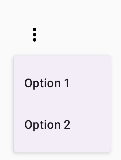
בקטע הקוד הבא מוצגת הטמעה מינימלית של DropdownMenu:
@ComposablefunMinimalDropdownMenu(){varexpandedbyremember{mutableStateOf(false)}Box(modifier=Modifier.padding(16.dp)){IconButton(onClick={expanded=!expanded}){Icon(Icons.Default.MoreVert,contentDescription="More options")}DropdownMenu(expanded=expanded,onDismissRequest={expanded=false}){DropdownMenuItem(text={Text("Option 1")},onClick={/* Do something... */})DropdownMenuItem(text={Text("Option 2")},onClick={/* Do something... */})}}}
הפרמטר expanded קובע אם התפריט יוצג במצב מורחב או מכווץ.
הפרמטר onDismissRequest מגדיר קריאה חוזרת שמופעלת כשהמשתמש סוגר את התפריט.
רכיב ה-DropdownMenuItem composable מייצג פריטים שאפשר לבחור בתפריט הנפתח.
IconButton גורם להרחבה ולכיווץ של התפריט.
התוצאה
איור 2. תפריט נפתח מינימלי עם שתי אפשרויות בלבד.
יצירת תפריט נפתח ארוך יותר
DropdownMenu אפשר לגלול כברירת מחדל אם אי אפשר להציג את כל הפריטים בתפריט בבת אחת. קטע הקוד הבא יוצר תפריט נפתח ארוך יותר שאפשר לגלול בו:
@ComposablefunLongBasicDropdownMenu(){varexpandedbyremember{mutableStateOf(false)}// Placeholder list of 100 strings for demonstrationvalmenuItemData=List(100){"Option ${it+1}"}Box(modifier=Modifier.padding(16.dp)){IconButton(onClick={expanded=!expanded}){Icon(Icons.Default.MoreVert,contentDescription="More options")}DropdownMenu(expanded=expanded,onDismissRequest={expanded=false}){menuItemData.forEach{option->
DropdownMenuItem(text={Text(option)},onClick={/* Do something... */})}}}}
אפשר לגלול בDropdownMenu כשהגובה הכולל של התוכן שלו גדול מהשטח הזמין. הקוד הזה יוצר רשימה עם אפשרות גלילה DropdownMenu
שמציגה 100 פריטים של placeholder.
הלולאה forEach יוצרת באופן דינמי רכיבי DropdownMenuItem composable. הפריטים לא נוצרים באופן עצלני, כלומר כל 100 הפריטים בתפריט הנפתח נוצרים וקיימים בהודעה.
הלחצן IconButton מרחיב ומכווץ את DropdownMenu בלחיצה.
הפונקציה onClick lambda בכל DropdownMenuItem מאפשרת להגדיר את הפעולה שמתבצעת כשהמשתמש בוחר פריט בתפריט.
התוצאה
קטע הקוד שלמעלה יוצר את התפריט הבא שאפשר לגלול בו:
איור 3. תפריט נפתח ארוך שאפשר לגלול בו.
יצירת תפריט נפתח ארוך יותר עם קווים מפרידים
בקטע הקוד הבא מוצגת הטמעה מתקדמת יותר של תפריט נפתח.
בקטע הקוד הזה, סמלים מובילים וסמלים נגררים מתווספים לפריטים בתפריט, וקווי הפרדה מפרידים בין קבוצות של פריטים בתפריט.
@ComposablefunDropdownMenuWithDetails(){varexpandedbyremember{mutableStateOf(false)}Box(modifier=Modifier.fillMaxWidth().padding(16.dp)){IconButton(onClick={expanded=!expanded}){Icon(Icons.Default.MoreVert,contentDescription="More options")}DropdownMenu(expanded=expanded,onDismissRequest={expanded=false}){// First sectionDropdownMenuItem(text={Text("Profile")},leadingIcon={Icon(Icons.Outlined.Person,contentDescription=null)},onClick={/* Do something... */})DropdownMenuItem(text={Text("Settings")},leadingIcon={Icon(Icons.Outlined.Settings,contentDescription=null)},onClick={/* Do something... */})HorizontalDivider()// Second sectionDropdownMenuItem(text={Text("Send Feedback")},leadingIcon={Icon(Icons.Outlined.Feedback,contentDescription=null)},trailingIcon={Icon(Icons.AutoMirrored.Outlined.Send,contentDescription=null)},onClick={/* Do something... */})HorizontalDivider()// Third sectionDropdownMenuItem(text={Text("About")},leadingIcon={Icon(Icons.Outlined.Info,contentDescription=null)},onClick={/* Do something... */})DropdownMenuItem(text={Text("Help")},leadingIcon={Icon(Icons.AutoMirrored.Outlined.Help,contentDescription=null)},trailingIcon={Icon(Icons.AutoMirrored.Outlined.OpenInNew,contentDescription=null)},onClick={/* Do something... */})}}}
דוגמאות התוכן והקוד שבדף הזה כפופות לרישיונות המפורטים בקטע רישיון לתוכן. Java ו-OpenJDK הם סימנים מסחריים או סימנים מסחריים רשומים של חברת Oracle ו/או של השותפים העצמאיים שלה.
עדכון אחרון: 2025-08-27 (שעון UTC).
[[["התוכן קל להבנה","easyToUnderstand","thumb-up"],["התוכן עזר לי לפתור בעיה","solvedMyProblem","thumb-up"],["סיבה אחרת","otherUp","thumb-up"]],[["חסרים לי מידע או פרטים","missingTheInformationINeed","thumb-down"],["התוכן מורכב מדי או עם יותר מדי שלבים","tooComplicatedTooManySteps","thumb-down"],["התוכן לא עדכני","outOfDate","thumb-down"],["בעיה בתרגום","translationIssue","thumb-down"],["בעיה בדוגמאות/בקוד","samplesCodeIssue","thumb-down"],["סיבה אחרת","otherDown","thumb-down"]],["עדכון אחרון: 2025-08-27 (שעון UTC)."],[],[],null,["Drop-down menus let users click an icon, text field, or other component, and\nthen select from a list of options on a temporary surface. This guide describes\nhow to create both basic menus and more complex menus with dividers and icons.\n**Figure 1.** A basic drop-down menu with two items listed.\n\nAPI surface\n\nUse [`DropdownMenu`](/reference/kotlin/androidx/compose/material3/package-summary#DropdownMenu(kotlin.Boolean,kotlin.Function0,androidx.compose.ui.Modifier,androidx.compose.ui.unit.DpOffset,androidx.compose.foundation.ScrollState,androidx.compose.ui.window.PopupProperties,androidx.compose.ui.graphics.Shape,androidx.compose.ui.graphics.Color,androidx.compose.ui.unit.Dp,androidx.compose.ui.unit.Dp,androidx.compose.foundation.BorderStroke,kotlin.Function1)), [`DropdownMenuItem`](/reference/kotlin/androidx/compose/material3/package-summary#DropdownMenuItem(kotlin.Function0,kotlin.Function0,androidx.compose.ui.Modifier,kotlin.Function0,kotlin.Function0,kotlin.Boolean,androidx.compose.material3.MenuItemColors,androidx.compose.foundation.layout.PaddingValues,androidx.compose.foundation.interaction.MutableInteractionSource)), and the [`IconButton`](/reference/kotlin/androidx/compose/material3/package-summary#IconButton(kotlin.Function0,androidx.compose.ui.Modifier,kotlin.Boolean,androidx.compose.material3.IconButtonColors,androidx.compose.foundation.interaction.MutableInteractionSource,androidx.compose.ui.graphics.Shape,kotlin.Function0))\ncomponents to implement a custom drop-down menu. The `DropdownMenu` and\n`DropdownMenuItem` components are used to display the menu items, while the\n`IconButton` is the trigger to display or hide the drop-down menu.\n\nThe key parameters for the `DropdownMenu` component include the following:\n\n- `expanded`: Indicates whether the menu is visible.\n- `onDismissRequest`: Used to handle menu dismissal.\n- `content`: The composable content of the menu, typically containing `DropdownMenuItem` composables.\n\nThe key parameters for `DropdownMenuItem` include the following:\n\n- `text`: Defines the content displayed in the menu item.\n- `onClick`: Callback to handle interaction with the item in the menu.\n\nCreate a basic drop-down menu\n\nThe following snippet demonstrates a minimal `DropdownMenu` implementation:\n\n\n```kotlin\n@Composable\nfun MinimalDropdownMenu() {\n var expanded by remember { mutableStateOf(false) }\n Box(\n modifier = Modifier\n .padding(16.dp)\n ) {\n IconButton(onClick = { expanded = !expanded }) {\n Icon(Icons.Default.MoreVert, contentDescription = \"More options\")\n }\n DropdownMenu(\n expanded = expanded,\n onDismissRequest = { expanded = false }\n ) {\n DropdownMenuItem(\n text = { Text(\"Option 1\") },\n onClick = { /* Do something... */ }\n )\n DropdownMenuItem(\n text = { Text(\"Option 2\") },\n onClick = { /* Do something... */ }\n )\n }\n }\n}https://github.com/android/snippets/blob/dd30aee903e8c247786c064faab1a9ca8d10b46e/compose/snippets/src/main/java/com/example/compose/snippets/components/Menus.kt#L98-L122\n```\n\n\u003cbr /\u003e\n\nKey points about the code\n\n- Defines a basic `DropdownMenu` containing two menu items.\n- The `expanded` parameter controls the menu's visibility as expanded or collapsed.\n- The `onDismissRequest` parameter defines a callback that executes when the user closes the menu.\n- The `DropdownMenuItem` composable represents selectable items in the drop-down menu.\n- An `IconButton` triggers the expansion and collapse of the menu.\n\nResult **Figure 2.** A minimal drop-down menu with only two options.\n\nCreate a longer drop-down menu\n\n`DropdownMenu` is scrollable by default if all the menu items can't be displayed\nat once. The following snippet creates a longer, scrollable drop-down menu:\n\n\n```kotlin\n@Composable\nfun LongBasicDropdownMenu() {\n var expanded by remember { mutableStateOf(false) }\n // Placeholder list of 100 strings for demonstration\n val menuItemData = List(100) { \"Option ${it + 1}\" }\n\n Box(\n modifier = Modifier\n .padding(16.dp)\n ) {\n IconButton(onClick = { expanded = !expanded }) {\n Icon(Icons.Default.MoreVert, contentDescription = \"More options\")\n }\n DropdownMenu(\n expanded = expanded,\n onDismissRequest = { expanded = false }\n ) {\n menuItemData.forEach { option -\u003e\n DropdownMenuItem(\n text = { Text(option) },\n onClick = { /* Do something... */ }\n )\n }\n }\n }\n}https://github.com/android/snippets/blob/dd30aee903e8c247786c064faab1a9ca8d10b46e/compose/snippets/src/main/java/com/example/compose/snippets/components/Menus.kt#L132-L157\n```\n\n\u003cbr /\u003e\n\nKey points about the code\n\n- The `DropdownMenu` is scrollable when the total height of its content exceeds the available space. This code creates a scrollable `DropdownMenu` that displays 100 placeholder items.\n- The `forEach` loop dynamically generates `DropdownMenuItem` composables. The items are not lazily created, which means that all 100 drop-down items are created and exist in the composition.\n- The `IconButton` triggers the expansion and collapse of the `DropdownMenu` when clicked.\n- The `onClick` lambda within each `DropdownMenuItem` lets you define the action performed when the user selects a menu item.\n\nResult\n\nThe preceding code snippet produces the following scrollable menu:\n**Figure 3.** A long, scrollable drop-down menu.\n\nCreate a longer drop-down menu with dividers\n\nThe following snippet shows a more advanced implementation of a drop-down menu.\nIn this snippet, leading and trailing icons are added to menu items, and\ndividers separate groups of menu items.\n\n\n```kotlin\n@Composable\nfun DropdownMenuWithDetails() {\n var expanded by remember { mutableStateOf(false) }\n\n Box(\n modifier = Modifier\n .fillMaxWidth()\n .padding(16.dp)\n ) {\n IconButton(onClick = { expanded = !expanded }) {\n Icon(Icons.Default.MoreVert, contentDescription = \"More options\")\n }\n DropdownMenu(\n expanded = expanded,\n onDismissRequest = { expanded = false }\n ) {\n // First section\n DropdownMenuItem(\n text = { Text(\"Profile\") },\n leadingIcon = { Icon(Icons.Outlined.Person, contentDescription = null) },\n onClick = { /* Do something... */ }\n )\n DropdownMenuItem(\n text = { Text(\"Settings\") },\n leadingIcon = { Icon(Icons.Outlined.Settings, contentDescription = null) },\n onClick = { /* Do something... */ }\n )\n\n HorizontalDivider()\n\n // Second section\n DropdownMenuItem(\n text = { Text(\"Send Feedback\") },\n leadingIcon = { Icon(Icons.Outlined.Feedback, contentDescription = null) },\n trailingIcon = { Icon(Icons.AutoMirrored.Outlined.Send, contentDescription = null) },\n onClick = { /* Do something... */ }\n )\n\n HorizontalDivider()\n\n // Third section\n DropdownMenuItem(\n text = { Text(\"About\") },\n leadingIcon = { Icon(Icons.Outlined.Info, contentDescription = null) },\n onClick = { /* Do something... */ }\n )\n DropdownMenuItem(\n text = { Text(\"Help\") },\n leadingIcon = { Icon(Icons.AutoMirrored.Outlined.Help, contentDescription = null) },\n trailingIcon = { Icon(Icons.AutoMirrored.Outlined.OpenInNew, contentDescription = null) },\n onClick = { /* Do something... */ }\n )\n }\n }\n}https://github.com/android/snippets/blob/dd30aee903e8c247786c064faab1a9ca8d10b46e/compose/snippets/src/main/java/com/example/compose/snippets/components/Menus.kt#L167-L221\n```\n\n\u003cbr /\u003e\n\nThis code defines a `DropdownMenu` within a `Box`.\n\nKey points about the code\n\n- The `leadingIcon` and `trailingIcon` parameters add icons to the start and end of a `DropdownMenuItem`.\n- An `IconButton` triggers the menu's expansion.\n- The `DropdownMenu` contains several `DropdownMenuItem` composables, each representing a selectable action.\n- [`HorizontalDivider`](/reference/kotlin/androidx/compose/material3/package-summary#HorizontalDivider(androidx.compose.ui.Modifier,androidx.compose.ui.unit.Dp,androidx.compose.ui.graphics.Color)) composables insert a horizontal line to separate groups of menu items.\n\nResult\n\nThe preceding snippet produces a drop-down menu with icons and dividers:\n**Figure 4.** A drop-down menu divided into sections with leading and trailing icons.\n\nAdditional resources\n\n- Material Design: [Menus](https://m3.material.io/components/menus)"]]