
ড্রপ-ডাউন মেনু ব্যবহারকারীদের একটি আইকন, টেক্সট ফিল্ড, অথবা অন্য কোনও উপাদানে ক্লিক করতে দেয় এবং তারপর একটি অস্থায়ী পৃষ্ঠায় বিকল্পগুলির তালিকা থেকে নির্বাচন করতে দেয়। এই নির্দেশিকাটি বর্ণনা করে যে কীভাবে ডিভাইডার এবং আইকন সহ মৌলিক মেনু এবং আরও জটিল মেনু উভয়ই তৈরি করতে হয়।
এপিআই সারফেস
একটি কাস্টম ড্রপ-ডাউন মেনু বাস্তবায়নের জন্য DropdownMenu , DropdownMenuItem এবং IconButton উপাদান ব্যবহার করুন। মেনু আইটেমগুলি প্রদর্শনের জন্য DropdownMenu এবং DropdownMenuItem উপাদানগুলি ব্যবহার করা হয়, যখন IconButton হল ড্রপ-ডাউন মেনু প্রদর্শন বা লুকানোর জন্য ট্রিগার।
DropdownMenu কম্পোনেন্টের মূল প্যারামিটারগুলির মধ্যে নিম্নলিখিতগুলি অন্তর্ভুক্ত রয়েছে:
-
expanded: মেনুটি দৃশ্যমান কিনা তা নির্দেশ করে। -
onDismissRequest: মেনু ডিসমিসাল পরিচালনা করতে ব্যবহৃত হয়। -
content: মেনুর কম্পোজেবল কন্টেন্ট, সাধারণতDropdownMenuItemকম্পোজেবল ধারণ করে।
DropdownMenuItem এর মূল প্যারামিটারগুলির মধ্যে নিম্নলিখিতগুলি অন্তর্ভুক্ত রয়েছে:
-
text: মেনু আইটেমে প্রদর্শিত বিষয়বস্তু নির্ধারণ করে। -
onClick: মেনুতে থাকা আইটেমের সাথে ইন্টারঅ্যাকশন পরিচালনা করার জন্য কলব্যাক।
একটি মৌলিক ড্রপ-ডাউন মেনু তৈরি করুন
নিম্নলিখিত স্নিপেটটি একটি ন্যূনতম DropdownMenu বাস্তবায়ন প্রদর্শন করে:
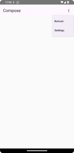
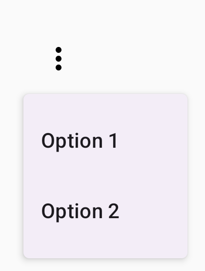
@Composable fun MinimalDropdownMenu() { var expanded by remember { mutableStateOf(false) } Box( modifier = Modifier .padding(16.dp) ) { IconButton(onClick = { expanded = !expanded }) { Icon(Icons.Default.MoreVert, contentDescription = "More options") } DropdownMenu( expanded = expanded, onDismissRequest = { expanded = false } ) { DropdownMenuItem( text = { Text("Option 1") }, onClick = { /* Do something... */ } ) DropdownMenuItem( text = { Text("Option 2") }, onClick = { /* Do something... */ } ) } } }
কোড সম্পর্কে গুরুত্বপূর্ণ বিষয়সমূহ
- দুটি মেনু আইটেম ধারণকারী একটি মৌলিক
DropdownMenuসংজ্ঞায়িত করে। -
expandedপ্যারামিটারটি মেনুর দৃশ্যমানতা প্রসারিত বা সংকুচিত হিসাবে নিয়ন্ত্রণ করে। -
onDismissRequestপ্যারামিটার একটি কলব্যাক সংজ্ঞায়িত করে যা ব্যবহারকারী মেনু বন্ধ করলে কার্যকর হয়। -
DropdownMenuItemকম্পোজেবল ড্রপ-ডাউন মেনুতে নির্বাচনযোগ্য আইটেমগুলিকে প্রতিনিধিত্ব করে। - একটি
IconButtonমেনুটির সম্প্রসারণ এবং পতন ঘটায়।
ফলাফল
একটি দীর্ঘ ড্রপ-ডাউন মেনু তৈরি করুন
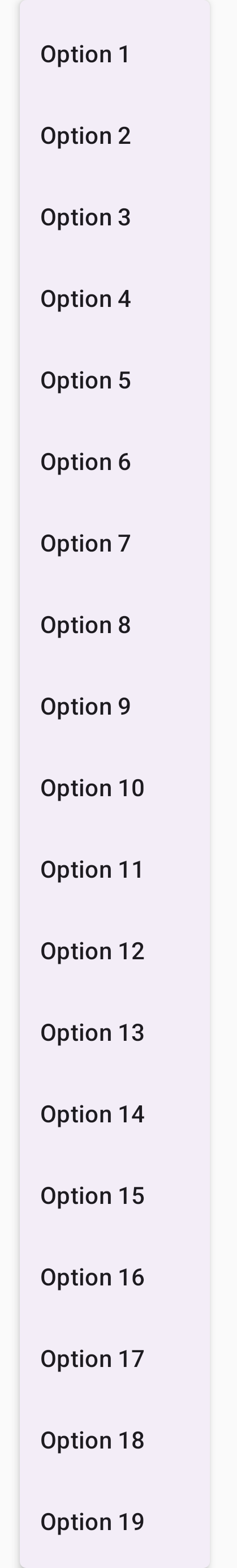
যদি সমস্ত মেনু আইটেম একসাথে প্রদর্শিত না হয়, তাহলে DropdownMenu ডিফল্টরূপে স্ক্রোলযোগ্য থাকে। নিম্নলিখিত স্নিপেটটি একটি দীর্ঘ, স্ক্রোলযোগ্য ড্রপ-ডাউন মেনু তৈরি করে:
@Composable fun LongBasicDropdownMenu() { var expanded by remember { mutableStateOf(false) } // Placeholder list of 100 strings for demonstration val menuItemData = List(100) { "Option ${it + 1}" } Box( modifier = Modifier .padding(16.dp) ) { IconButton(onClick = { expanded = !expanded }) { Icon(Icons.Default.MoreVert, contentDescription = "More options") } DropdownMenu( expanded = expanded, onDismissRequest = { expanded = false } ) { menuItemData.forEach { option -> DropdownMenuItem( text = { Text(option) }, onClick = { /* Do something... */ } ) } } } }
কোড সম্পর্কে গুরুত্বপূর্ণ বিষয়সমূহ
-
DropdownMenuতখনই স্ক্রোলযোগ্য যখন এর কন্টেন্টের মোট উচ্চতা উপলব্ধ স্থানের চেয়ে বেশি হয়। এই কোডটি একটি স্ক্রোলযোগ্যDropdownMenuতৈরি করে যা ১০০টি প্লেসহোল্ডার আইটেম প্রদর্শন করে। -
forEachলুপটি গতিশীলভাবেDropdownMenuItemকম্পোজেবল তৈরি করে। আইটেমগুলি অলসভাবে তৈরি করা হয়নি, যার অর্থ হল সমস্ত 100টি ড্রপ-ডাউন আইটেম তৈরি করা হয়েছে এবং কম্পোজিশনে বিদ্যমান। - ক্লিক করলে
IconButtonDropdownMenuসম্প্রসারণ এবং পতন ঘটায়। - প্রতিটি
DropdownMenuItemমধ্যে থাকাonClickল্যাম্বডা আপনাকে ব্যবহারকারী যখন একটি মেনু আইটেম নির্বাচন করে তখন সম্পাদিত ক্রিয়াটি সংজ্ঞায়িত করতে দেয়।
ফলাফল
পূর্ববর্তী কোড স্নিপেটটি নিম্নলিখিত স্ক্রোলযোগ্য মেনু তৈরি করে:
ডিভাইডার দিয়ে একটি দীর্ঘ ড্রপ-ডাউন মেনু তৈরি করুন
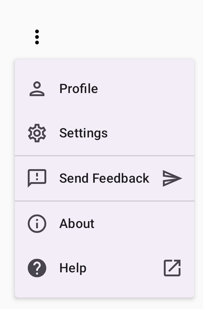
নিচের স্নিপেটটি ড্রপ-ডাউন মেনুর আরও উন্নত বাস্তবায়ন দেখায়। এই স্নিপেটে, মেনু আইটেমগুলিতে লিডিং এবং ট্রেলিং আইকন যোগ করা হয় এবং মেনু আইটেমগুলির পৃথক গ্রুপগুলিকে বিভক্ত করে।
@Composable fun DropdownMenuWithDetails() { var expanded by remember { mutableStateOf(false) } Box( modifier = Modifier .fillMaxWidth() .padding(16.dp) ) { IconButton(onClick = { expanded = !expanded }) { Icon(Icons.Default.MoreVert, contentDescription = "More options") } DropdownMenu( expanded = expanded, onDismissRequest = { expanded = false } ) { // First section DropdownMenuItem( text = { Text("Profile") }, leadingIcon = { Icon(Icons.Outlined.Person, contentDescription = null) }, onClick = { /* Do something... */ } ) DropdownMenuItem( text = { Text("Settings") }, leadingIcon = { Icon(Icons.Outlined.Settings, contentDescription = null) }, onClick = { /* Do something... */ } ) HorizontalDivider() // Second section DropdownMenuItem( text = { Text("Send Feedback") }, leadingIcon = { Icon(Icons.Outlined.Feedback, contentDescription = null) }, trailingIcon = { Icon(Icons.AutoMirrored.Outlined.Send, contentDescription = null) }, onClick = { /* Do something... */ } ) HorizontalDivider() // Third section DropdownMenuItem( text = { Text("About") }, leadingIcon = { Icon(Icons.Outlined.Info, contentDescription = null) }, onClick = { /* Do something... */ } ) DropdownMenuItem( text = { Text("Help") }, leadingIcon = { Icon(Icons.AutoMirrored.Outlined.Help, contentDescription = null) }, trailingIcon = { Icon(Icons.AutoMirrored.Outlined.OpenInNew, contentDescription = null) }, onClick = { /* Do something... */ } ) } } }
এই কোডটি একটি Box মধ্যে একটি DropdownMenu সংজ্ঞায়িত করে।
কোড সম্পর্কে গুরুত্বপূর্ণ বিষয়সমূহ
-
leadingIconএবংtrailingIconপ্যারামিটারগুলিDropdownMenuItemএর শুরু এবং শেষে আইকন যোগ করে। - একটি
IconButtonমেনুটির সম্প্রসারণকে ট্রিগার করে। -
DropdownMenuবেশ কয়েকটিDropdownMenuItemকম্পোজেবল রয়েছে, প্রতিটি একটি নির্বাচনযোগ্য ক্রিয়া প্রতিনিধিত্ব করে। -
HorizontalDividerকম্পোজেবল মেনু আইটেমের গ্রুপগুলিকে পৃথক করার জন্য একটি অনুভূমিক রেখা সন্নিবেশ করায়।
ফলাফল
পূর্ববর্তী স্নিপেটটি আইকন এবং ডিভাইডার সহ একটি ড্রপ-ডাউন মেনু তৈরি করে:
অতিরিক্ত সম্পদ
- মেটেরিয়াল ডিজাইন: মেনু