
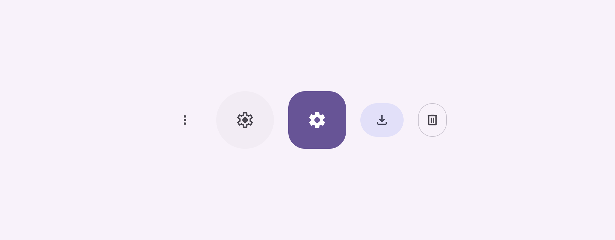
图标按钮用于显示用户可以执行的操作。图标按钮必须使用含义明确的图标,通常表示常用或经常执行的操作。
图标按钮有两种类型:
- 默认:这些按钮可以打开其他元素,例如菜单或搜索。
- 切换:这些按钮可以表示可开启或关闭的二进制操作,例如“收藏”或“书签”。
API Surface
使用 IconButton 可组合项实现标准图标按钮。如需创建不同的视觉样式(例如填充、填充色调或轮廓),请分别使用 FilledIconButton、FilledTonalIconButton 和 OutlinedIconButton。
IconButton 的关键参数包括:
onClick:一个 lambda 函数,用于在用户点按图标按钮时执行。enabled:一个布尔值,用于控制按钮的启用状态。当false时,按钮不会响应用户输入。content:按钮内的可组合项内容,通常为Icon。
基本示例:切换图标按钮
此示例展示了如何实现切换图标按钮。切换开关图标按钮的外观会根据其处于选中或未选中状态而发生变化。
@Preview @Composable fun ToggleIconButtonExample() { // isToggled initial value should be read from a view model or persistent storage. var isToggled by rememberSaveable { mutableStateOf(false) } IconButton( onClick = { isToggled = !isToggled } ) { Icon( painter = if (isToggled) painterResource(R.drawable.favorite_filled) else painterResource(R.drawable.favorite), contentDescription = if (isToggled) "Selected icon button" else "Unselected icon button." ) } }
代码要点
ToggleIconButtonExample可组合项定义了一个可切换的IconButton。mutableStateOf(false)会创建一个MutableState对象,用于存储一个布尔值(初始值为false)。这会将isToggled变成状态容器,这意味着每当其值发生变化时,Compose 都会重组界面。rememberSaveable可确保isToggled状态在发生配置更改(例如屏幕旋转)后保持不变。
IconButton的onClicklambda 定义了点击按钮时的行为,在true和false之间切换状态。Icon可组合项的painter形参会根据isToggled状态有条件地加载不同的painterResource。这会更改图标的视觉外观。- 如果
isToggled为true,则会加载填充的心形可绘制对象。 - 如果
isToggled为false,则会加载轮廓心形可绘制对象。
- 如果
Icon的contentDescription也会根据isToggled状态更新,以提供适当的无障碍信息。
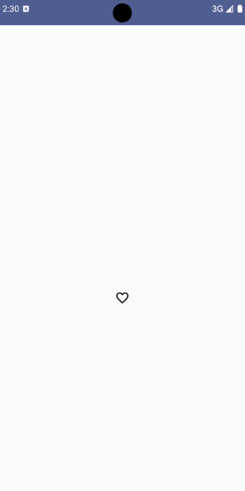
结果
下图显示了上方代码段中的切换开关图标按钮处于未选中状态:
高级示例:按下时重复执行操作
本部分将演示如何创建图标按钮,以便在用户按住这些按钮时持续触发操作,而不是每次点击触发一次操作。
@Composable fun MomentaryIconButton( unselectedImage: Int, selectedImage: Int, contentDescription: String, modifier: Modifier = Modifier, stepDelay: Long = 100L, // Minimum value is 1L milliseconds. onClick: () -> Unit ) { val interactionSource = remember { MutableInteractionSource() } val isPressed by interactionSource.collectIsPressedAsState() val pressedListener by rememberUpdatedState(onClick) LaunchedEffect(isPressed) { while (isPressed) { delay(stepDelay.coerceIn(1L, Long.MAX_VALUE)) pressedListener() } } IconButton( modifier = modifier, onClick = onClick, interactionSource = interactionSource ) { Icon( painter = if (isPressed) painterResource(id = selectedImage) else painterResource(id = unselectedImage), contentDescription = contentDescription, ) } }
代码要点
MomentaryIconButton接受unselectedImage: Int(未按下按钮时图标的可绘制资源 ID)和selectedImage: Int(按下按钮时图标的可绘制资源 ID)。- 它使用
interactionSource专门跟踪用户的“按压”互动。 - 如果按钮正在被按下,则
isPressed为 true,否则为 false。当isPressed为true时,LaunchedEffect会进入循环。- 在此循环内,它使用
delay(与stepDelay搭配使用)在触发操作之间创建暂停时间。coerceIn可确保延迟时间至少为 1 毫秒,以防止无限循环。 - 系统会在循环中的每次延迟后调用
pressedListener。这会使操作重复执行。
- 在此循环内,它使用
pressedListener使用rememberUpdatedState来确保onClicklambda(要执行的操作)始终是最新组合中的最新版本。Icon会根据按钮当前是否处于按下状态来更改其显示的图片。- 如果
isPressed为 true,则显示selectedImage。 - 否则,系统会显示
unselectedImage。
- 如果
接下来,在示例中使用此 MomentaryIconButton。以下代码段演示了两个图标按钮如何控制计数器:
@Preview() @Composable fun MomentaryIconButtonExample() { var pressedCount by remember { mutableIntStateOf(0) } Row( modifier = Modifier.fillMaxWidth(), verticalAlignment = Alignment.CenterVertically ) { MomentaryIconButton( unselectedImage = R.drawable.fast_rewind, selectedImage = R.drawable.fast_rewind_filled, stepDelay = 100L, onClick = { pressedCount -= 1 }, contentDescription = "Decrease count button" ) Spacer(modifier = Modifier) Text("advanced by $pressedCount frames") Spacer(modifier = Modifier) MomentaryIconButton( unselectedImage = R.drawable.fast_forward, selectedImage = R.drawable.fast_forward_filled, contentDescription = "Increase count button", stepDelay = 100L, onClick = { pressedCount += 1 } ) } }
代码要点
MomentaryIconButtonExample可组合项会显示一个包含两个MomentaryIconButton实例和一个Text可组合项的Row,以构建用于递增和递减计数器的界面。- 它使用
remember和mutableIntStateOf维护一个初始化为 0 的pressedCount可变状态变量。当pressedCount发生变化时,观察它的所有可组合项(例如Text可组合项)都会重组以反映新值。 - 第一个
MomentaryIconButton在被点击或按住时会降低pressedCount。 - 第二个
MomentaryIconButton在被点击或按住时会增加pressedCount。 - 这两个按钮的
stepDelay均为 100 毫秒,这意味着在按住某个按钮时,onClick操作会每 100 毫秒重复一次。
结果
以下视频展示了包含图标按钮和计数器的界面: