Sử dụng bộ sưu tập để sắp xếp ngăn nắp các trang
Lưu và phân loại nội dung dựa trên lựa chọn ưu tiên của bạn.
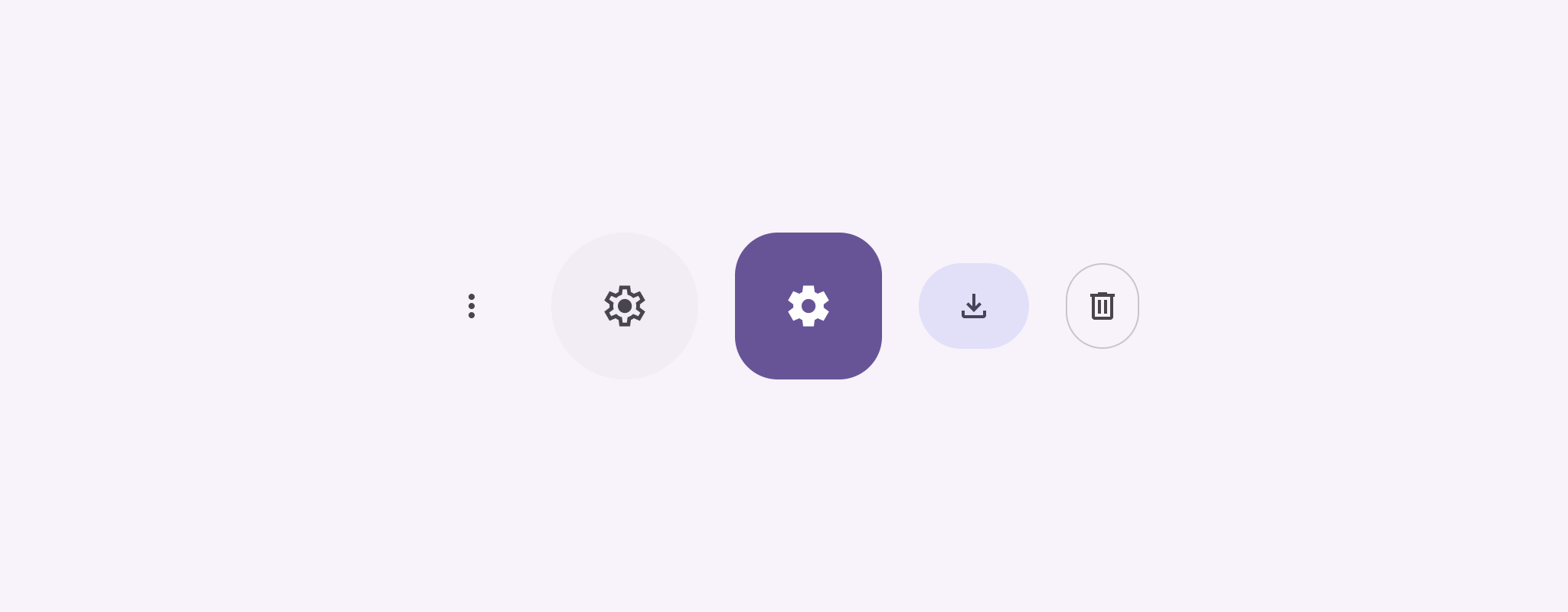
Nút biểu tượng hiển thị các hành động mà người dùng có thể thực hiện. Nút biểu tượng phải sử dụng biểu tượng có ý nghĩa rõ ràng và thường biểu thị các thao tác phổ biến hoặc thường dùng.
Có hai loại nút biểu tượng:
Mặc định: Các nút này có thể mở các thành phần khác, chẳng hạn như trình đơn hoặc tìm kiếm.
Bật/tắt: Các nút này có thể đại diện cho các thao tác nhị phân có thể bật hoặc tắt, chẳng hạn như "yêu thích" hoặc "dấu trang".
Hình 1. Các nút biểu tượng, một số nút được tô màu (cho biết lựa chọn) và được viền.
onClick: Hàm lambda thực thi khi người dùng nhấn vào nút biểu tượng.
enabled: Một boolean kiểm soát trạng thái bật của nút. Khi false, nút này không phản hồi hoạt động đầu vào của người dùng.
content: Nội dung có thể kết hợp bên trong nút, thường là Icon.
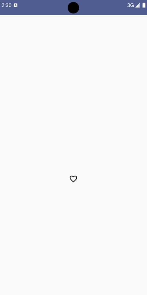
Ví dụ cơ bản: Nút biểu tượng bật/tắt
Ví dụ này cho bạn biết cách triển khai nút biểu tượng bật/tắt. Nút biểu tượng bật/tắt sẽ thay đổi giao diện dựa trên trạng thái đã chọn hoặc chưa chọn.
@Preview@ComposablefunToggleIconButtonExample(){// isToggled initial value should be read from a view model or persistent storage.varisToggledbyrememberSaveable{mutableStateOf(false)}IconButton(onClick={isToggled=!isToggled}){Icon(painter=if(isToggled)painterResource(R.drawable.favorite_filled)elsepainterResource(R.drawable.favorite),contentDescription=if(isToggled)"Selected icon button"else"Unselected icon button.")}}
Thành phần kết hợp ToggleIconButtonExample xác định một IconButton có thể bật/tắt.
mutableStateOf(false) tạo một đối tượng MutableState chứa giá trị boolean, ban đầu là false. Điều này khiến isToggled trở thành trình giữ trạng thái, nghĩa là Compose sẽ kết hợp lại giao diện người dùng bất cứ khi nào giá trị của trình giữ trạng thái thay đổi.
rememberSaveable đảm bảo trạng thái isToggled vẫn tồn tại trên các thay đổi về cấu hình, chẳng hạn như xoay màn hình.
Lambda onClick của IconButton xác định hành vi của nút khi được nhấp, chuyển đổi trạng thái giữa true và false.
Tham số painter của thành phần kết hợp Icon sẽ tải một painterResource khác theo điều kiện dựa trên trạng thái isToggled. Thao tác này sẽ thay đổi giao diện của biểu tượng.
Nếu isToggled là true, thì hàm này sẽ tải hình trái tim có thể vẽ được.
Nếu isToggled là false, thì lớp này sẽ tải hình trái tim có đường viền có thể vẽ.
contentDescription của Icon cũng cập nhật dựa trên trạng thái isToggled để cung cấp thông tin hỗ trợ tiếp cận phù hợp.
Kết quả
Hình ảnh sau đây cho thấy nút biểu tượng bật/tắt trong đoạn mã trước đó ở trạng thái chưa chọn:
Hình 2. Nút biểu tượng bật/tắt "yêu thích" ở trạng thái chưa chọn.
Ví dụ nâng cao: Hành động lặp lại khi nhấn
Phần này minh hoạ cách tạo các nút biểu tượng liên tục kích hoạt một thao tác trong khi người dùng nhấn và giữ các nút đó, thay vì chỉ kích hoạt một lần cho mỗi lượt nhấp.
@ComposablefunMomentaryIconButton(unselectedImage:Int,selectedImage:Int,contentDescription:String,modifier:Modifier=Modifier,stepDelay:Long=100L,// Minimum value is 1L milliseconds.onClick:()->Unit){valinteractionSource=remember{MutableInteractionSource()}valisPressedbyinteractionSource.collectIsPressedAsState()valpressedListenerbyrememberUpdatedState(onClick)LaunchedEffect(isPressed){while(isPressed){delay(stepDelay.coerceIn(1L,Long.MAX_VALUE))pressedListener()}}IconButton(modifier=modifier,onClick=onClick,interactionSource=interactionSource){Icon(painter=if(isPressed)painterResource(id=selectedImage)elsepainterResource(id=unselectedImage),contentDescription=contentDescription,)}}
MomentaryIconButton lấy unselectedImage: Int, mã nhận dạng tài nguyên có thể vẽ cho biểu tượng khi không nhấn nút và selectedImage: Int, mã nhận dạng tài nguyên có thể vẽ cho biểu tượng khi nhấn nút.
Phương thức này sử dụng interactionSource để theo dõi cụ thể các lượt tương tác "nhấn" của người dùng.
isPressed là true khi nút đang được nhấn và là false nếu không. Khi isPressed là true, LaunchedEffect sẽ chuyển vào một vòng lặp.
Bên trong vòng lặp này, nó sử dụng delay (với stepDelay) để tạo khoảng tạm dừng giữa các hành động kích hoạt. coerceIn đảm bảo độ trễ tối thiểu là 1 mili giây để ngăn vòng lặp vô hạn.
pressedListener được gọi sau mỗi độ trễ trong vòng lặp. Thao tác này sẽ lặp lại.
pressedListener sử dụng rememberUpdatedState để đảm bảo rằng lambda onClick (thao tác cần thực hiện) luôn là thông tin mới nhất từ thành phần mới nhất.
Icon thay đổi hình ảnh hiển thị dựa trên việc nút hiện đang được nhấn hay không.
Nếu isPressed là true, selectedImage sẽ xuất hiện.
Nếu không, unselectedImage sẽ xuất hiện.
Tiếp theo, hãy sử dụng MomentaryIconButton này trong một ví dụ. Đoạn mã sau đây minh hoạ hai nút biểu tượng kiểm soát bộ đếm:
@Preview()@ComposablefunMomentaryIconButtonExample(){varpressedCountbyremember{mutableIntStateOf(0)}Row(modifier=Modifier.fillMaxWidth(),verticalAlignment=Alignment.CenterVertically){MomentaryIconButton(unselectedImage=R.drawable.fast_rewind,selectedImage=R.drawable.fast_rewind_filled,stepDelay=100L,onClick={pressedCount-=1},contentDescription="Decrease count button")Spacer(modifier=Modifier)Text("advanced by $pressedCount frames")Spacer(modifier=Modifier)MomentaryIconButton(unselectedImage=R.drawable.fast_forward,selectedImage=R.drawable.fast_forward_filled,contentDescription="Increase count button",stepDelay=100L,onClick={pressedCount+=1})}}
Thành phần kết hợp MomentaryIconButtonExample hiển thị một Row chứa hai thực thể MomentaryIconButton và một thành phần kết hợp Text để tạo giao diện người dùng cho việc tăng và giảm bộ đếm.
Phương thức này duy trì một biến trạng thái có thể thay đổi pressedCount bằng cách sử dụng remember và mutableIntStateOf, được khởi tạo thành 0. Khi pressedCount thay đổi, mọi thành phần kết hợp quan sát thấy điều này (chẳng hạn như thành phần kết hợp Text) sẽ kết hợp lại để phản ánh giá trị mới.
MomentaryIconButton đầu tiên giảm pressedCount khi được nhấp hoặc giữ.
MomentaryIconButton thứ hai tăng pressedCount khi được nhấp hoặc giữ.
Cả hai nút đều sử dụng stepDelay là 100 mili giây, nghĩa là thao tác onClick sẽ lặp lại sau mỗi 100 mili giây khi một nút được giữ.
Kết quả
Video sau đây cho thấy giao diện người dùng với các nút biểu tượng và bộ đếm:
Hình 3. Giao diện người dùng của bộ đếm có hai nút biểu tượng (dấu cộng và dấu trừ) để tăng và giảm bộ đếm.
Nội dung và mã mẫu trên trang này phải tuân thủ các giấy phép như mô tả trong phần Giấy phép nội dung. Java và OpenJDK là nhãn hiệu hoặc nhãn hiệu đã đăng ký của Oracle và/hoặc đơn vị liên kết của Oracle.
Cập nhật lần gần đây nhất: 2025-08-28 UTC.
[[["Dễ hiểu","easyToUnderstand","thumb-up"],["Giúp tôi giải quyết được vấn đề","solvedMyProblem","thumb-up"],["Khác","otherUp","thumb-up"]],[["Thiếu thông tin tôi cần","missingTheInformationINeed","thumb-down"],["Quá phức tạp/quá nhiều bước","tooComplicatedTooManySteps","thumb-down"],["Đã lỗi thời","outOfDate","thumb-down"],["Vấn đề về bản dịch","translationIssue","thumb-down"],["Vấn đề về mẫu/mã","samplesCodeIssue","thumb-down"],["Khác","otherDown","thumb-down"]],["Cập nhật lần gần đây nhất: 2025-08-28 UTC."],[],[],null,["Icon buttons display actions that users can take. Icon buttons must use an icon\nwith a clear meaning, and typically represent common or frequently used actions.\n\nThere are two types of icon buttons:\n\n- **Default**: These buttons can open other elements, such as a menu or search.\n- **Toggle**: These buttons can represent binary actions that can be toggled on or off, such as \"favorite\" or \"bookmark\".\n\n**Figure 1.** Icon buttons, some of which are filled (indicating selection) and outlined.\n\nAPI surface\n\nUse the [`IconButton`](/reference/kotlin/androidx/compose/material3/package-summary#IconButton(kotlin.Function0,androidx.compose.ui.Modifier,kotlin.Boolean,androidx.compose.material3.IconButtonColors,androidx.compose.foundation.interaction.MutableInteractionSource,kotlin.Function1)) composable to implement standard icon buttons. To\ncreate different visual styles like filled, filled tonal, or outlined, use\n[`FilledIconButton`](/reference/kotlin/androidx/compose/material3/package-summary#FilledIconButton(kotlin.Function0,androidx.compose.material3.IconButtonShapes,androidx.compose.ui.Modifier,kotlin.Boolean,androidx.compose.material3.IconButtonColors,androidx.compose.foundation.interaction.MutableInteractionSource,kotlin.Function0)), [`FilledTonalIconButton`](/reference/kotlin/androidx/compose/material3/package-summary#FilledTonalIconButton(kotlin.Function0,androidx.compose.ui.Modifier,kotlin.Boolean,androidx.compose.ui.graphics.Shape,androidx.compose.material3.IconButtonColors,androidx.compose.foundation.interaction.MutableInteractionSource,kotlin.Function0)), and\n[`OutlinedIconButton`](/reference/kotlin/androidx/compose/material3/package-summary#OutlinedIconButton(kotlin.Function0,androidx.compose.material3.IconButtonShapes,androidx.compose.ui.Modifier,kotlin.Boolean,androidx.compose.material3.IconButtonColors,androidx.compose.foundation.BorderStroke,androidx.compose.foundation.interaction.MutableInteractionSource,kotlin.Function0)), respectively.\n\nThe key parameters for `IconButton` include:\n\n- `onClick`: A lambda function that executes when the user taps the icon button.\n- `enabled`: A boolean that controls the enabled state of the button. When `false`, the button does not respond to user input.\n- `content`: The composable content inside the button, typically an `Icon`.\n\nBasic example: Toggle icon button\n\nThis example shows you how to implement a toggle icon button. A toggle icon\nbutton changes its appearance based on whether it's selected or unselected.\n\n\n```kotlin\n@Preview\n@Composable\nfun ToggleIconButtonExample() {\n // isToggled initial value should be read from a view model or persistent storage.\n var isToggled by rememberSaveable { mutableStateOf(false) }\n\n IconButton(\n onClick = { isToggled = !isToggled }\n ) {\n Icon(\n painter = if (isToggled) painterResource(R.drawable.favorite_filled) else painterResource(R.drawable.favorite),\n contentDescription = if (isToggled) \"Selected icon button\" else \"Unselected icon button.\"\n )\n }\n}https://github.com/android/snippets/blob/5673ffc60b614daf028ee936227128eb8c4f9781/compose/snippets/src/main/java/com/example/compose/snippets/components/IconButton.kt#L44-L58\n```\n\n\u003cbr /\u003e\n\nKey points about the code\n\n- The `ToggleIconButtonExample` composable defines a toggleable `IconButton`.\n - `mutableStateOf(false)` creates a `MutableState` object that holds a boolean value, initially `false`. This makes `isToggled` a state holder, meaning Compose recomposes the UI whenever its value changes.\n - `rememberSaveable` ensures the `isToggled` state persists across configuration changes, like screen rotation.\n- The `onClick` lambda of the `IconButton` defines the button's behavior when clicked, toggling the state between `true` and `false`.\n- The [`Icon`](/reference/kotlin/androidx/compose/material3/package-summary#Icon(androidx.compose.ui.graphics.painter.Painter,kotlin.String,androidx.compose.ui.Modifier,androidx.compose.ui.graphics.Color)) composable's `painter` parameter conditionally loads a different `painterResource` based on the `isToggled` state. This changes the visual appearance of the icon.\n - If `isToggled` is `true`, it loads the filled heart drawable.\n - If `isToggled` is `false`, it loads the outlined heart drawable.\n- The `contentDescription` of the `Icon` also updates based on the `isToggled` state to provide appropriate accessibility information.\n\nResult\n\nThe following image shows the toggle icon button from the preceding snippet in\nits unselected state:\n**Figure 2.** A \"favorite\" toggle icon button in its unselected state.\n\nAdvanced example: Repeated actions on press\n\nThis section demonstrates how to create icon buttons that continuously trigger\nan action while the user presses and holds them, rather than just triggering\nonce per click.\n\n\n```kotlin\n@Composable\nfun MomentaryIconButton(\n unselectedImage: Int,\n selectedImage: Int,\n contentDescription: String,\n modifier: Modifier = Modifier,\n stepDelay: Long = 100L, // Minimum value is 1L milliseconds.\n onClick: () -\u003e Unit\n) {\n val interactionSource = remember { MutableInteractionSource() }\n val isPressed by interactionSource.collectIsPressedAsState()\n val pressedListener by rememberUpdatedState(onClick)\n\n LaunchedEffect(isPressed) {\n while (isPressed) {\n delay(stepDelay.coerceIn(1L, Long.MAX_VALUE))\n pressedListener()\n }\n }\n\n IconButton(\n modifier = modifier,\n onClick = onClick,\n interactionSource = interactionSource\n ) {\n Icon(\n painter = if (isPressed) painterResource(id = selectedImage) else painterResource(id = unselectedImage),\n contentDescription = contentDescription,\n )\n }\n}https://github.com/android/snippets/blob/5673ffc60b614daf028ee936227128eb8c4f9781/compose/snippets/src/main/java/com/example/compose/snippets/components/IconButton.kt#L62-L92\n```\n\n\u003cbr /\u003e\n\nKey points about the code\n\n- `MomentaryIconButton` takes an `unselectedImage: Int`, the drawable resource ID for the icon when the button is not pressed, and `selectedImage: Int`, the drawable resource ID for the icon when the button is pressed.\n- It uses an `interactionSource` to specifically track \"press\" interactions from the user.\n- `isPressed` is true when the button is actively being pressed and false otherwise. When `isPressed` is `true`, the `LaunchedEffect` enters a loop.\n - Inside this loop, it uses a `delay` (with `stepDelay`) to create pauses between triggering actions. `coerceIn` ensures the delay is at least 1ms to prevent infinite loops.\n - The `pressedListener` is invoked after each delay within the loop. This makes the action repeat.\n- The `pressedListener` uses `rememberUpdatedState` to ensure that the `onClick` lambda (the action to perform) is always the most up-to-date from the latest composition.\n- The `Icon` changes its displayed image based on whether the button is currently pressed or not.\n - If `isPressed` is true, the `selectedImage` is shown.\n - Otherwise, the `unselectedImage` is shown.\n\nNext, use this `MomentaryIconButton` in an example. The following snippet\ndemonstrates two icon buttons controlling a counter:\n\n\n```kotlin\n@Preview()\n@Composable\nfun MomentaryIconButtonExample() {\n var pressedCount by remember { mutableIntStateOf(0) }\n\n Row(\n modifier = Modifier.fillMaxWidth(),\n verticalAlignment = Alignment.CenterVertically\n ) {\n MomentaryIconButton(\n unselectedImage = R.drawable.fast_rewind,\n selectedImage = R.drawable.fast_rewind_filled,\n stepDelay = 100L,\n onClick = { pressedCount -= 1 },\n contentDescription = \"Decrease count button\"\n )\n Spacer(modifier = Modifier)\n Text(\"advanced by $pressedCount frames\")\n Spacer(modifier = Modifier)\n MomentaryIconButton(\n unselectedImage = R.drawable.fast_forward,\n selectedImage = R.drawable.fast_forward_filled,\n contentDescription = \"Increase count button\",\n stepDelay = 100L,\n onClick = { pressedCount += 1 }\n )\n }\n}https://github.com/android/snippets/blob/5673ffc60b614daf028ee936227128eb8c4f9781/compose/snippets/src/main/java/com/example/compose/snippets/components/IconButton.kt#L96-L123\n```\n\n\u003cbr /\u003e\n\nKey points about the code\n\n- The `MomentaryIconButtonExample` composable displays a `Row` containing two `MomentaryIconButton` instances and a `Text` composable to build a UI for incrementing and decrementing a counter.\n- It maintains a `pressedCount` mutable state variable using `remember` and `mutableIntStateOf`, initialized to 0. When `pressedCount` changes, any composables observing it (like the `Text` composable) recompose to reflect the new value.\n- The first `MomentaryIconButton` decreases `pressedCount` when clicked or held.\n- The second `MomentaryIconButton` increases `pressedCount` when clicked or held.\n- Both buttons use a `stepDelay` of 100 milliseconds, meaning the `onClick` action repeats every 100ms while a button is held.\n\nResult\n\nThe following video shows the UI with the icon buttons and the counter:\n**Figure 3**. A counter UI with two icon buttons (plus and minus) that increment and decrement the counter.\n\nAdditional resources\n\n- [Material 3 - Icon buttons](https://m3.material.io/components/icon-buttons/overview)"]]