Zadbaj o dobrą organizację dzięki kolekcji
Zapisuj i kategoryzuj treści zgodnie ze swoimi preferencjami.
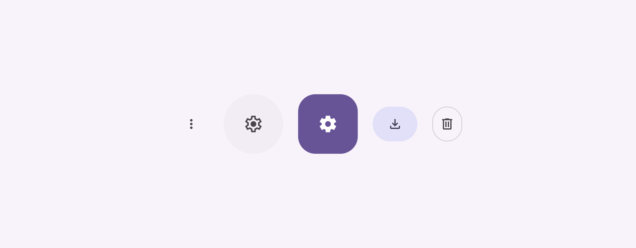
Ikony przycisków wskazują działania, które mogą wykonać użytkownicy. Ikony przycisków muszą mieć wyraźne znaczenie i zazwyczaj przedstawiają częste lub często wykonywane czynności.
Istnieją 2 rodzaje przycisków z ikonami:
Domyślne: te przyciski mogą otwierać inne elementy, takie jak menu czy wyszukiwarka.
Przełącznik: te przyciski mogą reprezentować działania binarne, które można włączyć lub wyłączyć, takie jak „ulubione” lub „zakładka”.
Rysunek 1. przyciski z ikonami, z których niektóre są wypełnione (co oznacza zaznaczenie) i obrysowane.
Interfejs API
Aby zaimplementować standardowe przyciski z ikonami, użyj komponentu IconButton. Aby tworzyć różne style wizualne, takie jak wypełnione, wypełnione tonalnie lub obrysowane, użyj odpowiednio wartości FilledIconButton, FilledTonalIconButton i OutlinedIconButton.
Najważniejsze parametry IconButton to:
onClick: funkcja lambda, która jest wykonywana, gdy użytkownik kliknie ikonę.
enabled: wartość logiczna określająca stan włączenia przycisku. Gdy false, przycisk nie reaguje na dane wejściowe użytkownika.
content: składana zawartość w przycisku, zwykle Icon.
Przykład podstawowy: przycisk przełączania ikon
Ten przykład pokazuje, jak zaimplementować przycisk przełącznika. Ikona przełącznika zmienia wygląd w zależności od tego, czy jest zaznaczona, czy nie.
@Preview@ComposablefunToggleIconButtonExample(){// isToggled initial value should be read from a view model or persistent storage.varisToggledbyrememberSaveable{mutableStateOf(false)}IconButton(onClick={isToggled=!isToggled}){Icon(painter=if(isToggled)painterResource(R.drawable.favorite_filled)elsepainterResource(R.drawable.favorite),contentDescription=if(isToggled)"Selected icon button"else"Unselected icon button.")}}
Element kompozycyjny ToggleIconButtonExample definiuje przełącznik IconButton.
mutableStateOf(false) tworzy obiekt MutableState, który przechowuje wartość logiczną, początkowo false. Dzięki temu isToggled będzie przechowywać stan, co oznacza, że Compose będzie zmieniać interfejs za każdym razem, gdy zmieni się wartość tego atrybutu.
rememberSaveable zapewnia, że stan isToggled jest zachowany w przypadku zmian konfiguracji, takich jak obrót ekranu.
Lambda onClick funkcji IconButton określa zachowanie przycisku po kliknięciu, przełączając stan między true a false.
Parametr painter komponentu Icon wczytuje warunkowo inny element painterResource w zależności od stanu isToggled. Spowoduje to zmianę wyglądu ikony.
Jeśli isToggled to true, wczytuje wypełnione serce.
Jeśli isToggled = false, wczytuje zarysowane serce.
contentDescriptionIcon również się aktualizuje na podstawie stanu isToggled, aby wyświetlać odpowiednie informacje o dostępności.
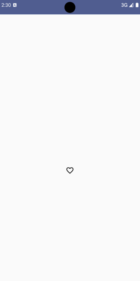
Wynik
Na poniższym obrazku widać ikonę przełącznika z poprzedniego fragmentu kodu w stanie niewybranym:
Rysunek 2. Ikona przycisku przełącznika „ulubione” w stanie niewybranym.
Przykład zaawansowany: powtarzające się działania po naciśnięciu
W tej sekcji pokazujemy, jak tworzyć przyciski z ikonami, które będą stale wywoływać działanie, gdy użytkownik naciśnie i przytrzyma przycisk, a nie tylko raz na kliknięcie.
@ComposablefunMomentaryIconButton(unselectedImage:Int,selectedImage:Int,contentDescription:String,modifier:Modifier=Modifier,stepDelay:Long=100L,// Minimum value is 1L milliseconds.onClick:()->Unit){valinteractionSource=remember{MutableInteractionSource()}valisPressedbyinteractionSource.collectIsPressedAsState()valpressedListenerbyrememberUpdatedState(onClick)LaunchedEffect(isPressed){while(isPressed){delay(stepDelay.coerceIn(1L,Long.MAX_VALUE))pressedListener()}}IconButton(modifier=modifier,onClick=onClick,interactionSource=interactionSource){Icon(painter=if(isPressed)painterResource(id=selectedImage)elsepainterResource(id=unselectedImage),contentDescription=contentDescription,)}}
Funkcja MomentaryIconButton przyjmuje parametr unselectedImage: Int, czyli identyfikator zasobu rysowanego dla ikony, gdy przycisk nie jest wciśnięty, oraz parametr selectedImage: Int, czyli identyfikator zasobu rysowanego dla ikony, gdy przycisk jest wciśnięty.
Używa ona interactionSource do śledzenia interakcji użytkownika z przyciskiem.
isPressed ma wartość true, gdy przycisk jest aktywnie wciśnięty, a w przeciwnym razie ma wartość false. Gdy isPressed ma wartość true, instrukcja LaunchedEffect przechodzi w pętlę.
Wewnątrz tego pętli używa ona instrukcji delay (z wartością stepDelay), aby tworzyć przerwy między działaniami wywołującymi. coerceIn zapewnia, że opóźnienie wynosi co najmniej 1 ms, co zapobiega nieskończonym pętlom.
Funkcja pressedListener jest wywoływana po każdym opóźnieniu w pętli. Powtarza to działanie.
pressedListener używa rememberUpdatedState, aby zapewnić, że funkcja onClicklambda (działanie do wykonania) jest zawsze najbardziej aktualna z ostatniej kompozycji.
Przycisk Icon zmienia wyświetlany obraz w zależności od tego, czy jest w danym momencie wciśnięty.
Jeśli isPressed ma wartość true, wyświetla się selectedImage.
W przeciwnym razie wyświetla się unselectedImage.
Następnie użyj słowa MomentaryIconButton w przykładzie. Ten fragment kodu demonstruje 2 przyciski z ikonami, które sterują licznikiem:
@Preview()@ComposablefunMomentaryIconButtonExample(){varpressedCountbyremember{mutableIntStateOf(0)}Row(modifier=Modifier.fillMaxWidth(),verticalAlignment=Alignment.CenterVertically){MomentaryIconButton(unselectedImage=R.drawable.fast_rewind,selectedImage=R.drawable.fast_rewind_filled,stepDelay=100L,onClick={pressedCount-=1},contentDescription="Decrease count button")Spacer(modifier=Modifier)Text("advanced by $pressedCount frames")Spacer(modifier=Modifier)MomentaryIconButton(unselectedImage=R.drawable.fast_forward,selectedImage=R.drawable.fast_forward_filled,contentDescription="Increase count button",stepDelay=100L,onClick={pressedCount+=1})}}
Komponent MomentaryIconButtonExample wyświetla komponent Row zawierający 2 instancje komponentu MomentaryIconButton oraz komponent Text, aby utworzyć interfejs do zwiększania i zmniejszania wartości licznika.
Zawiera zmienną stanu pressedCount, która może być zmieniana za pomocą zmiennych remember i mutableIntStateOf, zainicjowanych na 0. Gdy wartość pressedCount ulegnie zmianie, wszystkie komponenty, które ją obserwują (np. komponent Text), zostaną ponownie skompilowane, aby odzwierciedlić nową wartość.
Po kliknięciu lub przytrzymaniu pierwszego przycisku MomentaryIconButton wartość pressedCount maleje.
Drugi przycisk MomentaryIconButton zwiększa wartość pressedCount po kliknięciu lub przytrzymaniu.
Oba przyciski używają stepDelay 100 ms, co oznacza, że działanie onClick
powtarza się co 100 ms, gdy przycisk jest przytrzymany.
Wynik
Film poniżej pokazuje interfejs z przyciskami z ikonami i licznikiem:
Rysunek 3. Interfejs licznika z 2 przyciskami (plus i minus), które zwiększają i zmniejszają wartość licznika.
Treść strony i umieszczone na niej fragmenty kodu podlegają licencjom opisanym w Licencji na treści. Java i OpenJDK są znakami towarowymi lub zastrzeżonymi znakami towarowymi należącymi do firmy Oracle lub jej podmiotów stowarzyszonych.
Ostatnia aktualizacja: 2025-08-28 UTC.
[[["Łatwo zrozumieć","easyToUnderstand","thumb-up"],["Rozwiązało to mój problem","solvedMyProblem","thumb-up"],["Inne","otherUp","thumb-up"]],[["Brak potrzebnych mi informacji","missingTheInformationINeed","thumb-down"],["Zbyt skomplikowane / zbyt wiele czynności do wykonania","tooComplicatedTooManySteps","thumb-down"],["Nieaktualne treści","outOfDate","thumb-down"],["Problem z tłumaczeniem","translationIssue","thumb-down"],["Problem z przykładami/kodem","samplesCodeIssue","thumb-down"],["Inne","otherDown","thumb-down"]],["Ostatnia aktualizacja: 2025-08-28 UTC."],[],[],null,["Icon buttons display actions that users can take. Icon buttons must use an icon\nwith a clear meaning, and typically represent common or frequently used actions.\n\nThere are two types of icon buttons:\n\n- **Default**: These buttons can open other elements, such as a menu or search.\n- **Toggle**: These buttons can represent binary actions that can be toggled on or off, such as \"favorite\" or \"bookmark\".\n\n**Figure 1.** Icon buttons, some of which are filled (indicating selection) and outlined.\n\nAPI surface\n\nUse the [`IconButton`](/reference/kotlin/androidx/compose/material3/package-summary#IconButton(kotlin.Function0,androidx.compose.ui.Modifier,kotlin.Boolean,androidx.compose.material3.IconButtonColors,androidx.compose.foundation.interaction.MutableInteractionSource,kotlin.Function1)) composable to implement standard icon buttons. To\ncreate different visual styles like filled, filled tonal, or outlined, use\n[`FilledIconButton`](/reference/kotlin/androidx/compose/material3/package-summary#FilledIconButton(kotlin.Function0,androidx.compose.material3.IconButtonShapes,androidx.compose.ui.Modifier,kotlin.Boolean,androidx.compose.material3.IconButtonColors,androidx.compose.foundation.interaction.MutableInteractionSource,kotlin.Function0)), [`FilledTonalIconButton`](/reference/kotlin/androidx/compose/material3/package-summary#FilledTonalIconButton(kotlin.Function0,androidx.compose.ui.Modifier,kotlin.Boolean,androidx.compose.ui.graphics.Shape,androidx.compose.material3.IconButtonColors,androidx.compose.foundation.interaction.MutableInteractionSource,kotlin.Function0)), and\n[`OutlinedIconButton`](/reference/kotlin/androidx/compose/material3/package-summary#OutlinedIconButton(kotlin.Function0,androidx.compose.material3.IconButtonShapes,androidx.compose.ui.Modifier,kotlin.Boolean,androidx.compose.material3.IconButtonColors,androidx.compose.foundation.BorderStroke,androidx.compose.foundation.interaction.MutableInteractionSource,kotlin.Function0)), respectively.\n\nThe key parameters for `IconButton` include:\n\n- `onClick`: A lambda function that executes when the user taps the icon button.\n- `enabled`: A boolean that controls the enabled state of the button. When `false`, the button does not respond to user input.\n- `content`: The composable content inside the button, typically an `Icon`.\n\nBasic example: Toggle icon button\n\nThis example shows you how to implement a toggle icon button. A toggle icon\nbutton changes its appearance based on whether it's selected or unselected.\n\n\n```kotlin\n@Preview\n@Composable\nfun ToggleIconButtonExample() {\n // isToggled initial value should be read from a view model or persistent storage.\n var isToggled by rememberSaveable { mutableStateOf(false) }\n\n IconButton(\n onClick = { isToggled = !isToggled }\n ) {\n Icon(\n painter = if (isToggled) painterResource(R.drawable.favorite_filled) else painterResource(R.drawable.favorite),\n contentDescription = if (isToggled) \"Selected icon button\" else \"Unselected icon button.\"\n )\n }\n}https://github.com/android/snippets/blob/5673ffc60b614daf028ee936227128eb8c4f9781/compose/snippets/src/main/java/com/example/compose/snippets/components/IconButton.kt#L44-L58\n```\n\n\u003cbr /\u003e\n\nKey points about the code\n\n- The `ToggleIconButtonExample` composable defines a toggleable `IconButton`.\n - `mutableStateOf(false)` creates a `MutableState` object that holds a boolean value, initially `false`. This makes `isToggled` a state holder, meaning Compose recomposes the UI whenever its value changes.\n - `rememberSaveable` ensures the `isToggled` state persists across configuration changes, like screen rotation.\n- The `onClick` lambda of the `IconButton` defines the button's behavior when clicked, toggling the state between `true` and `false`.\n- The [`Icon`](/reference/kotlin/androidx/compose/material3/package-summary#Icon(androidx.compose.ui.graphics.painter.Painter,kotlin.String,androidx.compose.ui.Modifier,androidx.compose.ui.graphics.Color)) composable's `painter` parameter conditionally loads a different `painterResource` based on the `isToggled` state. This changes the visual appearance of the icon.\n - If `isToggled` is `true`, it loads the filled heart drawable.\n - If `isToggled` is `false`, it loads the outlined heart drawable.\n- The `contentDescription` of the `Icon` also updates based on the `isToggled` state to provide appropriate accessibility information.\n\nResult\n\nThe following image shows the toggle icon button from the preceding snippet in\nits unselected state:\n**Figure 2.** A \"favorite\" toggle icon button in its unselected state.\n\nAdvanced example: Repeated actions on press\n\nThis section demonstrates how to create icon buttons that continuously trigger\nan action while the user presses and holds them, rather than just triggering\nonce per click.\n\n\n```kotlin\n@Composable\nfun MomentaryIconButton(\n unselectedImage: Int,\n selectedImage: Int,\n contentDescription: String,\n modifier: Modifier = Modifier,\n stepDelay: Long = 100L, // Minimum value is 1L milliseconds.\n onClick: () -\u003e Unit\n) {\n val interactionSource = remember { MutableInteractionSource() }\n val isPressed by interactionSource.collectIsPressedAsState()\n val pressedListener by rememberUpdatedState(onClick)\n\n LaunchedEffect(isPressed) {\n while (isPressed) {\n delay(stepDelay.coerceIn(1L, Long.MAX_VALUE))\n pressedListener()\n }\n }\n\n IconButton(\n modifier = modifier,\n onClick = onClick,\n interactionSource = interactionSource\n ) {\n Icon(\n painter = if (isPressed) painterResource(id = selectedImage) else painterResource(id = unselectedImage),\n contentDescription = contentDescription,\n )\n }\n}https://github.com/android/snippets/blob/5673ffc60b614daf028ee936227128eb8c4f9781/compose/snippets/src/main/java/com/example/compose/snippets/components/IconButton.kt#L62-L92\n```\n\n\u003cbr /\u003e\n\nKey points about the code\n\n- `MomentaryIconButton` takes an `unselectedImage: Int`, the drawable resource ID for the icon when the button is not pressed, and `selectedImage: Int`, the drawable resource ID for the icon when the button is pressed.\n- It uses an `interactionSource` to specifically track \"press\" interactions from the user.\n- `isPressed` is true when the button is actively being pressed and false otherwise. When `isPressed` is `true`, the `LaunchedEffect` enters a loop.\n - Inside this loop, it uses a `delay` (with `stepDelay`) to create pauses between triggering actions. `coerceIn` ensures the delay is at least 1ms to prevent infinite loops.\n - The `pressedListener` is invoked after each delay within the loop. This makes the action repeat.\n- The `pressedListener` uses `rememberUpdatedState` to ensure that the `onClick` lambda (the action to perform) is always the most up-to-date from the latest composition.\n- The `Icon` changes its displayed image based on whether the button is currently pressed or not.\n - If `isPressed` is true, the `selectedImage` is shown.\n - Otherwise, the `unselectedImage` is shown.\n\nNext, use this `MomentaryIconButton` in an example. The following snippet\ndemonstrates two icon buttons controlling a counter:\n\n\n```kotlin\n@Preview()\n@Composable\nfun MomentaryIconButtonExample() {\n var pressedCount by remember { mutableIntStateOf(0) }\n\n Row(\n modifier = Modifier.fillMaxWidth(),\n verticalAlignment = Alignment.CenterVertically\n ) {\n MomentaryIconButton(\n unselectedImage = R.drawable.fast_rewind,\n selectedImage = R.drawable.fast_rewind_filled,\n stepDelay = 100L,\n onClick = { pressedCount -= 1 },\n contentDescription = \"Decrease count button\"\n )\n Spacer(modifier = Modifier)\n Text(\"advanced by $pressedCount frames\")\n Spacer(modifier = Modifier)\n MomentaryIconButton(\n unselectedImage = R.drawable.fast_forward,\n selectedImage = R.drawable.fast_forward_filled,\n contentDescription = \"Increase count button\",\n stepDelay = 100L,\n onClick = { pressedCount += 1 }\n )\n }\n}https://github.com/android/snippets/blob/5673ffc60b614daf028ee936227128eb8c4f9781/compose/snippets/src/main/java/com/example/compose/snippets/components/IconButton.kt#L96-L123\n```\n\n\u003cbr /\u003e\n\nKey points about the code\n\n- The `MomentaryIconButtonExample` composable displays a `Row` containing two `MomentaryIconButton` instances and a `Text` composable to build a UI for incrementing and decrementing a counter.\n- It maintains a `pressedCount` mutable state variable using `remember` and `mutableIntStateOf`, initialized to 0. When `pressedCount` changes, any composables observing it (like the `Text` composable) recompose to reflect the new value.\n- The first `MomentaryIconButton` decreases `pressedCount` when clicked or held.\n- The second `MomentaryIconButton` increases `pressedCount` when clicked or held.\n- Both buttons use a `stepDelay` of 100 milliseconds, meaning the `onClick` action repeats every 100ms while a button is held.\n\nResult\n\nThe following video shows the UI with the icon buttons and the counter:\n**Figure 3**. A counter UI with two icon buttons (plus and minus) that increment and decrement the counter.\n\nAdditional resources\n\n- [Material 3 - Icon buttons](https://m3.material.io/components/icon-buttons/overview)"]]