
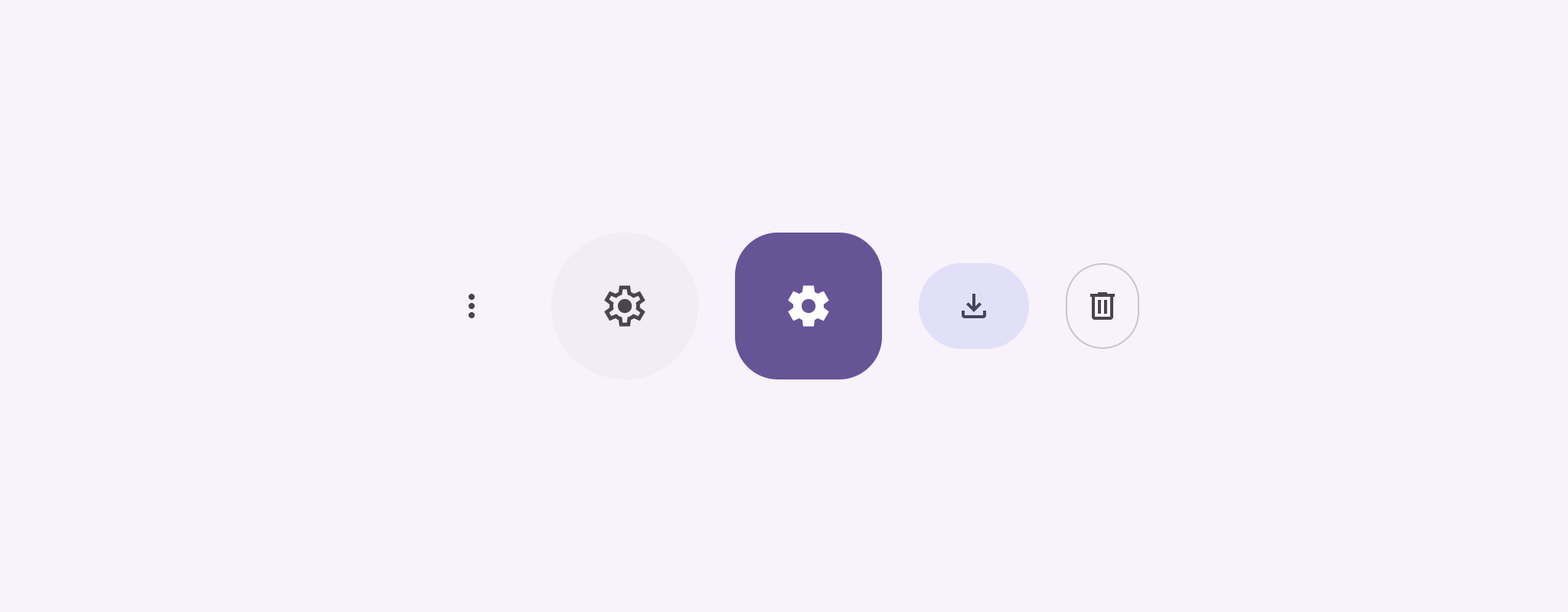
כפתורי סמלים מציגים פעולות שהמשתמשים יכולים לבצע. לחצני סמלים חייבים לכלול סמל עם משמעות ברורה, ובדרך כלל הם מייצגים פעולות נפוצות או פעולות שמשתמשים בהן לעיתים קרובות.
יש שני סוגים של לחצני סמלים:
- ברירת מחדל: הלחצנים האלה יכולים לפתוח רכיבים אחרים, כמו תפריט או חיפוש.
- מתג: הלחצנים האלה יכולים לייצג פעולות בינאריות שאפשר להפעיל או להשבית, כמו 'מועדף' או 'סימנייה'.
ממשק API
כדי להטמיע לחצני סמלים רגילים, משתמשים ברכיב ה-Composable IconButton. כדי ליצור סגנונות חזותיים שונים, כמו מלא, מלא עם גוון או עם קו מתאר, משתמשים ב-FilledIconButton, ב-FilledTonalIconButton וב-OutlinedIconButton, בהתאמה.
הפרמטרים העיקריים של IconButton כוללים:
onClick: פונקציית lambda שפועלת כשהמשתמש מקייש על לחצן הסמל.enabled: ערך בוליאני שקובע את מצב ההפעלה של הלחצן. כשהערך הואfalse, הלחצן לא מגיב לקלט של המשתמש.content: התוכן שאפשר ליצור בתוך הלחצן, בדרך כללIcon.
דוגמה בסיסית: כפתור של סמל החלפת מצב
בדוגמה הזו מוסבר איך מטמיעים לחצן של סמל החלפת מצב. המראה של לחצן עם סמל החלפת מצב משתנה בהתאם לכך שהוא נבחר או לא נבחר.
@Preview @Composable fun ToggleIconButtonExample() { // isToggled initial value should be read from a view model or persistent storage. var isToggled by rememberSaveable { mutableStateOf(false) } IconButton( onClick = { isToggled = !isToggled } ) { Icon( painter = if (isToggled) painterResource(R.drawable.favorite_filled) else painterResource(R.drawable.favorite), contentDescription = if (isToggled) "Selected icon button" else "Unselected icon button." ) } }
נקודות עיקריות לגבי הקוד
- הרכיב הקומפוזיציבי
ToggleIconButtonExampleמגדירIconButtonשניתן להפעיל או להשבית.mutableStateOf(false)יוצר אובייקטMutableStateשמכיל ערך בוליאני, בהתחלהfalse. כך,isToggledהוא מאגר המצב, כלומר Compose יוצר מחדש את ממשק המשתמש בכל פעם שהערך שלו משתנה.rememberSaveableמוודא שהמצבisToggledנשמר גם אחרי שינויים בהגדרות, כמו סיבוב המסך.
- פונקציית הלמה
onClickשלIconButtonמגדירה את התנהגות הלחצן כשלוחצים עליו, ומעבירה את המצב ביןtrueל-false. - הפרמטר
painterשל ה-composableIconטועןpainterResourceשונה באופן מותנה על סמך המצב שלisToggled. כך אפשר לשנות את המראה החזותי של הסמל.- אם הערך של
isToggledהואtrue, המערכת תטען את הלב המלא שאפשר לצייר. - אם הערך של
isToggledהואfalse, המערכת תטען את הלב עם קו המתאר.
- אם הערך של
- גם השדה
contentDescriptionשל ה-Iconמתעדכן על סמך המצב שלisToggledכדי לספק מידע נגישות מתאים.
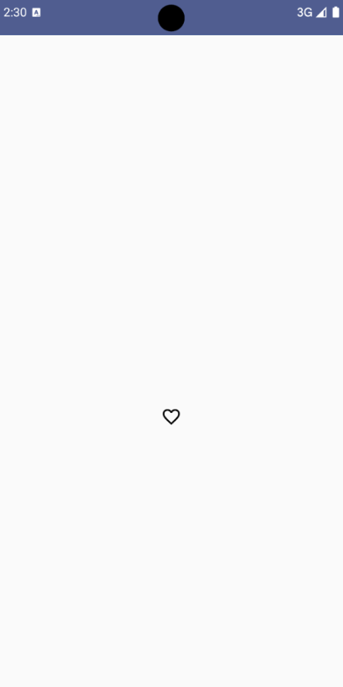
התוצאה
בתמונה הבאה מוצג לחצן סמל המתג מהקטע הקודם במצב שבו הוא לא מסומן:
דוגמה מתקדמת: פעולות חוזרות על לחיצה
בקטע הזה מוסבר איך ליצור לחצני סמלים שמפעילים פעולה באופן רציף בזמן שהמשתמש לוחץ עליהם ומחזיק אותם, במקום להפעיל פעולה רק פעם אחת לכל קליק.
@Composable fun MomentaryIconButton( unselectedImage: Int, selectedImage: Int, contentDescription: String, modifier: Modifier = Modifier, stepDelay: Long = 100L, // Minimum value is 1L milliseconds. onClick: () -> Unit ) { val interactionSource = remember { MutableInteractionSource() } val isPressed by interactionSource.collectIsPressedAsState() val pressedListener by rememberUpdatedState(onClick) LaunchedEffect(isPressed) { while (isPressed) { delay(stepDelay.coerceIn(1L, Long.MAX_VALUE)) pressedListener() } } IconButton( modifier = modifier, onClick = onClick, interactionSource = interactionSource ) { Icon( painter = if (isPressed) painterResource(id = selectedImage) else painterResource(id = unselectedImage), contentDescription = contentDescription, ) } }
נקודות עיקריות לגבי הקוד
MomentaryIconButtonמקבלת את הערךunselectedImage: Int, מזהה המשאב הניתן לציור של הסמל כשהלחצן לא לוחצים עליו, ואת הערךselectedImage: Int, מזהה המשאב הניתן לציור של הסמל כשהלחצן לוחצים עליו.- הוא משתמש ב-
interactionSourceכדי לעקוב באופן ספציפי אחרי אינטראקציות של 'לחיצה' מהמשתמש. - הערך של
isPressedהוא true כשהלחצן לוחצים עליו באופן פעיל, ו-false במקרים אחרים. כשהערך שלisPressedהואtrue, ה-LaunchedEffectנכנס ללולאה.- בתוך הלולאה הזו, המערכת משתמשת ב-
delay(עםstepDelay) כדי ליצור הפסקות בין פעולות ההפעלה.coerceInמוודא שהעיכוב הוא לפחות 1ms כדי למנוע לולאות אינסופיות. - הפונקציה
pressedListenerמופעלת אחרי כל עיכוב בתוך הלולאה. הפעולה תתבצע שוב.
- בתוך הלולאה הזו, המערכת משתמשת ב-
- הפונקציה
pressedListenerמשתמשת ב-rememberUpdatedStateכדי לוודא שהפונקציהonClick(הפעולה לביצוע) תמיד תהיה העדכנית ביותר מההרכב האחרון. - התמונה שמוצגת ב-
Iconמשתנה בהתאם למצב של הכפתור.- אם הערך של
isPressedהוא True, הערך שלselectedImageמוצג. - אחרת, יוצג
unselectedImage.
- אם הערך של
בשלב הבא, נשתמש ב-MomentaryIconButton בדוגמה. קטע הקוד הבא מדגים שני לחצני סמלים ששולטים בספירה:
@Preview() @Composable fun MomentaryIconButtonExample() { var pressedCount by remember { mutableIntStateOf(0) } Row( modifier = Modifier.fillMaxWidth(), verticalAlignment = Alignment.CenterVertically ) { MomentaryIconButton( unselectedImage = R.drawable.fast_rewind, selectedImage = R.drawable.fast_rewind_filled, stepDelay = 100L, onClick = { pressedCount -= 1 }, contentDescription = "Decrease count button" ) Spacer(modifier = Modifier) Text("advanced by $pressedCount frames") Spacer(modifier = Modifier) MomentaryIconButton( unselectedImage = R.drawable.fast_forward, selectedImage = R.drawable.fast_forward_filled, contentDescription = "Increase count button", stepDelay = 100L, onClick = { pressedCount += 1 } ) } }
נקודות עיקריות לגבי הקוד
- ה-composable של
MomentaryIconButtonExampleמציגRowשמכיל שתי מכונותMomentaryIconButtonו-composable שלTextכדי ליצור ממשק משתמש להגדלה ולצמצום של מונה. - הוא שומר על משתנה מצב שאפשר לשנות (mutable) בשם
pressedCountבאמצעותrememberו-mutableIntStateOf, שמאופסים בזמן האימפריסאליזציה. כשהערך שלpressedCountמשתנה, כל הרכיבים הניתנים לקיבוץ שמתבצעת עליהם תצפית (כמו הרכיב הניתן לקיבוץText) עוברים יצירת מחדש כדי לשקף את הערך החדש. - ה-
MomentaryIconButtonהראשון מקטין אתpressedCountכשלוחצים עליו או לוחצים לחיצה ארוכה עליו. - הערך השני של
MomentaryIconButtonמגדיל את הערך שלpressedCountכשמקישים עליו או לוחצים לחיצה ארוכה. - בשני הלחצנים
stepDelayמוגדר ל-100 אלפיות השנייה, כלומר הפעולהonClickחוזרת על עצמה כל 100 אלפיות השנייה בזמן הלחיצה על הלחצן.
התוצאה
בסרטון הבא מוצג ממשק המשתמש עם לחצני הסמלים והמספר: