با مجموعهها، منظم بمانید
ذخیره و طبقهبندی محتوا براساس اولویتهای شما.
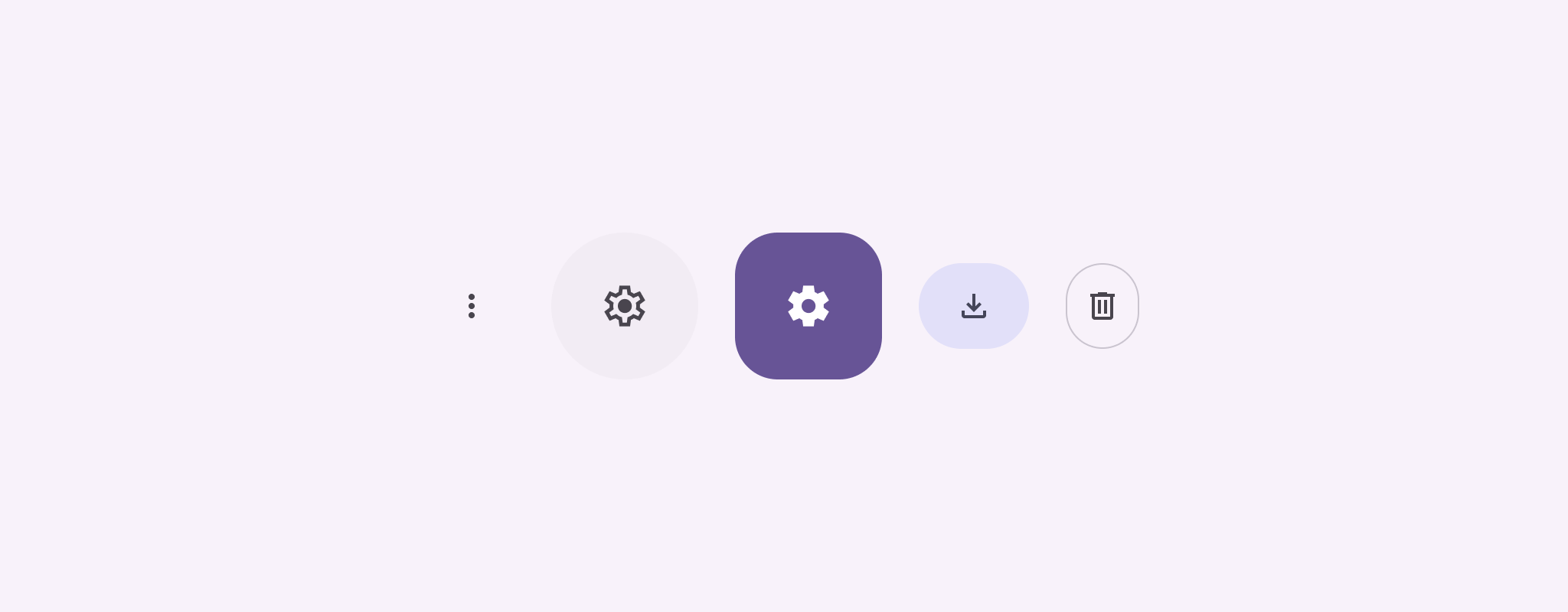
دکمه های نماد اقداماتی را که کاربران می توانند انجام دهند را نمایش می دهند. دکمههای نماد باید از نمادی با معنای واضح استفاده کنند و معمولاً اقدامات رایج یا پرکاربرد را نشان میدهند.
دو نوع دکمه آیکون وجود دارد:
پیشفرض : این دکمهها میتوانند عناصر دیگری مانند منو یا جستجو را باز کنند.
Toggle : این دکمهها میتوانند عملکردهای باینری را نشان دهند که میتوان آنها را روشن یا خاموش کرد، مانند "مورد علاقه" یا "نشانک".
شکل 1. دکمه های نماد، که برخی از آنها پر شده است (نشان دهنده انتخاب) و مشخص شده است.
onClick : یک تابع لامبدا که با ضربه زدن کاربر روی دکمه نماد اجرا می شود.
enabled : یک بولی که وضعیت فعال بودن دکمه را کنترل می کند. وقتی false ، دکمه به ورودی کاربر پاسخ نمی دهد.
content : محتوای قابل ترکیب در داخل دکمه، معمولاً یک Icon .
مثال اصلی: دکمه نماد را تغییر دهید
این مثال به شما نشان می دهد که چگونه یک دکمه آیکون جابجایی را پیاده سازی کنید. یک دکمه نماد تغییر ظاهر خود را بر اساس انتخاب یا عدم انتخاب تغییر می دهد.
@Preview@ComposablefunToggleIconButtonExample(){// isToggled initial value should be read from a view model or persistent storage.varisToggledbyrememberSaveable{mutableStateOf(false)}IconButton(onClick={isToggled=!isToggled}){Icon(painter=if(isToggled)painterResource(R.drawable.favorite_filled)elsepainterResource(R.drawable.favorite),contentDescription=if(isToggled)"Selected icon button"else"Unselected icon button.")}}
قابلیت ترکیب ToggleIconButtonExample یک IconButton قابل تغییر را تعریف می کند.
mutableStateOf(false) یک شیء MutableState ایجاد می کند که دارای مقدار بولی، در ابتدا false . این باعث میشود که isToggled یک حالت نگهدارنده باشد، به این معنی که Compose هر زمان که مقدار آن تغییر کند، UI را دوباره ترکیب میکند.
rememberSaveable تضمین میکند که وضعیت isToggled در تمام تغییرات پیکربندی، مانند چرخش صفحه، باقی میماند.
لامبدا onClickIconButton رفتار دکمه را هنگام کلیک کردن مشخص می کند و حالت را بین true و false تغییر می دهد.
پارامتر painterIcon composable به صورت مشروط یک painterResource متفاوت را بر اساس وضعیت isToggled بارگیری می کند. این ظاهر بصری آیکون را تغییر می دهد.
اگر isToggledtrue باشد، قلب پر شده را بارگذاری می کند.
اگر isToggledfalse باشد، قلب ترسیم شده را بارگیری می کند.
contentDescriptionIcon همچنین بر اساس وضعیت isToggled بهروزرسانی میشود تا اطلاعات دسترسی مناسب را ارائه دهد.
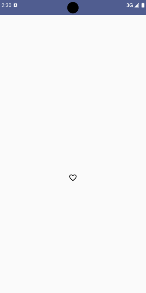
نتیجه
تصویر زیر دکمه نماد تغییر را از قطعه قبلی در حالت انتخاب نشده نشان می دهد:
شکل 2. یک دکمه نماد تغییر "مورد علاقه" در حالت انتخاب نشده آن.
مثال پیشرفته: اقدامات تکراری در مطبوعات
این بخش نحوه ایجاد دکمههای آیکونی را نشان میدهد که به طور مداوم یک عمل را در حالی که کاربر فشار میدهد و نگه میدارد، فعال میکند، نه اینکه فقط یک بار در هر کلیک فعال شود.
@ComposablefunMomentaryIconButton(unselectedImage:Int,selectedImage:Int,contentDescription:String,modifier:Modifier=Modifier,stepDelay:Long=100L,// Minimum value is 1L milliseconds.onClick:()->Unit){valinteractionSource=remember{MutableInteractionSource()}valisPressedbyinteractionSource.collectIsPressedAsState()valpressedListenerbyrememberUpdatedState(onClick)LaunchedEffect(isPressed){while(isPressed){delay(stepDelay.coerceIn(1L,Long.MAX_VALUE))pressedListener()}}IconButton(modifier=modifier,onClick=onClick,interactionSource=interactionSource){Icon(painter=if(isPressed)painterResource(id=selectedImage)elsepainterResource(id=unselectedImage),contentDescription=contentDescription,)}}
MomentaryIconButton یک unselectedImage: Int ، شناسه منبع قابل ترسیم برای نماد زمانی که دکمه فشار داده نشده است، و selectedImage: Int ، شناسه منبع قابل ترسیم برای نماد هنگام فشار دادن دکمه.
از یک interactionSource برای ردیابی خاص تعاملات "پرس" از کاربر استفاده می کند.
هنگامی که دکمه به طور فعال فشار داده می شود isPressed درست است و در غیر این صورت false است. وقتی isPressedtrue باشد، LaunchedEffect وارد یک حلقه می شود.
در داخل این حلقه، از یک delay (با stepDelay ) برای ایجاد مکث بین اقدامات راهاندازی استفاده میکند. coerceIn تضمین می کند که تاخیر حداقل 1 میلی ثانیه است تا از حلقه های بی نهایت جلوگیری شود.
pressedListener پس از هر تأخیر در حلقه فراخوانی می شود. این باعث تکرار عمل می شود.
pressedListener از rememberUpdatedState استفاده می کند تا اطمینان حاصل کند که onClick lambda (عملی که باید انجام شود) همیشه به روزترین از آخرین ترکیب بندی است.
Icon تصویر نمایش داده شده خود را بر اساس اینکه آیا دکمه در حال حاضر فشار داده شده است یا خیر، تغییر می دهد.
اگر isPressed درست باشد، تصویر selectedImage نشان داده می شود.
در غیر این صورت، تصویر unselectedImage نشان داده می شود.
بعد، از این MomentaryIconButton در یک مثال استفاده کنید. قطعه زیر دو دکمه نماد را نشان می دهد که یک شمارنده را کنترل می کنند:
@Preview()@ComposablefunMomentaryIconButtonExample(){varpressedCountbyremember{mutableIntStateOf(0)}Row(modifier=Modifier.fillMaxWidth(),verticalAlignment=Alignment.CenterVertically){MomentaryIconButton(unselectedImage=R.drawable.fast_rewind,selectedImage=R.drawable.fast_rewind_filled,stepDelay=100L,onClick={pressedCount-=1},contentDescription="Decrease count button")Spacer(modifier=Modifier)Text("advanced by $pressedCount frames")Spacer(modifier=Modifier)MomentaryIconButton(unselectedImage=R.drawable.fast_forward,selectedImage=R.drawable.fast_forward_filled,contentDescription="Increase count button",stepDelay=100L,onClick={pressedCount+=1})}}
ترکیبپذیر MomentaryIconButtonExample یک Row حاوی دو نمونه MomentaryIconButton و یک Text قابل نوشتن برای ایجاد یک رابط کاربری برای افزایش و کاهش شمارنده نمایش میدهد.
یک متغیر حالت قابل تغییر pressedCount با استفاده از remember و mutableIntStateOf نگه می دارد که به 0 مقداردهی اولیه شده است. هنگامی که pressedCount تغییر می کند، هر composable که آن را مشاهده می کند (مانند Text composable) دوباره ترکیب می شود تا مقدار جدید را منعکس کند.
اولین MomentaryIconButton با کلیک یا نگه داشتن، pressedCount کاهش می دهد.
دومین MomentaryIconButton با کلیک یا نگه داشتن، pressedCount افزایش می دهد.
هر دو دکمه از یک stepDelay 100 میلی ثانیه استفاده می کنند، به این معنی که عمل onClick هر 100 میلی ثانیه تکرار می شود در حالی که یک دکمه نگه داشته می شود.
نتیجه
ویدئوی زیر رابط کاربری را با دکمههای آیکون و شمارنده نشان میدهد:
شکل 3 . رابط کاربری شمارنده با دو دکمه آیکون (بعلاوه و منهای) که شمارنده را افزایش و کاهش می دهد.
محتوا و نمونه کدها در این صفحه مشمول پروانههای توصیفشده در پروانه محتوا هستند. جاوا و OpenJDK علامتهای تجاری یا علامتهای تجاری ثبتشده Oracle و/یا وابستههای آن هستند.
تاریخ آخرین بهروزرسانی 2025-08-28 بهوقت ساعت هماهنگ جهانی.
[[["درک آسان","easyToUnderstand","thumb-up"],["مشکلم را برطرف کرد","solvedMyProblem","thumb-up"],["غیره","otherUp","thumb-up"]],[["اطلاعاتی که نیاز دارم وجود ندارد","missingTheInformationINeed","thumb-down"],["بیشازحد پیچیده/ مراحل بسیار زیاد","tooComplicatedTooManySteps","thumb-down"],["قدیمی","outOfDate","thumb-down"],["مشکل ترجمه","translationIssue","thumb-down"],["مشکل کد / نمونهها","samplesCodeIssue","thumb-down"],["غیره","otherDown","thumb-down"]],["تاریخ آخرین بهروزرسانی 2025-08-28 بهوقت ساعت هماهنگ جهانی."],[],[],null,["Icon buttons display actions that users can take. Icon buttons must use an icon\nwith a clear meaning, and typically represent common or frequently used actions.\n\nThere are two types of icon buttons:\n\n- **Default**: These buttons can open other elements, such as a menu or search.\n- **Toggle**: These buttons can represent binary actions that can be toggled on or off, such as \"favorite\" or \"bookmark\".\n\n**Figure 1.** Icon buttons, some of which are filled (indicating selection) and outlined.\n\nAPI surface\n\nUse the [`IconButton`](/reference/kotlin/androidx/compose/material3/package-summary#IconButton(kotlin.Function0,androidx.compose.ui.Modifier,kotlin.Boolean,androidx.compose.material3.IconButtonColors,androidx.compose.foundation.interaction.MutableInteractionSource,kotlin.Function1)) composable to implement standard icon buttons. To\ncreate different visual styles like filled, filled tonal, or outlined, use\n[`FilledIconButton`](/reference/kotlin/androidx/compose/material3/package-summary#FilledIconButton(kotlin.Function0,androidx.compose.material3.IconButtonShapes,androidx.compose.ui.Modifier,kotlin.Boolean,androidx.compose.material3.IconButtonColors,androidx.compose.foundation.interaction.MutableInteractionSource,kotlin.Function0)), [`FilledTonalIconButton`](/reference/kotlin/androidx/compose/material3/package-summary#FilledTonalIconButton(kotlin.Function0,androidx.compose.ui.Modifier,kotlin.Boolean,androidx.compose.ui.graphics.Shape,androidx.compose.material3.IconButtonColors,androidx.compose.foundation.interaction.MutableInteractionSource,kotlin.Function0)), and\n[`OutlinedIconButton`](/reference/kotlin/androidx/compose/material3/package-summary#OutlinedIconButton(kotlin.Function0,androidx.compose.material3.IconButtonShapes,androidx.compose.ui.Modifier,kotlin.Boolean,androidx.compose.material3.IconButtonColors,androidx.compose.foundation.BorderStroke,androidx.compose.foundation.interaction.MutableInteractionSource,kotlin.Function0)), respectively.\n\nThe key parameters for `IconButton` include:\n\n- `onClick`: A lambda function that executes when the user taps the icon button.\n- `enabled`: A boolean that controls the enabled state of the button. When `false`, the button does not respond to user input.\n- `content`: The composable content inside the button, typically an `Icon`.\n\nBasic example: Toggle icon button\n\nThis example shows you how to implement a toggle icon button. A toggle icon\nbutton changes its appearance based on whether it's selected or unselected.\n\n\n```kotlin\n@Preview\n@Composable\nfun ToggleIconButtonExample() {\n // isToggled initial value should be read from a view model or persistent storage.\n var isToggled by rememberSaveable { mutableStateOf(false) }\n\n IconButton(\n onClick = { isToggled = !isToggled }\n ) {\n Icon(\n painter = if (isToggled) painterResource(R.drawable.favorite_filled) else painterResource(R.drawable.favorite),\n contentDescription = if (isToggled) \"Selected icon button\" else \"Unselected icon button.\"\n )\n }\n}https://github.com/android/snippets/blob/5673ffc60b614daf028ee936227128eb8c4f9781/compose/snippets/src/main/java/com/example/compose/snippets/components/IconButton.kt#L44-L58\n```\n\n\u003cbr /\u003e\n\nKey points about the code\n\n- The `ToggleIconButtonExample` composable defines a toggleable `IconButton`.\n - `mutableStateOf(false)` creates a `MutableState` object that holds a boolean value, initially `false`. This makes `isToggled` a state holder, meaning Compose recomposes the UI whenever its value changes.\n - `rememberSaveable` ensures the `isToggled` state persists across configuration changes, like screen rotation.\n- The `onClick` lambda of the `IconButton` defines the button's behavior when clicked, toggling the state between `true` and `false`.\n- The [`Icon`](/reference/kotlin/androidx/compose/material3/package-summary#Icon(androidx.compose.ui.graphics.painter.Painter,kotlin.String,androidx.compose.ui.Modifier,androidx.compose.ui.graphics.Color)) composable's `painter` parameter conditionally loads a different `painterResource` based on the `isToggled` state. This changes the visual appearance of the icon.\n - If `isToggled` is `true`, it loads the filled heart drawable.\n - If `isToggled` is `false`, it loads the outlined heart drawable.\n- The `contentDescription` of the `Icon` also updates based on the `isToggled` state to provide appropriate accessibility information.\n\nResult\n\nThe following image shows the toggle icon button from the preceding snippet in\nits unselected state:\n**Figure 2.** A \"favorite\" toggle icon button in its unselected state.\n\nAdvanced example: Repeated actions on press\n\nThis section demonstrates how to create icon buttons that continuously trigger\nan action while the user presses and holds them, rather than just triggering\nonce per click.\n\n\n```kotlin\n@Composable\nfun MomentaryIconButton(\n unselectedImage: Int,\n selectedImage: Int,\n contentDescription: String,\n modifier: Modifier = Modifier,\n stepDelay: Long = 100L, // Minimum value is 1L milliseconds.\n onClick: () -\u003e Unit\n) {\n val interactionSource = remember { MutableInteractionSource() }\n val isPressed by interactionSource.collectIsPressedAsState()\n val pressedListener by rememberUpdatedState(onClick)\n\n LaunchedEffect(isPressed) {\n while (isPressed) {\n delay(stepDelay.coerceIn(1L, Long.MAX_VALUE))\n pressedListener()\n }\n }\n\n IconButton(\n modifier = modifier,\n onClick = onClick,\n interactionSource = interactionSource\n ) {\n Icon(\n painter = if (isPressed) painterResource(id = selectedImage) else painterResource(id = unselectedImage),\n contentDescription = contentDescription,\n )\n }\n}https://github.com/android/snippets/blob/5673ffc60b614daf028ee936227128eb8c4f9781/compose/snippets/src/main/java/com/example/compose/snippets/components/IconButton.kt#L62-L92\n```\n\n\u003cbr /\u003e\n\nKey points about the code\n\n- `MomentaryIconButton` takes an `unselectedImage: Int`, the drawable resource ID for the icon when the button is not pressed, and `selectedImage: Int`, the drawable resource ID for the icon when the button is pressed.\n- It uses an `interactionSource` to specifically track \"press\" interactions from the user.\n- `isPressed` is true when the button is actively being pressed and false otherwise. When `isPressed` is `true`, the `LaunchedEffect` enters a loop.\n - Inside this loop, it uses a `delay` (with `stepDelay`) to create pauses between triggering actions. `coerceIn` ensures the delay is at least 1ms to prevent infinite loops.\n - The `pressedListener` is invoked after each delay within the loop. This makes the action repeat.\n- The `pressedListener` uses `rememberUpdatedState` to ensure that the `onClick` lambda (the action to perform) is always the most up-to-date from the latest composition.\n- The `Icon` changes its displayed image based on whether the button is currently pressed or not.\n - If `isPressed` is true, the `selectedImage` is shown.\n - Otherwise, the `unselectedImage` is shown.\n\nNext, use this `MomentaryIconButton` in an example. The following snippet\ndemonstrates two icon buttons controlling a counter:\n\n\n```kotlin\n@Preview()\n@Composable\nfun MomentaryIconButtonExample() {\n var pressedCount by remember { mutableIntStateOf(0) }\n\n Row(\n modifier = Modifier.fillMaxWidth(),\n verticalAlignment = Alignment.CenterVertically\n ) {\n MomentaryIconButton(\n unselectedImage = R.drawable.fast_rewind,\n selectedImage = R.drawable.fast_rewind_filled,\n stepDelay = 100L,\n onClick = { pressedCount -= 1 },\n contentDescription = \"Decrease count button\"\n )\n Spacer(modifier = Modifier)\n Text(\"advanced by $pressedCount frames\")\n Spacer(modifier = Modifier)\n MomentaryIconButton(\n unselectedImage = R.drawable.fast_forward,\n selectedImage = R.drawable.fast_forward_filled,\n contentDescription = \"Increase count button\",\n stepDelay = 100L,\n onClick = { pressedCount += 1 }\n )\n }\n}https://github.com/android/snippets/blob/5673ffc60b614daf028ee936227128eb8c4f9781/compose/snippets/src/main/java/com/example/compose/snippets/components/IconButton.kt#L96-L123\n```\n\n\u003cbr /\u003e\n\nKey points about the code\n\n- The `MomentaryIconButtonExample` composable displays a `Row` containing two `MomentaryIconButton` instances and a `Text` composable to build a UI for incrementing and decrementing a counter.\n- It maintains a `pressedCount` mutable state variable using `remember` and `mutableIntStateOf`, initialized to 0. When `pressedCount` changes, any composables observing it (like the `Text` composable) recompose to reflect the new value.\n- The first `MomentaryIconButton` decreases `pressedCount` when clicked or held.\n- The second `MomentaryIconButton` increases `pressedCount` when clicked or held.\n- Both buttons use a `stepDelay` of 100 milliseconds, meaning the `onClick` action repeats every 100ms while a button is held.\n\nResult\n\nThe following video shows the UI with the icon buttons and the counter:\n**Figure 3**. A counter UI with two icon buttons (plus and minus) that increment and decrement the counter.\n\nAdditional resources\n\n- [Material 3 - Icon buttons](https://m3.material.io/components/icon-buttons/overview)"]]