Mit Sammlungen den Überblick behalten
Sie können Inhalte basierend auf Ihren Einstellungen speichern und kategorisieren.
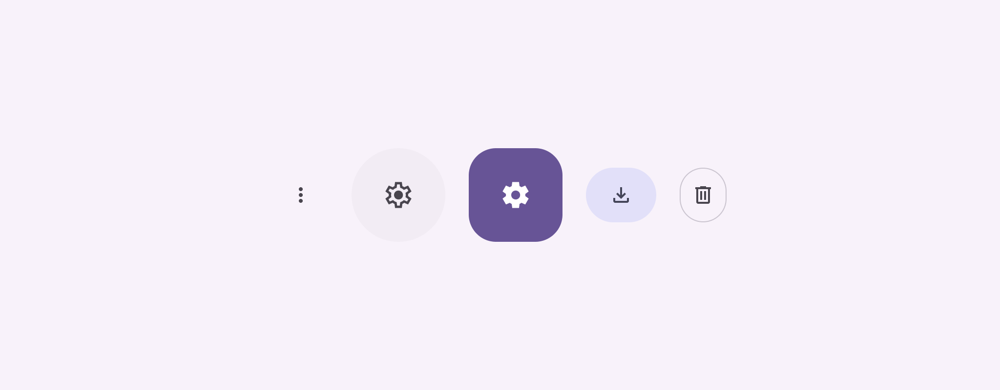
Symbolschaltflächen zeigen Aktionen an, die Nutzer ausführen können. Symbolschaltflächen müssen ein Symbol mit einer eindeutigen Bedeutung verwenden und stehen in der Regel für gängige oder häufig verwendete Aktionen.
Es gibt zwei Arten von Symbolschaltflächen:
Standard: Mit diesen Schaltflächen können andere Elemente geöffnet werden, z. B. ein Menü oder eine Suche.
Ein/Aus-Schaltflächen: Diese Schaltflächen können binäre Aktionen darstellen, die aktiviert oder deaktiviert werden können, z. B. „Favoriten“ oder „Lesezeichen“.
Abbildung 1: Symbolschaltflächen, von denen einige ausgefüllt (Auswahl) und umrandet sind.
Zu den wichtigsten Parametern für IconButton gehören:
onClick: Eine Lambda-Funktion, die ausgeführt wird, wenn der Nutzer auf die Symbolschaltfläche tippt.
enabled: Ein boolescher Wert, der den Aktivierungsstatus der Schaltfläche steuert. Bei false reagiert die Schaltfläche nicht auf Nutzereingaben.
content: Die zusammensetzbaren Inhalte in der Schaltfläche, in der Regel ein Icon.
Einfaches Beispiel: Ein/Aus-Schaltfläche
In diesem Beispiel wird gezeigt, wie Sie eine Schaltfläche mit einem Ein-/Aus-Symbol implementieren. Die Darstellung einer Ein-/Aus-Schaltfläche ändert sich je nachdem, ob sie ausgewählt ist oder nicht.
@Preview@ComposablefunToggleIconButtonExample(){// isToggled initial value should be read from a view model or persistent storage.varisToggledbyrememberSaveable{mutableStateOf(false)}IconButton(onClick={isToggled=!isToggled}){Icon(painter=if(isToggled)painterResource(R.drawable.favorite_filled)elsepainterResource(R.drawable.favorite),contentDescription=if(isToggled)"Selected icon button"else"Unselected icon button.")}}
Mit dem ToggleIconButtonExample-Element wird ein umschaltbarer IconButton definiert.
mutableStateOf(false) erstellt ein MutableState-Objekt mit einem booleschen Wert, anfangs false. Dadurch wird isToggled zu einem Statushalter. Das bedeutet, dass Compose die Benutzeroberfläche immer dann neu zusammensetzt, wenn sich der Wert ändert.
rememberSaveable sorgt dafür, dass der isToggled-Status bei Konfigurationsänderungen wie der Bildschirmdrehung erhalten bleibt.
Das onClick-Lambda des IconButton definiert das Verhalten der Schaltfläche beim Klicken, wobei der Status zwischen true und false wechselt.
Der Parameter painter des Icon-Elements lädt abhängig vom Status isToggled bedingt eine andere painterResource. Dadurch ändert sich die visuelle Darstellung des Symbols.
Wenn isToggledtrue ist, wird das gefüllte Herz geladen.
Wenn isToggledfalse ist, wird das gezeichnete Herz mit Umriss geladen.
Die contentDescription des Icon wird ebenfalls basierend auf dem isToggled-Status aktualisiert, um entsprechende Informationen zur Barrierefreiheit bereitzustellen.
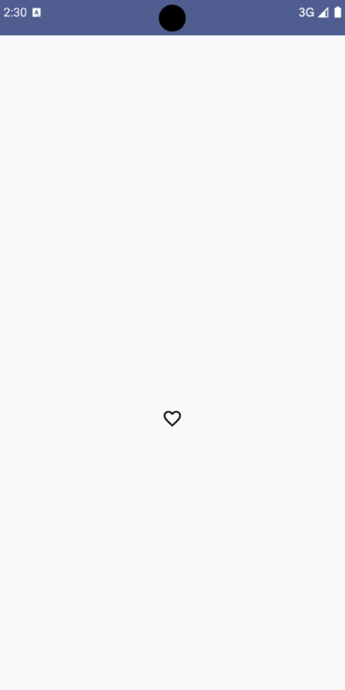
Ergebnis
Das folgende Bild zeigt die Schaltfläche mit dem Schaltersymbol aus dem vorherigen Snippet im nicht ausgewählten Zustand:
Abbildung 2. Ein Ein/Aus-Symbol für „Favoriten“ im nicht ausgewählten Zustand.
Fortgeschrittenes Beispiel: Wiederholte Aktionen beim Drücken
In diesem Abschnitt wird gezeigt, wie Sie Symbolschaltflächen erstellen, die eine Aktion kontinuierlich auslösen, während der Nutzer sie gedrückt hält, anstatt sie nur einmal pro Klick auszulösen.
@ComposablefunMomentaryIconButton(unselectedImage:Int,selectedImage:Int,contentDescription:String,modifier:Modifier=Modifier,stepDelay:Long=100L,// Minimum value is 1L milliseconds.onClick:()->Unit){valinteractionSource=remember{MutableInteractionSource()}valisPressedbyinteractionSource.collectIsPressedAsState()valpressedListenerbyrememberUpdatedState(onClick)LaunchedEffect(isPressed){while(isPressed){delay(stepDelay.coerceIn(1L,Long.MAX_VALUE))pressedListener()}}IconButton(modifier=modifier,onClick=onClick,interactionSource=interactionSource){Icon(painter=if(isPressed)painterResource(id=selectedImage)elsepainterResource(id=unselectedImage),contentDescription=contentDescription,)}}
Für MomentaryIconButton wird eine unselectedImage: Int, die drawable-Ressourcen-ID für das Symbol, wenn die Schaltfläche nicht gedrückt wird, und selectedImage: Int, die drawable-Ressourcen-ID für das Symbol, wenn die Schaltfläche gedrückt wird, verwendet.
Dabei wird ein interactionSource verwendet, um Interaktionen vom Typ „Drücken“ des Nutzers zu erfassen.
isPressed ist „wahr“, wenn die Taste gedrückt wird, und andernfalls „falsch“. Wenn isPressed = true ist, begibt sich die LaunchedEffect in eine Schleife.
Innerhalb dieser Schleife wird eine delay (mit stepDelay) verwendet, um Pausen zwischen den ausgelösten Aktionen zu schaffen. coerceIn sorgt dafür, dass die Verzögerung mindestens 1 ms beträgt, um Endlosschleifen zu vermeiden.
pressedListener wird nach jeder Verzögerung innerhalb der Schleife aufgerufen. Dadurch wird die Aktion wiederholt.
Der pressedListener verwendet rememberUpdatedState, um sicherzustellen, dass das onClick-Lambda (die auszuführende Aktion) immer das aktuellste aus der neuesten Zusammensetzung ist.
Das angezeigte Bild des Icon ändert sich je nachdem, ob die Schaltfläche gerade gedrückt wird oder nicht.
Wenn isPressed wahr ist, wird selectedImage angezeigt.
Andernfalls wird die unselectedImage angezeigt.
Verwenden Sie MomentaryIconButton als Nächstes in einem Beispiel. Im folgenden Snippet werden zwei Symbolschaltflächen verwendet, um einen Zähler zu steuern:
@Preview()@ComposablefunMomentaryIconButtonExample(){varpressedCountbyremember{mutableIntStateOf(0)}Row(modifier=Modifier.fillMaxWidth(),verticalAlignment=Alignment.CenterVertically){MomentaryIconButton(unselectedImage=R.drawable.fast_rewind,selectedImage=R.drawable.fast_rewind_filled,stepDelay=100L,onClick={pressedCount-=1},contentDescription="Decrease count button")Spacer(modifier=Modifier)Text("advanced by $pressedCount frames")Spacer(modifier=Modifier)MomentaryIconButton(unselectedImage=R.drawable.fast_forward,selectedImage=R.drawable.fast_forward_filled,contentDescription="Increase count button",stepDelay=100L,onClick={pressedCount+=1})}}
Das MomentaryIconButtonExample-Kompositelement zeigt ein Row mit zwei MomentaryIconButton-Instanzen und einem Text-Kompositelement an, um eine Benutzeroberfläche zum Erhöhen und Verringern eines Zählers zu erstellen.
Es wird eine mutable Statusvariable pressedCount mit remember und mutableIntStateOf verwaltet, die auf 0 initialisiert ist. Wenn sich pressedCount ändert, werden alle zugehörigen Composeables (z. B. das Text-Composeable) neu zusammengesetzt, um den neuen Wert widerzuspiegeln.
Wenn Sie auf das erste MomentaryIconButton klicken oder es gedrückt halten, wird pressedCount verringert.
Wenn Sie auf das zweite MomentaryIconButton klicken oder es gedrückt halten, erhöht sich pressedCount.
Für beide Schaltflächen wird eine stepDelay von 100 Millisekunden verwendet. Das bedeutet, dass die onClick-Aktion alle 100 Millisekunden wiederholt wird, solange eine Schaltfläche gedrückt wird.
Ergebnis
Das folgende Video zeigt die Benutzeroberfläche mit den Symbolschaltflächen und dem Zähler:
Abbildung 3: Eine Zähler-UI mit zwei Symbolschaltflächen (Plus und Minus), mit denen der Zähler erhöht und verringert wird.
Alle Inhalte und Codebeispiele auf dieser Seite unterliegen den Lizenzen wie im Abschnitt Inhaltslizenz beschrieben. Java und OpenJDK sind Marken oder eingetragene Marken von Oracle und/oder seinen Tochtergesellschaften.
Zuletzt aktualisiert: 2025-08-27 (UTC).
[[["Leicht verständlich","easyToUnderstand","thumb-up"],["Mein Problem wurde gelöst","solvedMyProblem","thumb-up"],["Sonstiges","otherUp","thumb-up"]],[["Benötigte Informationen nicht gefunden","missingTheInformationINeed","thumb-down"],["Zu umständlich/zu viele Schritte","tooComplicatedTooManySteps","thumb-down"],["Nicht mehr aktuell","outOfDate","thumb-down"],["Problem mit der Übersetzung","translationIssue","thumb-down"],["Problem mit Beispielen/Code","samplesCodeIssue","thumb-down"],["Sonstiges","otherDown","thumb-down"]],["Zuletzt aktualisiert: 2025-08-27 (UTC)."],[],[],null,["Icon buttons display actions that users can take. Icon buttons must use an icon\nwith a clear meaning, and typically represent common or frequently used actions.\n\nThere are two types of icon buttons:\n\n- **Default**: These buttons can open other elements, such as a menu or search.\n- **Toggle**: These buttons can represent binary actions that can be toggled on or off, such as \"favorite\" or \"bookmark\".\n\n**Figure 1.** Icon buttons, some of which are filled (indicating selection) and outlined.\n\nAPI surface\n\nUse the [`IconButton`](/reference/kotlin/androidx/compose/material3/package-summary#IconButton(kotlin.Function0,androidx.compose.ui.Modifier,kotlin.Boolean,androidx.compose.material3.IconButtonColors,androidx.compose.foundation.interaction.MutableInteractionSource,kotlin.Function1)) composable to implement standard icon buttons. To\ncreate different visual styles like filled, filled tonal, or outlined, use\n[`FilledIconButton`](/reference/kotlin/androidx/compose/material3/package-summary#FilledIconButton(kotlin.Function0,androidx.compose.material3.IconButtonShapes,androidx.compose.ui.Modifier,kotlin.Boolean,androidx.compose.material3.IconButtonColors,androidx.compose.foundation.interaction.MutableInteractionSource,kotlin.Function0)), [`FilledTonalIconButton`](/reference/kotlin/androidx/compose/material3/package-summary#FilledTonalIconButton(kotlin.Function0,androidx.compose.ui.Modifier,kotlin.Boolean,androidx.compose.ui.graphics.Shape,androidx.compose.material3.IconButtonColors,androidx.compose.foundation.interaction.MutableInteractionSource,kotlin.Function0)), and\n[`OutlinedIconButton`](/reference/kotlin/androidx/compose/material3/package-summary#OutlinedIconButton(kotlin.Function0,androidx.compose.material3.IconButtonShapes,androidx.compose.ui.Modifier,kotlin.Boolean,androidx.compose.material3.IconButtonColors,androidx.compose.foundation.BorderStroke,androidx.compose.foundation.interaction.MutableInteractionSource,kotlin.Function0)), respectively.\n\nThe key parameters for `IconButton` include:\n\n- `onClick`: A lambda function that executes when the user taps the icon button.\n- `enabled`: A boolean that controls the enabled state of the button. When `false`, the button does not respond to user input.\n- `content`: The composable content inside the button, typically an `Icon`.\n\nBasic example: Toggle icon button\n\nThis example shows you how to implement a toggle icon button. A toggle icon\nbutton changes its appearance based on whether it's selected or unselected.\n\n\n```kotlin\n@Preview\n@Composable\nfun ToggleIconButtonExample() {\n // isToggled initial value should be read from a view model or persistent storage.\n var isToggled by rememberSaveable { mutableStateOf(false) }\n\n IconButton(\n onClick = { isToggled = !isToggled }\n ) {\n Icon(\n painter = if (isToggled) painterResource(R.drawable.favorite_filled) else painterResource(R.drawable.favorite),\n contentDescription = if (isToggled) \"Selected icon button\" else \"Unselected icon button.\"\n )\n }\n}https://github.com/android/snippets/blob/5673ffc60b614daf028ee936227128eb8c4f9781/compose/snippets/src/main/java/com/example/compose/snippets/components/IconButton.kt#L44-L58\n```\n\n\u003cbr /\u003e\n\nKey points about the code\n\n- The `ToggleIconButtonExample` composable defines a toggleable `IconButton`.\n - `mutableStateOf(false)` creates a `MutableState` object that holds a boolean value, initially `false`. This makes `isToggled` a state holder, meaning Compose recomposes the UI whenever its value changes.\n - `rememberSaveable` ensures the `isToggled` state persists across configuration changes, like screen rotation.\n- The `onClick` lambda of the `IconButton` defines the button's behavior when clicked, toggling the state between `true` and `false`.\n- The [`Icon`](/reference/kotlin/androidx/compose/material3/package-summary#Icon(androidx.compose.ui.graphics.painter.Painter,kotlin.String,androidx.compose.ui.Modifier,androidx.compose.ui.graphics.Color)) composable's `painter` parameter conditionally loads a different `painterResource` based on the `isToggled` state. This changes the visual appearance of the icon.\n - If `isToggled` is `true`, it loads the filled heart drawable.\n - If `isToggled` is `false`, it loads the outlined heart drawable.\n- The `contentDescription` of the `Icon` also updates based on the `isToggled` state to provide appropriate accessibility information.\n\nResult\n\nThe following image shows the toggle icon button from the preceding snippet in\nits unselected state:\n**Figure 2.** A \"favorite\" toggle icon button in its unselected state.\n\nAdvanced example: Repeated actions on press\n\nThis section demonstrates how to create icon buttons that continuously trigger\nan action while the user presses and holds them, rather than just triggering\nonce per click.\n\n\n```kotlin\n@Composable\nfun MomentaryIconButton(\n unselectedImage: Int,\n selectedImage: Int,\n contentDescription: String,\n modifier: Modifier = Modifier,\n stepDelay: Long = 100L, // Minimum value is 1L milliseconds.\n onClick: () -\u003e Unit\n) {\n val interactionSource = remember { MutableInteractionSource() }\n val isPressed by interactionSource.collectIsPressedAsState()\n val pressedListener by rememberUpdatedState(onClick)\n\n LaunchedEffect(isPressed) {\n while (isPressed) {\n delay(stepDelay.coerceIn(1L, Long.MAX_VALUE))\n pressedListener()\n }\n }\n\n IconButton(\n modifier = modifier,\n onClick = onClick,\n interactionSource = interactionSource\n ) {\n Icon(\n painter = if (isPressed) painterResource(id = selectedImage) else painterResource(id = unselectedImage),\n contentDescription = contentDescription,\n )\n }\n}https://github.com/android/snippets/blob/5673ffc60b614daf028ee936227128eb8c4f9781/compose/snippets/src/main/java/com/example/compose/snippets/components/IconButton.kt#L62-L92\n```\n\n\u003cbr /\u003e\n\nKey points about the code\n\n- `MomentaryIconButton` takes an `unselectedImage: Int`, the drawable resource ID for the icon when the button is not pressed, and `selectedImage: Int`, the drawable resource ID for the icon when the button is pressed.\n- It uses an `interactionSource` to specifically track \"press\" interactions from the user.\n- `isPressed` is true when the button is actively being pressed and false otherwise. When `isPressed` is `true`, the `LaunchedEffect` enters a loop.\n - Inside this loop, it uses a `delay` (with `stepDelay`) to create pauses between triggering actions. `coerceIn` ensures the delay is at least 1ms to prevent infinite loops.\n - The `pressedListener` is invoked after each delay within the loop. This makes the action repeat.\n- The `pressedListener` uses `rememberUpdatedState` to ensure that the `onClick` lambda (the action to perform) is always the most up-to-date from the latest composition.\n- The `Icon` changes its displayed image based on whether the button is currently pressed or not.\n - If `isPressed` is true, the `selectedImage` is shown.\n - Otherwise, the `unselectedImage` is shown.\n\nNext, use this `MomentaryIconButton` in an example. The following snippet\ndemonstrates two icon buttons controlling a counter:\n\n\n```kotlin\n@Preview()\n@Composable\nfun MomentaryIconButtonExample() {\n var pressedCount by remember { mutableIntStateOf(0) }\n\n Row(\n modifier = Modifier.fillMaxWidth(),\n verticalAlignment = Alignment.CenterVertically\n ) {\n MomentaryIconButton(\n unselectedImage = R.drawable.fast_rewind,\n selectedImage = R.drawable.fast_rewind_filled,\n stepDelay = 100L,\n onClick = { pressedCount -= 1 },\n contentDescription = \"Decrease count button\"\n )\n Spacer(modifier = Modifier)\n Text(\"advanced by $pressedCount frames\")\n Spacer(modifier = Modifier)\n MomentaryIconButton(\n unselectedImage = R.drawable.fast_forward,\n selectedImage = R.drawable.fast_forward_filled,\n contentDescription = \"Increase count button\",\n stepDelay = 100L,\n onClick = { pressedCount += 1 }\n )\n }\n}https://github.com/android/snippets/blob/5673ffc60b614daf028ee936227128eb8c4f9781/compose/snippets/src/main/java/com/example/compose/snippets/components/IconButton.kt#L96-L123\n```\n\n\u003cbr /\u003e\n\nKey points about the code\n\n- The `MomentaryIconButtonExample` composable displays a `Row` containing two `MomentaryIconButton` instances and a `Text` composable to build a UI for incrementing and decrementing a counter.\n- It maintains a `pressedCount` mutable state variable using `remember` and `mutableIntStateOf`, initialized to 0. When `pressedCount` changes, any composables observing it (like the `Text` composable) recompose to reflect the new value.\n- The first `MomentaryIconButton` decreases `pressedCount` when clicked or held.\n- The second `MomentaryIconButton` increases `pressedCount` when clicked or held.\n- Both buttons use a `stepDelay` of 100 milliseconds, meaning the `onClick` action repeats every 100ms while a button is held.\n\nResult\n\nThe following video shows the UI with the icon buttons and the counter:\n**Figure 3**. A counter UI with two icon buttons (plus and minus) that increment and decrement the counter.\n\nAdditional resources\n\n- [Material 3 - Icon buttons](https://m3.material.io/components/icon-buttons/overview)"]]