Komponen Dialog menampilkan pesan dialog atau meminta input pengguna pada
lapisan di atas konten aplikasi utama. Hal ini menciptakan pengalaman UI yang mengganggu untuk menarik perhatian pengguna.
Kasus penggunaan dialog antara lain:
- Mengonfirmasi tindakan pengguna, seperti saat menghapus file.
- Meminta input pengguna, seperti di aplikasi daftar tugas.
- Menampilkan daftar opsi untuk dipilih pengguna, seperti memilih negara dalam penyiapan profil.

Dialog notifikasi
Composable AlertDialog menyediakan API yang mudah digunakan untuk membuat dialog bertema Desain Material. AlertDialog memiliki parameter khusus untuk
menangani elemen tertentu dalam dialog. Di antaranya adalah sebagai berikut:
title: Teks yang muncul di bagian atas dialog.text: Teks yang muncul di tengah dialog.icon: Grafik yang muncul di bagian atas dialog.onDismissRequest: Fungsi yang dipanggil saat pengguna menutup dialog, seperti dengan mengetuk di luar dialog.dismissButton: Composable yang berfungsi sebagai tombol tutup.confirmButton: Composable yang berfungsi sebagai tombol konfirmasi.
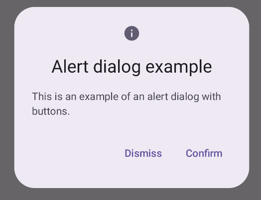
Contoh berikut menerapkan dua tombol dalam dialog pemberitahuan, satu yang menutup dialog, dan satu lagi yang mengonfirmasi permintaannya.
@Composable fun AlertDialogExample( onDismissRequest: () -> Unit, onConfirmation: () -> Unit, dialogTitle: String, dialogText: String, icon: ImageVector, ) { AlertDialog( icon = { Icon(icon, contentDescription = "Example Icon") }, title = { Text(text = dialogTitle) }, text = { Text(text = dialogText) }, onDismissRequest = { onDismissRequest() }, confirmButton = { TextButton( onClick = { onConfirmation() } ) { Text("Confirm") } }, dismissButton = { TextButton( onClick = { onDismissRequest() } ) { Text("Dismiss") } } ) }
Implementasi ini menyiratkan composable induk yang meneruskan argumen ke composable turunan dengan cara ini:
@Composable fun DialogExamples() { // ... val openAlertDialog = remember { mutableStateOf(false) } // ... when { // ... openAlertDialog.value -> { AlertDialogExample( onDismissRequest = { openAlertDialog.value = false }, onConfirmation = { openAlertDialog.value = false println("Confirmation registered") // Add logic here to handle confirmation. }, dialogTitle = "Alert dialog example", dialogText = "This is an example of an alert dialog with buttons.", icon = Icons.Default.Info ) } } } }
Penerapan ini akan terlihat seperti berikut:
Composable dialog
Dialog adalah composable dasar yang tidak menyediakan gaya atau slot yang telah ditentukan sebelumnya untuk konten. Ini adalah container yang relatif mudah yang harus Anda isi dengan container seperti Card. Berikut beberapa parameter utama dialog:
onDismissRequest: Lambda yang dipanggil saat pengguna menutup dialog.properties: InstanceDialogPropertiesyang menyediakan beberapa cakupan tambahan untuk penyesuaian.
Contoh dasar
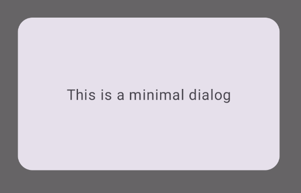
Contoh berikut adalah penerapan dasar composable Dialog. Perhatikan bahwa Card digunakan sebagai penampung sekunder. Tanpa Card, komponen Text
akan muncul sendiri di atas konten aplikasi utama.
@Composable fun MinimalDialog(onDismissRequest: () -> Unit) { Dialog(onDismissRequest = { onDismissRequest() }) { Card( modifier = Modifier .fillMaxWidth() .height(200.dp) .padding(16.dp), shape = RoundedCornerShape(16.dp), ) { Text( text = "This is a minimal dialog", modifier = Modifier .fillMaxSize() .wrapContentSize(Alignment.Center), textAlign = TextAlign.Center, ) } } }
Penerapan ini akan terlihat seperti berikut. Perhatikan bahwa saat dialog terbuka, konten aplikasi utama di bawahnya tampak lebih gelap dan berwarna abu-abu:
Contoh lanjutan
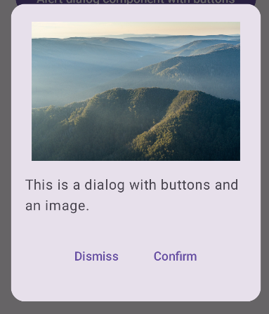
Berikut adalah penerapan composable Dialog yang lebih canggih. Dalam
kasus ini, komponen secara manual menerapkan antarmuka yang serupa dengan
contoh AlertDialog sebelumnya.
@Composable fun DialogWithImage( onDismissRequest: () -> Unit, onConfirmation: () -> Unit, painter: Painter, imageDescription: String, ) { Dialog(onDismissRequest = { onDismissRequest() }) { // Draw a rectangle shape with rounded corners inside the dialog Card( modifier = Modifier .fillMaxWidth() .height(375.dp) .padding(16.dp), shape = RoundedCornerShape(16.dp), ) { Column( modifier = Modifier .fillMaxSize(), verticalArrangement = Arrangement.Center, horizontalAlignment = Alignment.CenterHorizontally, ) { Image( painter = painter, contentDescription = imageDescription, contentScale = ContentScale.Fit, modifier = Modifier .height(160.dp) ) Text( text = "This is a dialog with buttons and an image.", modifier = Modifier.padding(16.dp), ) Row( modifier = Modifier .fillMaxWidth(), horizontalArrangement = Arrangement.Center, ) { TextButton( onClick = { onDismissRequest() }, modifier = Modifier.padding(8.dp), ) { Text("Dismiss") } TextButton( onClick = { onConfirmation() }, modifier = Modifier.padding(8.dp), ) { Text("Confirm") } } } } } }
Penerapan ini akan terlihat seperti berikut: