Dialog कॉम्पोनेंट, मुख्य ऐप्लिकेशन के कॉन्टेंट के ऊपर वाली
लेयर पर, डायलॉग मैसेज दिखाता है या उपयोगकर्ता के इनपुट का अनुरोध करता है. यह उपयोगकर्ता का ध्यान खींचने के लिए, इंटरप्टिव यूज़र इंटरफ़ेस (यूआई) वाला अनुभव देता है.
डायलॉग के इस्तेमाल के इन उदाहरणों पर ध्यान दें:
- उपयोगकर्ता की कार्रवाई की पुष्टि करना. जैसे, किसी फ़ाइल को मिटाने पर.
- उपयोगकर्ता का इनपुट अनुरोध करना, जैसे टू-डू लिस्ट वाले ऐप्लिकेशन में.
- उपयोगकर्ता के लिए विकल्पों की सूची दिखाना. जैसे, प्रोफ़ाइल सेटअप में कोई देश चुनना.

अलर्ट डायलॉग
AlertDialog कंपोज़ेबल,
मटीरियल डिज़ाइन थीम वाले डायलॉग बनाने के लिए, एक सुविधाजनक एपीआई उपलब्ध कराता है. AlertDialog में, डायलॉग के खास एलिमेंट को मैनेज करने के लिए, खास पैरामीटर होते हैं. इनमें ये शामिल हैं:
title: यह टेक्स्ट, डायलॉग के सबसे ऊपर दिखता है.text: यह टेक्स्ट, डायलॉग के बीच में दिखता है.icon: यह ग्राफ़िक, डायलॉग के सबसे ऊपर दिखता है.onDismissRequest: यह फ़ंक्शन तब कॉल किया जाता है, जब उपयोगकर्ता डायलॉग को खारिज करता है. जैसे, डायलॉग के बाहर टैप करने पर.dismissButton: यह कंपोज़ेबल, खारिज करने वाले बटन के तौर पर काम करता है.confirmButton: यह कंपोज़ेबल, पुष्टि करने वाले बटन के तौर पर काम करता है.
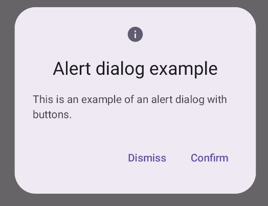
यहां दिए गए उदाहरण में, अलर्ट डायलॉग में दो बटन लागू किए गए हैं. इनमें से एक बटन, डायलॉग को खारिज करता है, जबकि दूसरा बटन, अनुरोध की पुष्टि करता है.
@Composable fun AlertDialogExample( onDismissRequest: () -> Unit, onConfirmation: () -> Unit, dialogTitle: String, dialogText: String, icon: ImageVector, ) { AlertDialog( icon = { Icon(icon, contentDescription = "Example Icon") }, title = { Text(text = dialogTitle) }, text = { Text(text = dialogText) }, onDismissRequest = { onDismissRequest() }, confirmButton = { TextButton( onClick = { onConfirmation() } ) { Text("Confirm") } }, dismissButton = { TextButton( onClick = { onDismissRequest() } ) { Text("Dismiss") } } ) }
इस उदाहरण में, पैरंट कंपोज़ेबल, चाइल्ड कंपोज़ेबल को इस तरह से आर्ग्युमेंट पास करता है:
@Composable fun DialogExamples() { // ... val openAlertDialog = remember { mutableStateOf(false) } // ... when { // ... openAlertDialog.value -> { AlertDialogExample( onDismissRequest = { openAlertDialog.value = false }, onConfirmation = { openAlertDialog.value = false println("Confirmation registered") // Add logic here to handle confirmation. }, dialogTitle = "Alert dialog example", dialogText = "This is an example of an alert dialog with buttons.", icon = Icons.Default.Info ) } } } }
लागू होने पर यह इस तरह दिखता है:
डायलॉग कंपोज़ेबल
Dialog एक बुनियादी कंपोज़ेबल है. यह कॉन्टेंट के लिए, कोई स्टाइलिंग या पहले से तय किए गए स्लॉट उपलब्ध नहीं कराता. यह एक सामान्य कंटेनर है. इसे Card जैसे कंटेनर से पॉप्युलेट किया जाना चाहिए. डायलॉग के कुछ अहम पैरामीटर यहां दिए गए हैं:
onDismissRequest: यह लैम्डा तब कॉल किया जाता है, जब उपयोगकर्ता डायलॉग बंद करता है.properties: यहDialogPropertiesका एक इंस्टेंस है. यह कंपोज़ेबल को पसंद के मुताबिक बनाने के लिए, कुछ अतिरिक्त स्कोप उपलब्ध कराता है.
सामान्य जानकारी
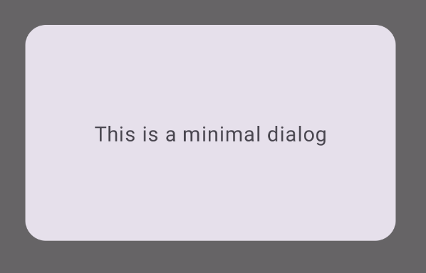
यहां दिया गया उदाहरण, Dialog कंपोज़ेबल का सामान्य उदाहरण है. ध्यान दें कि इसमें सेकंडरी कंटेनर के तौर पर, Card का इस्तेमाल किया गया है. Card के बिना, Text कॉम्पोनेंट, मुख्य ऐप्लिकेशन के कॉन्टेंट के ऊपर अकेला दिखेगा.
@Composable fun MinimalDialog(onDismissRequest: () -> Unit) { Dialog(onDismissRequest = { onDismissRequest() }) { Card( modifier = Modifier .fillMaxWidth() .height(200.dp) .padding(16.dp), shape = RoundedCornerShape(16.dp), ) { Text( text = "This is a minimal dialog", modifier = Modifier .fillMaxSize() .wrapContentSize(Alignment.Center), textAlign = TextAlign.Center, ) } } }
लागू होने पर यह इस तरह दिखता है. ध्यान दें कि डायलॉग खुलने पर, इसके नीचे मौजूद मुख्य ऐप्लिकेशन का कॉन्टेंट धुंधला और ग्रे दिखता है:
ऐडवांस उदाहरण
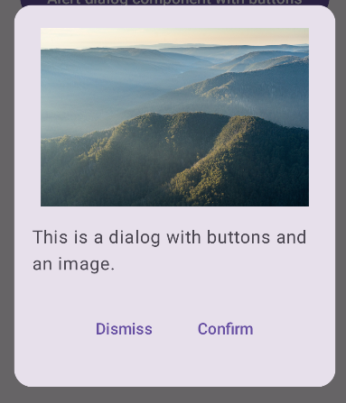
यहां दिया गया उदाहरण, Dialog कंपोज़ेबल का ज़्यादा जानकारी वाला उदाहरण है. इस मामले में, कॉम्पोनेंट, पिछली AlertDialog के उदाहरण जैसा इंटरफ़ेस मैन्युअल तरीके से लागू करता है.
@Composable fun DialogWithImage( onDismissRequest: () -> Unit, onConfirmation: () -> Unit, painter: Painter, imageDescription: String, ) { Dialog(onDismissRequest = { onDismissRequest() }) { // Draw a rectangle shape with rounded corners inside the dialog Card( modifier = Modifier .fillMaxWidth() .height(375.dp) .padding(16.dp), shape = RoundedCornerShape(16.dp), ) { Column( modifier = Modifier .fillMaxSize(), verticalArrangement = Arrangement.Center, horizontalAlignment = Alignment.CenterHorizontally, ) { Image( painter = painter, contentDescription = imageDescription, contentScale = ContentScale.Fit, modifier = Modifier .height(160.dp) ) Text( text = "This is a dialog with buttons and an image.", modifier = Modifier.padding(16.dp), ) Row( modifier = Modifier .fillMaxWidth(), horizontalArrangement = Arrangement.Center, ) { TextButton( onClick = { onDismissRequest() }, modifier = Modifier.padding(8.dp), ) { Text("Dismiss") } TextButton( onClick = { onConfirmation() }, modifier = Modifier.padding(8.dp), ) { Text("Confirm") } } } } } }
लागू होने पर यह इस तरह दिखता है: