Restez organisé à l'aide des collections
Enregistrez et classez les contenus selon vos préférences.
Le composant Dialog affiche des boîtes de dialogue ou demande à l'utilisateur de saisir des informations sur un calque au-dessus du contenu principal de l'application. Elle crée une expérience d'interface utilisateur intrusive pour capter l'attention de l'utilisateur.
Voici quelques cas d'utilisation d'une boîte de dialogue :
Confirmation de l'action de l'utilisateur, par exemple lors de la suppression d'un fichier.
Demander à l'utilisateur de saisir des informations, par exemple dans une application de liste de tâches.
Présenter une liste d'options à l'utilisateur, par exemple pour choisir un pays lors de la configuration d'un profil.
Figure 1. Un exemple de boîte de dialogue contenant du texte et des icônes.
Boîte de dialogue d'alerte
Le composable AlertDialog fournit une API pratique pour créer une boîte de dialogue avec le thème Material Design. AlertDialog comporte des paramètres spécifiques pour gérer certains éléments de la boîte de dialogue. En voici quelques-uns :
title : texte qui s'affiche en haut de la boîte de dialogue.
text : texte qui apparaît au centre de la boîte de dialogue.
icon : graphique qui s'affiche en haut de la boîte de dialogue.
onDismissRequest : fonction appelée lorsque l'utilisateur ferme la boîte de dialogue, par exemple en appuyant en dehors de celle-ci.
dismissButton : composable servant de bouton de fermeture.
confirmButton : composable servant de bouton de confirmation.
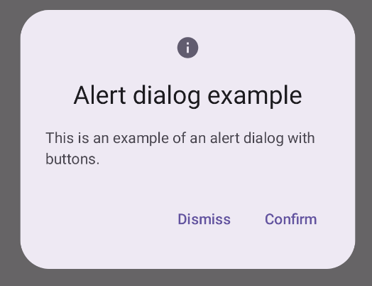
L'exemple suivant implémente deux boutons dans une boîte de dialogue d'alerte : l'un ferme la boîte de dialogue et l'autre confirme la requête.
Cette implémentation implique un composable parent qui transmet les arguments au composable enfant de la manière suivante :
@ComposablefunDialogExamples(){// ...valopenAlertDialog=remember{mutableStateOf(false)}// ...when{// ...openAlertDialog.value->{AlertDialogExample(onDismissRequest={openAlertDialog.value=false},onConfirmation={openAlertDialog.value=falseprintln("Confirmation registered")// Add logic here to handle confirmation.},dialogTitle="Alert dialog example",dialogText="This is an example of an alert dialog with buttons.",icon=Icons.Default.Info)}}}}
Figure 2 : Boîte de dialogue d'alerte avec des boutons.
Composable de boîte de dialogue
Dialog est un composable de base qui ne fournit aucun style ni aucun emplacement prédéfini pour le contenu. Il s'agit d'un conteneur relativement simple que vous devez remplir avec un conteneur tel que Card. Voici quelques-uns des principaux paramètres d'un dialogue :
onDismissRequest : lambda appelé lorsque l'utilisateur ferme la boîte de dialogue.
properties : instance de DialogProperties qui offre une marge de personnalisation supplémentaire.
Exemple de base
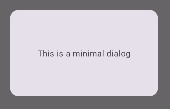
L'exemple suivant est une implémentation de base du composable Dialog. Notez qu'il utilise un Card comme conteneur secondaire. Sans Card, le composant Text s'afficherait seul au-dessus du contenu principal de l'application.
@ComposablefunMinimalDialog(onDismissRequest:()->Unit){Dialog(onDismissRequest={onDismissRequest()}){Card(modifier=Modifier.fillMaxWidth().height(200.dp).padding(16.dp),shape=RoundedCornerShape(16.dp),){Text(text="This is a minimal dialog",modifier=Modifier.fillMaxSize().wrapContentSize(Alignment.Center),textAlign=TextAlign.Center,)}}}
Cette implémentation se présente comme suit. Notez que lorsque la boîte de dialogue est ouverte, le contenu principal de l'application situé en dessous apparaît assombri et grisé :
Figure 3 : Boîte de dialogue minimale.
Exemple avancé
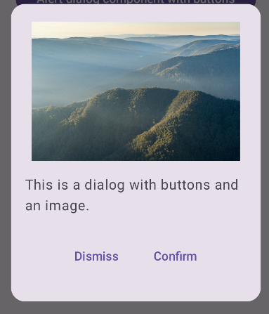
Voici une implémentation plus avancée du composable Dialog. Dans ce cas, le composant implémente manuellement une interface semblable à l'exemple AlertDialog ci-dessus.
@ComposablefunDialogWithImage(onDismissRequest:()->Unit,onConfirmation:()->Unit,painter:Painter,imageDescription:String,){Dialog(onDismissRequest={onDismissRequest()}){// Draw a rectangle shape with rounded corners inside the dialogCard(modifier=Modifier.fillMaxWidth().height(375.dp).padding(16.dp),shape=RoundedCornerShape(16.dp),){Column(modifier=Modifier.fillMaxSize(),verticalArrangement=Arrangement.Center,horizontalAlignment=Alignment.CenterHorizontally,){Image(painter=painter,contentDescription=imageDescription,contentScale=ContentScale.Fit,modifier=Modifier.height(160.dp))Text(text="This is a dialog with buttons and an image.",modifier=Modifier.padding(16.dp),)Row(modifier=Modifier.fillMaxWidth(),horizontalArrangement=Arrangement.Center,){TextButton(onClick={onDismissRequest()},modifier=Modifier.padding(8.dp),){Text("Dismiss")}TextButton(onClick={onConfirmation()},modifier=Modifier.padding(8.dp),){Text("Confirm")}}}}}}
Le contenu et les exemples de code de cette page sont soumis aux licences décrites dans la Licence de contenu. Java et OpenJDK sont des marques ou des marques déposées d'Oracle et/ou de ses sociétés affiliées.
Dernière mise à jour le 2025/08/27 (UTC).
[[["Facile à comprendre","easyToUnderstand","thumb-up"],["J'ai pu résoudre mon problème","solvedMyProblem","thumb-up"],["Autre","otherUp","thumb-up"]],[["Il n'y a pas l'information dont j'ai besoin","missingTheInformationINeed","thumb-down"],["Trop compliqué/Trop d'étapes","tooComplicatedTooManySteps","thumb-down"],["Obsolète","outOfDate","thumb-down"],["Problème de traduction","translationIssue","thumb-down"],["Mauvais exemple/Erreur de code","samplesCodeIssue","thumb-down"],["Autre","otherDown","thumb-down"]],["Dernière mise à jour le 2025/08/27 (UTC)."],[],[],null,["The [`Dialog`](/reference/kotlin/androidx/compose/ui/window/package-summary#Dialog(kotlin.Function0,androidx.compose.ui.window.DialogProperties,kotlin.Function0)) component displays dialog messages or requests user input on a\nlayer above the main app content. It creates an interruptive UI experience to\ncapture user attention.\n\nAmong the use cases for a dialog are the following:\n\n- Confirming user action, such as when deleting a file.\n- Requesting user input, such as in a to-do list app.\n- Presenting a list of options for user selection, like choosing a country in a profile setup.\n\n**Figure 1.** An example of a dialog populated with text and icons.\n\nAlert dialog\n\nThe [`AlertDialog`](/reference/kotlin/androidx/compose/material3/package-summary#AlertDialog(kotlin.Function0,kotlin.Function0,androidx.compose.ui.Modifier,kotlin.Function0,kotlin.Function0,kotlin.Function0,kotlin.Function0,androidx.compose.ui.graphics.Shape,androidx.compose.ui.graphics.Color,androidx.compose.ui.graphics.Color,androidx.compose.ui.graphics.Color,androidx.compose.ui.graphics.Color,androidx.compose.ui.unit.Dp,androidx.compose.ui.window.DialogProperties)) composable provides a convenient API for creating a\nMaterial Design themed dialog. `AlertDialog` has specific parameters for\nhandling particular elements of the dialog. Among them are the following:\n\n- `title`: The text that appears along the top of the dialog.\n- `text`: The text that appears centered within the dialog.\n- `icon`: The graphic that appears at the top of the dialog.\n- `onDismissRequest`: The function called when the user dismisses the dialog, such as by tapping outside of it.\n- `dismissButton`: A composable that serves as the dismiss button.\n- `confirmButton`: A composable that serves as the confirm button.\n\nThe following example implements two buttons in an alert dialog, one that\ndismisses the dialog, and another that confirms its request.\n\n\n```kotlin\n@Composable\nfun AlertDialogExample(\n onDismissRequest: () -\u003e Unit,\n onConfirmation: () -\u003e Unit,\n dialogTitle: String,\n dialogText: String,\n icon: ImageVector,\n) {\n AlertDialog(\n icon = {\n Icon(icon, contentDescription = \"Example Icon\")\n },\n title = {\n Text(text = dialogTitle)\n },\n text = {\n Text(text = dialogText)\n },\n onDismissRequest = {\n onDismissRequest()\n },\n confirmButton = {\n TextButton(\n onClick = {\n onConfirmation()\n }\n ) {\n Text(\"Confirm\")\n }\n },\n dismissButton = {\n TextButton(\n onClick = {\n onDismissRequest()\n }\n ) {\n Text(\"Dismiss\")\n }\n }\n )\n}https://github.com/android/snippets/blob/7a0ebbee11495f628cf9d574f6b6069c2867232a/compose/snippets/src/main/java/com/example/compose/snippets/components/Dialog.kt#L222-L262\n```\n\n\u003cbr /\u003e\n\nThis implementation implies a parent composable that passes arguments to the\nchild composable in this way:\n\n\n```kotlin\n@Composable\nfun DialogExamples() {\n // ...\n val openAlertDialog = remember { mutableStateOf(false) }\n\n // ...\n when {\n // ...\n openAlertDialog.value -\u003e {\n AlertDialogExample(\n onDismissRequest = { openAlertDialog.value = false },\n onConfirmation = {\n openAlertDialog.value = false\n println(\"Confirmation registered\") // Add logic here to handle confirmation.\n },\n dialogTitle = \"Alert dialog example\",\n dialogText = \"This is an example of an alert dialog with buttons.\",\n icon = Icons.Default.Info\n )\n }\n }\n }\n}https://github.com/android/snippets/blob/7a0ebbee11495f628cf9d574f6b6069c2867232a/compose/snippets/src/main/java/com/example/compose/snippets/components/Dialog.kt#L59-L137\n```\n\n\u003cbr /\u003e\n\nThis implementation appears as follows:\n**Figure 2.** An alert dialog with buttons. **Note:** When the user clicks either of the buttons, the dialog closes. When the user clicks confirm, it calls a function that also handles the confirmation. In this example, those functions are `onDismissRequest()` and `onConfirmRequest()`.\n| **Note:** In cases where your dialog requires a more complex set of buttons, you may benefit from using the `Dialog` composable and populating it in a more freeform manner.\n\nDialog composable\n\n[`Dialog`](/reference/kotlin/androidx/compose/ui/window/package-summary#Dialog(kotlin.Function0,androidx.compose.ui.window.DialogProperties,kotlin.Function0)) is a basic composable that doesn't provide any styling or\npredefined slots for content. It is a relatively straightforward container that\nyou should populate with a container such as `Card`. The following are some of\nthe key parameters of a dialog:\n\n- **`onDismissRequest`**: The lambda called when the user closes the dialog.\n- **`properties`** : An instance of [`DialogProperties`](/reference/kotlin/androidx/compose/ui/window/DialogProperties) that provides some additional scope for customization.\n\n| **Caution:** Unlike the example of `AlertDialog` in the preceding section, you need to manually specify the size and shape of `Dialog`. You also need to provide an inner container.\n\nBasic example\n\nThe following example is a basic implementation of the `Dialog` composable. Note\nthat it uses a `Card` as the secondary container. Without the `Card`, the `Text`\ncomponent would appear alone above the main app content.\n\n\n```kotlin\n@Composable\nfun MinimalDialog(onDismissRequest: () -\u003e Unit) {\n Dialog(onDismissRequest = { onDismissRequest() }) {\n Card(\n modifier = Modifier\n .fillMaxWidth()\n .height(200.dp)\n .padding(16.dp),\n shape = RoundedCornerShape(16.dp),\n ) {\n Text(\n text = \"This is a minimal dialog\",\n modifier = Modifier\n .fillMaxSize()\n .wrapContentSize(Alignment.Center),\n textAlign = TextAlign.Center,\n )\n }\n }\n}https://github.com/android/snippets/blob/7a0ebbee11495f628cf9d574f6b6069c2867232a/compose/snippets/src/main/java/com/example/compose/snippets/components/Dialog.kt#L141-L160\n```\n\n\u003cbr /\u003e\n\nThis implementation appears as follows. Note that when the dialog is open, the\nmain app content beneath it appears darkened and grayed out:\n**Figure 3.** Minimal dialog.\n\nAdvanced example\n\nThe following is a more advanced implemented of the `Dialog` composable. In this\ncase, the component manually implements a similar interface to the `AlertDialog`\nexample above.\n| **Caution:** If you only need to display a two-button dialog as in this example, you should use `AlertDialog` and its more convenient API. However, if you want to create a more complex dialog, perhaps with forms and multiple buttons, you should use `Dialog` with custom content, as in the following example.\n\n\n```kotlin\n@Composable\nfun DialogWithImage(\n onDismissRequest: () -\u003e Unit,\n onConfirmation: () -\u003e Unit,\n painter: Painter,\n imageDescription: String,\n) {\n Dialog(onDismissRequest = { onDismissRequest() }) {\n // Draw a rectangle shape with rounded corners inside the dialog\n Card(\n modifier = Modifier\n .fillMaxWidth()\n .height(375.dp)\n .padding(16.dp),\n shape = RoundedCornerShape(16.dp),\n ) {\n Column(\n modifier = Modifier\n .fillMaxSize(),\n verticalArrangement = Arrangement.Center,\n horizontalAlignment = Alignment.CenterHorizontally,\n ) {\n Image(\n painter = painter,\n contentDescription = imageDescription,\n contentScale = ContentScale.Fit,\n modifier = Modifier\n .height(160.dp)\n )\n Text(\n text = \"This is a dialog with buttons and an image.\",\n modifier = Modifier.padding(16.dp),\n )\n Row(\n modifier = Modifier\n .fillMaxWidth(),\n horizontalArrangement = Arrangement.Center,\n ) {\n TextButton(\n onClick = { onDismissRequest() },\n modifier = Modifier.padding(8.dp),\n ) {\n Text(\"Dismiss\")\n }\n TextButton(\n onClick = { onConfirmation() },\n modifier = Modifier.padding(8.dp),\n ) {\n Text(\"Confirm\")\n }\n }\n }\n }\n }\n}https://github.com/android/snippets/blob/7a0ebbee11495f628cf9d574f6b6069c2867232a/compose/snippets/src/main/java/com/example/compose/snippets/components/Dialog.kt#L164-L218\n```\n\n\u003cbr /\u003e\n\nThis implementation appears as follows:\n**Figure 4.** A dialog that includes an image.\n\nAdditional resources\n\n- [Material UI docs](https://m3.material.io/components/dialogs/overview)"]]